
Visual identity is the physical representation of a brand. It is extremely important because it communicates and reflects the philosophy and values of the company to the public. A bad visual identity can convey a wrong image of the company, damaging its corporate reputation, just as a strong visual identity helps to consolidate a strong and coherent image. In times where communication matters, and a lot, companies must strive to control what they communicate, assuming that they always transmit a message, whether they want to or not. Designing a communication strategy is the only way to guide the image that the stakeholders they are going to associate the company and the visual identity is undoubtedly part of that strategy.
Companies are increasingly concerned with going to market with a thoughtful, attractive visual identity in line with their spirit and business objectives. Organizations with years of experience in their respective sectors reform their visual identities to allude in some cases to the prestige of their experience or trying to renew their image to adapt to the present (as is the case of Burger King or McDonalds). Big brands, who are exemplary in terms of business success, have refined their visual identity for years. Apple, for example, has been implementing continuous changes to find the keys that make it today a reference in terms of brand design. But… How is the visual identity of a brand built? Keep reading because that's just what I'm going to tell you in this post.
Advance planning

A fundamental requirement for the visual identity of a brand to work is that it be consistent, consistent with the business model, with the values of the company and consistent in the elements that compose it. This consistency can only be achieved with planning in the creation process and with an exhaustive research work.
Newly created brands
When a brand starts from zero, it is logical that there is a certain tendency to experiment. Businesses mutate over time and are redefined to adapt to the needs of the market (which is constantly changing). However, before starting to design the visual identity of the brand it is necessary to answer some basic questions:
- What are the mission, vision and values of the company?
- What is the business model?
- What is the target audience? (Who do I address as a company)
- What place do I want the company to occupy in the market?
- What are the business objectives?
- What are the communication objectives?
Answering these questions is essential, because they are issues that, as a company, we must know how to communicate (either internally or abroad). If we don't know how to answer these questions in words, how do we intend to do it with visual elements through corporate identity?
Companies with a certain track record
In the case of companies with a certain track record, companies that perhaps already have a visual identity but want to reform it, the process is similar. However, at this point you have to take into account the current corporate image of the brand that has been consolidated throughout the company's history. The corporate image is, in essence, the image that the public has of the company, including the prejudices that we have before knowing the brand and the judgments that we form after knowing them and as a result of experience.
A well-constructed visual identity is tremendously helpful in directing people stakeholders to the picture that, as a company, we would like to convey. If your company is already active, before immersing yourself in a process of reform of the visual identity, worry about ask and know what image do your audiences have of the brand. When you know, ask yourself if that is the image you want to convey, what part of the fault (for better or for worse) your visual identity has and what a new visual identity should contribute.
Research: know the competition, the context and the market

Just as it is important to know the company to define the visual identity of the brand, Knowing the context in which the business will take place helps design to be more effective. Before launching your brand, investigate what works in the environment in which you are going to participate and find out what other companies in the sector do, Learning from the mistakes and successes of the competition is a great idea! In terms of visual identity there are also fashions and not knowing them can lead you to create an outdated brand that makes you perceived in the market as an outdated company and that is not capable of assuming the current challenges, constantly update your visual culture.
Create a corporate visual identity manual
The corporate visual identity manual brings together all the elements that make up the visual identity of the brand and it is a very useful tool that helps to achieve one of the most important objectives of a company's communication: coherence. Then I'm going to tell you what elements are basic in a corporate visual identity manual and that, therefore, must be defined and designed in the process of building the brand's visual identity.
Mission, Vision and Values
This part will sound familiar to you, but it is usually included in visual identity manuals. It is a way to guide the design of the rest of the elements of the visual identity of the brand that, obviously, must be designed to reinforce these values and to transmit to the public the mission, the vision and the spirit of the company.
Colours

You have to define what the color palette will be Of the brand. Colors have a fundamental power when transmitting ideas to stakeholders. For example, the change of colors that McDonalds has made has served the chain to transmit a message more appropriate to the times, trying to associate a new concept with its brand: fresh products.
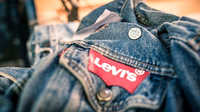
But a good color palette not only helps to be more consistent with the message we want to convey, there are brands that have achieved that certain color combinations are directly associated with your products (like for example Levi's, with red and white).
Typography
Typography is another of the visual elements that make up the brand's identity. After all, it could be understood as a voice timbre. The fact that the company always communicates with the same typographic combinations helps the public to associate the messages transmitted to the brand, without having to see other elements as representative as the logo.
Logo

It is perhaps the most representative visual identity element of a brand. Usually, They have great symbolic power so it is one of the most useful tools that the company has to get noticed and to create an image around their activities. Having a distinctive and striking logo is essential because it will help you to be present in society in which you develop as a company Look at the case of Starbucks! It is a good example of how a company manages to reach audiences through its logo, almost creating a community around it.
CHiring a professional to design your company logo is a good investment And today you can access a wide variety of designers on online platforms, for example, numerous freelancers offer their services for logo design on Fiverr and there are offers for all kinds of pockets and styles.
Indications for use of the logo must be included in the visual identity manual: all available versions and what each version should be used for, allowed sizes, margins ...
Visual support elements
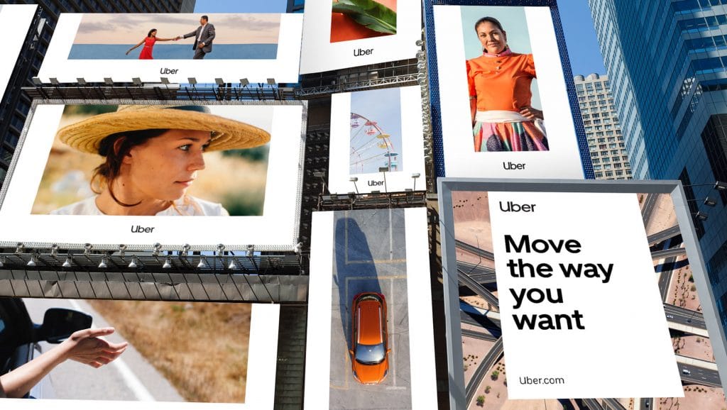
Supporting visuals they are very useful when adapting your message to different platforms and media. If you communicate on social networks, for example, you may not want to saturate all your publications with the company logo, having other visual tools will make those who go from one post to another quickly associate that publication with your brand, whether or not they are not the logo. Or in other cases, They can be used to reinforce that association with the brand in advertising campaigns Uber is a ten when it comes to using supportive visuals! See how smart they use Uber's "U" to create frames for their canopies and billboards.
One last note: supports
When designing the visual identity it is important to think about the supports in which the brand will communicate, because not all visual formulas work equally well on all media. There will be elements that work very well on social networks but lose their meaning on physical media and vice versa. Your pieces must be thought based on the destination they are going to have.