
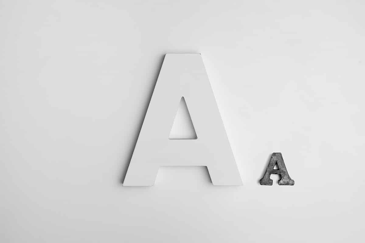
One of the fundamental decisions when facing a project is to choose a suitable font for that design. Each of the typefaces we see around us has been created with a specific function and therefore, it is not worth choosing any. We already know the great variety of fonts that exist and that are divided into four groups: serif, sans serif, script or manual and decorative.
Currently, they are many brands that are committed to using geometric fonts to create an image of simplicity and cleanliness. In this post, we are going to find out what is behind these geometric fonts and we are going to make a selection, which you cannot miss in your typographic catalog.
typographic classification
Source: Odyssey
Fonts can be organized in different ways, but in this case we are going to focus on their anatomy, so we will divide them into four groups in which we will find ourselves; serif typeface, sans serif typeface, script typeface and decorative typeface.
Before getting fully into geometric fonts, you have to know what the large groups are in order to differentiate one font from another.
Serif or serif typography
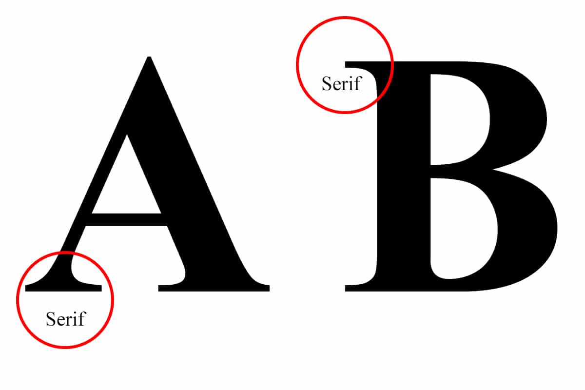
The element that characterizes this typographic group is the use of the serif in your characters. This type of typography has its origin in the first engravings in stone, since this auction was used to easily finish the letters with the chisel.
They are primarily intended for use to long blocks of text, as this typeface helps to make reading faster, thanks to the auction that it has, which is what favors its reading.
Sans serif or sans serif typography
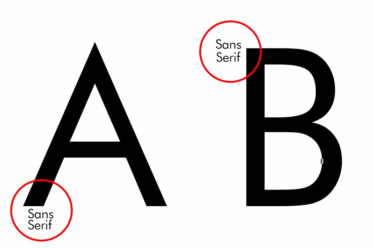
This typeface lacks serifs, his characters are straight and with uniform strokes. In this case, the first time they appear in history is during the industrial revolution, applied to posters.
Its main use is for short texts, since being a typeface that lacks serifs, it is not suitable for reading denser texts.
Script or manual fonts
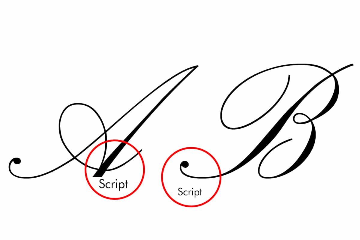
They can also be called cursive, they are known for their manual aspect, which emulates handwriting. This typeface usually makes use of ligatures or ornaments when joining letters.
Its main function is to be used in signatures or short phrases, such as in the title of a book chapter, since it is a typography with poor legibility.
Once we know in which groups the different types of typography are classified, we have to know in which the geometric typefaces are located.
What are geometric fonts?
As we have seen, this typographic classification works as a visual identification system, Each source has its own characteristics.. These particularities can be used to choose the correct font for each job, observing, analyzing and classifying them.
Geometric fonts are found within the classification of sans serif or sans serif fonts. That is, they are typefaces that lack auctions or flourishes. They are characterized by simple and clean lines.
It is a sans-serif typeface, built from geometric shapes, the same strokes are used to create as many characters as possible, the difference between each of them is minimal
The best geometric fonts
Next we will talk about the best geometric fonts you can find to take your designs to the highest level.
Avant Garde
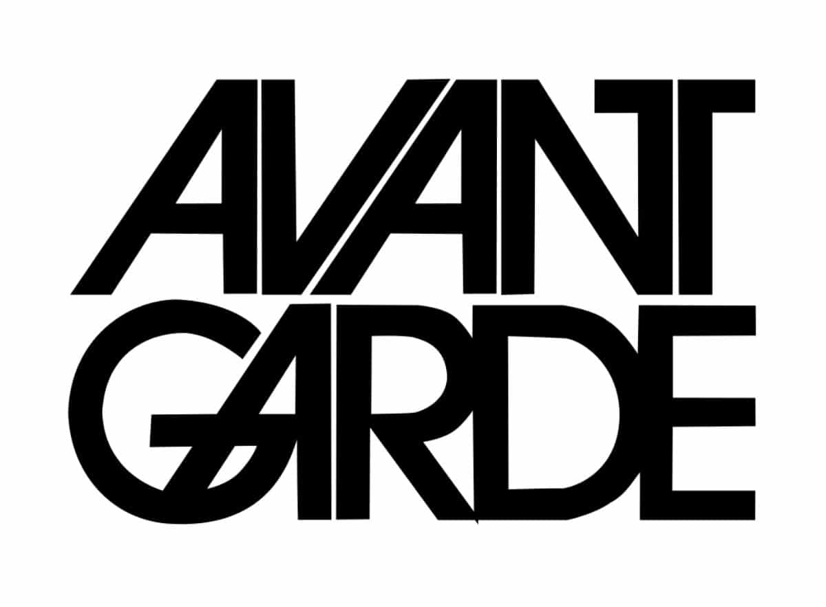
Typography inspired by the logo that designer Herb Lubalin created for Avant Garde Magazine in 1967, and that would later be redesigned together with typographer Tom Carnase.
It is a geometric typography, built by circles and straight lines. With a considerable X height, which gives it a solid and modern appearance.
Futura
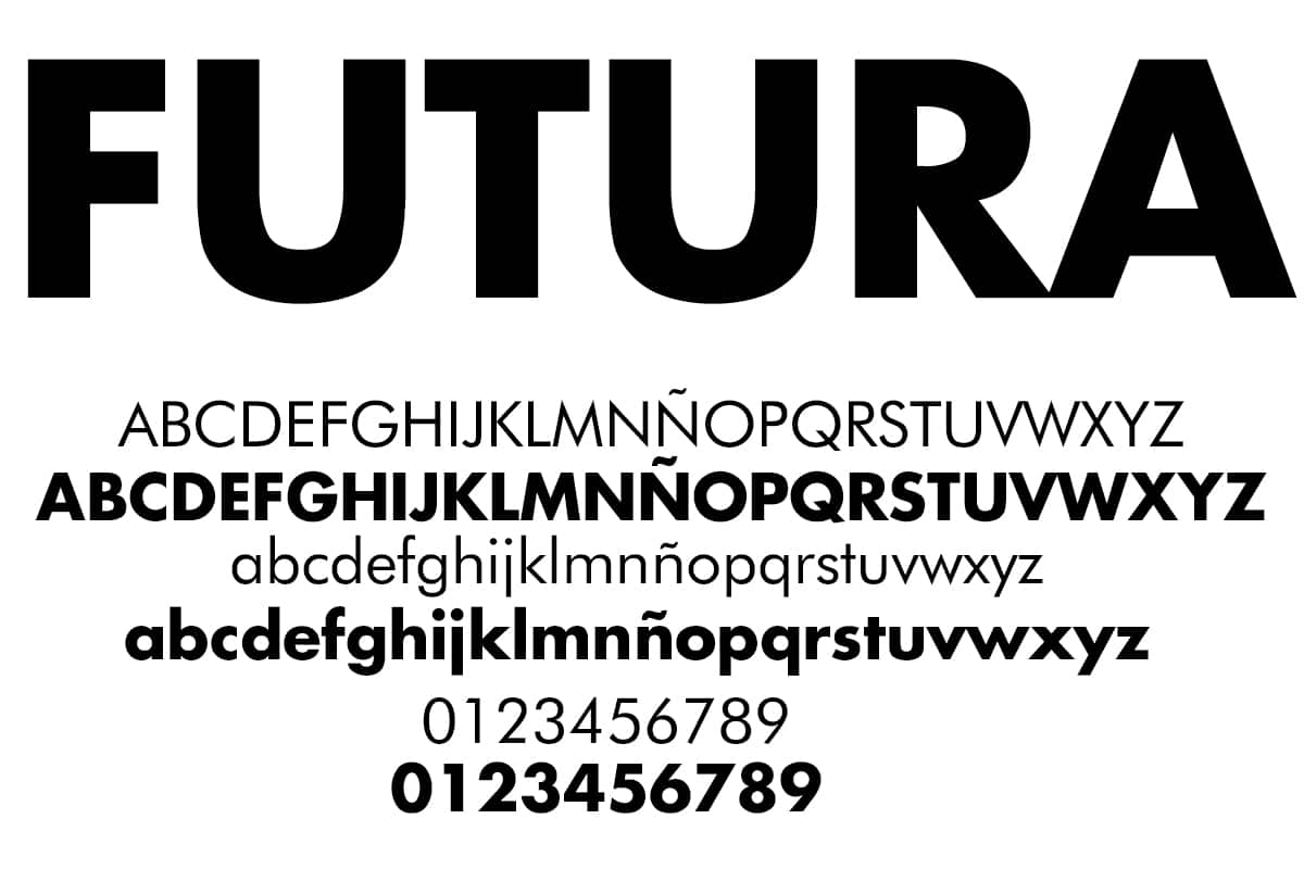
Sans serif typeface designed by Paul Renner in 1927. Considered a modern font and object of representation of European avant-garde. Inspired by the geometric style of the Bauhaus, simple, modern and functional.
The Futura typeface uses wide strokes with which to rule out contrast between its letters, in addition to basic geometric shapes. A characteristic of this font is that the ascending and descending stems of its lowercase characters are longer than those of its capital letters.
pantra
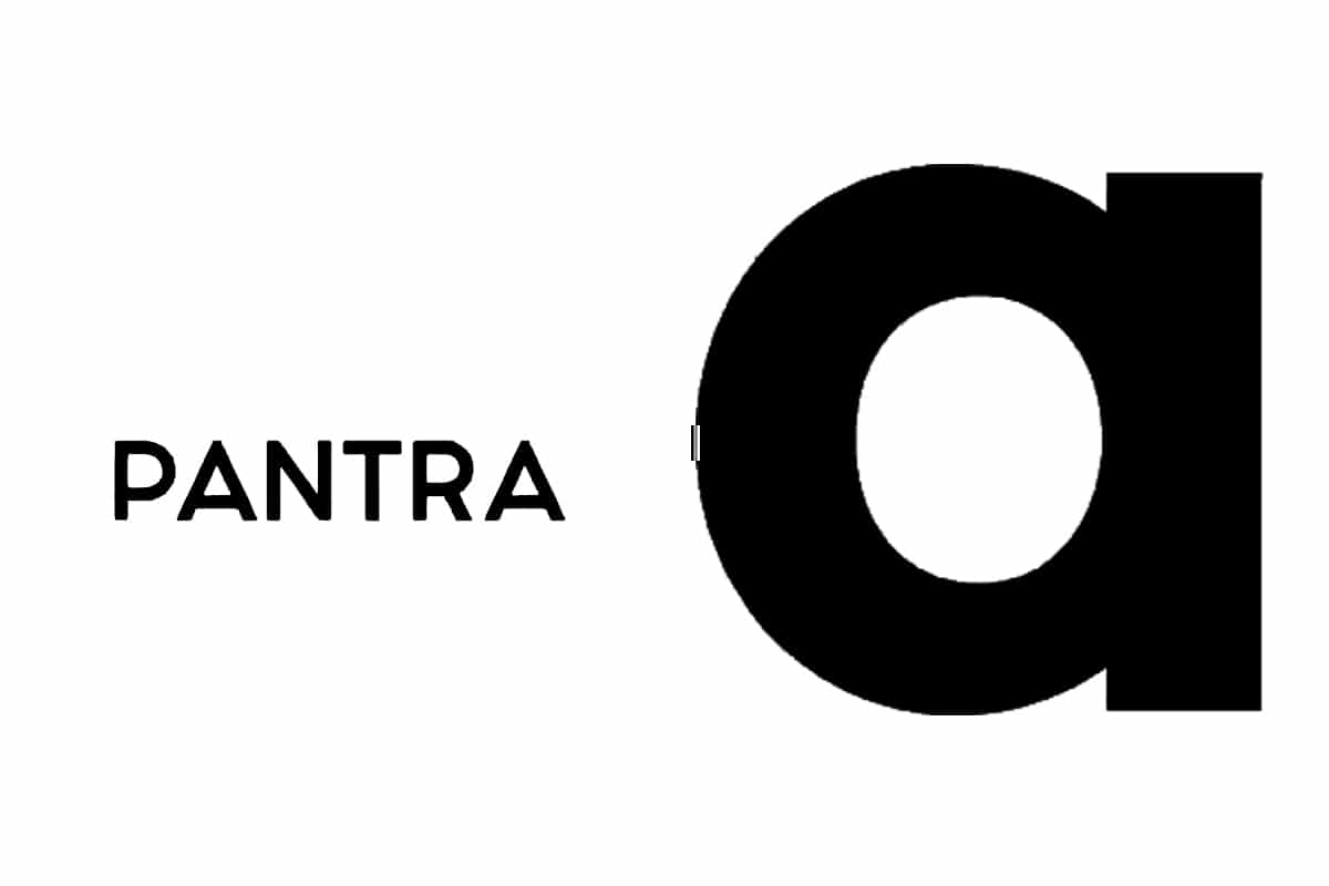
Geometric typography, in which we can observe the mix of circular shapes with straight lines and short lines, inspired by the Future. The Pantra font has four different thicknesses with which to work on our texts.
Century Gothic
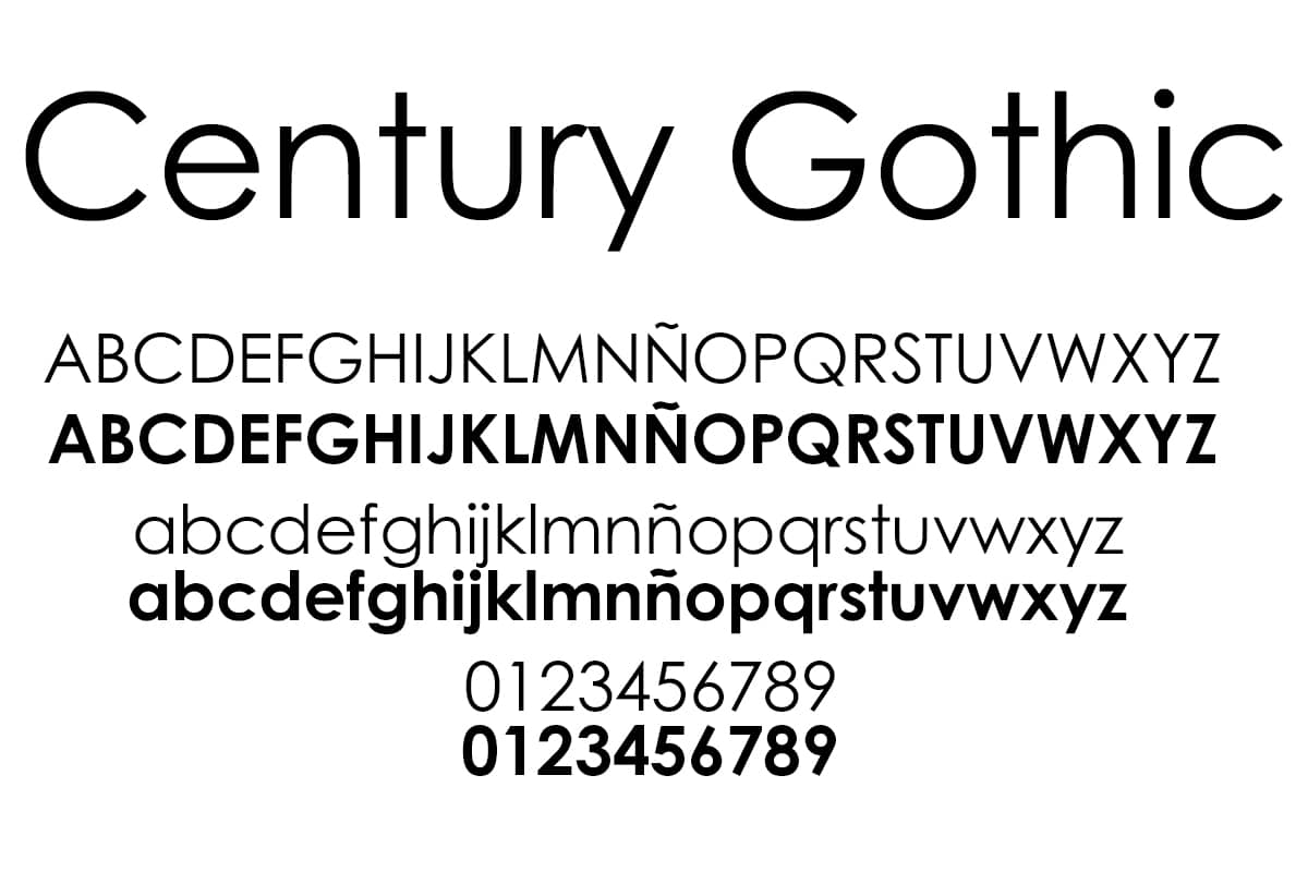
This geometric typeface was born thanks to the Monotype foundry, based on the Twentieth Century typeface by Sol Hess, created between 1937 and 1947, for Monotype Lanston looking for a style similar to the Futura, but with a higher X height and modifying its letters to improve its reproduction on digital media.
Century Gothic is a typeface that has no changes in the thickness of its strokes. One of the features that differentiates it from other sources is its letter G in lowercase and the lack of descending horn in a lowercase U.
Bauhaus
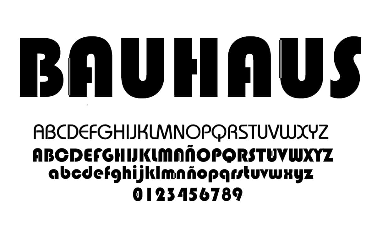
In 1925, Walter Gropius commissioned the design of a typography to use it in all communications of the Bauhaus school. Herbert Bayer, the designer thought of a universal character, a geometric sans serif typeface.
This universal character, as it was called at the time, has undergone several redesigns throughout history until 1975, when Victor Caruso together with Ed Benguiat created the ITC Bauhaus typeface.
Gilroy

Gilroy is a geometric typography with many possibilities, has 20 different thicknesses and up to 10 types of italics, as well as characters in other languages, such as Cyrillic. It has two weights, light and extrabold to be able to work with it.
To come up
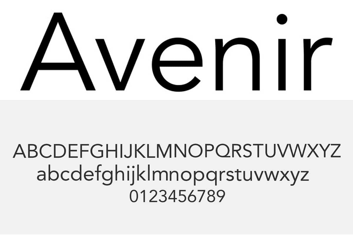
Typography sans serif with a geometric typeface style, although there are those who say that it can also belong to the humanist typography due to some of its characteristics. Designed by the great Adrian Frutiger in 1988.
Future has been a typography widely used when creating corporate brands since it is a legible and versatile typeface.
Insignia
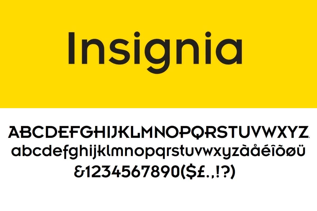
This typeface is born from the hands of renowned designer Neville Brody. It was originally designed for the masthead of Arena magazine in 1986, and was released by Linotype in 1989 as a typeface. badge stands built by basic geometric forms, which reveals a clear influence of the New Typography of the Bauhaus.
Badge in your design, mixes forms in its rounded letters, with other straight and watery ones, which differentiates it from other fonts.
Pro Wax
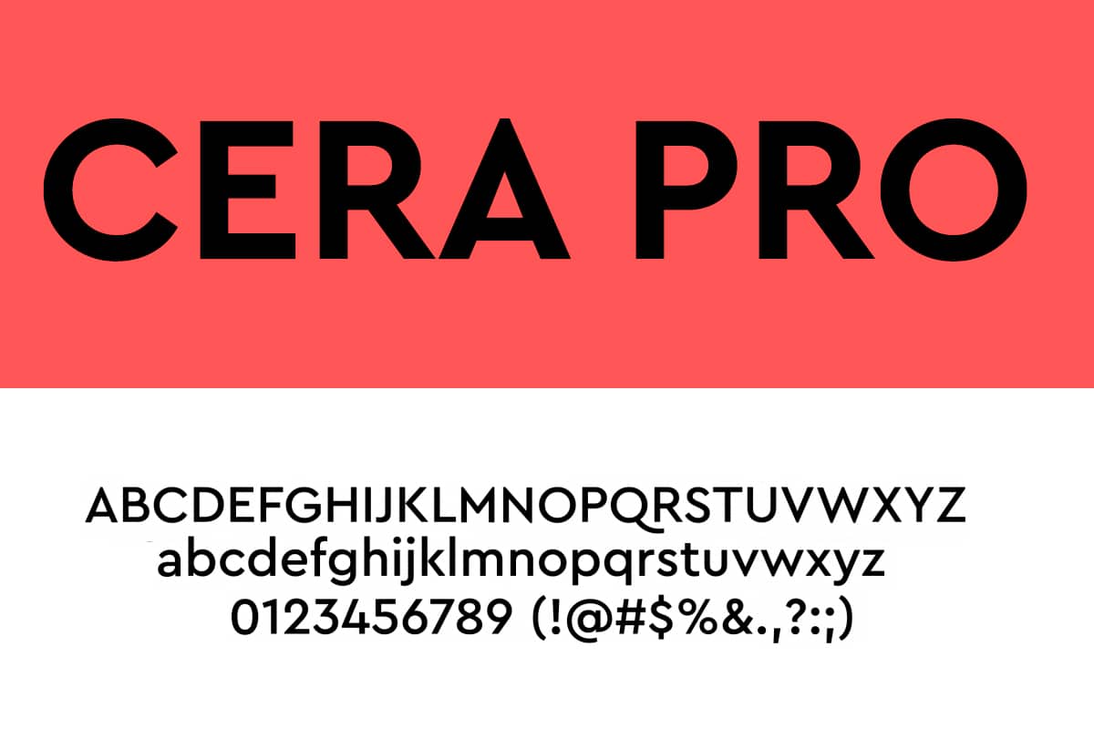
typography with little open and compact lines, belongs to the Cera Collection typography family, in which we find, Cera Stencil, Cera Condensed, Cera Brush and Cera Round, it is a family that covers all possible styles.
Geometric typefaces are timeless and versatile, are a popular option for brand logo designs, packaging, etc. They are simple, elegant fonts with great adaptability, since a geometric font can be used for many projects.
If you were looking for geometric fonts, in this post we have left you one selection of the best, take a look at them and start using them in your designs.