
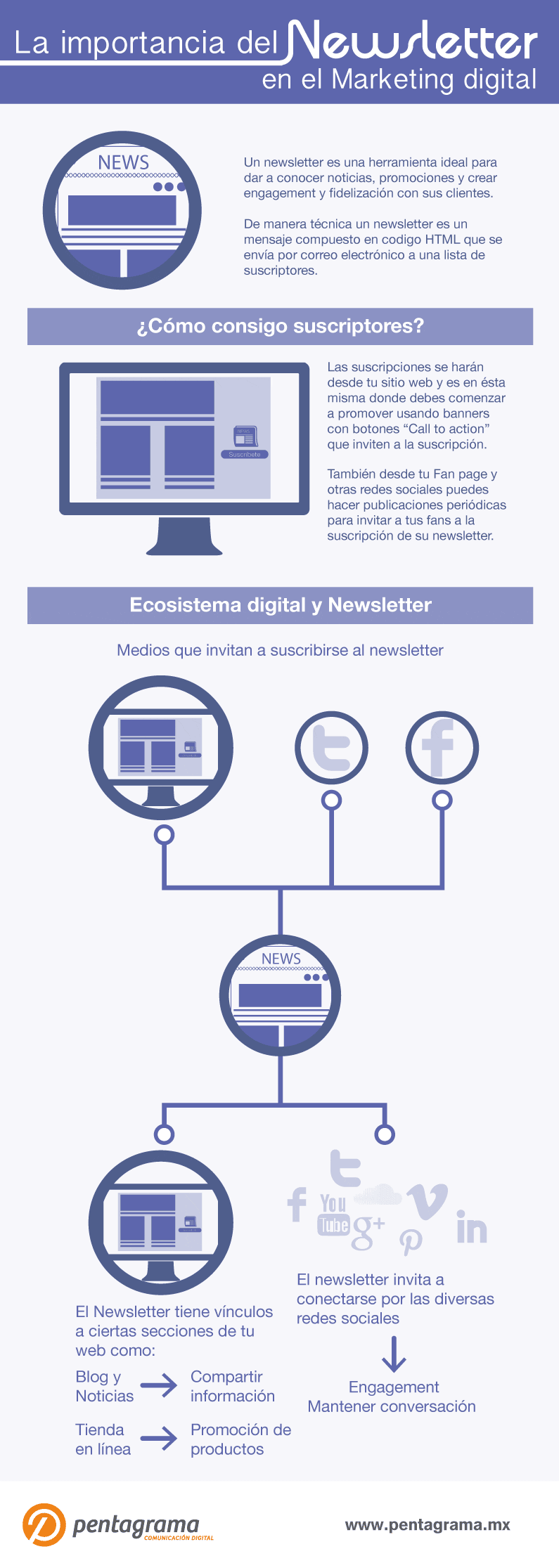
The role of the newsletter is important for Attract attention really about what has come to light in recent days or so that they know your brand. Not only does email claim to have a greater reach than social media channels, it is also a widely used and reliable system.
The most common mistake seen in email marketing is the use of large imagesSince large images take a long time to load, this is frustrating for the user and even damages their perception of the communication. Make sure to use tools like TinyPNG to compress your images and not use images with large dimensions to start keeping the brand constant.
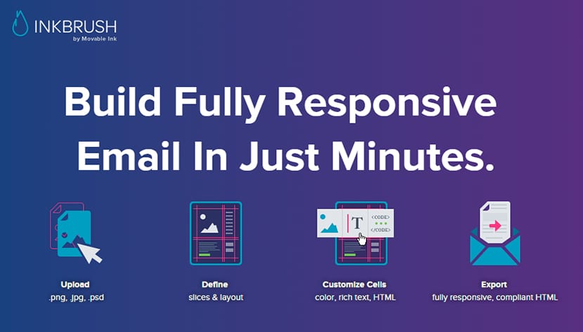
How to create an attention-grabbing design?
If the design is for your own project or a client, a clear corporate identity (CI), make sure you keep it.
For example, if a well established business has a logo, typeface, or color, it is crucial to adhere to that scheme. You will not only reinforce something that will be etched in the mind of the reader, but also the newsletter will convey professionalism and ability on the part of the designer.
This allows room for play with design and message, although you must also take into account the dates on which your newsletter will be sent, for example, if it is done during the week, while the user is at work or if it is done on holidays, since it will be possible that people will not there will be your email, so although the design of this type of work tool is important, several other things also influence.
Create a sensible layout
Newsletters with a confusing or unattractive design can be disastrous. They are difficult to read and that means they are difficult to click on, reduces customer click traffic and makes the campaign less effective as a whole.
A good design must awaken a pleasant reading experience and a desire to know more.
Always display make sure your design responds and flows cleanly on different screen sizes, from mobile to desktops, since the text must always be easy to read, so using a background color that complements the text color, ensures sufficient contrast to ensure legibility, thus avoiding dense blocks of text.
Make sure you choose a font that is readable and accessible, make sure you also set the call to action sections in addition to your regular text, these pieces should attract the attention of your readers.
This is the perfect place to use a button or linked image to accentuate the item in the reader's mind. Finally, if you specify the pixel size, you can keep the maximum width of your newsletter low 650 pixels. That is the cutoff point for most email readers and an image higher than this will result in a truncated newsletter.
Each newsletter is sent for the recipient to do something, such as make a new sale, check the latest news, download the new version of your application, donate to a noble cause or buy tickets for the next big show, newsletters exist to get people to do something.
In most cases, this call to action takes the form of a link that the reader must click on.
That link must be incredibly easy to find.
Must be visually and thematically prominent in your newsletter design, with larger text, a colored button, a linked image, or something more visually appealing.
In itself, it should be immediately apparent to the reader why they received your message, what you want to do, and why they should do it, so information must be organized in a clear and evident hierarchy, using text and images to organize your narrative and clarify your intentions.