
In the Art Déco movement, the use of straight lines and geometric shapes was characteristic, seeking a unique style and balance. In this post today, we are going to collect art deco typefaces that faithfully comply with the aesthetics of this movement.
This artistic style was carried out from early 20's to late 30's, becoming an aesthetic that accompanied cultural and social movements of that time.
Although it was a style that was developed in various countries, The United States and France were the cradle of this movement. The typographic fonts that we are going to talk about in the next section could well have appeared at the time we have discussed.
art deco, history
There are many styles that throughout history have influenced both the design sector and other specialties. In the 20s, came to revolutionize the Art Deco movement which was based on the use of geometric and ornamental forms.
The main origin of this artistic movement is centered in Europe and later in the United States. Art Deco arrived more than a century ago, but still sneaking into designs currently. It was not a style that sought functionality or comfort, simply its main function was decoration.
El end of the stage of this artistic movement, came with the beginning of the Second World War. This event caused the appearance of a new attitude towards design, everything became more functional avoiding the use of decorative elements of modernism.
Characteristics of Art Deco
As we have already mentioned, Art Decó is a artistic expression in which many and diverse influences come together, all related to modernism.
this movement, It fulfills a series of characteristics that makes it be recognized very quickly, we talked about the use of geometry, symmetry and the use of color.
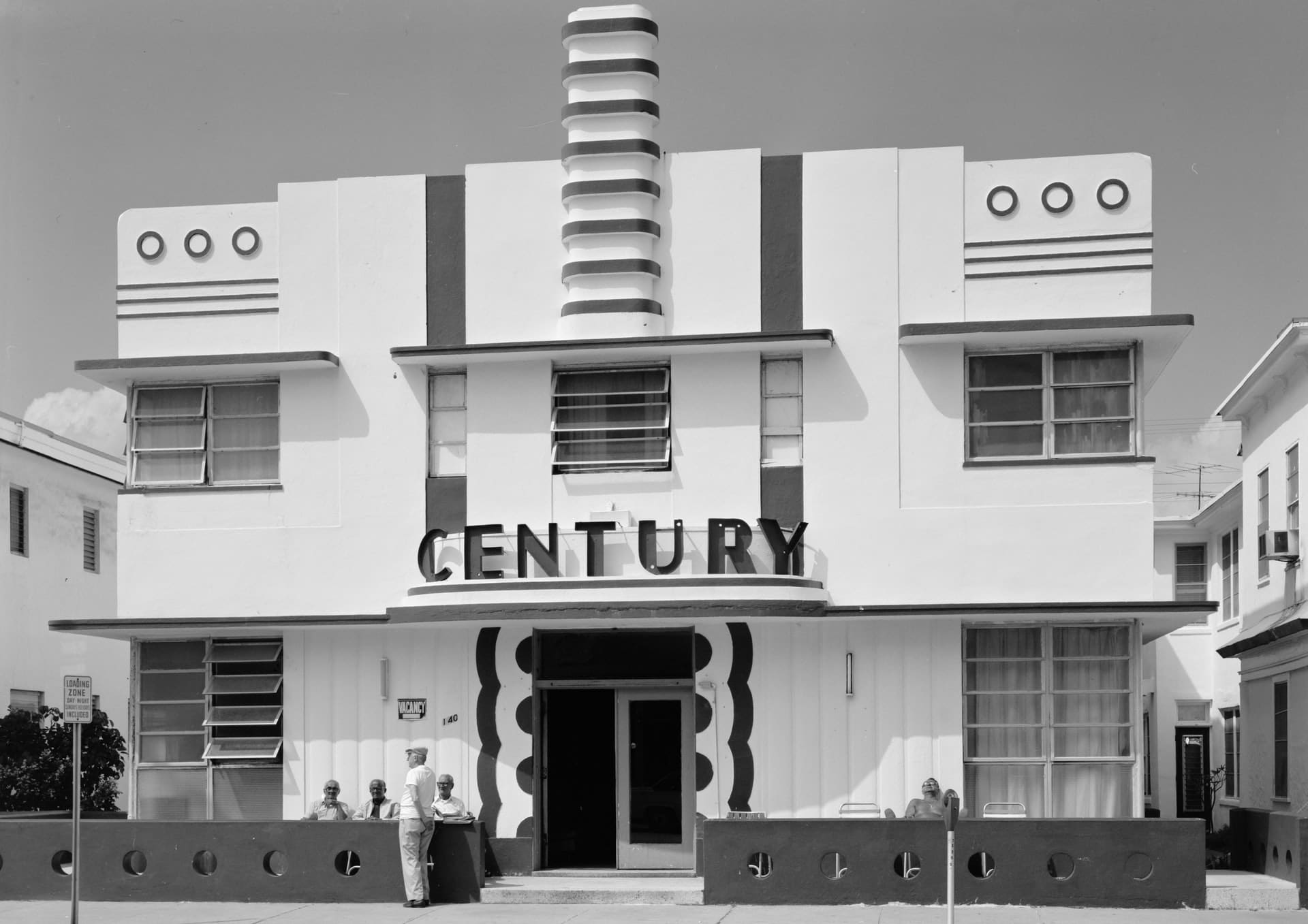
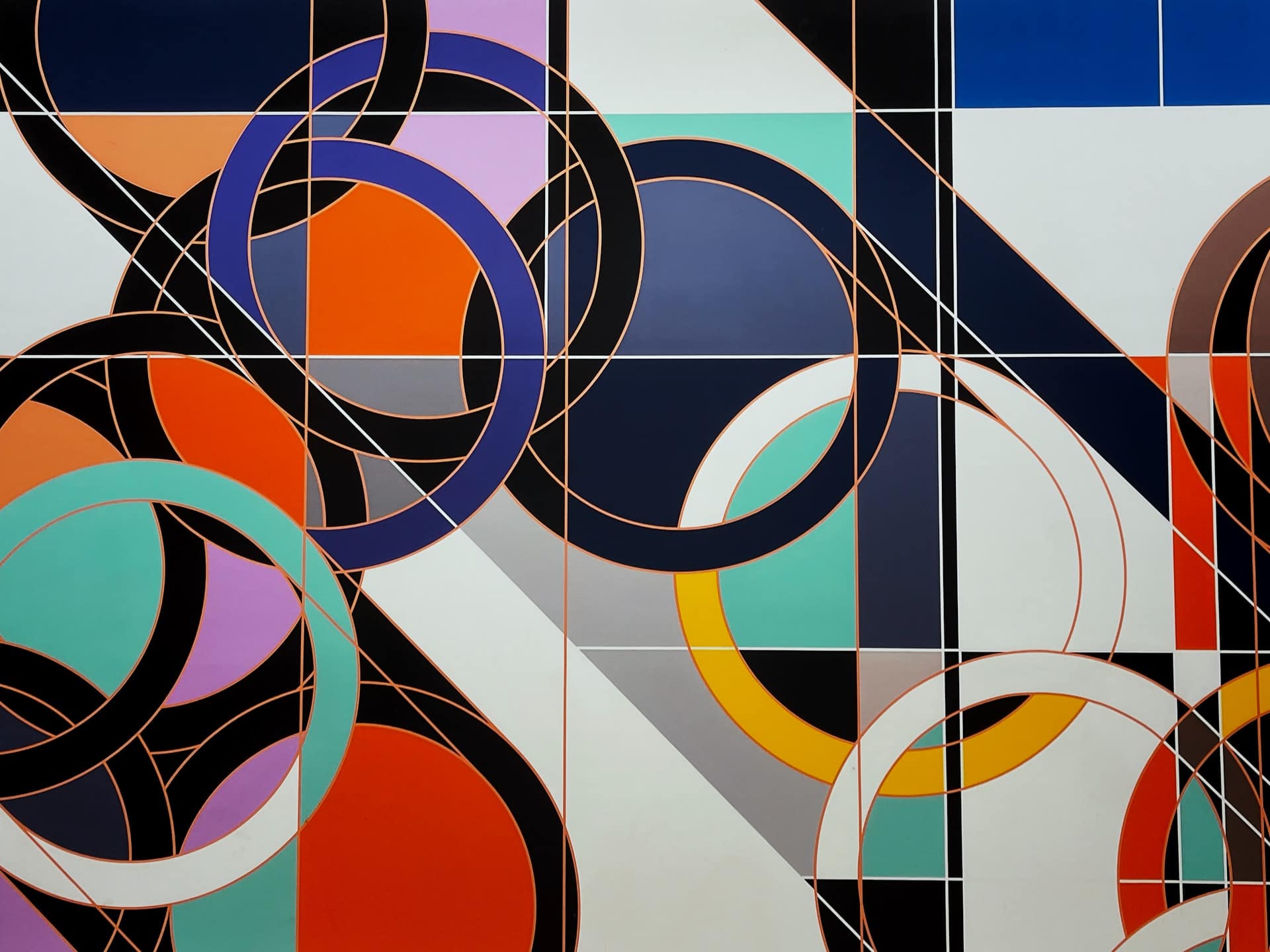
First of all, we talk about the main characteristic of this artistic movement, the use of geometric elements. Among these elements we highlight the use of straight line as main element, combinations of straight and zigzag lines, use of curves, spirals and circles, as well as a taste for figures such as hexagons and octagons.
The use of geometric elements is related to the symmetry search. Art Deco challenged patterns and criteria seen in art nouveau. Regarding the use of color, these tend to be bright and vibrant.
Art Deco Typefaces
After the tour of what this movement is and its main characteristics, it is time to take a look at this compilation of the best typefaces inspired by Art Deco available for download.
Deconical

Source: https://elements.envato.com/
a typeface beautiful and at the same time elegant, inspired by the artistic movement that we are talking about in this publication. If you work with it, you will add a sober and distinguished appearance to your work.
It's a design based on the style of the 20s in which uppercase and lowercase characters are included for download. Don't worry because it is compatible with Word, in addition to all Adobe programs and many others.
Classike

Source: https://graffica.info/
Letter square with a high contrast Developed by Emtype Foundry, it works like a charm combined with any type of functional font.
Its creators say that they have inspired by the Art Deco stage and in the typefaces used in the commercial signs. It is a sans typeface, with an elegant and refined high contrast.
copasetic
The Art Decó movement was present in the development of this classic typeface with a thick layout and very clean finishes. It should be noted that this font uses a design of uppercase letters when we want to use lowercase. exist original characters when using lowercase such as the letter O and Q.
Monogram
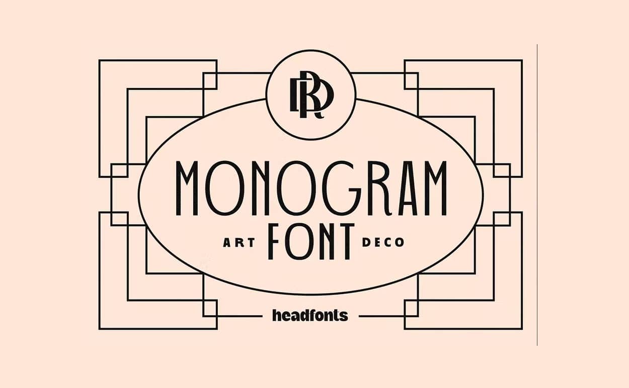
Source: https://elements.envato.com/
In this case, we bring you a typeface that represents one hundred percent Art Deco in any design in which you use it. It is a classic typeface, with an air of elegance. Its letters are pure and hard retro design.
You can find three different weights to work with; regular, bold, and light, as well as uppercase and lowercase characters. In each of its versions, you will be able to discover 360 different monogram combinations, letters and alternatives.
Metropolis
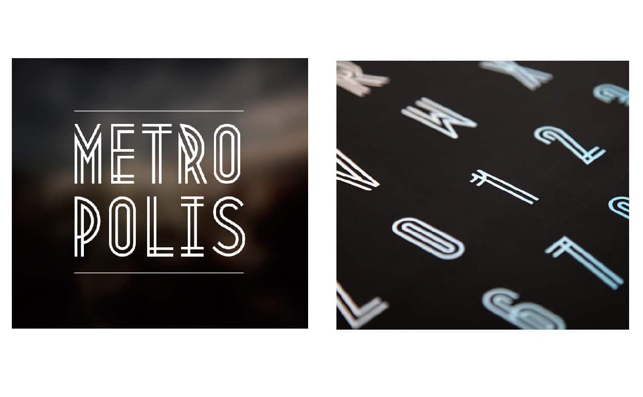
Font: https://www.fontfabric.com/
A true marvel in terms of typographic design, based on the modernist and futuristic era as in the movie with the same name. Some of the design professionals see a clear influence of urban development among its characters.
Murray
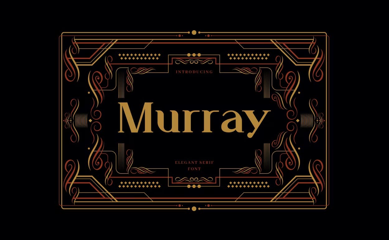
Source: https://elements.envato.com/
A perfect Czech typography font if you want to work with a Czech typeface. vintage style, with a subtle design inspired by the art movement of the 20s, Art Deco.
A serif typeface, which is very functional and an excellent option for all kinds of designs with this aesthetic such as banners, signs, logos, etc. You will have the possibility of working with uppercase and lowercase characters, as well as punctuation marks and numbers.
Odalisque
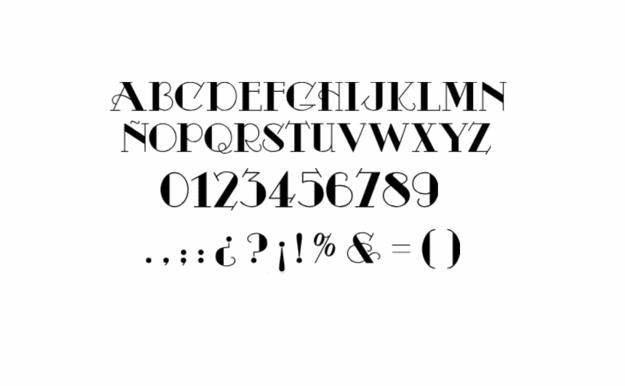
With its own name we are already focusing on a time that reminds us of when the cinema was projected in black and white. It perfectly combines this style with the one included in Art Decó.
The finishes of his characters are simply wonderfulIn addition, decorative elements can be found in some of its letters, such as in the bar of the letter A, H or the curved tail of the Q.
Ironclad
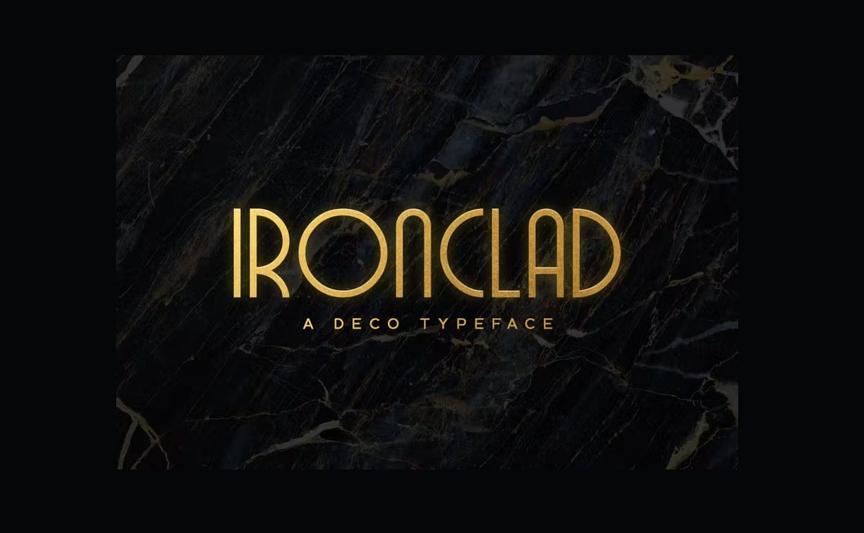
Source: https://elements.envato.com/
Clearly based on the Art Decó of the 20s, in which clean and rounded lines work. It includes three different thicknesses to be able to use them, in addition to the complete alphabet in upper and lower case. It is also complemented with a complete catalog of multilingual numbers and punctuation marks.
Kaiju
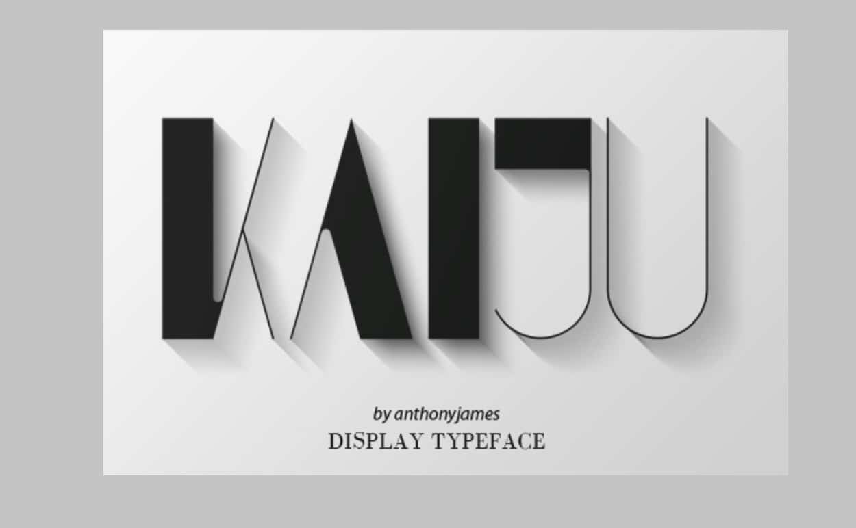
Source: https://graphicriver.net/
If you are looking for a typography inspired by the art movement of the 20s with an elegant style, this is the perfect choice. Kaiju, is made up of two collections of uppercase characters that will give you the opportunity to combine them in different ways to create your own text style.
Cormier
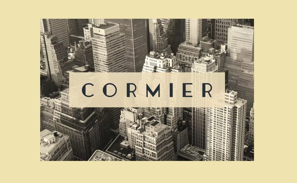
Source: https://elements.envato.com/
Three different weights to work with this typography with clear references to Art Decó. Only uppercase characters, plus numbers and punctuation marks, are included in your download.
Try this typeface in any type of design inspired by this movement and enjoy of how perfectly it adapts to them.
We hope that this list of resources will help you when you have a design project in front of you in which the protagonist is the artistic movement of the 20s, Art Decó.