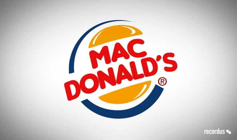
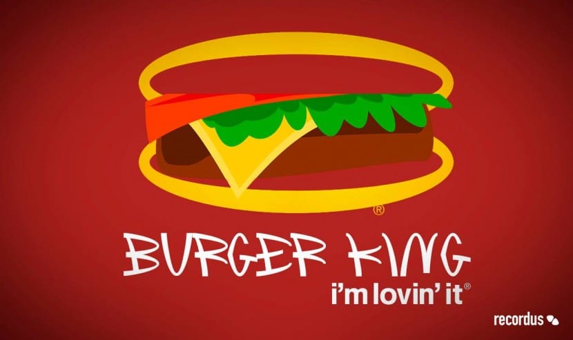
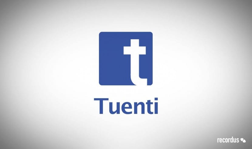
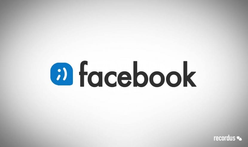
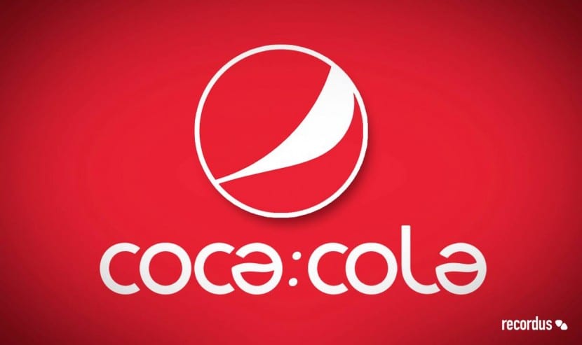
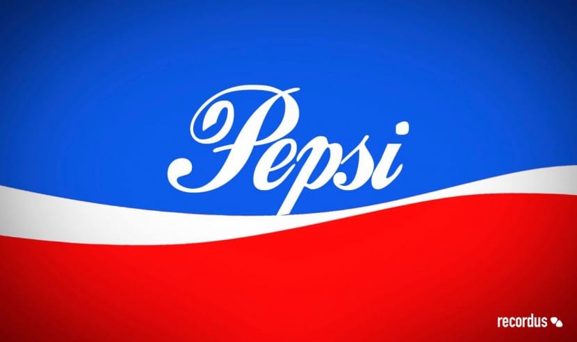
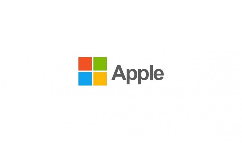
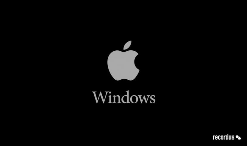
One of the most controversial and effective techniques when it comes to capturing the public's attention is the use of irony and contradiction. When we are faced with an incongruity, we automatically try to understand it. We analyze it until we find an answer to the challenge that is proposed to us. That is why the mashup is a very useful resource to grab attention. As we saw on another occasion, although the term comes from the musical environment, it has increasingly been introduced into the graphic environment and gaining ground with the sole purpose of sowing controversy. There are many types of mashups or mixes. From the fusion of characters in scenarios that do not correspond, the inclusion of opposing concepts to a certain environment or the literal mixture of two antagonistic elements, such as companies for example. The result is a fresh, daring and highly effective proposal that easily steals the eyes and comments of all those who see it.
From the Recordus agency they have made these nice and at the same time contradictory designs. In them the logos of renowned brands are mixed and that we all know too well, they are rivals. From the classic Coca-Cola vs. Pepsi, Apple vs. Windows, to Macdonald's vs. Burger King. Everyone is gathered and the truth is that it is quite shocking and curious to see them mixed. Then I leave you with them and I invite you to leave your opinion. Do you think it is an effective technique?