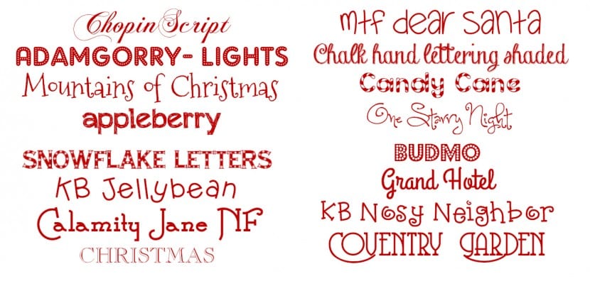
Christmas is getting closer and closer and we know that many of you will be looking for resources and materials to work with. The style or character of our Christmas compositions will largely depend on the type of typography that illustrates our headlines and content. The fonts that have traditionally been used in Christmas compositions have had a script or handwritten aesthetic and also tend to contain serifs, although lately sans serifs are becoming more and more prevalent. There are a lot of perfect fonts for Christmas, although without a doubt each project requires accentuating some features or components or others. Regarding shades, red and white colors are the most used although this depends on the color palette that we are using globally. Generally the color red is essential.
By here we propose some examples quite illustrative and that can be applied to different types of congratulations and jobs:
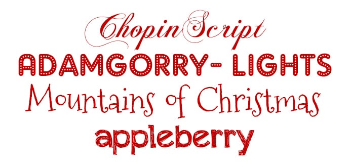
Chopin script: Handwritten in type, with a rather elegant and almost baroque bearing, it provides closeness to the public and warmth.
Adam Gorry- Lights: Ideal for the design of flyers and announcements of Christmas events.
Mountains of Christmas: It has a very childish style that makes it perfect to connect with the younger audience.
Appleberry: It contains a fairly youthful and close tonic without sacrificing legibility, making it very appropriate for titles and headlines.
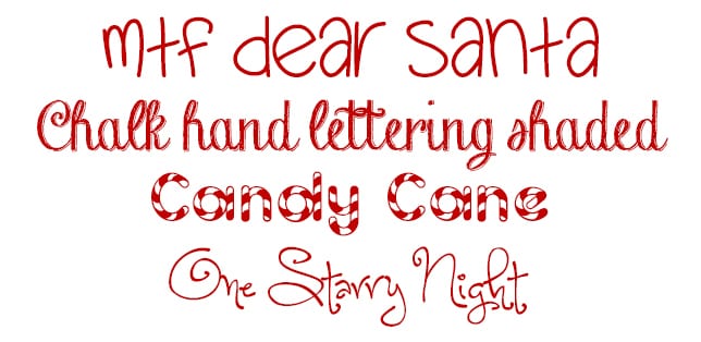
MTF Dear Santa: Although it is also a handwritten modality, it does not present excessive ornaments. It is simple, close and legible.
Chalk Hand Lettering Shaded: Its shading makes it the best choice for simple and large titles.
Candy Cane: A classic in Christmas aesthetics. It represents very well the most childish aspect of Christmas by imitating the texture of sweets and candies.
One Starry Night: Handwritten mode with accented tails and spiral shapes.
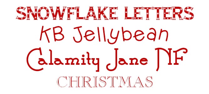
Snowflake Letters: Although it has serifs, it is quite simple. Inside it presents the quintessential Christmas motif, snowflakes.
KB Jellybean: It is a totally carefree and childish modality, perfect for creating congratulations.
Calamity Jane NF: It is not very legible so it is recommended that it be avoided to work on dense texts.
Christmas: It has shading, so it is recommended that it be applied on homogeneous surfaces to facilitate legibility.
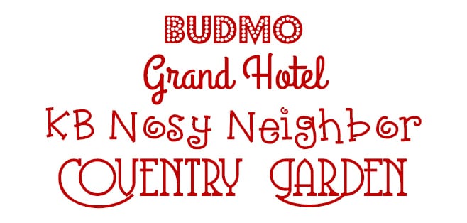
budmo: Very similar to AdamGorry-Lights, although its fill has much thicker light effects.
Grand Hotel: Elegant, classic and portentous solution. Perfect for traditional proposals.
KB Nosy Neighbor: It is quite irregular and that gives it a certain beauty. Ideal for children's proposals.
Coventry Garden: Regular mode, with serifs and accented tails.