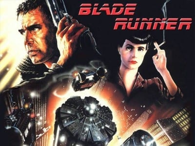
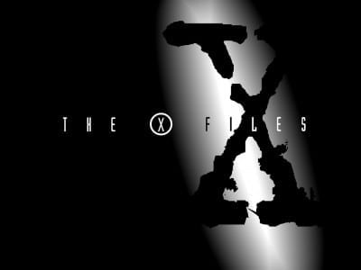
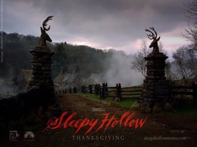
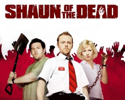
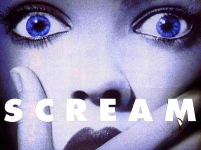
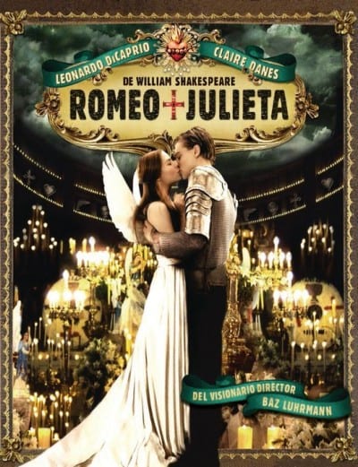
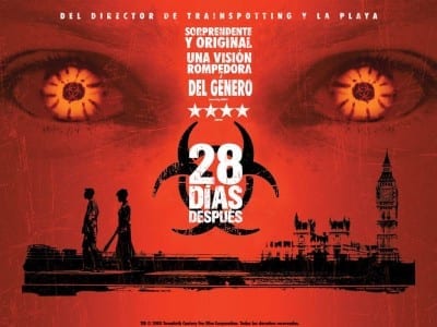
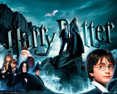
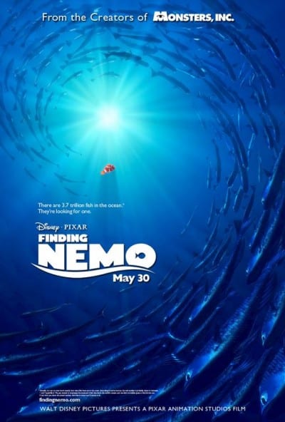
One of the best tests of the personality and significant load that typefaces have is their presence and character within film and promotional posters. The stories of the cinema, like any other artistic work, require elements that represent well the background of their content and it is here where the design of their titles gains great importance. The Simpsons, The X-Files or Finding Nemo they are different worlds and their fonts therefore are too.
Taking a look at these designs and analyzing them can be very instructive because we can easily relate concepts and develop our sensitivity and analytical skills, which will also revert to our work and our choice when building. It is some way of beginning to listen to design and perceive what the types tell us. You know that recently we were talking about the technique of mash-up in graphic design and that is partly why I decided to make a small selection of typefaces focused on cinema (and some series) and mythical titles. Here you have a free selection that you can take advantage of to carry out this type of work or directly as inspiration material. Have you ever wondered what the rest of the letters that make up these fonts are like in addition to those that appear in the main titles?
You can easily find the movie font pack on the server 4Shared at the following address. Undoubtedly very interesting to use, analyze and learn a little more about the fascinating world of typography from the designs that most attract us.