On many occasions we have talked about those fonts and fonts that cause a wide debate and division of opinions in the graphic design community. There are proposals that really create a major stir as in the case of Comic Sans with extreme detractors and literally fan club. However, there are also contrary cases: Sources and proposals that are undeniable examples and present great qualities in the eyes of any critic. Mythical fonts.
I've tried to gather twenty examples that are indisputably masterpieces from the world of typography. Of course if you consider that some more should be part of this list, leave me in a comment.
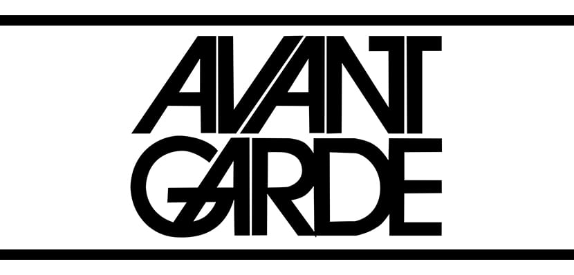
- Avant Garde.-It is a geometric sans serif typeface and its designer is Herb Lubalin who created it around 1967 for a magazine called Avant Garde, although three years later it was revised by Carnase who decided to add low box characters. It had a great success towards the decade of the seventies.
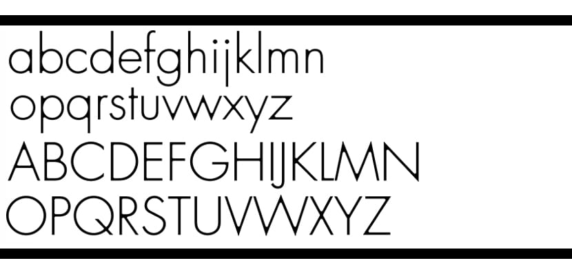
- To come.- It was created around 1988 by Adrián Frutiger and is classic sans serif type. It is largely based on Futura and Erbar typefaces that are 60 years older. Its simplicity and legibility make it one of the most used in titles or dense texts.

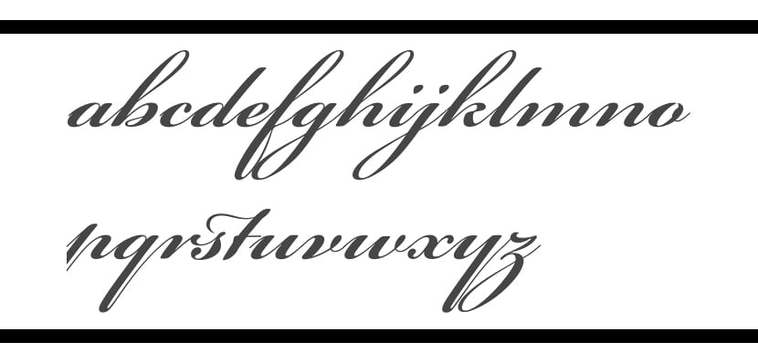
- Bickham Script Pro.- It is somewhat younger, it was born around 1997 and gives off a great sense of elegance, which is why it is widely used for exclusive events such as weddings or formal meetings. It is of the handwritten type and quite classical. Its author was Richard Lipton.
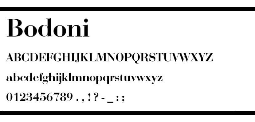
- Bodoni.- It is a font designed by the Italian Giambattista Bodoni. These are serif letters and quite simple. They present some instability in the thickness of their lines. It is one of the most popular typefaces today, especially in the field of the press.
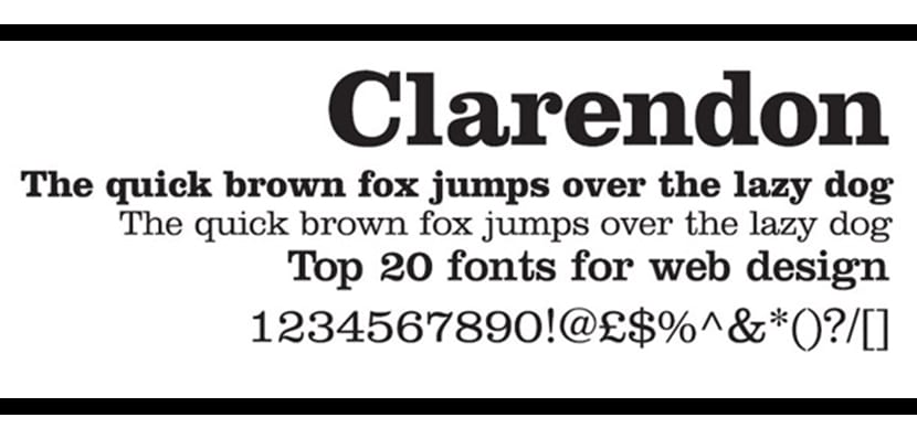
- Clarendon.- It dates from 1845 and is the first registered typographic font. Its age means that it has certain historical implications, in fact it was widely used by the German government during the First World War. Surely it sounds quite familiar to you as it is the font used for the typical "Wanted" posters of the old and far west.
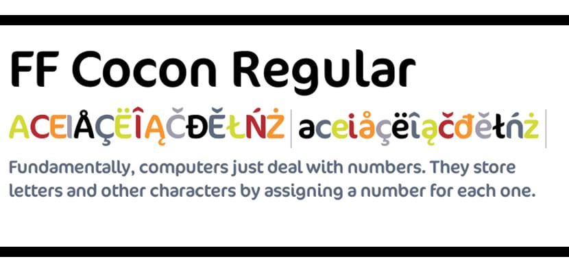
- Cocon.- Evert Bloemsma created it around 1998 and it is very useful both in the field of advertising and in the area of packaging. It is a variant that gives off a lot of style and that can produce a very good result if you know how to use it.
- DIN.- Also quite young, in fact it was created in 1995 by Albert-Jan Pool. It is one of the most used fonts today by designers and has been widely used, for example, for the design of traffic signs or technical and administrative applications. Its name is an abbreviation of the German Institute for Standardization.
- Eurostile.- Belonging to the 1950s and created by Aldo Novarese and Alessandro Butti, this font has a geometric and quite clean look. It has futuristic connotations due to its technical style, which makes it very attractive for projects that are related to the field of technology.

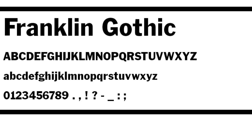
- Franklin Gothic.- It is a Sans Serif modality created and developed by Fuller Benton around 1992. It is a family with a large number of versions or variants and therefore has a wide variety of applications such as press or advertising.
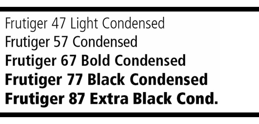
- Frutiger.- Its creator, Adrian Frutiger, baptized it with his same name. It was specifically designed for the signage of the Charles de Gaulle Airport in Paris. It was originally planned as a sans serif typeface, although currently it also includes some serif patterns.
- Future.- The living representation of the Bahuaus School and possibly the one that achieved the greatest success during the 1928th century. Designed by Paul Renner during XNUMX. Its design was perhaps one of the most important engines and inspirations for the emergence of the new geometric typefaces of the XNUMXth century. Its elegance and ergonomics make it especially suitable for use in advertising material.
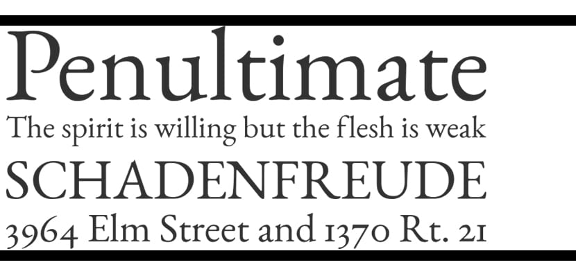
- Garamond.- Developed during the XNUMXth century by Claude Garamong. Curiously, our author died in poverty despite having been the creator of what became the typography of the millennium according to a survey among professionals. This typeface has the perfect balance between the practical component and the elegant component.
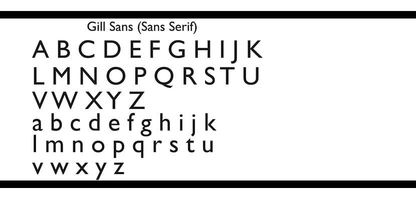
- Gill Sans.- Designed by typographer Eric Gill and published by the Monotype foundry in the first third of the XNUMXth century. It is a very ambiguous and versatile typeface that has been widely used in emblematic documents and architectural works such as the London Railway.
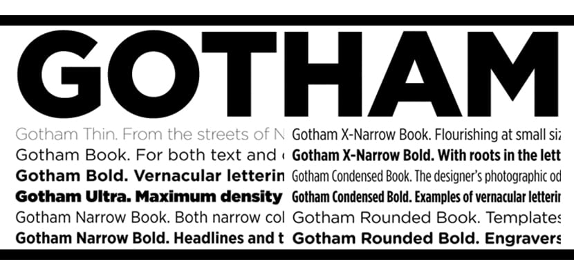
- Gotham.- This gem is among the top of the best fonts of all time according to numerous experts and has been widely recognized and used; in fact, it was chosen for the Obama political campaign around 2008. Its creators? Jonathan Hoefler and Tobias Frere-Jones.
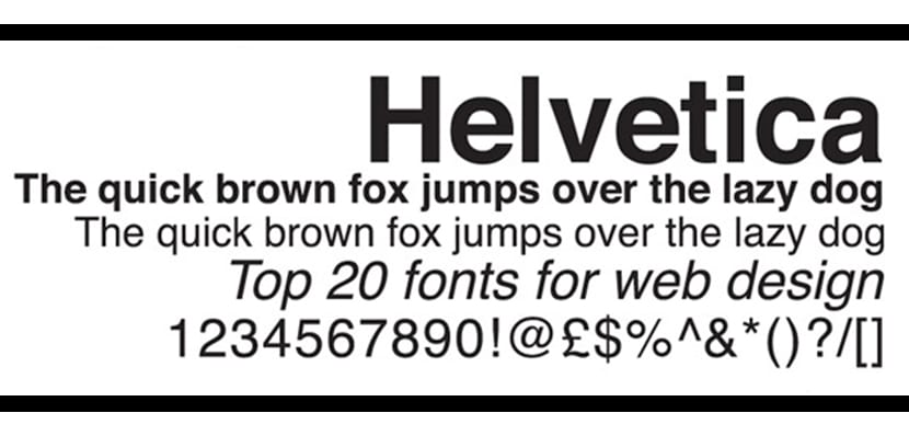
- Helvetica.- Its simplicity and elegance have made it the wild card of any designer. It is of the sans serif type and is a family made up of a multitude of variants that make it suitable for all kinds of proposals: From scientific, formal or technical documents, to corporate identity or advertising campaigns. It was developed by Max Miedinger and Edouard Hoffmann around 1957.
- Interstate.- It is inspired by the alphabet used in the US for road signs. Its readability and its speed in the transmission of the message makes it an ideal ingredient for advertising proposals, web pages or newspapers.
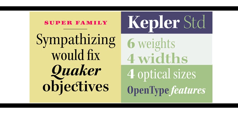
- Kepler Std.- Behind the name of this typeface is a tribute to the German astronomer Johannes Kepler. It was designed by Slicmback for Adobe and has characteristics that make it very interesting, such as the mix between modern air and more classic air, as well as its power and precision.
- Goal.- Created by Erik Spiekermann in the late 90's. Extremely flexible and suitable for any application. Of enormous popularity, it was recognized as the Helvetica of the 90s.
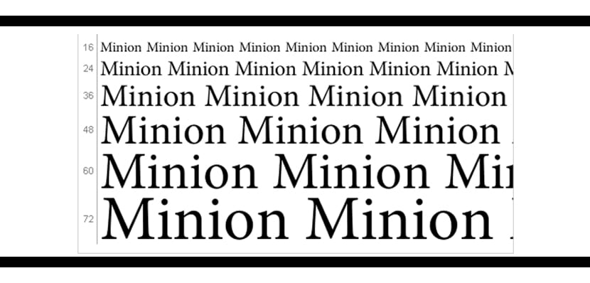
- Minion.- It is a digital typeface developed by Robet Slimbach around the 1990s. It is inspired by the Renaissance era and its applications are very varied due to its degree of legibility.
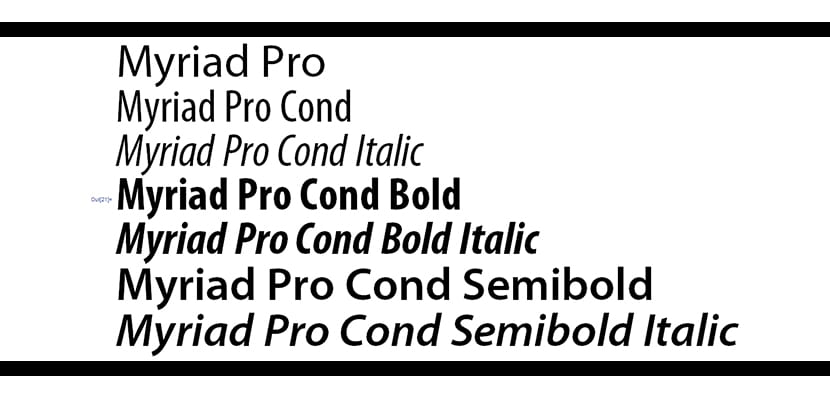
- Myriad.- It is Sans-serif style and designed by Robert Slimbach and C. Twombly for the Adobe house. It is well known especially for its use as Apple's corporate typeface since 2002. It is very identifiable from the rest of Sans Serif by the tail of the letter "y".