
Handwritten fonts are a very appropriate resource for a large number of graphic projects. Nevertheless, they also have drawbacks that make them less recommended for according to what cases and situations. Many graphic designers decide to ignore them often due to a certain fear of making it difficult to transmit their messages. They are not without reason, and it is that these types of fonts often provide in an obvious way, many problems in terms of readability. Although it is true that not all of them generate this problem, or at least not to the same degree, it is always convenient that we try to be cautious when using them in our designs. If you are here it is because you are definitely considering the possibility of using them in a project. From here, I encourage you to get down to work, although it is important that you have some things in mind before getting to work.
Today we present a very useful package of handwritten fonts and a small guide to optimize and make the most of them. Because they can certainly be used without creating interference in the transmission of information and can provide added value to our designs and concepts. Lets start by the beginning!
The issue of readability
If these types of sources are characterized by something, it is because they are somewhat more complex than the rest of sources. This causes some problems because they require more attention and concentration to read the content fluently. Some letters tend to be confused with others and this type of problem makes the reader lose interest in the message and therefore the attractiveness of our designs decreases. These are the main reasons why these types of fonts are used more regularly and sparingly among the designer community. This is why they have been relegated in some way to a merely decorative plane and in a very reduced way in the composition. However, we must be clear about its role in these cases. When a handwritten font is used as a decorative complement, it is also supporting the message and the concept behind our designs, in fact it has a double purpose: Ornamental and on the other hand communicative. It is important that if you decide to use these types of sources, you never lose sight of moderation. We must learn to dose its use and when we use it, we must be clear that our font must align perfectly with the message that the design wishes to convey. We do this not only to avoid certain readability and fluency problems, but also so that the handwritten font has the power or ability to grab the reader and grab their attention. Keep in mind that if you use these types of fonts throughout your design, the handwritten font will lose all the power it has from moderation. Once it appears in each and every one of the words that make up the composition, they will not have any force or hook with the reader. Somehow, they won't be able to impress or hold the user's attention.
Italic is not synonymous with handwritten

Almost like a myth, the concept of handwritten font is always mentally associated with italics. It is not strange that this happened, we have to bear in mind that there are a large number of handwritten fonts that at the same time have the feature of being italics. However, this is not an inherent feature of the manuscript concept. Not all handwritten fonts are cursive, not even close. The main feature of this type of font, as its name suggests, is that it seems to be handmade. Not all letters that have been made by hand are cursive, right? It is time for you to learn to differentiate both concepts. In reality, handwritten fonts can have a huge variety of features and appearances, so there are many alternatives to using italics. You must make an effort to choose the most appropriate one. Analyze a vast bank of sources and try to recognize those that share the same trend as your business. But please don't just choose fonts whose main feature is being italics. Search and examine the more possibilities and varieties the better. When we turn to these types of sources, it is because we need to apply a little "humanity" to our visual discourse. You can find this component from different alternatives. For example, a font that is certainly visually messy may work very well for your project. Your composition may need a certain dose of chaos through the sources used and therefore this endows the speech with greater closeness, humanity and sincerity. Many of the fonts that are proposed within the italics catalog differ in the type of instrument that has drawn them: a pencil, a pen, a marker ... Analyzing this feature to apply them in your projects can also be quite interesting. The more you see, the greater your degree of knowledge about them and you will find greater differences. Nuances that seem to go unnoticed but nevertheless make an important difference.
Relations with staff branding

Handwritten fonts are used more and more frequently in the environment of personal brands or personal branding. The reason is very simple, and is that these types of letters offer a feeling of warmth, intimacy and closeness. They are able to suggest what the personality of the person behind said logo is like. This is why it is very important that you take into account the traits you want to enhance in the selection and testing phase. You must be able to identify the main features of your brand and find them in the font to use. This requires some sensitivity but is tremendously effective. There is a point that you must keep in mind, and that is you should avoid using a handwritten font as is. The use of a font directly taken from a bank is unprofessional and also too automated. It is important that you learn to put a little of your personality and creativity into it. Modify it, develop your own features based on the typeface you are working on. You should avoid it slightly, because if you do it disproportionately you run the risk of falling back into the lack of readability. If you have the opportunity to hire a typographer, a custom font would be much better, although not everyone has the possibility. Especially when we are facing the first stages of development of a business or a brand. If you are passionate about the world of typography you could design your own font based on the needs of your brand. Previously you must make a powerful concept design and of course analyze many fonts that are attractive to you. You could also use your own calligraphy. You don't need more than a pen and paper, write the word you want to represent your business and scan it. You will then be able to start working digitally with this sketch and with a specialized typeface design program.
Handwritten fonts and creating emphasis

There are a wide variety of strategies and techniques to be able to provide dynamism in the form of accents or emphasis in a composition. Among these strategies we find color. As axis we use the colors corporate and we make changes in tones in certain areas so that in this way an asynchrony occurs and the message gains in strength and vitality. Another of these strategy is based on the size. It will be enough to modify the size of an element that is part of the composition, in this way we will break the rhythm. Rather, we will create rhythm from a break with the harmony that paradoxically makes the whole more harmonious. As you can see, the fundamental principle of all these movements is the same: Capture attention and somehow establish a conceptual and visual hierarchy that helps the reader focus their attention on some elements. From this targeting strategy it will be much easier for us «handle»The information, play with it and build a more powerful and persuasive speech. The main objective of any visual discourse is to remain embedded in the memory of the viewer. In this way we will make sure to create a relationship with him and therefore a reciprocity with our brand. Typography is no exception and therefore does not escape this strategy. We can use different types of fonts to provide a visual impact on the viewer, or sometimes it is simply enough to use the same typeface with different styles (bold, italic ...). Although many designers decide to stay away from this technique it is highly recommended. Although it is true that it is essential to have a certain taste and sensitivity to combine two different sources. In any case, it is not advisable to abuse this technique either from the fonts. It is recommended that a maximum of three different fonts be used in a single design. You may need some practice to begin to master this strategy. From here I invite you to try it and put it into practice.
Handwritten fonts as decorative elements
One of the most striking features of this type of font is the curvature of the lines, the irregularity of the volumes and of course the constant presence of rounded and elegant shapes. For these reasons, a handwritten font can be perfect to design and develop from it, a decorative element that complements a logo or composition. Although it is not very common, it can become a strategy that provides freshness, joviality and elegance to a composition.
Key tips
- Don't use them for broad masses of text: Handwritten letters are easy to confuse and merge, therefore it is necessary that we avoid first of all using them in large masses of text. We should try to reduce its use to exceptional cases or reduced text areas. Otherwise they will lose impact and probably become a text that does not invite to be read. It is most recommended that we allocate this type of fonts to reduced phrases, sometimes highlighting the keyword (sometimes even the letter) is more than enough and its effect is much more striking, legible and effective.
- Background and text contrast: We must learn to take care of the contrasts. Especially to play with the tones of the letters and the background. The best thing is that within the areas or text boxes there is a uniform or at least semi-transparent color. If the background consists of a photograph, it is recommended that we try to apply some kind of blur to improve legibility. Keep in mind that a photograph is much more random and its shades are almost accidentally distributed in areas of much contrast and less and also happens with lighting. Therefore, you should try to choose well what is the right tonality, lighting, and the background as well.
- Size: You should try to give your handwritten fonts dimensions that are between a medium size and a larger one. This will make reading much easier for the viewer and it will be much more distinguishable visually and in a short space of time.
- Take stock, is it worth it? : Including handwritten fonts has a series of implications and entails a series of conditions in the ordering and arrangement of the space as well as the use of colors. There are many times when after we've finished a composition that looks pretty good, we decided that it might be a good idea to include a handwritten font. The problem is that by including the font that is interesting to us, we begin to see that it is not as aesthetic or legible as we expected. Then we begin to apply the strategies mentioned in the previous points but we realize that we must restructure the entire composition. In these cases, is it profitable? Above all, it must have a connection with the conceptual design that we have developed. In these cases it is absolutely irrelevant that "we like" its aesthetics. If it takes us away from the connotations of our design, we must discard the idea.
- Color balance, combinations: If we alternate handwritten fonts with other types of fonts, we must also learn to play at the color level. We can underline this contrast in the change of fonts with chromatic contrast, and also with contrast at the level of size or font style. If we can play with the corporate colors of our company or alternate them to work for example an advertising poster or influence the slogan, the result will be the most effective.


If you have doubts about what result you are looking for, it is recommended that you try to develop different creative lines and creative processes with different elements. You may find different formulas that attract you or your client if you are working for a third party. In these cases there is nothing better than resorting to a little more in-depth analysis. Especially if we are working on a logo or some element of corporate identity for a business. Resort to advertising graphology it can be a good way to get the answers we are looking for. We can also apply each of the designs to the future supports that they will occupy and in this way decide based on their functionality and seeing which of the solutions is more practical for the objectives set. The more complex logos are much more problematic when implanted on smaller surfaces or dimensions. You will need to ensure that it is legible and easily recognizable.
As a conclusion, you must bear in mind that handwritten typeface can be presented in different types and varieties so it can be adapted to projects of different types. Handwritten typography is being used more and more frequently in graphic design projects, editorial design, web design and audiovisual projects. When deciding on these solutions, you must bear in mind that there will be some conditions or points to take into account so that it is fully assimilable by your composition. Next we will share with you a small selection of fonts The most attractive and best of all is that they are available for free.
It is recommended that you have some source banks available and access them regularly. Good examples are Squirrel Font, Google Fonts or similar. Generally, in these types of banks, you can easily locate these types of sources because they appear categorized in the main menus.

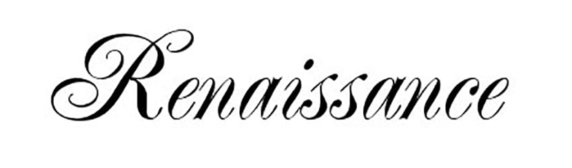
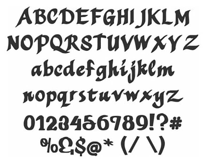
Renaissance

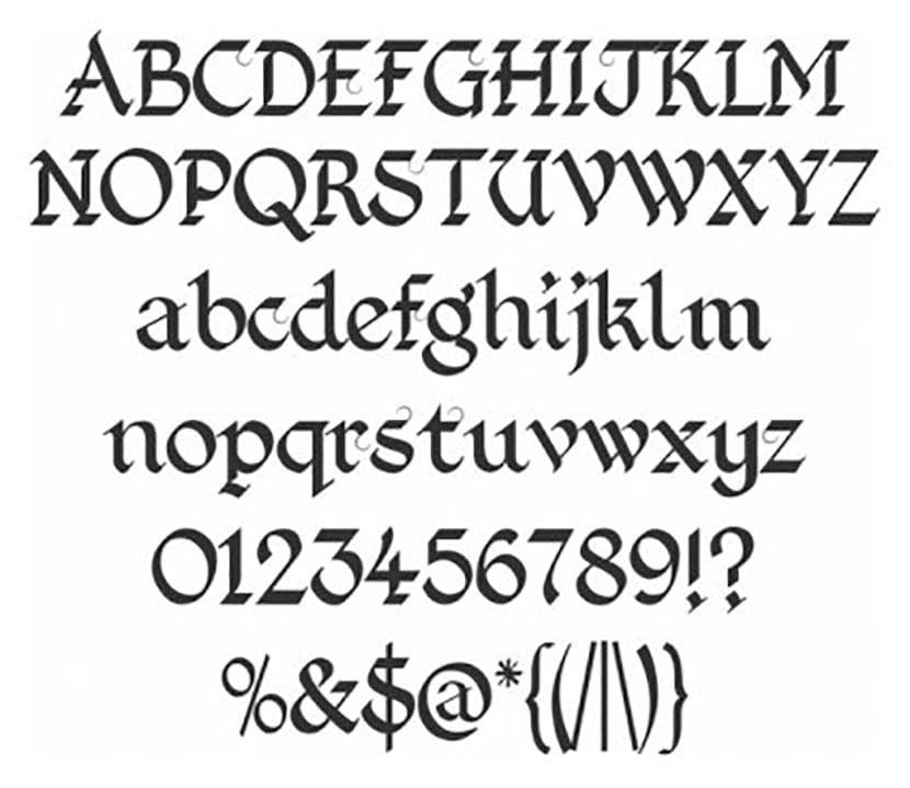
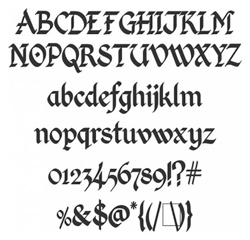
English


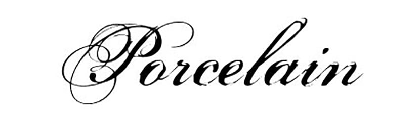
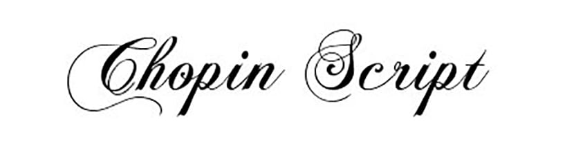
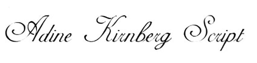
Adine Kirnberg Script


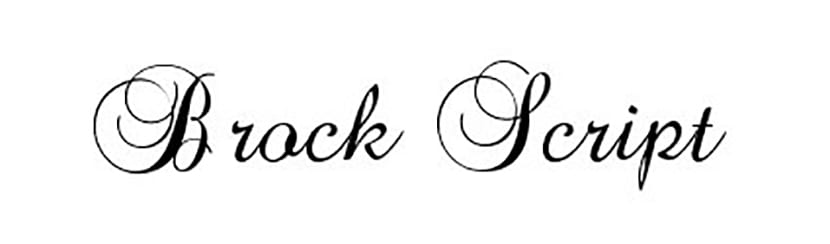
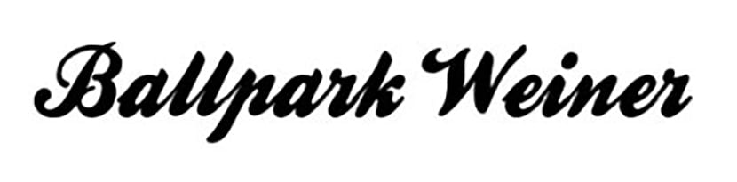
Brock script
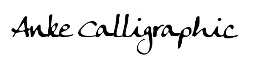
Anke callagraphic

Have you used any handwritten fonts in your visual and corporate identity projects? Tell me in the comment section and share your work with us if you wish!
Excellent I had already tired of searching from this type of sources, thank you very much.
excellent, I'm making some wedding invitations and this is great, thank you very much
I loved
thanks for the selection but, in qualitative terms, there are a few left over ... I tell you as a designer and lover of typography.
Excellent!!. Thank you.