
Any writing, whatever its nature, must comply with some basic and inalienable conditions. The main one is that the text must be legible. But if it is also beautiful, even better. For this reason, information portals, websites, blogs and even Internet forums tend to use a certain font. The fine fonts, which we are talking about here today, are fundamental to having clean and clear designs.
It is not only a matter of image, but also of communication. In the early days of the Internet, there was a very small group of available sources. Today we have all become much more sophisticated when it comes to the use of fonts. In addition, thanks to the work of numerous designers from around the world, we can count on countless typefaces.
Today we are going to review some examples, 25 fine quality fonts What do you want to serve? So that you can choose without conditions, we present them in alphabetical order:
aaargh

aaargh it could be the onomatopoeia of a terrible scream, but the typeface, sober and warm, makes us reject the idea. A font that could fit into any kind of text.
Link: aaargh
Asenin

Our second proposal of fine and quality fonts is Asenin, a design by Graham Meade that we have probably already seen in many places.
Link: Asenin
bird cherry

This design strikes just the right balance between straight lines and minimal fluidity that we ask of fine fonts to be included in the list.
Link: bird cherry
Bonveno CF Light

It may vaguely resemble Century Gothic, but if you look closely there are important differences. Bonveno CF is an idea of Barry Schwarz.
Link: Bonveno CF Light
beavergate

Perhaps one of the more discreet fine font types on our list. Castorgate is a simple, clear and functional proposal.
Link: beavergate
Caviar dreams

Small, delicate and gourmet typography, like caviar. To give that touch of exclusivity to our websites and our texts.
Link: Caviar dreams
Champagne and Limousines

An elegant and sophisticated typeface that evokes the aesthetics of the labels of those “happy” years “20 (those of the last century, of course). Name, Champagne & Limousines, is wisely chosen.
Link: Champagne & Limousines
Cycle

Another of the fine sources that could pass for one of the classics. It is a creation of The Tipomatika, a design studio based in Barcelona.
Link: Cycle
Collaborate

Creation of the popular designer Ralph duCarrois in 2009. An effective typeface with a really functional look.
Link: Collaborate
Engel Light

The fountain Engel Light It is a creation of the German Sophie Beier and is based on traditional typography, albeit with a modern twist.
Link: Engel Light
Existence Light

The virtue of Existence Light it's simplicity. A clean, simple typeface that is pleasing to the eye whatever the environment in which it is used.
Link: Existence Light
The font
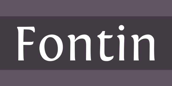
Link: The font
garogier

A design of Roger Van Dalen which reminds us a bit of the lyrics of the most famous search engine in the world: Google.
Link: garogier
Greyscale Basic

Designed by Greyscale.net following an aesthetic of more hieratic lines, more serious.
Link: Greyscale Basic
Lane

Link: Lane
Mank sans

Link: Mank sans
Mondia
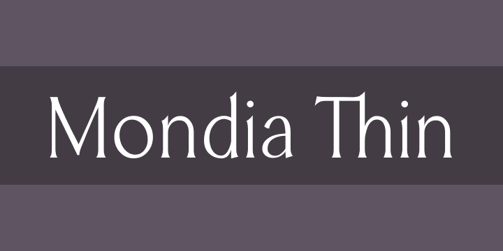
A versatile design that can be adapted to numerous graphic or editorial applications.
Link: Mondia
New Cycle

A slightly more stylized version of the Cicle typeface.
Link: New Cycle
print clearly

Among all the fine fonts on this list, this is one of the ones that offers the clearest and cleanest result. print clearly it also has a charming touch of childish writing.
Link: print clearly
Quicksand

Geometric and rounded.
Link: Quicksand
Raleway

A creation of Matt McInerney which currently has up to nine different variants to choose from, depending on the need.
Link: Raleway
Sansumi

Link: Sansumi
Shy

Link: Shy
Spirequal Light

A fine and elegant font with a classic cut. Sober and condensed, for a pleasant and easy reading experience.
Link: Spirequal Light
Type Slab Serif

Typography that is inspired by that of the old typewriters, although with a much more modern and attractive air.
Link: Type Slab Serif

To close our list, a fine but fun font: walkway, created by Gem Fonts and available in nine different styles.
Link: walkway
Source | VD
I love the idea of "clean and clear designs".
Very good contribution from the sources, thank you!