
Some of the most famous pages are very overloaded with information, but I prefer the opposite: the simple ones.
Obviously the great exponent of this group is Google with its minimalist home page since it began its journey, but clearly it is not the only one on the Internet that is committed to keeping things simple.
Simple HTML web page examples
Kean richmond

Kean Richmond makes us see the simplicity of playing with few elements, but very well placed to give a great feel to minimalism. His logo in the upper left, the Twitter and contact icons on the right and in the center, with an eye-catching typography, to what he is dedicated.
Link to the web: Keanrich mond
Alice drougard
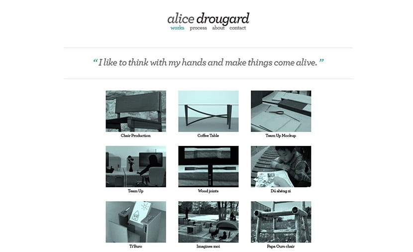
Alice drougard keep it simple also with your logo placed in the center, four tabs to move between the main pages of your website and a series of photographs properly placed so that at a glance we know what you do and what you do.
Link to the web: Alice drougard
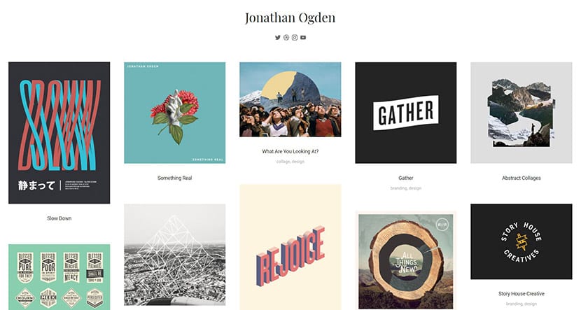
jonathan ogden
Ogden keep playing with how simple your name is as a logo, the social networks located just below without attracting attention and their design works so that we can quickly go through them. On one page it shows everything that matters.
Link to the web: jonathan ogden
Finch
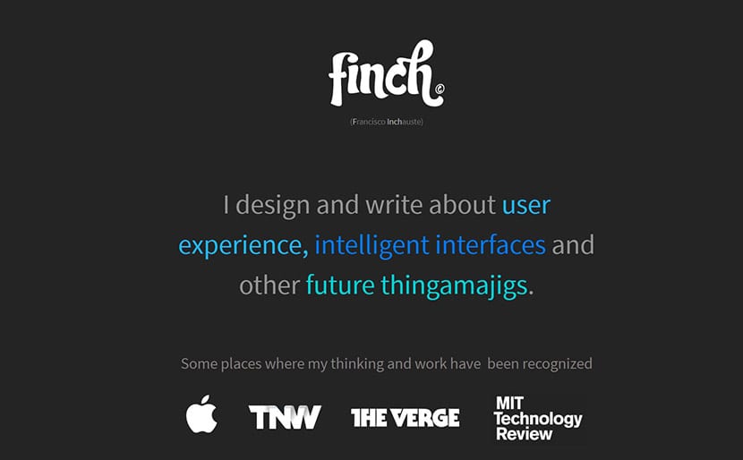
Finch is already going to other places to play with typography and those colors that denote elegance and wisdom of what it does. With just a few elements, he leaves all his professionalism in view. It also makes it clear which pages have linked to you.
Link to the web: Finch
A different Design

This website play differently. Use a wallpaper with a header from which we can go to the main pages, your phone and the links to your social networks.
Link to the web: A different Design
brisk
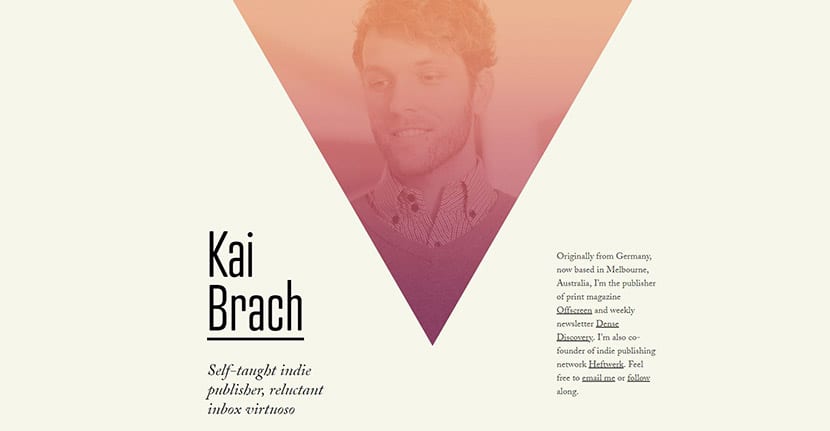
Kai illustrates us with his own figure with an abstract triangle and a suitable color palette to give closeness. He also offers part of his bio with a font in a smaller size in case we want to know more about him.
Link to the web: brisk
Vertical garden design
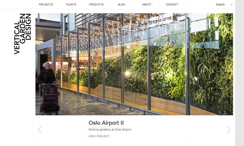
Like the previous one, Vertical Garden Design goes towards a photograph that shows fast one of his best jobs at the Oslo airport. At the top we have the header with the «nav bar» or navigation bar and even the possibility of changing the language. The logo puts it in vertical format to give the final touch to a very simple page.
Link to the web: Vertical garden design
247Grad

247Grad play with monochrome and a background image almost totally dark. The header font, smaller than the text and header, is capitalized to create a great contrast in the overall design.
Link to the web: 247Grad
enjoy this
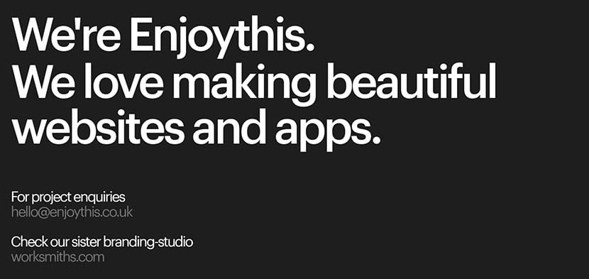
Una great typography can be the sign of being authentic and that we know what we do. You don't have to give anything more if the message is direct. They make it very clear: they love to create beautiful apps and websites. They leave the mail for projects and their study in another link.
Link to the web: enjoy this
Allison hou
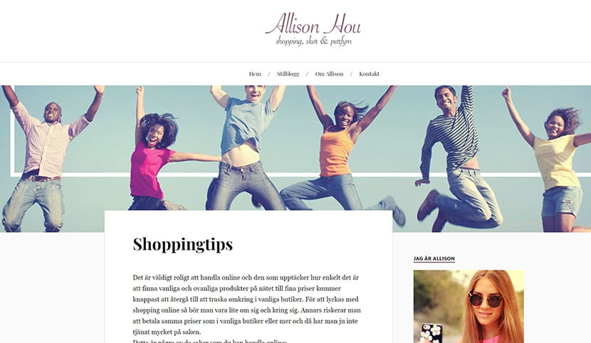
Allison takes us before other courses and includes more images and that more "feminine" typeface. The same goes for your main image and that header. He has the luxury of presenting a card showing tricks for shopping.
Link to the web: Allison hou
pixelot
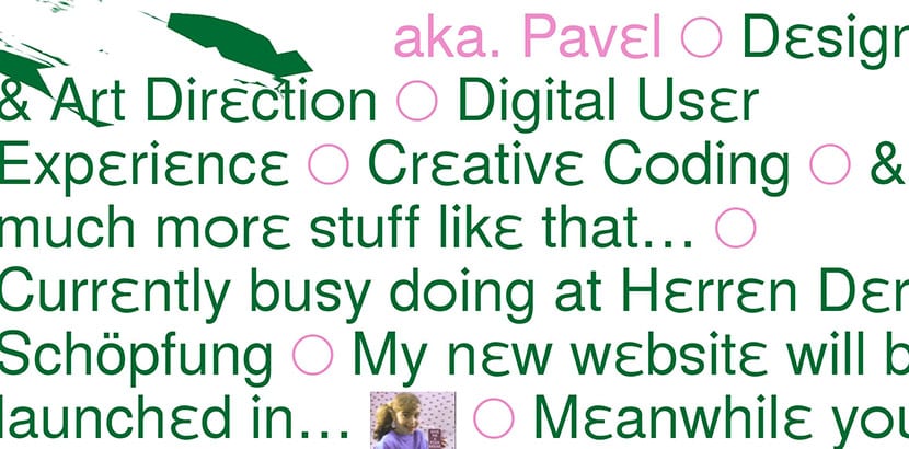
Pixelot is a bit crazy, but it also indicates the creativity of the author. Use the mouse pointer to create a mask that blurs wherever we have it perched.
Link to the web: pixelot
Lionel scholtes
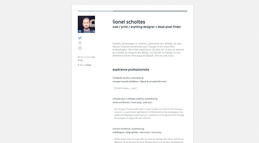
If you would like to make your resume online with nothing more than that, Lionel shows you the steps. A suitable font, your photo in the upper left, links to your social networks and your experience. The only decorative element are those two horizontal lines of different colors.
Link to the web: Lionel scholtes
Elegant seagulls

We return to the elegance of minimalism and those big blank spaces. On the one hand the header is very far from the rest of the elements, and on the other hand those elements shaped in such a way that they create a great visual harmony between them.
Link to the web: Elegant seagulls
Living Space
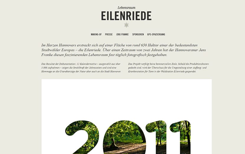
As you can see in all the examples, it is important the header tabs to go to the different pages from the website. The typography is of great importance, play with one for the header and another for the text with a sans serif that does a great job.
Link to the web: Living Space
PinkPoint

The contrast of colors leads us to a slightly more complex web of all the views. Not all those main elements are missing to play with the gradients for the background image this time and those two sections that have the main colors of the gradient for the main image.
Link to the web: PinkPoint
IWC
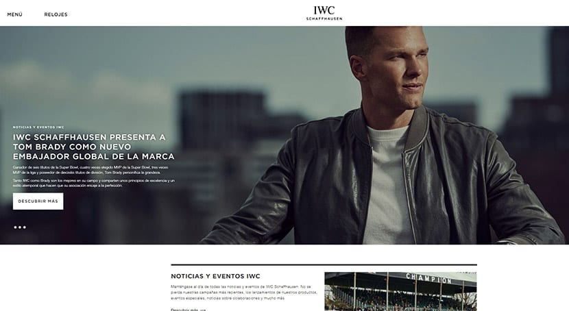
A great photograph with a well-chosen font and a "hero" element you can give to this web. With a slider it shows part of the work to be quite simple in its conception.
Link to the web: IWC
Chop chop
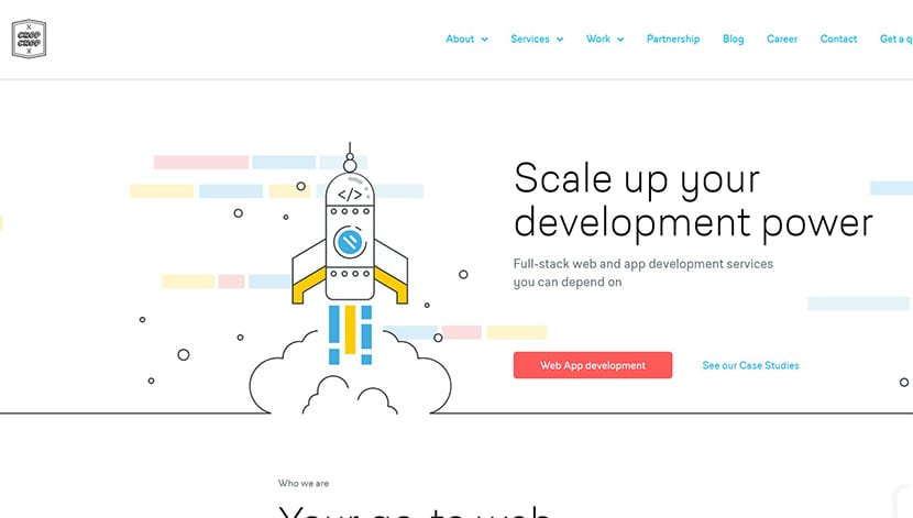
The digital illustration brings us to Chop Chop with that image that eats up all the visual presence of it. The blue color in the header gives it its point to create chromatic values in tune with the entire image projected by the web.
Link to the web: Chop chop
7Pine
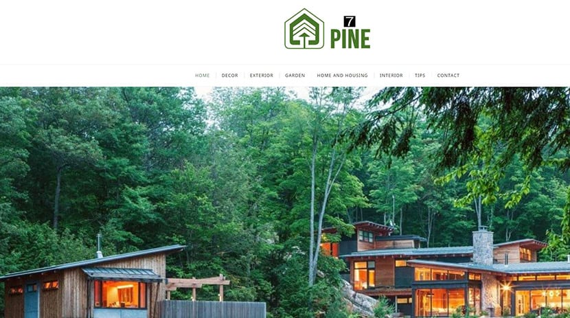
7Pine plays with the green to be the great protagonist of the home plate. The rest composes it an image with lots of green and a simple header that wants to go unnoticed by the logo.
Link to the web: 7Pine
the sum
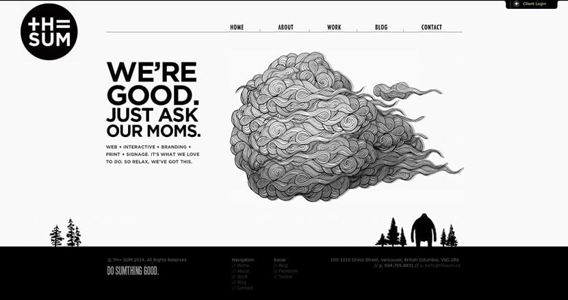
The Sum does take us in other directions. Play with the fabled black and white, a very creative illustration and that goes along with the rest of the elements and two other illustrations to create a more than interesting landscape. An example to create a website that stands out from the rest.
Link to the web: the sum
hat box
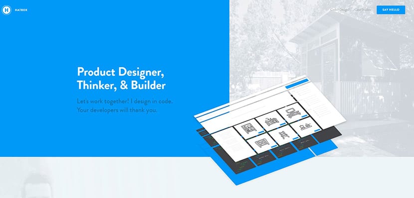
Blue is the predominant color on this website in which there are no missing images fully illuminated by white and what the game would be like in 3D of that site builder that moves as we move.
Link to the web: hat box
Kara lyte
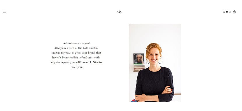
Kara goes to simplicity and minimalism with its natural and beautiful presence in your photograph. The rest is a text that comes along with what are the main elements for the header and a hamburger button to open it.
Link to the web: Kara lyte
Instrinsic Studio Marketing
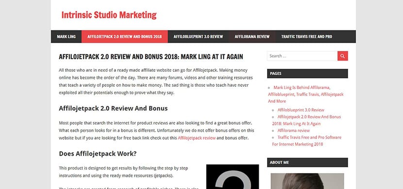
Es of the simplest web but that shows us what it is to make a blog. Red and black are the protagonists in a very "blog" site.
Link to the web: Instrinsic Studio Marketing
How to create a simple website in HTML

We are going to teach you create a simple website in HTML so that you know the most basic elements that compose it. It will be necessary to have a web host where we can load the code and some tweaks in CSS, but come on, these are the principles to begin our journey in HTML.
Having seen some simple web examples With which you can motivate yourself enough to make your own designs without breaking your head a lot. Sometimes the simple creates a better effect than complicating us in complex things. You will see that in most cases the simple works very well. Go for it.
Creating a simple website in HTML is easier than it may seem at first. A website consists of a header, the body or content and the footer or footer as main elements. We can classify them in this way:
- Documents: all the documents that we are going to create must be done with a . We open with a and always closes with a
- The body or body: the visible part of the document is between Y
- Headers: they are known by the H1, H2, H3 ... We start with a and we close with a . The text that is inside will appear as a header and depending on its numbering it will do so in a smaller or larger size.
- Paragraphs: the paragraph is enclosed within a and closes with
- Links: the clearest example iscreativosonline.org/»> Link to Creativos Online
- Images: we define them by the label . An example would be . We invoke the image between the quotation marks and use an alt for the alternative text which for SEO is essential.
- Subscriber lists: we define the lists with for a messy and with for a neat. List items are used with . Always remember to close them with the bar.
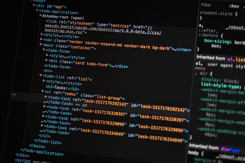
With these elements we will have the basis for creating a simple website as you will see in the good amount of them that we will teach you in the next section. Let's say that the semantic structure with its most important elements looks like this:
- Header with its navigation bar for the various pages of the site.
- The article or body space in which we can create a blog entry, put our curriculum or an image.
- The sidebar or sidebar to put additional information.
- The footer or foot, where we will place links to the most important pages of the site as well as the icons of social networks (always as an example).
In the examples that you will see below are all based on a simple but elegant logo, a header where they place the navigation to the different pages of the site, a central space dominated by a text or an image and a footer with the elements mentioned in the previous paragraph.
We recommend that do not break your head and go to the simple. The main thing is that these areas are differentiated from the rest in a visual pass of seconds. With time we will be able to complicate ourselves and work more on other spaces.
This is a clear example of an HTML code with the most important elements:
<!DOCTYPE html>
<html lang='es'>
  <head>
    <meta charset='UTF-8'/>
    <title>HTML Semántico</title>
  </head>
  <body>

    <h1>Crear web es fácil!</h1>
    <ul>
      <li><a href='#'>Inicio</a></li>
      <li><a href='#'>Acerca de</a></li>
      <li><a href='#'>Blog</a></li>
      <li><a href='#'>Iniciar sesión</a></li>
    </ul>

  </body>
</html>
With these lines of HTML code we would have first created the page title in the header with, in this case «Semantic HTML», we would close both the title with , the header with and we would give way to open the body with .
We would have a first header in H1 with to close it with , and we would go to a list that would help us to create the navigation bar for the different pages of our site. We close the list with , we close and finally the html document with .
Finally, always open a document with to close it at the end of the entire code with the slash. After opening the document, the reference to the language is always used, which in this case is Spanish with "es" and with a .
It is important that you look closely at the code and whenever you open a function close it with the bar .
A bit of CSS
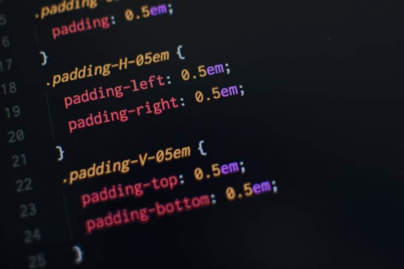
We go into the CSS a bit, but in passing so that you understand how to style HTML. Let's say that CSS and HTML go hand in hand to give those simple websites that you will find below.
If on the one hand we have the semantic use of HTML for what is the header or header, the body or body with its article or image and the footer, in CSS we would use the «Div» function to identify to each of these spaces in order to later apply the necessary changes in the design.
Something as simple as:
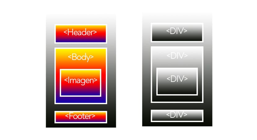
While we can apply the styles with Div, a suitable and perfect structure will help so that web crawlers can perfectly "read" what our content is about, so if we follow that basic structure, we will have a great job and base first.
Un simple CSS code example:
h1 {
color: white;
text-align: center;
}
We call H1 and the text we will put it in white with color: white; and we will align it to the center with «text align». Always close with brackets after opening to the H1 call.
Header photo of Greg rakozy
I am really also passionate about design, a good page to see the world of design.
Best regards.
Hello friends, how are you doing?
I am making a very simple web page in html, and I would like to add a comment box to each publication. Could you guide me how to do it?
Those of us who need a very simple web page with three buttons and an image, and in any case a player, something like this would be very useful.
However I do not believe that with this info I am able to build my page, but at least it gives you ideas and what to look for