
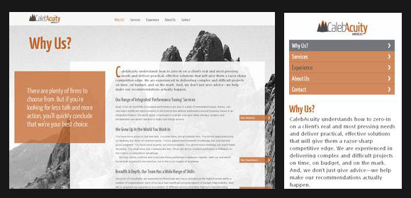
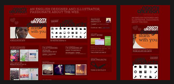
When designing a website, it is very easy to do it for a computer with a specific resolution, but it is much more complicated to do it as it should: it looks good in a multitude of resolutions and, if possible, compatible with smartphones and tablets.
In this compilation you have 30 designs that have been perfectly created to be viewed in a very similar way on a smartphone and a computer, with minimal differences and maintaining the original concept of the web.
The captures are truly inspiring, they show us the way to design small starting from big.
Source | WebDesignLedger
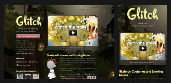
glitch
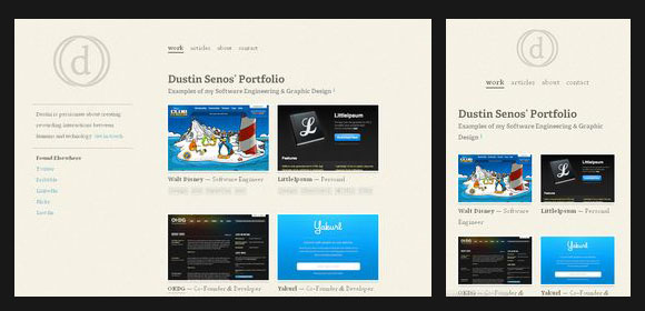
dustinsen
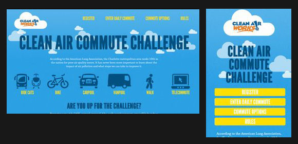
clearairchallenge
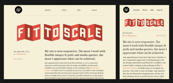
trentwalton
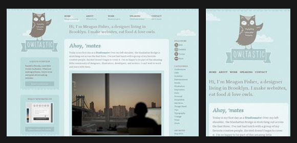
owltastic
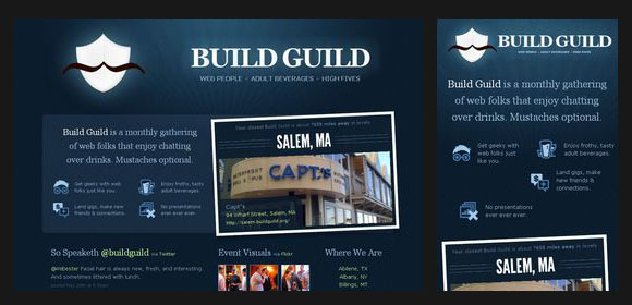
buildguild
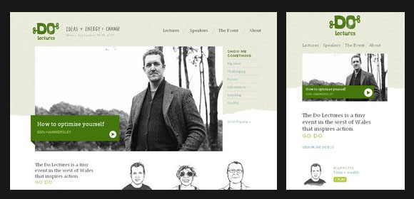
dolectures
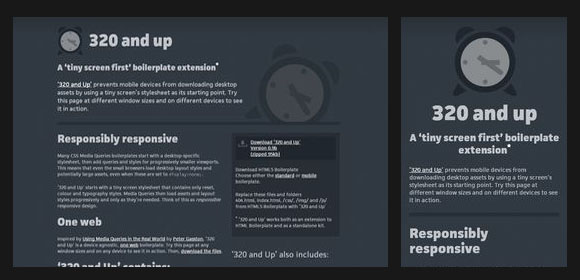
320andup
sasquatchfestival
knowledge
interim
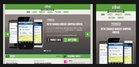
rebot
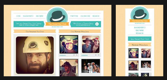
sweetthatclub
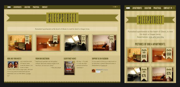
sleepstreet
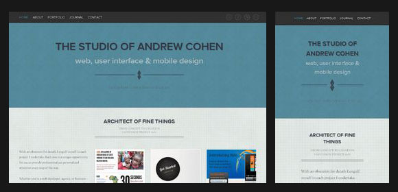
cohenspire
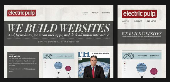
electricpulp
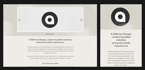
different design
oxide
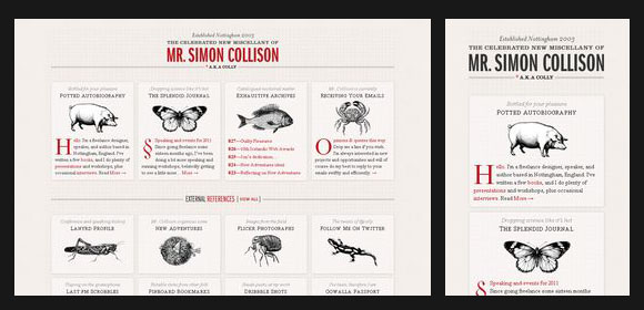
colly
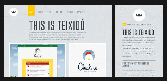
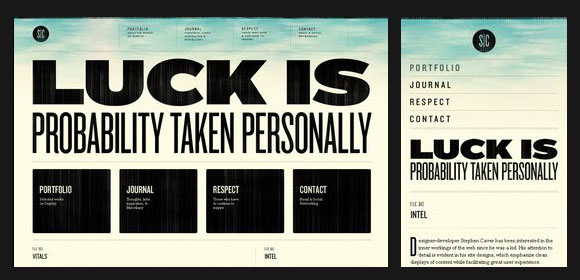
stephencaver
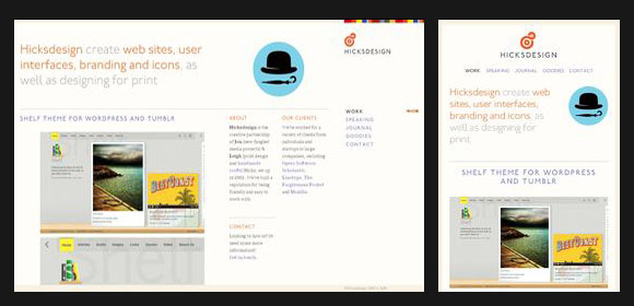
hicksdesign
readypart
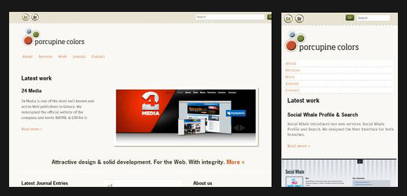
porcupines
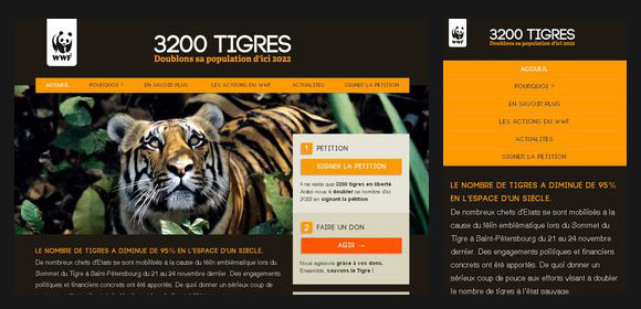
3200tigers
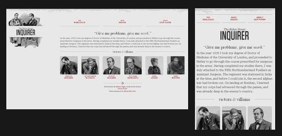
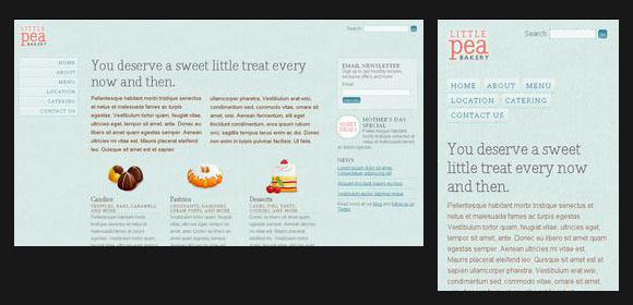
bakery
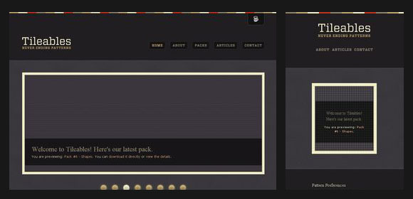
tileable
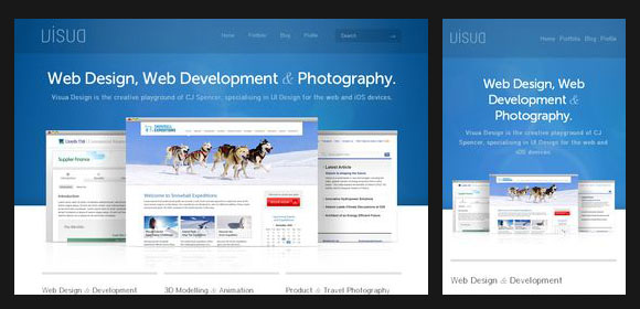
visualdesign
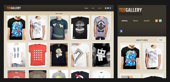
teegallery
calebcuity
naomiatkinson
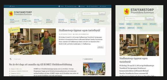
staffanstorp