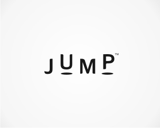
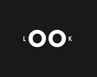
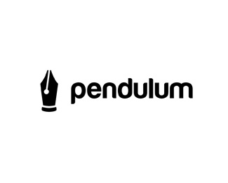
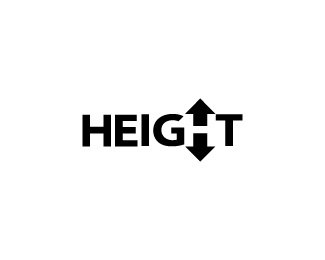
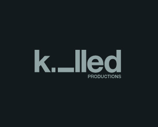
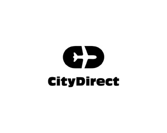
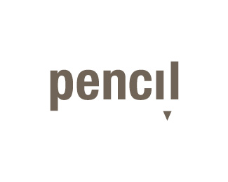
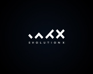
Minimalism is one of the most complicated things to handle and know how to implement, especially when it comes to logos, where lately one tends too much towards the quirky and much less towards the simple.
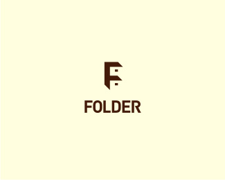
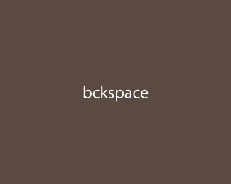
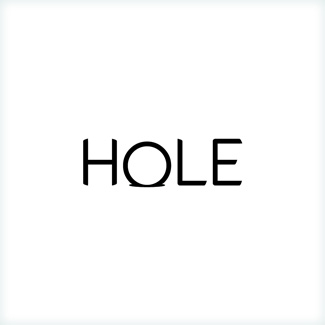
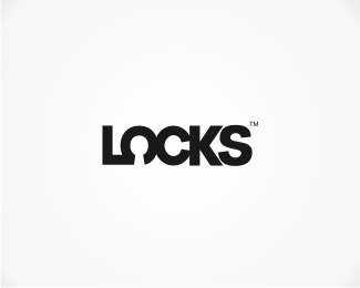
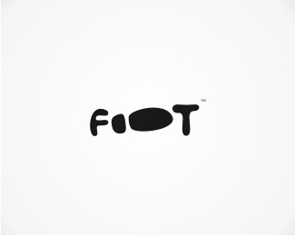
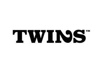
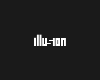
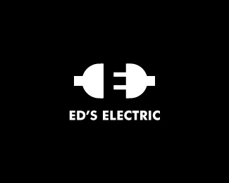
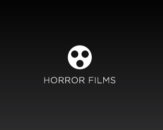
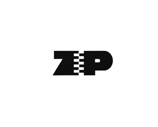
The logos that remain after the jump are really incredible because they captivate you with very little, They are the simplest thing I have seen for a long time and at the same time what I like the most, and I am afraid that if you see them you will also be captivated.
Source | WDL


Excellent!
They are worldwide, especially the one about evolution, I thought it was great
These logos are really simple and attractive, and they are getting a really well-deserved fame across the web.
But once again, it must be remembered that these images have been created (at least for the most part) for imaginary companies, thus giving you a very great degree of freedom when choosing the name. And unfortunately, real company names are rarely tied to such original concepts that they provide such great inspiration.
Complex company names, as well as the most illustrative or even ornate logos respond to a real need in the world of corporate identity: the need to stand out and identify in a globalized market.
While a simple logo is theoretically the best possible approach, sometimes a little more complex concepts have to be resorted to because basically all extremely simple approaches would remind of existing and already registered trademarks.
On the other hand, as a positioning strategy for some brands, sometimes something more illustrative is chosen, because it really represents this showy and innovative trend.
I simply agree with Serrano, creating a logo for a company with somewhat complex names is difficult because they do not give the facility to create something that identifies them quickly, however I think that with names like these that are given or lent to receive something innovative it is easier to please the client as who says
Something to inspire me in some logos for my blogs. regards