
On some occasions we have seen designs so simple that we did not believe that this had a job of months behind it. Even the hackneyed phrase "my nephew does it better and cheaper", but when your nephew tries it, he doesn't come out the same. This simple design has been elaborated as a result of the analysis of a work team design experts. In this article we are going to show you 5 basic elements of graphic design that experts play with to make these simple designs.
Because after all, you will have verified that there are elements that, even if you try to imitate them, do not come out as professional. This is because these basic elements and others that are not so basic are combined in a certain way. Color, lines and even space have to be analyzed so that the final appearance of the design is perfect. And not knowing what each of the elements you place means makes it more complicated.
What are these basic elements?
There are many basic elements that can be used to design any type of work that you have pending or want to perform as a test. This time we have decided to show the six that are considered the most basic to start with. With them you can make a complete design and make sense of what you want to express.
These elements that we are going to show are Color, lines, space, size and shape. Each of them looks for a way to show some characteristics to your design to highlight sensations in potential customers of the brand.
The main basic element: Color
Color has always been a differentiating element, which makes each design show a way of being unique.. The first chromatic range was made by Newton and since then, graphic designers from different eras have decided to be guided by it. Over the years, different personalities from different fields have delved into this chromatic range, including more and more shades of color.
Today, graphic designers are guided by them to combine colors, hue and saturation in their designs.. Choosing between two and three colors to identify a brand project. There are some multicolor designs, but it is normal to choose between a main and a secondary to differentiate the most important elements within the work to be done.
To make a correct color combination, there are different tools with which you can match colors depending on the color harmony you want to use, such as Adobe color.
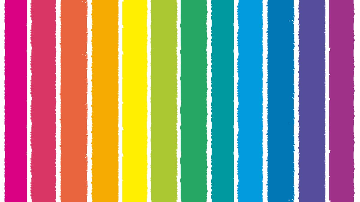
An example of the use of color

You can see many examples of uses of color in current designs, with colors of the same chromatic range or completely opposite. Here we are going to show you one of them, where the color combination can be completely opposite or of the same range, with a difference in tonality.
In the first case, we can see orange and blue colors, which are opposite in the chromatic range and are well connected. In the second case It is a design made by Mateus Melo, a Brazilian designer who use the same color range in up to three different shades.
Lines
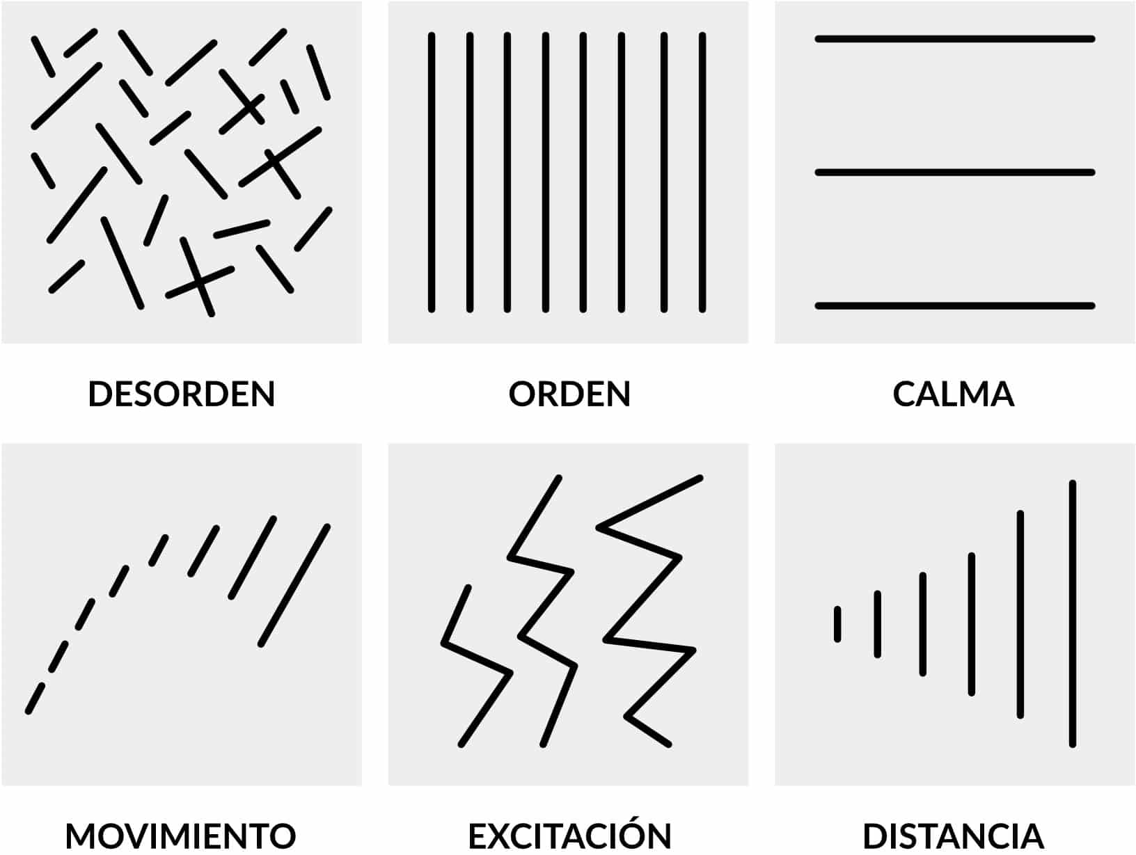
Lines are often used to separate content, for example the title of a text. But they are not only useful for this, each of the lines can express different sensations, depending on what shape they have and in which part of the graphic composition you place it. Here I give you some examples What type of lines is used to express one thing or another:
- straight and fine line: It is a delicate element, which generates simplicity and makes a clean design
- short line: Suggests firmness in the design.
- curved line with straight edge: It is an element wants to talk about excitement, sudden movements.
- curved line with rounded edge: It is a comical and casual element, it is used in the marketing agencies themselves to give a cheerful and fun tone
- set of straight lines: Whether a set that you form through a vertical line with a horizontal one evokes stability. Gives a formal criteria to the design
These are some examples of what a line expresses, but there are many more. We can see it in the designs of the best-known visual brands or small projects from the designer community. It is important to know each of the expressions that these lines mean so that your design is consistent with the product it shows.
Size does matter
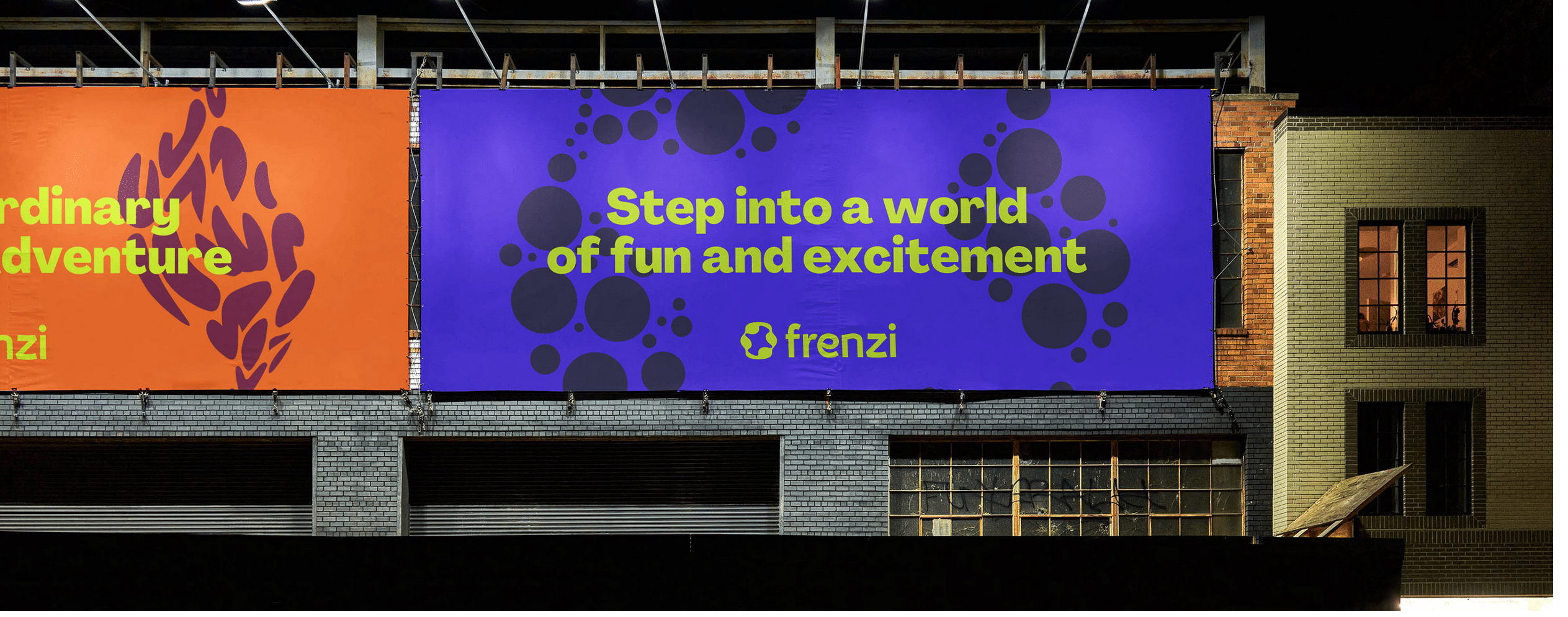
The size is a reference to how big or small each element is that you provide to the design in question. Depending on how big you give an element, you give it more importance and mean more to your project than other child elements. The position you give it is also important with respect to the rest of the elements.
As we can see in the image, the Frenzi brand is in second place position on this billboard. They leave the largest size for the slogan, since they want to send a specific message in this campaign, so that message is more important, which will remain with potential customers.
The forms

As in everything you see yourself immersed in, shapes are going to play a fundamental role. Since we started our journey in education, we can learn each of the forms through games. This is still important when expressing any message we design. Surely it comes to mind, the typical oval shape with triangle-shaped tips, with the word "OFFER!".
These shapes are important and you have to keep in mind how many and what type of shapes you include in the design, as some of these shapes can be positive and others negative.
The space between elements
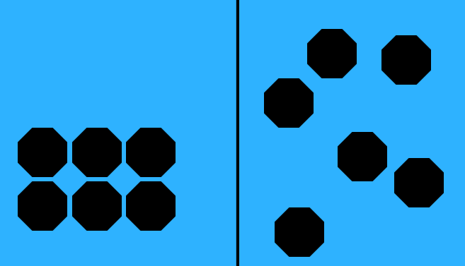
Spacing is exactly the amount of air you leave between the different elements of the design.. When you work with a design, you have to take into account how you make up all the elements that you are going to add. Group different elements and order them in such a way that each one of them can be read and identified correctly and easily.
This is so, like the so-called Kerning or tracking in the text elements. This space serves to give the same importance to each letter and not give prominence to one or the other if it does not have it.. In the image we can see how it works, when some elements are more or less aligned with the rest of the design.