
The strength of a logo it is based on the insight and intelligence with which the company's most representative and visual discourse is defended. But sometimes it can be more difficult to encapsulate the essence of a business in a simple yet dynamic logo. That is why it is very important that we have good examples that help us inspire us to develop our own work in a fresh and innovative way.
For this reason, to start this week, I would like to share with all of you a selection of 60 highly intelligent logos that are most effective in their communicative and aesthetic exercise. Enjoy them!
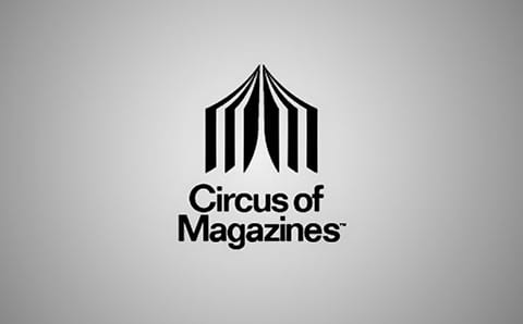
Magazine circus: The shape can be both a circus tent and an open magazine.
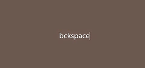
Seeing the logo makes us want to erase and correct the error ourselves.
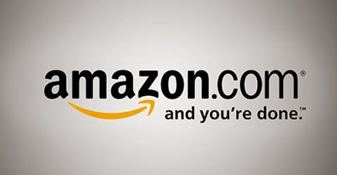
Amazon is known for selling everything from "A to Z". It also serves as a smile, so the company is considered friendly and approachable.

The black space around the plane is made up of the letters C and D.
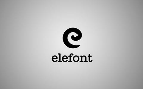
An elephant's trunk forms the interior space of the letter E.
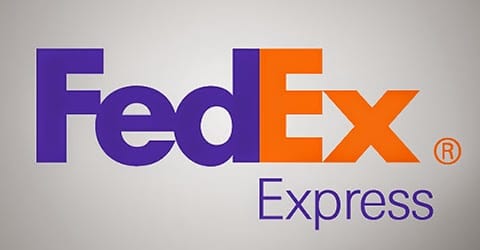
Between the E and the X there is an arrow. This represents the accuracy and speed of the service.
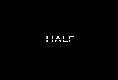
Half means half in English.
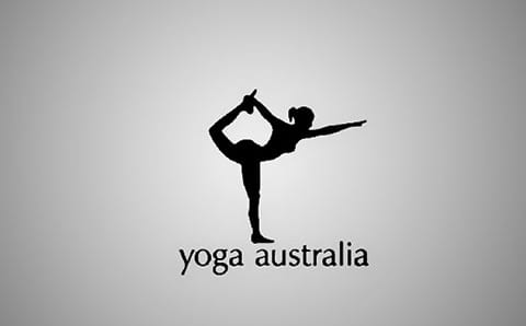
Between the leg and the arm we find the shape of the Australian continent.
The letter I is playing dead.
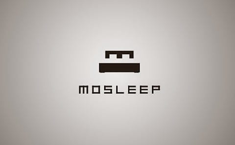
Mosleep is a medical organization that cares for people with sleep disorders. The logo is your initial 'M' which was designed to look like a bed.
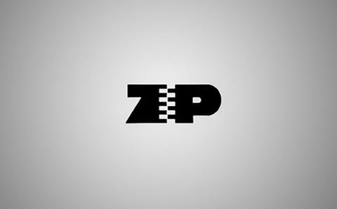
Zip means zipper and is the name of the brand.
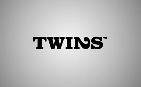
The letter N is a lying 2 that represents the idea of twins very well.
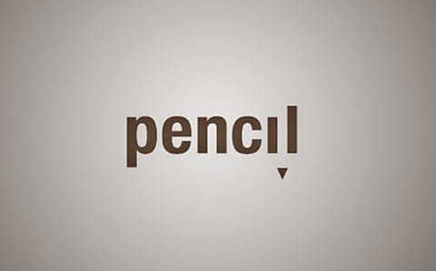
The letters "L" and "i" form a pencil.
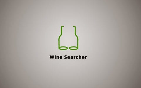
Wine Searcher (the wine finder): We found a mix between some binoculars and some bottles of wine.
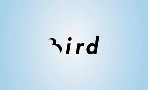
The letter B is shaped like a bird.
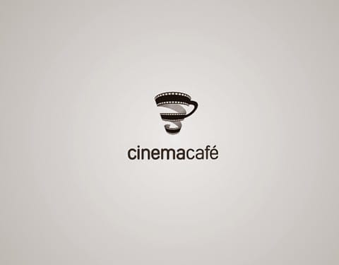
The roll of film forms the silhouette of a cup of coffee.
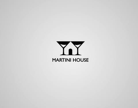
The union between both glasses creates at the same time the silhouette of a house.
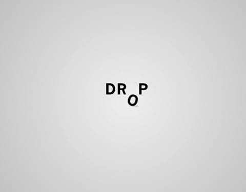
Drop means to drop in English.
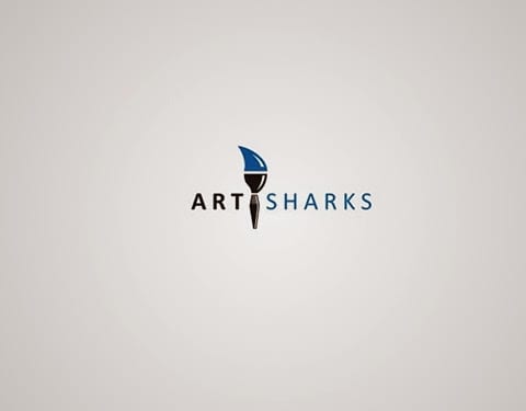
Art + Shark. The upper area of the brush is shaped and colored like a shark fin.

The leaf is shaped like a house.
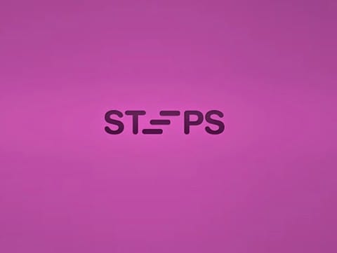
Steps means steps in English. The E forms a ladder.
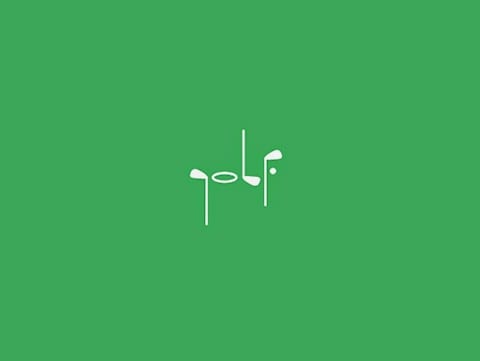
The title is formed solely from the silhouette of golf clubs and golf balls.
The infinity symbol is formed from two hearts.
The word mummy is made up of letters that make up a mummy silhouette.
The grouped wine glasses form the image of the keys of a piano.
Motion means movement.

Fit means to fit. The "I" is present as a union between the F and the T.
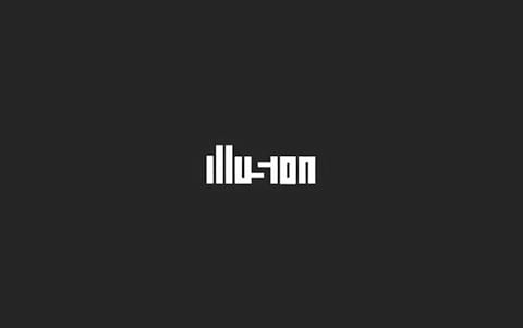
Illusion: The S is deduced from the space left by its lateral letters.

Coffee + Octopus.
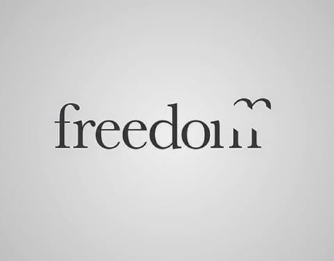
Freedom means freedom. In this case the upper area of the letter M appears to have broken free and to be flying like a bird.
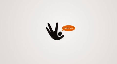
Catch me! The central figure looks like a cross between a human figure and a hand catching a ball.
The shape of the coffee and the cup merge, representing the essential concept of the business.
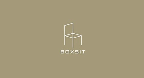
Mix of box (box) and chair (sit). The logo can be both a chair and an open box.
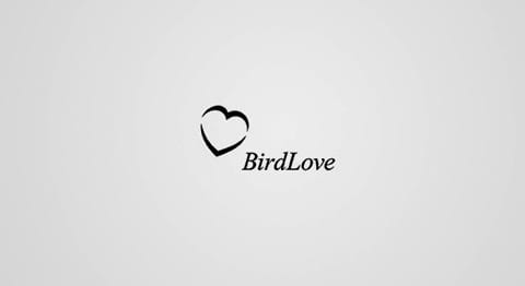
This logo contains a triple relationship. On one side appears the shape of a heart. On the other hand, the main word contains the initials B and L that make up said heart. On the other hand, the word is composed of love (heart shape) and bird (schematic shape of the letters B and L).
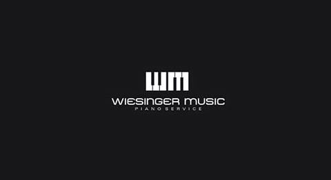
The initials of the brand are W and M. They have been played with to obtain an object that perfectly represents the essence of the business. In this case two pianos in inverted positions.
Have you seen a better way to represent a problem of sexual impotence through a logo? I honestly don't.
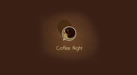
The main concept that a night cafe is is implicit. Inside the mug there is a moon created from its foam.
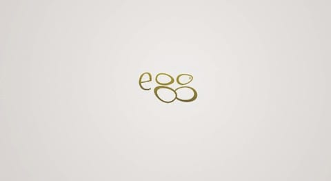
The letters "G" that make up the word Egg look like eggs.
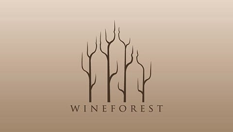
Forest wines: The position and design of the trees and branches in the logo will make us easily recognize three bottles of wine.
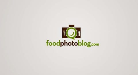
Food Photo Blog: Food is represented by cutlery and plates. Photography by a camera. The blog concept because of the sandwich shape that is also part of the camera lens and the plate.
Kingfish: A crown is formed from blue fish shapes.
Uptown: The houses and skyscrapers are at the same time arrows that point upwards, thus containing the essence of the word game.
The word coffee is formed through the form of smoke that our coffee leaves behind.
Portrait Photos: The figure of an individual appears within the lens of the camera.
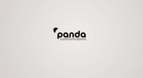
If you look closely, you will see that at the same time, the letters p and a are part of the panda's eyes.
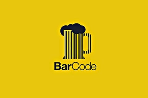
Barcode in English refers to a barcode. It is played with the formation of the word to work on the design of the logo of a bar.
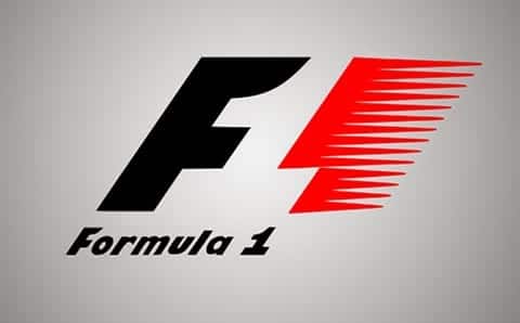
The space between the F and the red area is number 1.
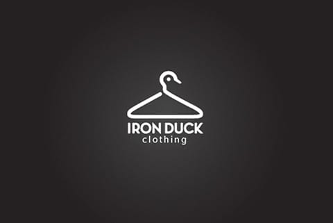
The hanger of this clothing business (Duck is duck in English) forms the silhouette of a duck.
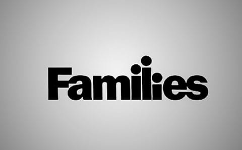
The dots on the letters simulate the silhouette of people of different ages, easily associated with the idea of family.
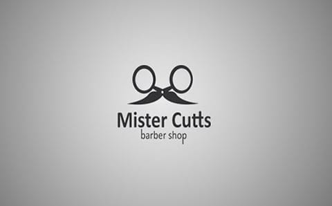
Here we find both a face with glasses and a mustache and scissors.
The turkey in the center facing right represents the company's motto to look forward and not back.
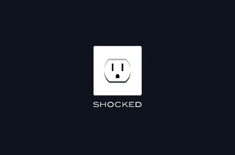
The expression on the outlet says it all.
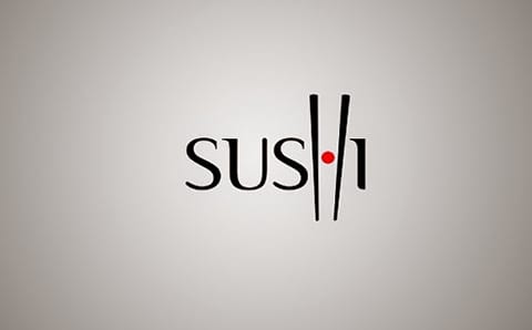
Chopsticks catching sushi are well represented by the letter H.
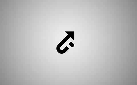
The mark is called UP which means 'up', the arrow forms the 'U' and has the letter 'P' hidden.
If you look closely at the C's you will also see the look of a cat.
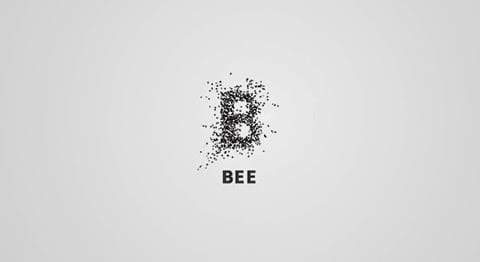
Bee means bee. In this case the initial is made up of a swarm of bees.
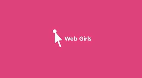
The cursor and the point form the silhouette of a female figure.
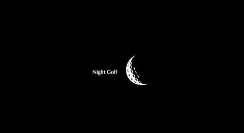
A textured crescent is used in such a way that at the same time it is a Golf ball.

Missing means "missing." In this case the Is have literally disappeared, although it is still easy to read our word.

The hands of this clock provide the shape of an airplane.