
These are 7 simple rules that you should use when using some type of font for your project or a client's project and for it to be seen perfectly on the mobile phone.
Give space
There is a extra hierarchy affecting the flow of a line or paragraph and is about the spatial hierarchyIn other words, the space between the letters is smaller than the space between the words and the space between the words is smaller than the space between the lines. To obtain perfect readability from mobile, you should pay attention to the spatial hierarchy, in addition to the style of the characters in words, lines and paragraphs, which is even more important in natural light.
Get the measurement
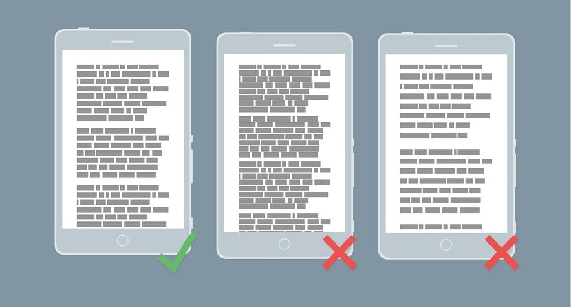
Commonly, the measurement for a good reading is about 65 characters. The physical length of this measurement usually depends on the design of the typeface and the tracking, as well as the text you use. It is strange that 65 characters are expanded to the edge of a desktop browser, however, on almost all mobiles these characters tend to extend well beyond the limits, so it is necessary to decrease the measurement.
Loosen and tighten
If they are made very freely, the spaces between the words start to line up, which gives rise to what is normally called "rivers".
The traditional standard for the monitor is about 1.4em, although it is believed that this is very tight for screens, a key characteristic for fonts that work properly on screens are large counters, which they need a little more space to preserve spatial hierarchy.
Find the sweet spot
Each fountain has at least one sweet spot, which it is basically a combination of the size which tends to be best reproduced on screen, and from the point at which the antialiasing applied to the browser tends to distort the type design as little as possible.
El Sweet spot, is practically the point at which most of the strokes tend to align with the pixel grid. Generally, the standard approach for designers is to place the font type using a baseline grid, however when it comes to mobiles you need use height "X" instead, which is literally the height of the lowercase letter x.
Don't lose your rag

The rag, is basically the border of a text box; generally what we read is aligned to the left causing the right margin to be uneven. Once the eyes jump from one end to the other in some line, the brain has a chance to better judge the angle and distance to next jump, if all the jumps have been made consistently and much faster if they are spaced the same way. That is why the left margin of the text always has to be flat, making all the lines start in exactly the same place.
When using a justified text Inconsistent blanks are often created. The main problem with justified texts is that they use a much shorter length, causing the text to be practically unreadable for mobile phones.
Reduce the contrast
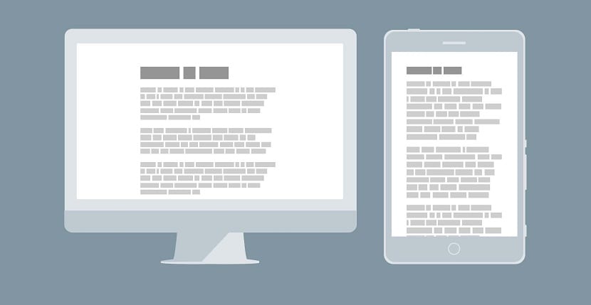
Headers they could be 2 and even 3 times the size of the body of your text designed for desktops, which works because there is so much more text inside the screen. However, when it comes to mobile, not all the text is very visible and contrast tends to be very exaggerated.
Adjust tracking to scale
When adjusting font sizes for mobile, you must take into account the changes required in the follow-up, which is basically the letter spacing applied to each of the characters in the font.