
Source: Hogarmania
Surely, if you work in the graphic design sector, you will have come across the perfect occasion to have to choose between a typeface that shows the character that your project needs and another similar one that if you look at it twice, it does not seem so similar.
Choosing fonts is one of the most difficult tasks for the designerActually having to choose between both has always been a difficult task.
In this post we are going to show you why you should not choose that typeface that catches your attention so much and why you should choose the one you hate the most or not so interesting to you. To do this, we are going to divide this post into several sections: typography, main groups of fonts and their general characteristics, and tips on how to choose the perfect fonts.
We start
Typography
Source: Graph
Perhaps, you already know what this term or this technique is, but to know how to choose it is necessary to have a reason before choosing. And that's why we can't do it if we don't have a little scientific basis of what typography is. well, typography is defined as the technique of designing or creating letters, is considered one of the branches of graphic design, since it is also considered a main element.
It is not an easy task, since the typographer must build from scratch a letter design that has not been designed before. The truth is that it is not a technique that has existed a few years ago, but that it was already carried out in Roman times.
The Romans spent much of their time carving and sculpting a type of fountain that is known today as having a very classic and serious look. Since then, many designers have dared to use this technique and that is why today we find more than 100.000 fonts.
The two main groups
There are two groups that are the most prominent and the first that are shown when you learn typography. They are not the only ones that exist, since they are also made up of subcategories or subgroups, these categories come from these two main ones but they appear physically completely different.
As main groups we find serif and sans serif fonts:
- Serif: Serif fonts, as their name suggests, are those that are characterized by containing a serif in their serifs. They are the first typefaces that were created and yes, it was from the hands of the Romans. Its look so classic and traditional, comes from the technique used by the Romans, where they carved stones and carved these fountains in stones or rocks.
- Sans Serif: The term sans comes from the word "without" and unlike the ones we mentioned above, these are characterized by not containing serif in their serifs. You can already get a little idea and think that this type of fonts denote a more renewed, updated and clean appearance. They are often used a lot in signage since they are always an excellent option.
Tips for choosing typeface
Source: Spreadshirt
If you already have a small idea of what this typeface is, then we are going to show you a series of tips or ideas so that the typographic choice is not too difficult for you and you can even learn to combine some of them in a way that they have coherence .
typographic personality
typographic personality It is defined as the character or personality that a certain typography can contain. As we have mentioned before, there are fonts or font families that show a much more classic and traditional appearance. Others, on the other hand, are cleaner and more current, which may convey more confidence to the viewer.
The typographic personality must be taken into account when choosing a typeface since it will be what will provide the character that you want to offer to your project. To do this, you must ask yourself the following questions: what do I want to convey to my audience, what topic am I going to talk about, how am I going to address them, or how am I going to tell things. Depending on what your answer is, you can use one typographic style or another. To give you a little idea, it is not appropriate to put a non-serious and animated typography on a poster that announces a movie whose theme is suspense.
What am I going to use it for?
It is a question that seems obvious at first glance, but it fits if you have not yet asked yourself what typeface is best for your project. Since a logo is not the same as a poster, it is very important that from the first minute you stop to think about what you are going to choose, you think about the characteristics of a logo and those of a poster. Does it still seem like an obvious question to you?
It is essential to be clear about the main objective and the use we want to give our typography. For this reason, before choosing, we advise you to first document yourself about the sources you want to add and make a kind of list with the good and bad things that each one has. The one that has the most benefits for your project is the one indicated.
Other details to consider
Until now we have thought that typography was the only thing we had to take into account when choosing it, but no. Do the project you do, your typography is going to be surrounded by other elements that may downplay it or give it all the prominence.
That is why you must do a little preliminary analysis and think that if your logo is surrounded by a very striking symbol where all the importance falls on it, it will not be possible to apply a font that has the same characteristics, since one of the two elements will cease to matter and your brand will cease to be a functional brand. The same happens with the poster, you can have a perfect slogan or headline along with a good distribution of the elements, but if you apply an inappropriate typography, you take away the prominence of everything else.
interesting fonts
After this brainstorm, we are going to suggest some typefaces that, due to their appearance, have been the protagonists of numerous very important projects. This does not mean that they are only the most interesting, since we are surrounded by more than 100.000 different fonts.
Commode
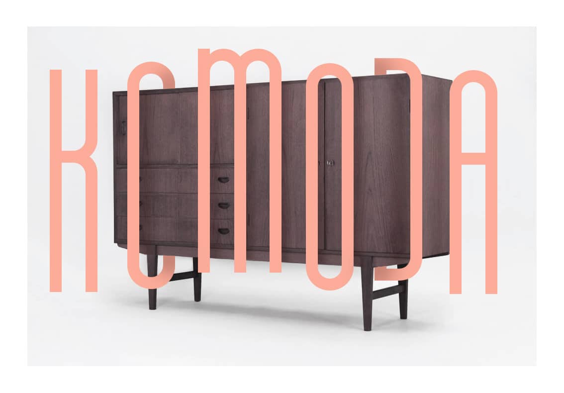
Source: Asia Angulska
Komoda is a typeface designed by designer Asia Ang. What characterizes this typeface so much are its geometric shapes, since part of the base to be quite rectangular. It is an ideal typeface if you are looking for it to fit into interesting headlines or subtitles. But be very careful, since it may only be useful for certain themes.
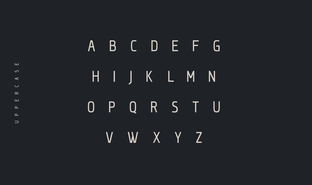
minimalust
It is one of the fonts that, as its name suggests, belongs to the minimalist style. Due to its appearance, it is defined as a clean typeface and, furthermore, it is inspired by manual writing and classic printing. Is a typeface designed by Pratama Yudha and it is the font you need if you like the minimalist style, counting a lot with little. It is undoubtedly one of the most interesting fonts and its friendly and trusting character makes it functional in the vast majority of projects to be carried out.
against
Source: Graphic Pear
Qontra is a typeface designed by Tomaz Hrastar. Typography is characterized by presenting lines and curves that are very interesting and quite functional if you intend to use them in titles or headers. It is an easy to handle font, since it does not contain deformities and its appearance is very modern.
It is the ideal typography if what you are looking for is a clean, slightly overloaded and fluid result. It is similar to Futura in that it also has regular and simple geometric shapes on its exterior and at first glance it also maintains a pleasant and quite creative and artistic personality.
Matey
Matey is a typeface that has been designed for today's world. It was designed by typographer Andreas Leonidou. It is characterized by its renewed and current forms. In addition, it has a certain trend and evokes the retro world, which offers it a much more modern look, typical of contemporaneity.
It is also considered one of the typefaces formed by geometric shapes, and what is also quite characterized is its large size, in this way allows it to be used in both titles and headers. Which provides a wide range of uses and functions to offer.
Conclusion
Without a doubt, choosing a typeface is not as easy as it seems, following the steps or ideas that we have suggested will help you in the previous exercise or mental analysis. That is why it is important to be clear about the initial concepts and to know what we are facing.
Now the time has come for you to use your most creative and original side and choose those fonts that you find most functional and attractive. In short, carry out a wide search for fonts and investigate new ones that may be much more interesting to you. You just have to be patient and everything will come.