
Design a poster correctly to reach a larger audience is without a doubt the goal of every designer, What should we highlight in the design of a poster? this is undoubtedly the basis of everything graphic project, think first what is most important and how to highlight it so that it is an effective design and reaches a wider audience. Establish a hierarchy The importance of content is essential to transmit the idea of the design to users and for them to understand quickly what is it about.
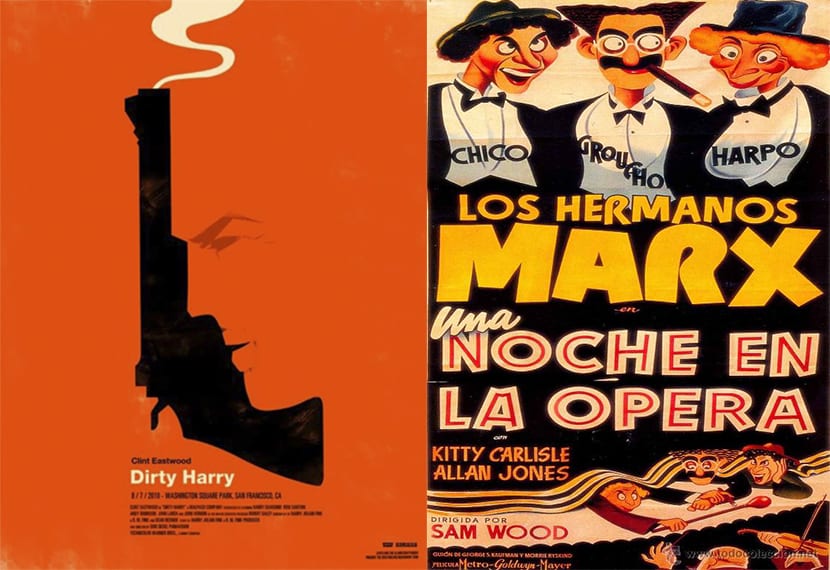
We must think at first what is the basic idea of our poster and which elements are most important than others to create a content hierarchy. In a movie poster the most important thing is usually the graphic part (images), therefore the hierarchy focuses first on this point and then move on to the text. If what we are designing is a poster for an event important the most common is highlight event name or its participants.
In every poster there is always more or less useful information, our mission is to know what information is most important to be able to establish a hierarchy in our design. Once we are clear about the content hierarchy, what we have to do is interpret that hierarchy graphically, for this we have two languages Main:
- Typography
- Images
Two ways represent the content of our poster graphically being able to choose to highlight more the image or text. Whatever our decision we have to ask ourselves if what we have chosen for our design works or not Does the image represent what we are looking for? Is the message clearly understood? These are some of the questions that we must ask ourselves when faced with this type of project.
When we have already decided our design and we know what the content hierarchy is, we can move on to the part of transcribe that hierarchy to the graphic world, We can do this in different ways:
- Size contrast
- Color contrast
- Contrast of forms
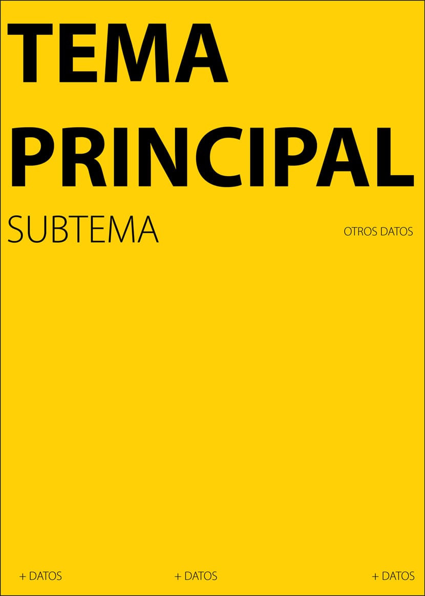
A large text will always stand out over a smaller one, therefore by our logic main topicl could be written in a older body than the rest of fonts. Other kind of contrast It can be the color one highlighting words using a different tone, the ideal is to do it with one or two colors at most to avoid creating a pastiche of colors. Use geometric shapes can help us establish a content hierarchy, for example put the main text inside a square or separate a part by using fillets.
We must not forget that generally a poster is an element that must draw attention quickly in such a way that as we walk past we stop to look at it. Deciding if we want a visually impressive poster or focused on the broadcast of a lot of content is essential in this type of media. Do I want to attract attention with my poster or focus more on informing the user? Each graphic work is unique and must be treated in great detail. Design is a whole world and we must know the way of life of that great world.