Logo of the Finnish brand Tapped Birch Water
"Less is more" As trite as this phrase sounds to us, it is the best description we can give to the Scandinavian style design. When we talk about this style, images of highly functional and simple furniture, or useful as well as beautiful decorative objects, probably come to mind. And it is that the Swedish multinational IKEA has been in charge of making Nordic aesthetics known globally.
Although most people do recognize this style because of interior design, the truth is that it is also applicable to the world of graphic design, and in recent years has influenced the aesthetics of the most popular graphic trends. A marked inspiration in natural elements, minimalism and simplicity, are some of the most notable features of this style you are looking for create highly useful pieces taken to their minimum visual or spatial expression, that in turn are aesthetically beautiful.
The key to this design is adapt form to function of the piece and not the other way around. But if you want to adopt the Scandinavian style in your own design aesthetic, there are a few principles you should know.
Ease
Simplicity in Scandinavian design translates into do not place any element that is not necessary Or load it with elaborate illustrations or strong colors. You have to make a graphic piece as less complex as possible, that has the right and necessary elements to convey the visual message you are looking for.
Scandinavian Design House interior design brand logo
Minimalism
Although they tend to be taken for the same thing, minimalism is not synonymous with simplicity, rather it will arise as a consequence of it.
Those necessary elements that you placed in your design, you have to take them to their minimum graphic expression. Skip any details that are not relevant And forget about ornaments that can carry them visually. The idea is that you believe minimal graphical synthesis that is very consistent, strong and easily recognizable at a visual level.
Logo of the Norwegian Meteorological Institute
Simple lines and shapes
The applied result of the two previous principles is that our design is going to have very simple lines, and flat and simple shapes, that you can preferably locate in wide spaces of white background or unicolored backgrounds. In this way, the visual focus of attention will be directed to these figures.
The 7 Eleven brand branding uses only lines
Sans Serif Typography
If we have been talking about simplifying and minimizing the elements of our design, use a sans serif typeface is the choice we have to make by default. This typeface has already taken away that “extra” ornament, technically called Serif, which is always placed on the edge of the characters.
Using a Sans Serif typeface will allow more space between each character, what will make a difference on a visual level in the design. As a result, our graphic piece is going to have a more modern look, simple, straightforward and very accessible to the public.
Inspiration from nature
All Scandinavian style aesthetics is strongly influenced by nature. Perhaps it is because of the lifestyle that the Nordics promote, where being outdoors and spending quality time in contact with nature, plays a very important role in their culture and in their way of enjoying life.
So, just as the Nordic style uses natural elements, you can Include silhouettes of trees, leaves, flowers, mountains, animals, etc. in your designs. or you can use wood, ice or marble textures as background.
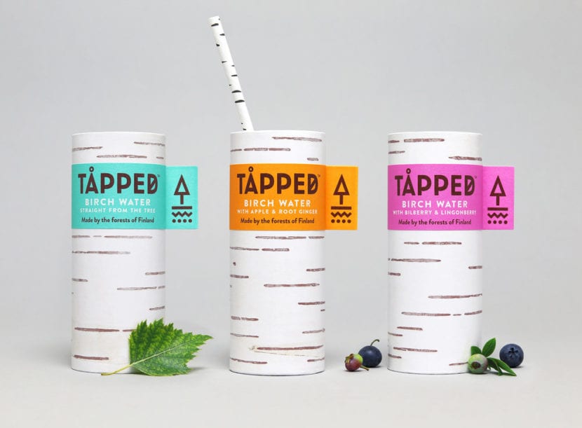
Tapped Birch Water brand glasses are inspired by tree trunks
Color palette
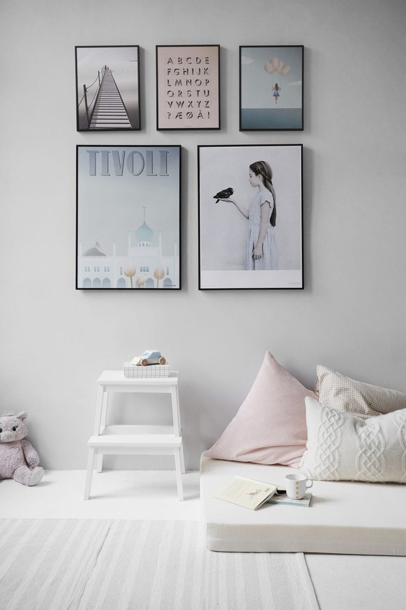
For your design choose one light color palette, that is gentle and harmonious in sight.
If you want a sober, simple and purely Scandinavian design, use shades of gray, brown, beige or pastel colors. If you want to give those tones a more striking touch while maintaining the same aesthetic, you can choose cream tones, terracotta colors or a touch of gold that capture the attention of the eye.
In case you want to go a bit out of the script and use stronger and more vivid colors, contrast them with more neutral colors so that you do not lose the essence of the style. For example, you can combine a gray color with a bright orange color.
The shades of the paintings are what is usually used in Scandinavian design
Patterns
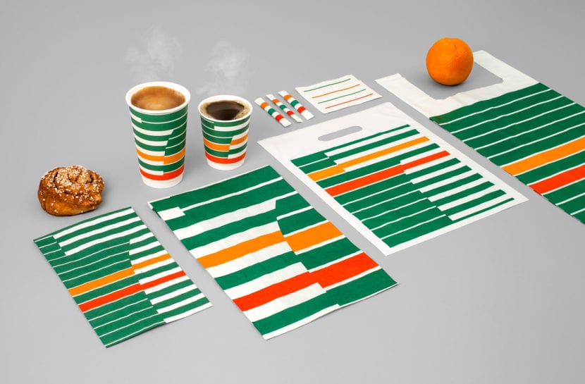
A very popular graphic resource in the scandinavian style are the patterns, So if you are looking for an element that sticks to the style but has a bit more rhythm, you can try a pattern.
Traditional Scandinavian patterns use simple flat figures, usually floral, geometric or animal themed, which will almost always go arranged symmetrically.
And if by chance you want some other reference, the typical Christmas sweaters knitted with snowflake patterns they are also Scandinavian in design.
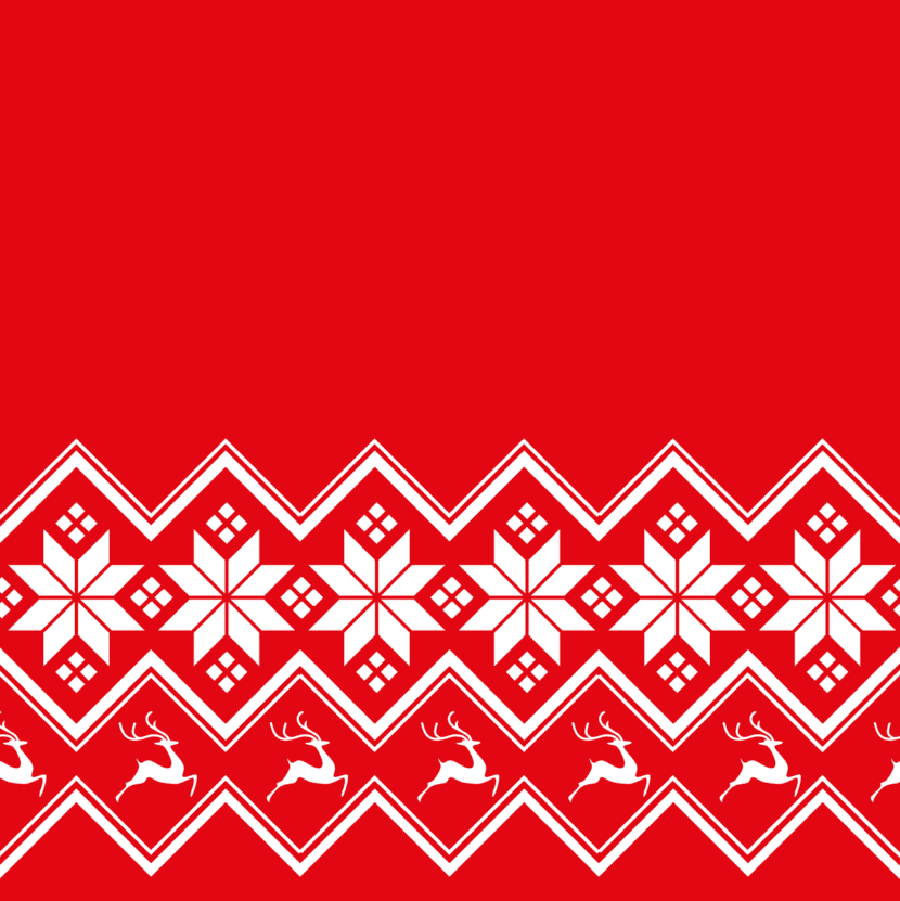
Scandinavian Christmas Pattern
Use of light
Something that is handled very well in the Scandinavian style is the use of light, so, you can place a spotlight to your design that highlights the most important elements.
Crafts
Lastly, manual skills and making arts and crafts in Scandinavian culture They have been the ones that have started this style. Therefore, if you consider that you also have this talent, use your own fonts, draw your own graphic syntheses or design your own patterns.