
One of the typographies most useful and most used worldwide is the Helvetica, a source of palo seco without finishing or also called a without serif. It was created in the mid-1957th century, more specifically in XNUMX in Basel (Switzerland) by the designer Max Miedinger commissioned by Edouard Hoffmann of the Hass Foundry.
It was designed based on typographies already existing in its time as known as Akzidenz Grotesk created in 1896.
Your name, Helvetica, comes from the literal reference to "Swiss" in the Latin name, although at first it was called Neue Haas Grotesk until the Stempel Foundry acquired the rights and changed its name to the current one.
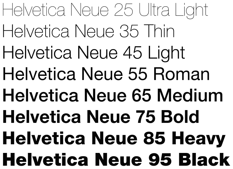
In 1983, Linotype and the Stempel Foundry redesigned this typography creating new widths and weights more current at the time calling it Neue Helvetica.
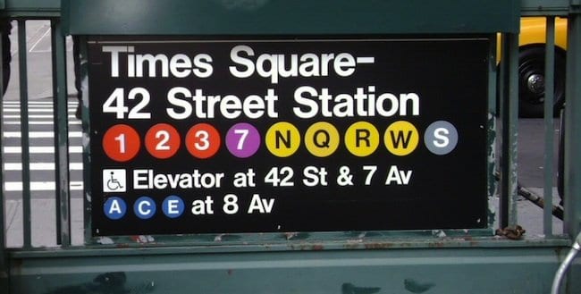
In the sixties its popularity and use increased notably, which was the most used for images of corporate brands in the 60's and 70's, especially in the Swiss country. It went on to become the source used in most of the posters urban and signage that has spread to the rest of the world's major capitals
At present it is the company linotype the one that is in charge of the licenses of the Helvetica family and all the variants of this that have arisen since it was created.
images: identityfont, wikipedia, go