Source: Autobild
Surely throughout our lives, you will have seen an endless number of logos that will have caught your attention for their appearance, colors, typography, values etc. Every time there are many branding designs that are projected and designed, with the aim of capturing the public's attention.
In this new installment, we not only return to the world of brands, but we are going to show you which logos have gone down in history as the more incredible and unique, and also, we are going to show you some of the secrets that these identity designers have carried out for their projects.
Shall we start?
The logotype
Source: Rosario Web Design
A logo is part of the marketing area, and is defined as a typographic design. The logo is made up of different dimensions, colors, shapes and specific and regulated provisions of the name of a company or institution. For example, we can find in the image the logos of: Google, Facebook, Twitter, Coca Cola and Yahoo!
The word logo, in English logotype, has been associated only with the visual formation of the word or brand, the logo, in its most generalized form, encompasses all kinds of graphic representations of a brand, in this way, all the physical manifestations of the image are part of the logo of a brand or company, nowadays, encompassed in the corporate visual identity.
The best kept secrets
Before putting ourselves in a situation, it is necessary that we show you some of the secrets that have made possible the recognition of the best brands today, or those that have made history.
Simplicity
They say that less is more, so it is not necessary to saturate shapes and colors for an effective visual effect, in graphic design it is understood as minimalist design. That also helps make it easy to remember and recognize as it appears in view of people, so designers know that to create a good logo they must bet on a piece that looks simple, despite the fact that it has gone through an arduous process of drawing, color palettes and shapes.
Easy to remember
There are many brands that exist in the world, that it is necessary to create a truly distinctive image and of which viewers remember its characteristics. This is something that the best logos have in common: they become so iconic that even people immediately recognize them when they see a small part, a color or just a shape.
Timelessness
What characterizes a good logo, is undoubtedly the fact that its design reflects and is maintained in the era in which the brand is in the weather. Many brands have had to be redesigned as their designs did not meet the characteristics suitable to be represented.
Versatility
Since they appear in various formats, should adapt easily, without losing its distinction. Especially when you take into account that a logo will accompany a social media post, that it will be seen on screens of all sizes, or that it should be printed on business cards or labels.
Therefore, each logo that is designed must comply with the corresponding sizes and structure to be applied on any medium, whether it is an online or offline medium.
Now that we have given you some tips or tips on how to create a logo and take it to success, we are going to present you some of the most incredible logos in the history of branding.
The most incredible logos
Barbie
Source: Wikipedia
This may surprise you, but the Barbie logo created in 1959 has been one of the most recognizable by children and the toy industry.
It is designed with few elements that transmit the femininity, but not in a classic way, but dynamic and contemporary. It has been modified several times. Each evolution maintains its essence, although adapted to the new times, (timelessness).
Starbucks

Source: Opinion
The famous brand of coffees in the world, also counts as one of the most recognized. It is an iconic logo and easy to identify by users, which at the same time provokes curiosity, in addition the relationship between a mermaid and the cafe has captured the attraction of users. It should be added that its solid green tone speaks of progress and security.
Coca-Cola
Source: Money only
It is one of the logos that cannot be missing from the list of incredible logos. The famous typeface and its color are recognized worldwide, and it has had a positive impact on many people.
If a logo meets the main characteristics we have mentioned, the Coca-Cola logo wins. In addition, it resists fashions and its largest variation was almost 70 years ago, when it stopped being black and became 3 different shades of crimson.
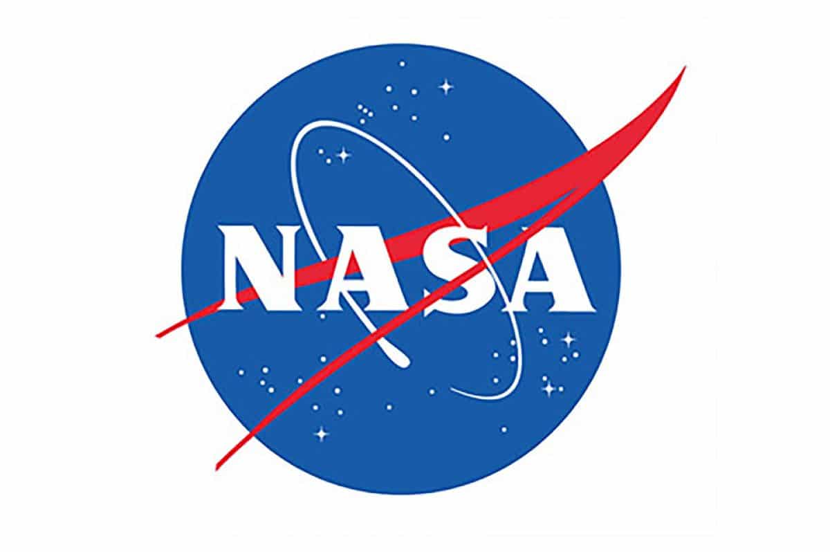
NASA
Source: Graffica
This famous logo is formed by a large blue circle that simulates being the planet Earth and at the same time the entire universe. In addition, it emphasizes movement through space. It is definitely so memorable that we could wear it on a t-shirt or some other piece of clothing.
This logo brings back a design from the 1950s, with contemporary design elements, and is one of the most successful over the years.
Amazon

Source: Amazon Seller
It is one of the most famous logos, not only your company, which is considered one of the best parcel companies in the world, but its design consisting of a simple typography and an arrow manages to say it all. Creativity plays an important role, as the arrow not only smiles at you, it indicates that they sell everything: from A to Z.
This is an example of how to give a smart message with a minimal gesture, and also how to use a single image to offer more than one meaning.
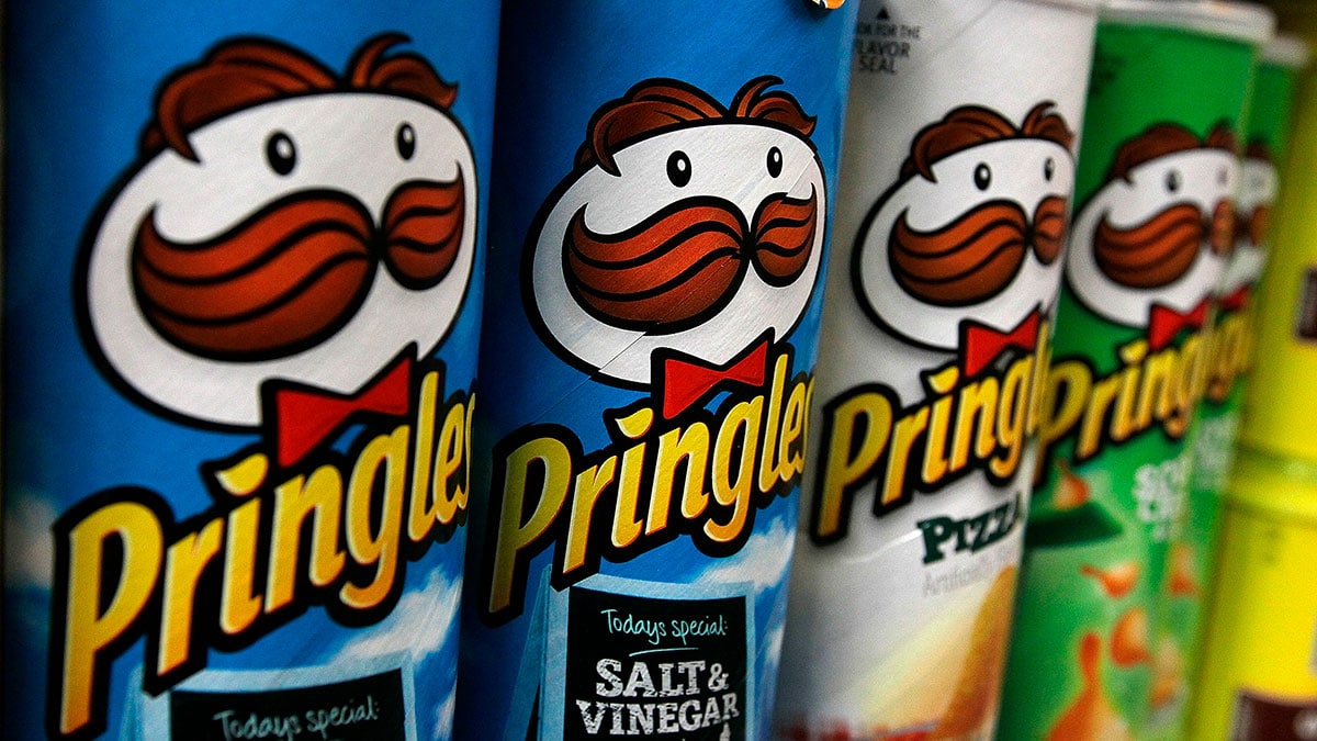
Pringles
Source: Opinion
The company that manufactures these famous potatoes contains a logo that is considered one of the best-known logos on the market, since it combines a legible typeface and a simple, but perfectly recognizable isotype. Among the badges with a character, this is the one that is best integrated, Julius Pringles.
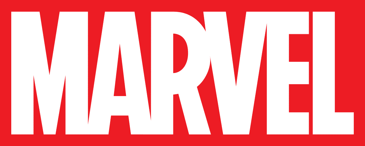
Marvel
Source: Decine
If you are a fan or passionate about superhero movies and comics, you are surely familiar with the Marvel logo. We have seen it on the big screen for more than 10 years every time a new film comes out and, as you can see, its colors and typography are impossible to ignore: the contrast between red and white and the space that the letters occupy make This logo is quite a statement that essentially tells us that, like its heroes, Marvel is not something you will quickly forget.
Source: Engadget
The logo of this company is one of the logos that has undergone the most changes throughout its history. However, an element does not move, they remain completely static: the colors of its letters. That has been one of their successes, because although the typography was transformed, and they even created different icons for each product that joins their family (the search engine, the mail, the shared documents, etc.), thanks to that color palette it is easy to recognize when using any of their digital solutions.
HBO
Source: Multipress
Currently, it is one of the channels with the best reputation in the United States (and now, thanks to streaming, in practically the whole world) it is HBO. At first, it was a channel of the television payment system that created its own series ignoring the rules of the censors of its native country. In no time, it became synonymous with quality, new stakes and even tasteful status.
Initially, the company logo showed the full name: Home Box Office; However, in five years it had an adjustment so that it was only its acronym, so that it was immediately recognized by viewers, and it has not changed since.
McDonald's
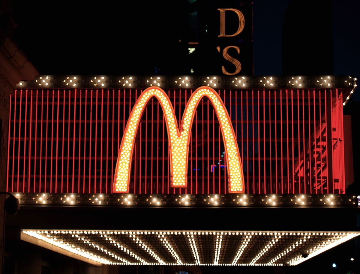
Source: Wikipedia
The McDonald's brothers hamburger chain has become one of the most famous fast food sectors in the world. The same has happened with the logo, it uses the colors yellow, red and white in its palette.
Even so, its greatest distinguishing feature is the large curves that form the "M", which are sufficient for the brand to be recognized anywhere in the world.
Conclusion
In short, as you may have seen, more and more logos have marked a before and after in the history of graphic design.
Creative logos are in order and the advantage is that you can explore other companies' designs for inspiration. Regardless of the use you want to give the logo you want to design, remember that it will appear in many places: on your website, on social networks, in emails, in your commercial offers ... It will be the first impression that people and those who use it. see they will have of you.
Design the perfect logo, which represents with faithfulness what you want to convey is not an easy task. Currently there are so many variants, designs and fonts that knowing which one to choose correctly has become increasingly difficult.
Now the time has come for you to start creating your first designs, following the advice that we have offered you.
Do you dare?