
Continuing with the different publications that you can find about historical reviews of some logos, today we are going to stop to analyze the history behind the Android logo. An image that since its first appearance has known how to become an icon of the technology of the time and today.
As we all know, Android is a Linux based operating system. It was developed initially by Android Inc, in 2003 and later bought by the giant Google in 2005. Since the appearance of the funny green android, there have been many ideas or speculations about the creation of this logo.
In this post, we will try to clarify any doubt regarding who designed the Android logo. In addition to, the different versions that have been appearing throughout its years. With the increase in its popularity, it has become one of the main competitors in the market in terms of mobile devices and that is why its image has to be consistent with its status.
Who designed the Android logo?

https://en.wikipedia.org/
The logo is created in 2005 when Google buys Android Inc. It is from that moment, when different ideas begin to be generated about the creation of the logo of this operating system. Among those ideas that were around, was that the icon was similar to the image of R2D2 or that it was even linked or inspired by the novel "Do Androids Dream of Electric Sheep?"
We are all free to create our own ideas of where the designs of the different brands originate. In the case of Android, it should be noted that the connection with R2D2 is completely wrong, while the one created with the novel by Philip K. Dick is correct.
The person in charge of designing this corporate image is the designer Irina Block. She defines the brand as something full of simplicity and with a clear statement, which has led this icon to become the image of Android. The design, as we will see in the next section, has had different design proposals. But it had always been defined by the image of a small robot.
Android Logo Evolution
The logo, as we have just mentioned, was carried out by the graphic designer Irina Blok in 2007. Both she and her work team, made the decision early on to design an open source logo. Reading this, surely you have asked yourself what is an open source logo?
Well, an open source logo means that any company around the world could customize that image freely corporate. Later, the graphic designer in charge of the project referred to the logo as a small child who had to be given her own life.
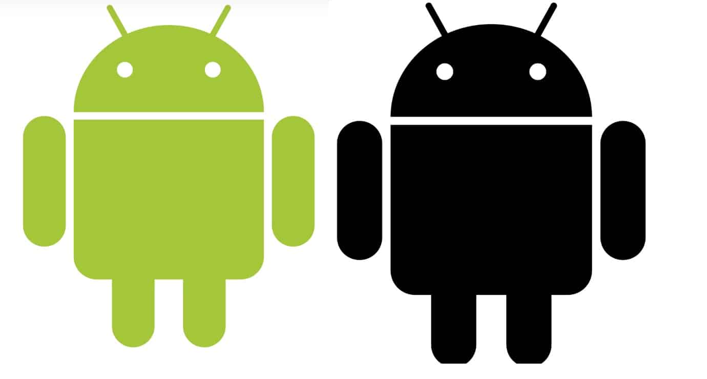
In 2008, the company's initial logo appears in two color palettes. The design team presented two proposals for companies. It should be noted that the most recognizable and striking was the image where a light green tone was used. The image presented a small robot with a rounded and wide body, made with a clean and smooth outline. It was an icon, representing the technological world, but with a close style.
After a few years, more specifically in 2014, the logo undergoes its first redesign and it is that the contours of the funny robot had been refined. This made all the different elements of the icon look more uniform as well as consistent and tidy.
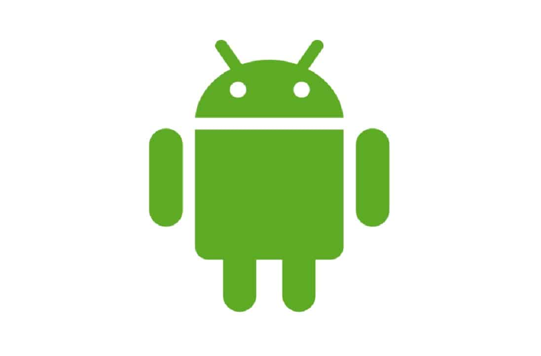
The details in white colors became more visible, so they were more daring. In addition, the robot was stylized, drawing a taller and slimmer figure, leaving aside the wide and flattened body from the beginning. The green color became the main tone of the visual identity of the brand, but a darker tone than the design of years ago, a brighter and more intense green color.
As for the typefaces used in the brand name, in its beginnings a font was used that lacked lines on the sides and the entire name appeared in lowercase. With the use of this typeface they were looking for a technological style. Over the years and the launch of the Android 5.0 system, not only did the icon change, as we have seen, but also the font.. A sans-serif lowercase font is used and is much more legible than the previous one.
Time before the redesign suffered by the brand at a global level, the creators of android again updated their typographic design by putting it in a thicker weight, that is, using bold. This new version appeared in advertisements, websites, loading screens, etc.
The last known update of the logo to date is in 2019. The logo that we know today and see on our devices is the result of exhaustive and meticulous work of HUGE. The design team revised the brand from scratch and added modernity and accessibility to the corporate image.
The identity of the brand is the green head of the famous robot in the shape of a semicircle., with two striking eyes and two funny antennae. All this of course, with the corporate color green.
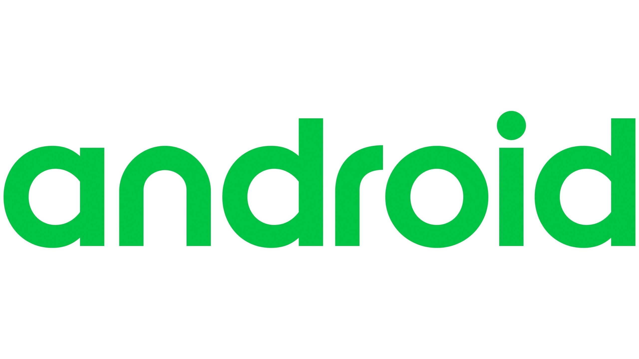
As for the typography, the creatives made use of a finer bold font. This led to the brand name being much more readable in any size and context in which it appears. These changes appear for the first time with the launch of the Android 10 system.
Little Andy, Mike, as he was called in the past, or Bugdroid, as Google workers call him, has become the main piece of the operating system logo, there is no person in the world who sees this iconic character and relate it to the brand. In this latest change, the brand has chosen both its typography and its final corporate color. Well…in principle, because you never know when a new rebranding might come out.