One of the basic concepts that we must always take into account in typographic design is that of family. As its name suggests, a type family is a group of elements related to each other and that they are part of the same set. By typographic family we understand a grouping of signs that present characteristics of a common structural and aesthetic nature, in this way we can locate and place them within the same system.
This system is made up of a series of elements, specifically the following:
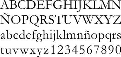
- Alphabetical signs: Uppercase, uppercase accented, uppercase, lowercase, lowercase accented, and lowercase ligatures.
- Non-alphabetic signs: Numbers, punctuation marks, and other signs.
In each of these families all the elements or components necessary to write a text of any type in different languages and formats are grouped together. Do you know the basic font families? Here I propose a summary:
CONDENSED
This is a narrowed version of a typeface family. In a condensed alternative, the typographer modifies the proportions of the elements of each type in a totally sought after way and with a certain harmony. We must bear in mind that the condensed version is not the result of the simple narrowing of the letters, deforming them on their horizontal axis. Condensation is a process that requires a certain technique and visual taste. Warping becomes a gross sin in typography that we must always avoid.
The condensed fonts are usually divided into three types. On the one hand condensed, on the other hand extra condensed and ultimately ultra-condensed, although the truth is that there are few families that support all these variants. Helvetica, for example, is one of them.
EXTENDED
It is very similar to the regular one but in this case slightly more stretched at its ends and with some optical corrections. Although the dimensions are altered on the horizontal axis, it is always done in a proportional way and maintaining the same thickness on the line. This family is usually used mainly in headlines and structures that have some relevance within a composition.
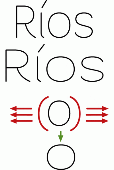
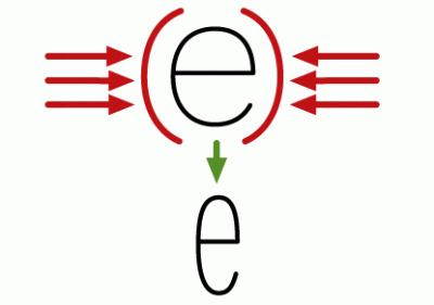
SMALL CAPS
This is the variant characterized by the use of small capital letters slightly larger than the letter m of that font. Although it is usually called small caps (plural) there is a singular for each of these characters. This modality does not have subvariants such as bold, italics or others, it is at the same level as these and cannot be mixed. But you have to be careful when using this alternative, because many computer programs use pseudo-transversalites and the difference between the two is quite noticeable (in the false small caps the stroke of the types is totally unbalanced to that of the original source). Using pseudo-transversalites instead of original small caps can unbalance our font and make it lose elegance and presence. This variant is usually found in professionally finished fonts and especially designed to be used in excessively dense and large texts.

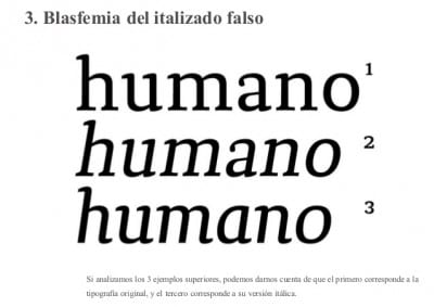
ITALIC
In typographic language Italic is synonymous with italics. Italic is a complete variant of the set of characters that make up a font and has the vertical axis tilted to the right normally at an angle of twelve degrees and mimics the result of handwriting. In fact, this characteristic is what will allow us to differentiate an original italic variant from a fake imitation. What differentiates them is that the original italic will always have a lowercase letter a similar to the one that is written by hand and will never have the hook shape typical of printers.
BOLD FONT
It is the variant in the characters of a font that is much thicker than the Roman or "normal" form, it is important to know that the increase in the thickness of the characters is done only and exclusively on the horizontal axis, that is, the strokes of the types they spread wide but not high. It is common for there to be more than one variant and thickness in the design of a font, categorized in terms of semi-black, bold or extra-bold.

FINA
This is the opposite version to the bold version, that is, the characters appear thinner or lighter on the horizontal axis than in the standard or Roman version.
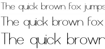
ROMANA
We call the set of basic court characters Roman family and without being subject to the variations belonging to the previous families. The term has its origin in the inscriptions on Roman monuments.