The logo is an important part of the visual identity of a brand. Let your stakeholders identify you and tell a message. Like almost all design decisions in Branding, the logo is a communication tool, transmit your values as a company and make the spirit of the brand known.
When we talk about clothing brands, this is no different. The logo plays such an important role that, in prestigious brands, can revalue basic garments and it even works as a stamp for some designs. Chanel, for example, usually does. If you are looking for inspiration to create the logo of your clothing brand, do not miss the list of the best clothing brand logos that I will share in this post so you can be inspired. Also, at the end, you will find a very practical guide with some tips so you can design your own logo.
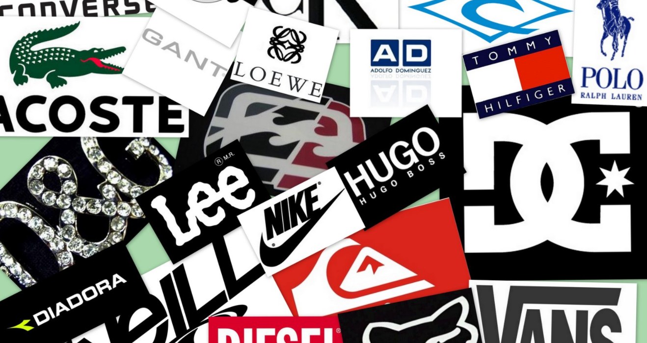
The best clothing brand logos
3 best sportswear brand logos
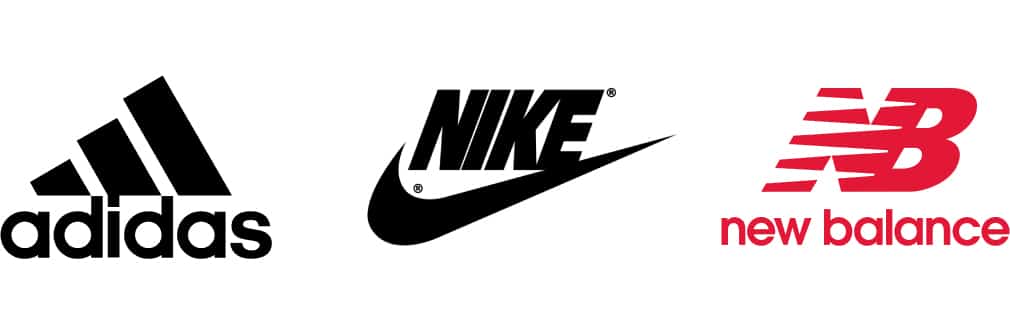
Adidas
There are several versions of the Adidas logo and all of them have a minimalist design that, from my point of view, is very successful. The three lines present in the imagotype act as an identifying element of the brand and it has even become the motif of some of his clothes. The font used is modern, it reminds me a bit of the future, thick and rounded.
My favorite version of the logo is the one with the slanted lines, that inclination conveys a sense of movement that fits perfectly with the spirit of a sportswear brand.
Nike
The Nike logo, I mean the design closest to the current one, was created in 1971 by Carolyn Davidson. The logo already integrated the "Swoosh", an imagotype of the brand that has become one of the most recognizable on the planet. As with the slanted lines at Adidas, lThe swoosh shape conveys that sense of movement necessary in sportswear brands.
In the current logo of the brand the "swoosh" has not been modified, only the word "Nike" has been added in a font from the Futura family.
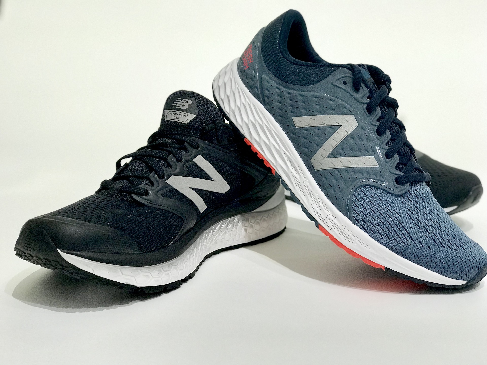
New Balance
The New Balance logo is a good example of timeless design. Since it was created in 1972, the changes that have been made to the design have been minimal and still the aesthetic is very modern and it works great. Having so many years of history, the New Balance logo has become tremendously representative of the brand. When deciding if you want to renew your company logo, it is good to assess what you will gain by doing it and what you will lose. In the case of New Balance, having kept the same design for so long has worked in its favor, giving the brand a very solid visual identity.
Regarding the design, the logo is made up of the initials of New Balance. The typeface used, similar to Avant Garde Gothic in a bold style, is broken with some lines that create a speed effect, ideal for a brand that has positioned itself as a sports shoe seller. In sneakers, they use only the 'N' as a reference to the brand, so they have that letter as additional symbol of identity.
3 best luxury brand logos
Gucci
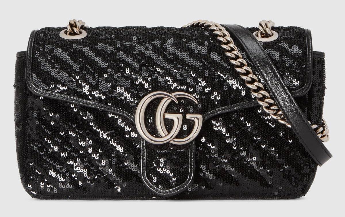
In the world of luxury brands, Gucci has become an institution. The first version of the logo was designed in 1921 by Aldo Gucci in honor of his father, Guccio Gucci. With a very minimal design, the father's initials appear opposite and intertwined, configuring a drawing that the Italian firm has stamped on almost all kinds of products and fabrics. Today, the use of the initials is maintained, although the layout has changed a bitor, placing both "G", still intertwined, but in the same sense.
When creating a logo, it can be risky to use it in different colors simultaneously. However, as Gucci proves, if the logo is personal enough and there is a strong association with the brand, you can do it without any problem. So, you can find the Gucci logo in different versions: black, white, silver tones, gold ...
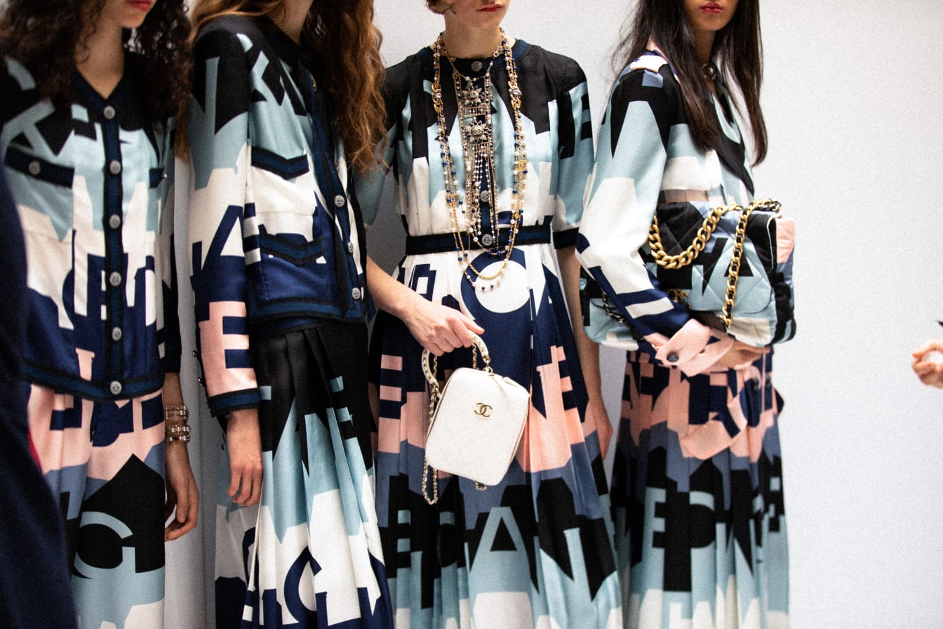
Chanel
Chanel has an isotype and with a version of the logo composed solely of the brand nameBoth are very recognizable and representative of the French firm.
The isotype design is composed of Coco Chanel's initials, creator of the brand. The two "Cs" appear intertwined, one of them written normally and the other arranged as if it were the reflection of the letter in a mirror.
However, to this day, the logo consisting solely of typography has gained strength, appearing on the labeling of the firm's products without being accompanied by the isotype created in 1925. The font used is Couture, a very powerful personalized dry-stick typeface that, when related to Chanel, has become representative of exclusivity brand.
Moschino
I wanted to bring you this logo as an example because I think it fulfills a vital requirement in the design of logos for clothing brands. The logo must convey the spirit of the brand.
Moschino, went on the market as an exclusive and luxury fashion house, characterized by its eccentric and colorful designs. The essence of the Italian firm distances itself a bit from the elegant and more classic style of brands like Gucci or Chanel, its logo, therefore, should also do it. So, for the layout, opted for a minimalist aesthetic, with a thick san serif typeface, leaving little space between characters that have an elongated shape. Still being simple, the logo has an urban touch and modern that complements very well with the style of the brand.
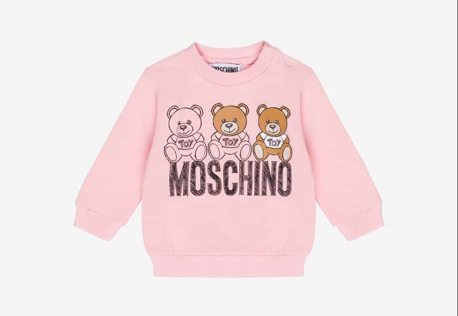
I find it interesting to highlight another element of visual identity that has also become iconic for Moschino. In 2014, Jeremy Scott, creative director, launched the fragrance "TOY". The bottle is shaped like a teddy bear and the entire perfume promotion campaign focused on the doll. It was so disruptive and so far removed from the style of other luxury brand fragrances that the impact was very high. So, "TOY", Moschino's bear, became a powerful symbol, extending its use to other products of the firm, especially in the children's fashion line.
3 best casual clothing brand logos
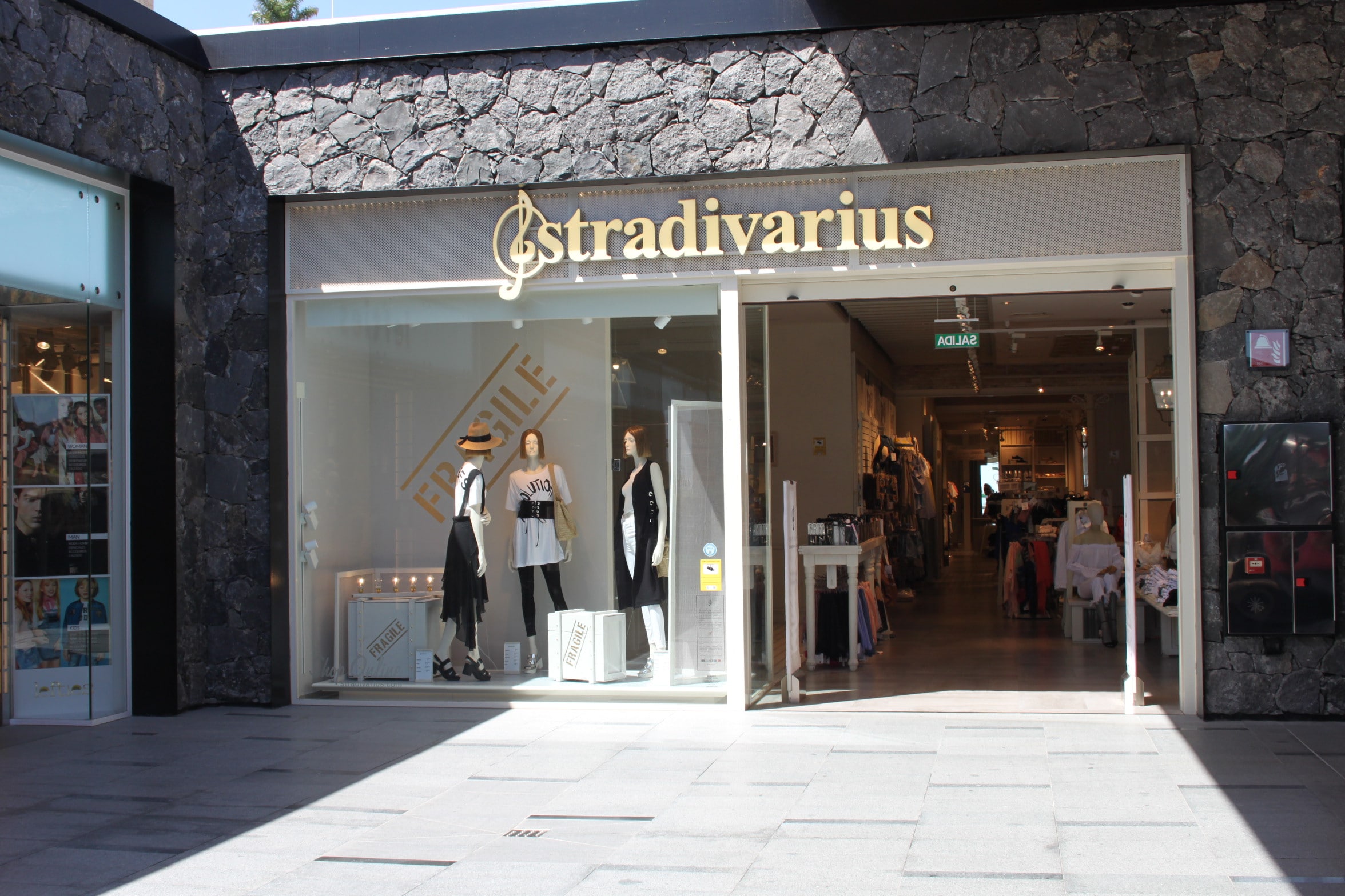
Stradivarius
The logo of the Spanish brand belonging to Inditex was designed before the acquisition of the company by the group. In its early versions the first "S" is replaced by the treble clef. However, in the current design, although the iconic treble clef remains, that "S" has been recovered.
The logo refers to the name of the brand. Stradivarius is the term used to refer to the violins made by the Italian Antonio Stradivari, who was one of the most famous luthiers in history. Their violins are characterized by their quality and excellence and, by giving the brand the same name, the Triquell family, founder of Stradivarius, wanted these values to be associated with their clothing brand as well.
The logo, made up of the musical symbol and a script typeface, manages to harmonize the world of fashion and the origins of the name with the own and current identity of a casual fashion brand.
Levi's
Levi's, founded in 1953 in California, is an example of how, keeping the most representative elements that are associated with the brand, you can renew and reform the logo until obtaining a more harmonious version adapted to the trends of each moment.
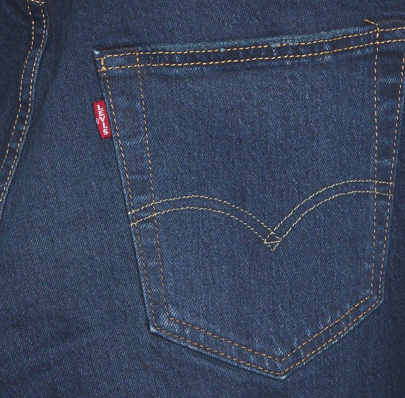
The logo has had numerous versions, but there are two elements that have been consolidated as representative of the brand and that are already part of its visual code: the red and the «R» trademark surrounded by a partially cut circle. In some of its versions, precisely in the logo that heads its website, the word Levi's appears contained in a red text box that simulates the shape of a bat's wings. These bat wings are present in the back pockets of the jeans, Levi's flagship product, and that is why they were also integrated into their logo.
In the case of Levi's, I find it very interesting how well the color codeTo such an extent that if today we put red on a denim texture, many would automatically think of the American brand.
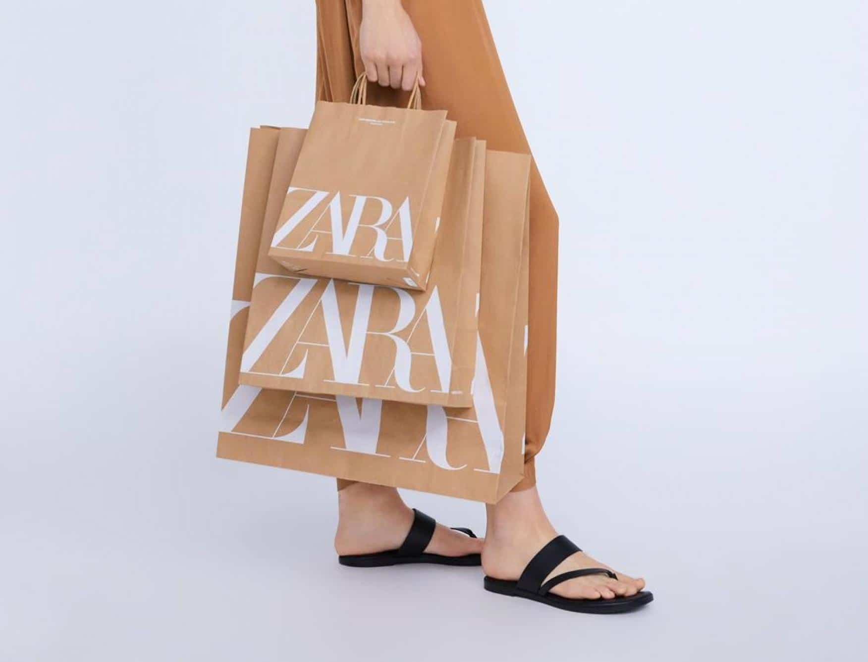
Zara
The Zara brand, also owned by Inditex, is based on the concept that luxury and designer garments can be accessible to everyone. Your logo perfectly conveys that message. The firm has opted for a minimalist logo which is even reminiscent of haute couture fashion houses.
The logo, which is usually presented in black on a white background or in white on a dark background, consists of the brand name in a very elegant typeface which, in its latest version, makes a clear allusion to fashion magazines such as Vogue or Harper's Bazaar and connect with all that world of luxury and design.
How to make a perfect logo for your clothing brand
I hope the examples I have shown you have served to inspire you. As you may have seen, the logo is a very important element within the Branding of a company and helps to have a clear and well-closed visual message. To facilitate the process of creating your own logo I will leave you here some tips that can be very useful to guide your design.
Everything communicates
When you design the visual identity of a company, each and every one of the elements communicates. Therefore, you must control what you include in your logo and the design decisions you make, even if they care for aesthetics, should not be based solely on that, nor should they be random.
As a brand you have a message and an identity and that must be evident in your logo. Before designing your logo, make a briefing in which you set what you want to transmit and get with the design. If, through the logo, you give a contradictory message, you could confuse your stakeholders and even the representative and associative value of this element of visual identity could be lost.
If you allow me some advice, simplifying can help you. It depends a lot on the brand, and there are firms that ask you for a more eccentric and overloaded design. However, sometimes when we are getting into graphic design we have the horror vacui and we tend to introduce elements that don't say anything. If there are elements of your logo that do not communicate anything, it is usually better to ignore them, because they cloud the message and can diminish the prominence of the elements that do serve to tell what your brand is like.
Study the competition
Watching what the competition is doing can help you figure out where the shots are going. I'm not saying you should copy what the competition does., the logo is a distinctive symbol of the brand, so it has to be personal and unique. But if there are companies that have been in the sector for years and have tried thousands of options and ideas, it is smart to look for inspiration in their designs and study the history of your logos to identify formulas and visual codes that have not worked or that they have. Knowing the competition is the basis to start building your own and creative logo.
Think about your supports
Sometimes, we make the mistake of designing something without thinking about the support in which it will be applied and in the spaces where it should be implemented. If we don't think about this, we can design a logo that works great on the web, but won't work on our labels or as a stamp on our products.
Therefore, Before creating your logo you must be clear about what you want it for. Obviously, throughout the life of a company new needs arise and, as we have already seen, this can be solved by creating new versions of the same logo. But if you are in the first design phase, it is good to think about what it is going to be used for and how many versions you need.
In addition, I recommend that you include in your corporate visual identity manual, what uses of your logo are correct, what changes can be implemented, what sizes it supports and the available versions. Thus, if you work with someone else or if you design the logo for someone else, they will know how to make good use of it, taking advantage of its full potential.
Make it personal and unique
Your logo it will be the first thing your stakeholders see your company. Therefore it must be representative, personal and unique. For it introduce elements in your logo that tell what your company is and what makes it special and different. Including graphic elements, isotypes, that work separately from the company name is a good idea to reinforce the association between the logo and the brand.
Make sure your logo is in line with your brand's visual identity
Although the logo is usually designed even before the company begins to operate, this is not always the case. There are brands that start selling without having a clear visual identity and it is the day to day that is shaping it little by little. If this is your case and you are now trying to define a visual identity for your company, I recommend that you study what you have done so far and identify what elements have served you and have become representative of your fashion firm.
Surely, you may have unconsciously begun to apply visual codes and patterns. If they work, don't waste them and design or redesign your logo based on them.