
The graphic designers, dedicate a lot of effort and work to be able to convey an idea or message with a single visual punch to the viewers. They try to capture the attention of the public, with the aim of creating bonds between them and thus attract them to the products or services that the brand is offering.
Colors play a fundamental role in the development of creativity. Each of the colors that we find in our day to day has different connotations and we must always keep them in mind. That is why, today, We are going to talk to you about the ranges of blue colors. We will see what sensations this color brings, what types of different blues exist and we will show you some examples not only of the range, but of projects with these colors.
Not only is it enough to have good taste when designing, but we have to know all the elements with which we are going to work, in order to achieve pleasant and attractive compositions for the different audiences we are targeting. To be a good graphic designer, One of the most important knowledge to master is the psychology of color.
Is it important to know how to choose a color range?
One of the aspects that takes the most time to decide, apart from typography, is color. Every designer is aware of the influence different colors have on the audience. That is, each of them evokes a feeling or sensation.
Not all colors, as we know, mean or cause the same thing. Personal tastes are left aside, and the meaning and sensations that it transmits are put above. In this case, we are going to try the color blue. A color that is normally associated with images that take us to the sea or the sky, giving a feeling of calm and freshness.
It must be remembered that on certain occasions, the same color can produce contradictory feelings or sensations. Depending on how it is used, it can evoke a happy feeling or, quite the opposite. This is because this color is surrounded by other elements and colors.
You have to be aware that, when making a design of any kind, in the vast majority of cases, more than one color is going to be needed. In this case, we are going to use different shades of the same color. With this we will achieve harmony and balance in our projects.
Different shades of blue that you can choose
Blue is one of the most commonly used colors. It can come to symbolize contradictory feelings, but they are not usually related to something negative. It belongs to the range of cold colors, and is linked to calm and tranquility.
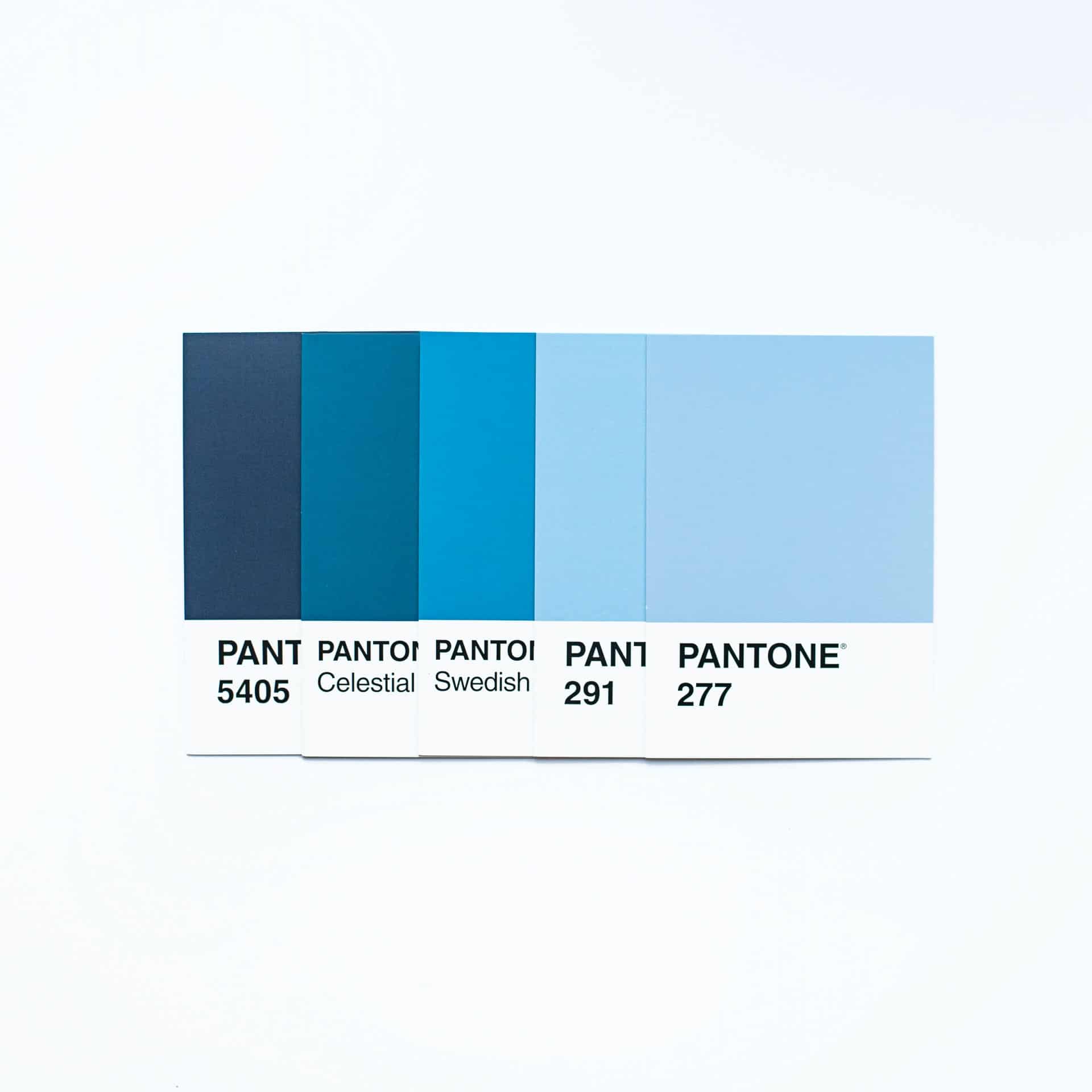
The blue chart is very extensive, from the lightest tones to the darkest. It offers us a great variety of possibilities in terms of its use in design. Some of the best known colors are shown in the following table with their RGB values.
| NAME | RGB VALUES |
| standard blue | 0 / 112 / 184 |
| Blue Steel | 86 / 119 / 151 |
| Alice Blue | 145 /163 176 |
| Cobalt blue | 63 / 68 / 140 |
| blue crayon | 31 / 117 / 254 |
| egyptian blue | 16 / 52 / 166 |
| Electric blue | 22 / 48 / 190 |
| Navy blue | 0 / 48 / 78 |
| mayan blue | 115 / 194 / 251 |
| Ocean blue | 29 / 51 / 74 |
| persian blue | 28 / 57 / 187 |
| prussian blue | 0 / 49 / 83 |
| Indigo | 9 / 31 / 146 |
| Celeste's | 12 / 183 / 242 |
| Periwinkle | 204 / 204 / 255 |
| cerulean | 0 / 135 / 209 |
| Indigo | 0 / 65 / 106 |
| zafiro | 101 / 118 / 180 |
| porcelain blue | 67 / 107 / 149 |
The standard blue color or one of its different shades, It is one of the most used in the world of design. both for brand identities, as for posters or any other design. Outside the world of graphic arts, it is also a color that is used in different fields such as decoration.
The logos of many brands that we know and see in our day to day, have this color between their identities, since it is an easy color to remember and that, in addition, many people like. These brands by using this color, become interesting to a larger audience.

Examples of blue color palettes
Using the color blue in your creativities as we have mentioned, can evoke feelings or sensations of serenity, generosity, calm, depth, among many others.
In this section, we bring you some examples of blue color ranges to serve as both inspiration and help in your next designs. In all of them, the main color is blue and several ranges have been created from its different tones.
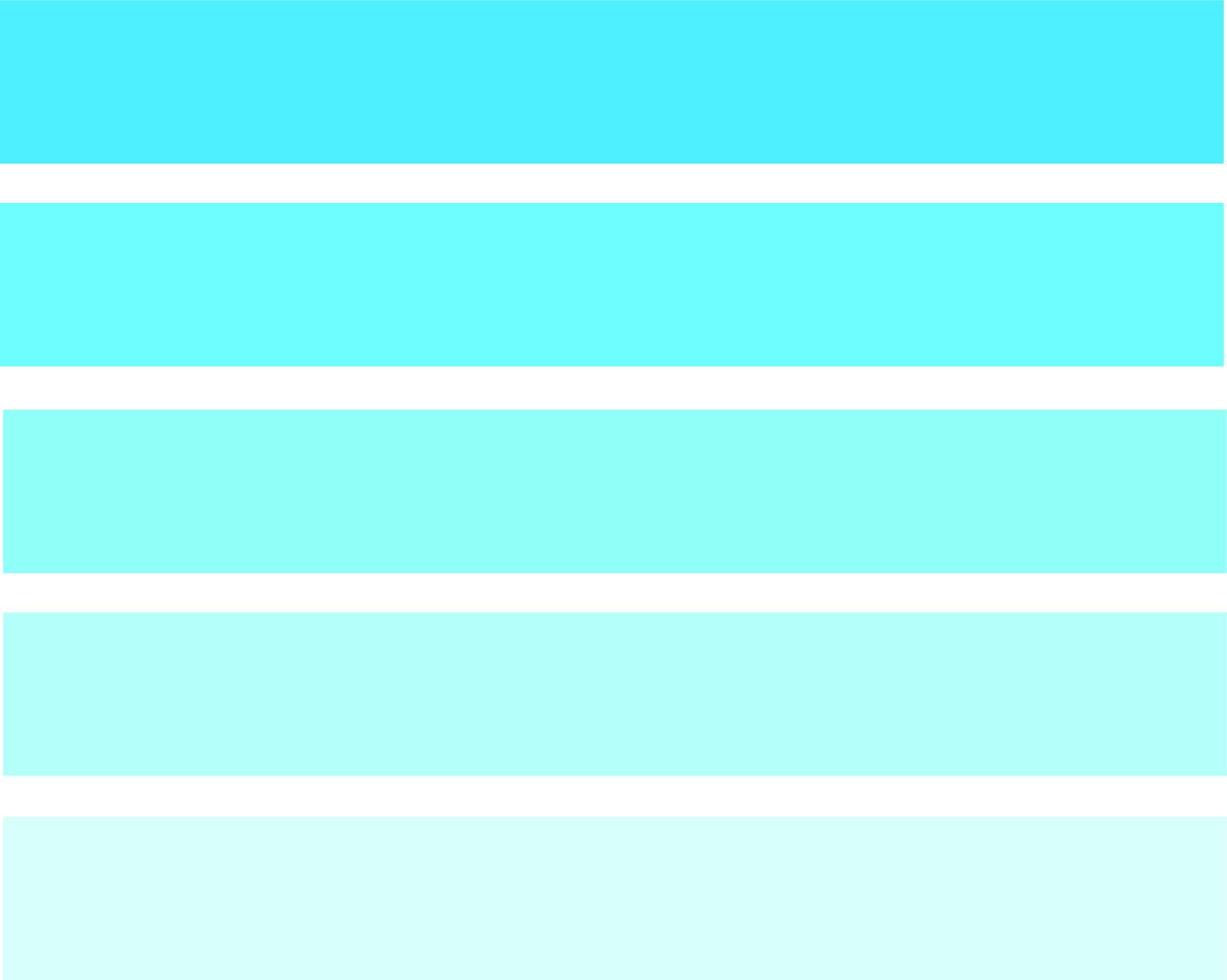
sky blue palette
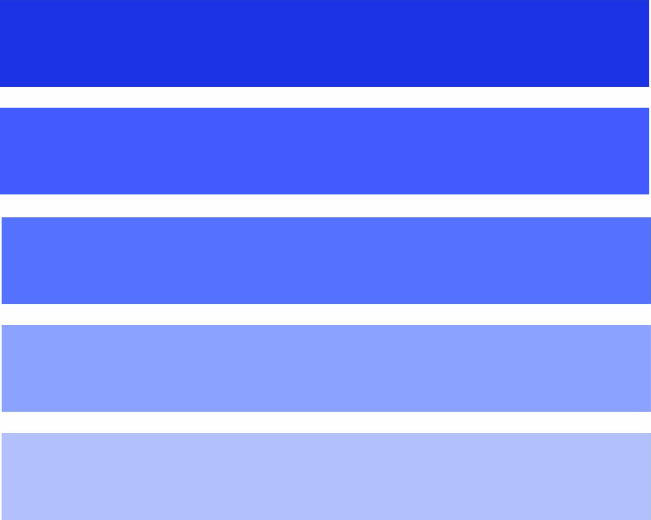
Cobalt blue
Indigo Blue Color Palette

Navy colour
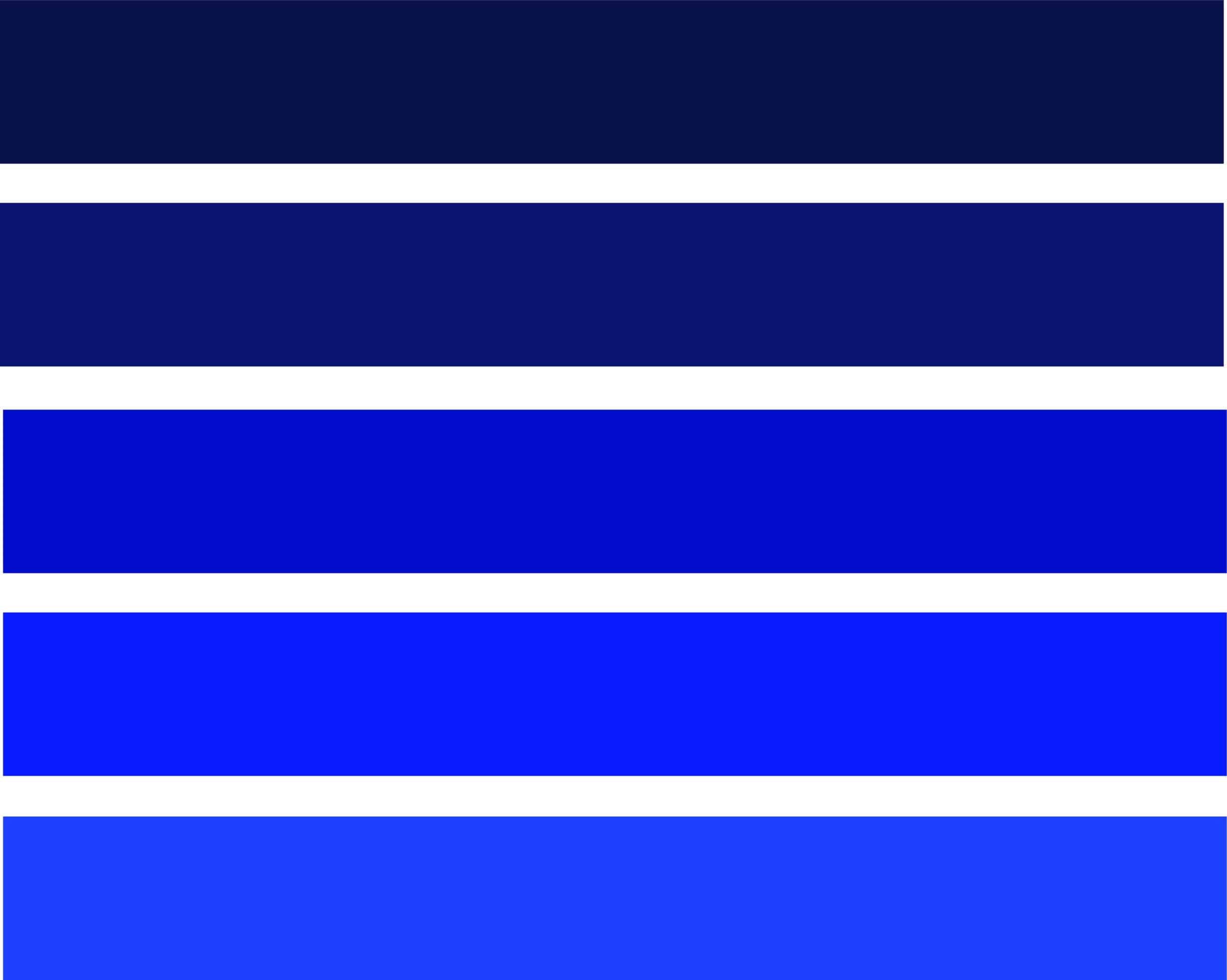
Electric blue
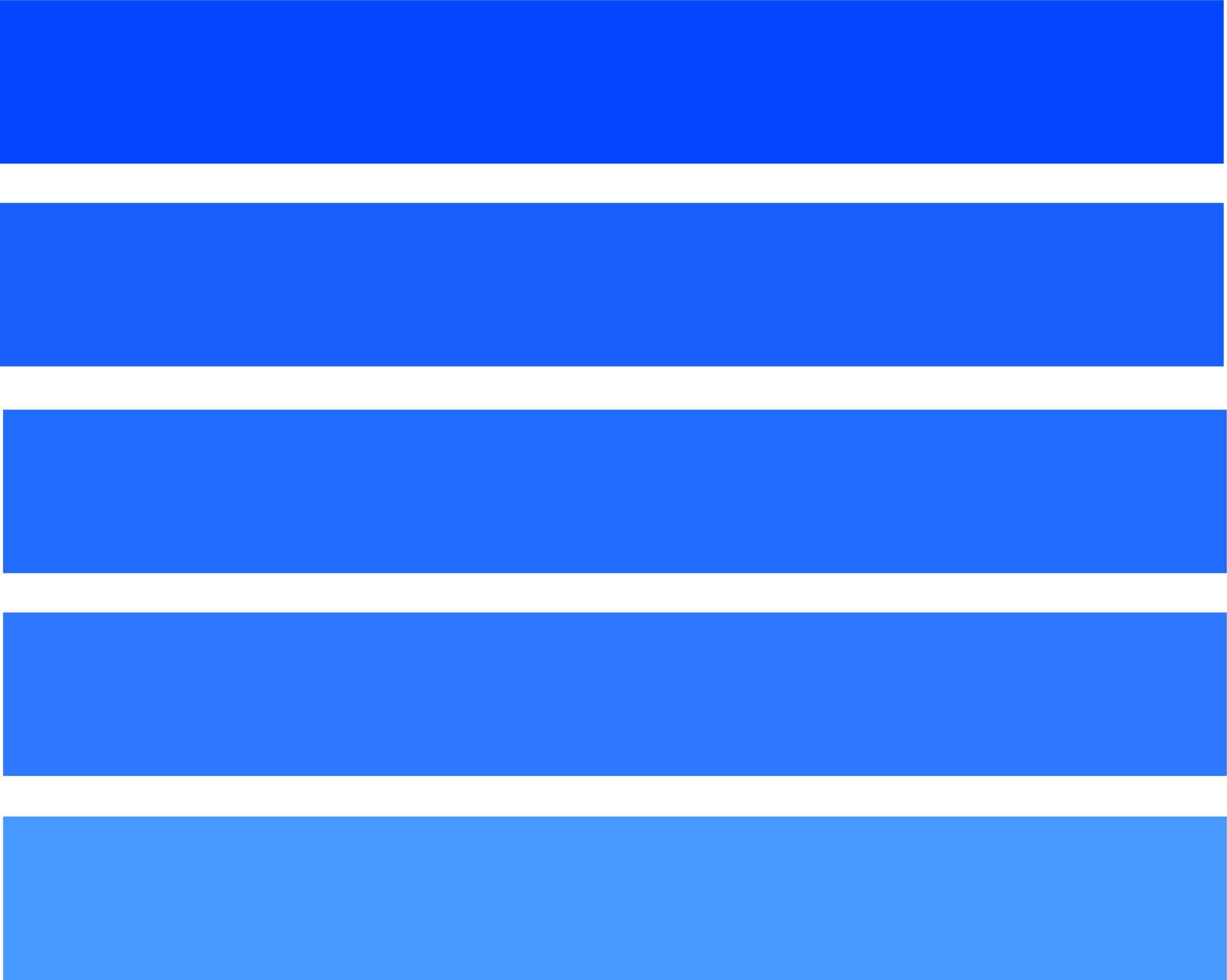
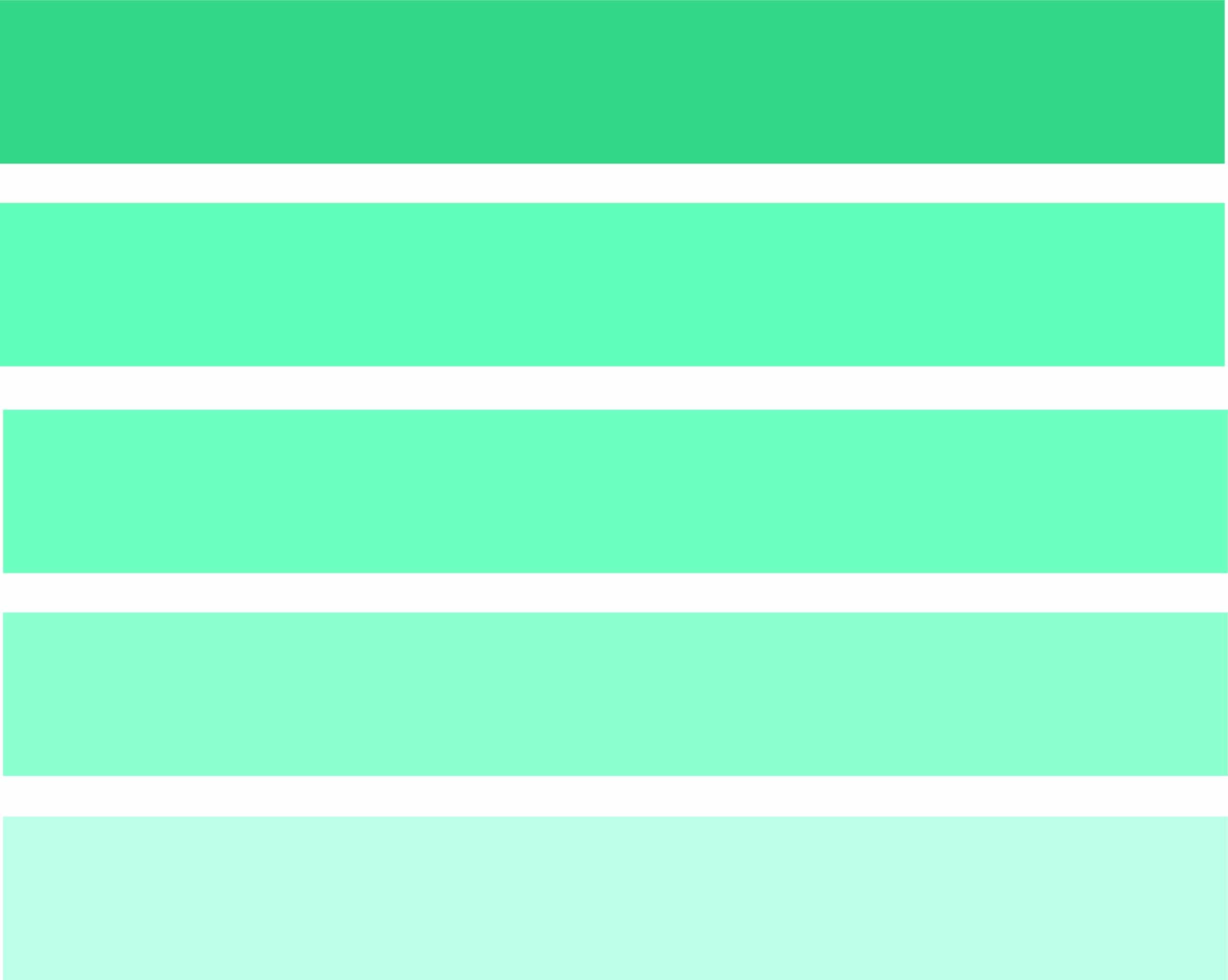
Color palette with combination of shades

Aqua Blue Palette
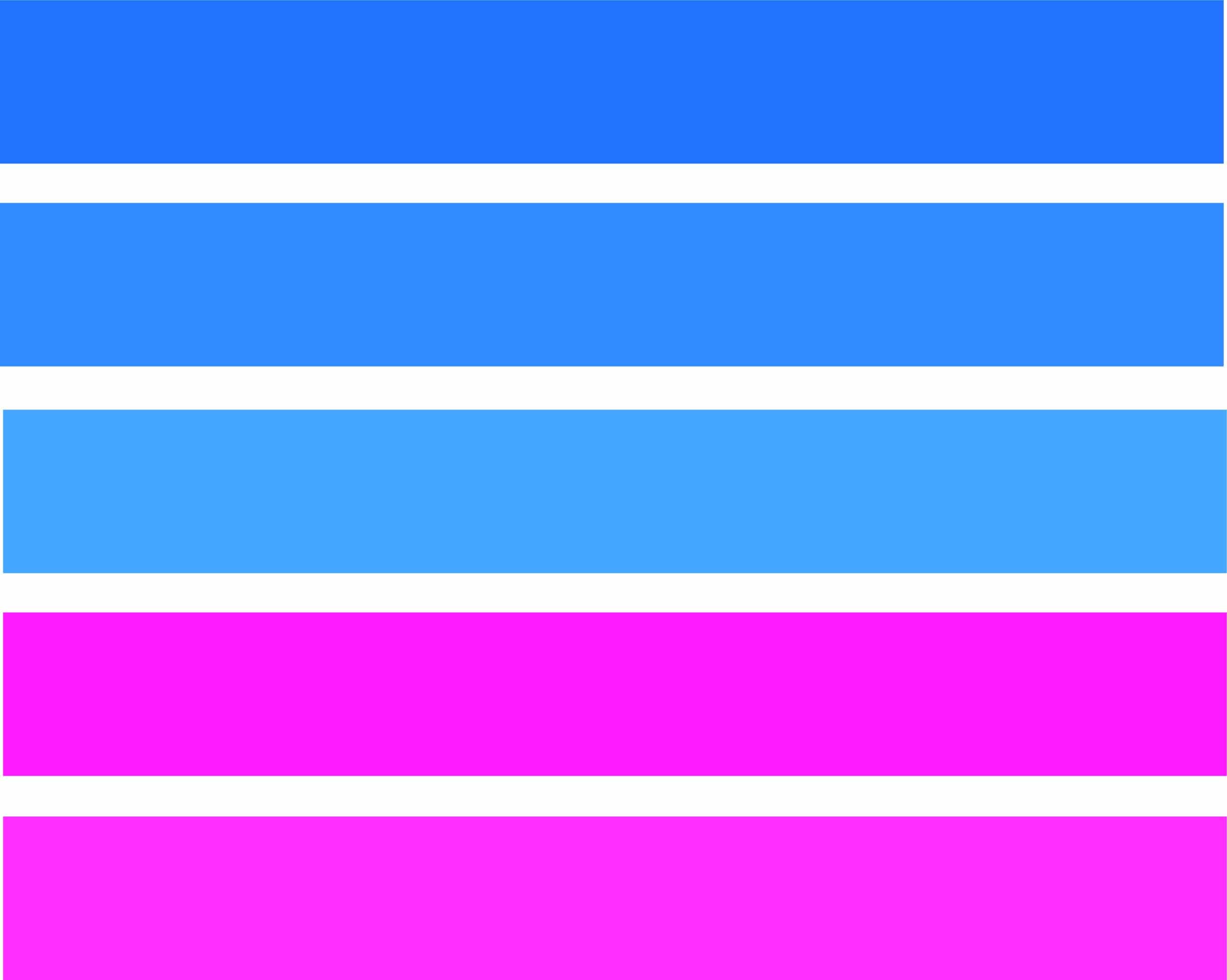
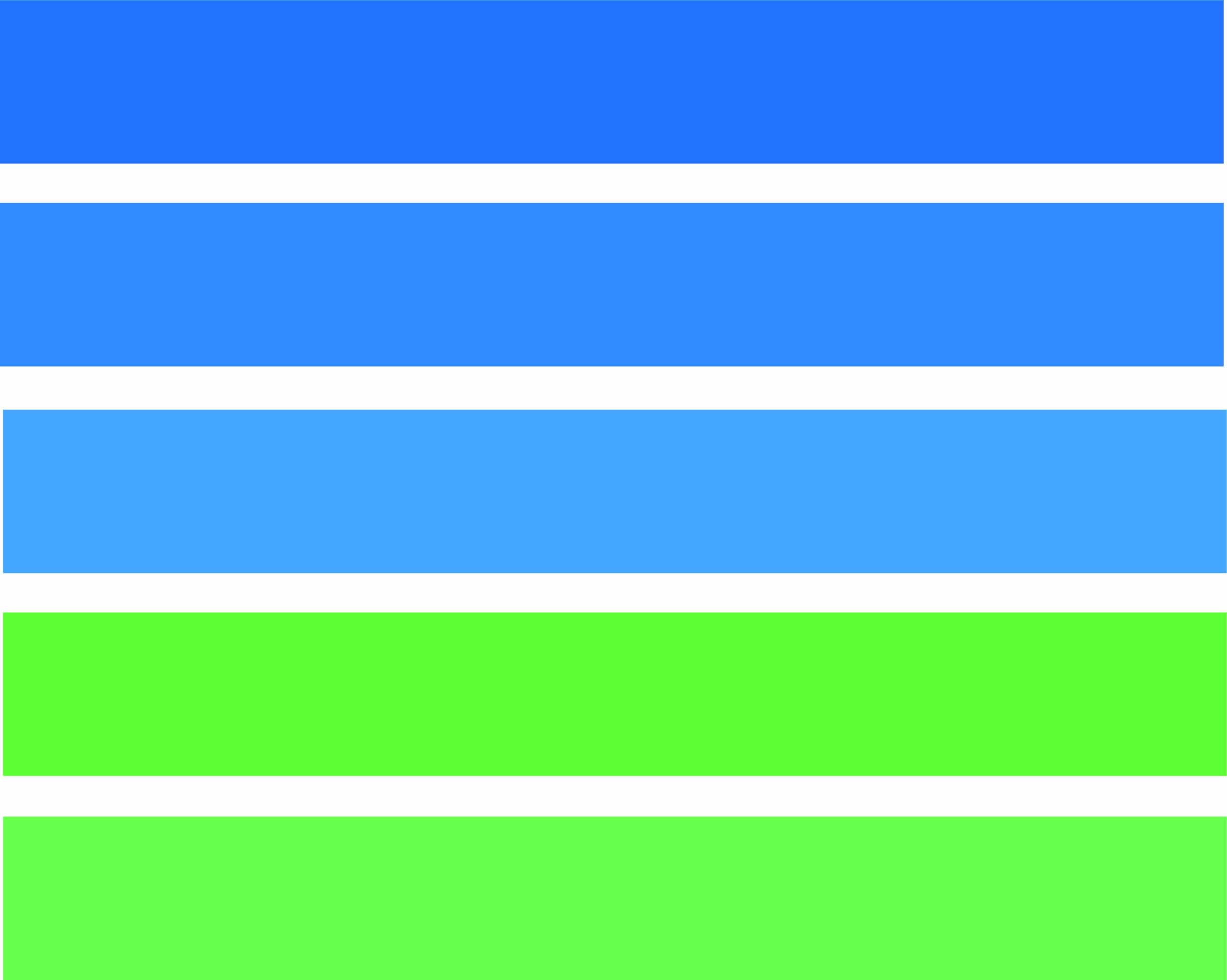
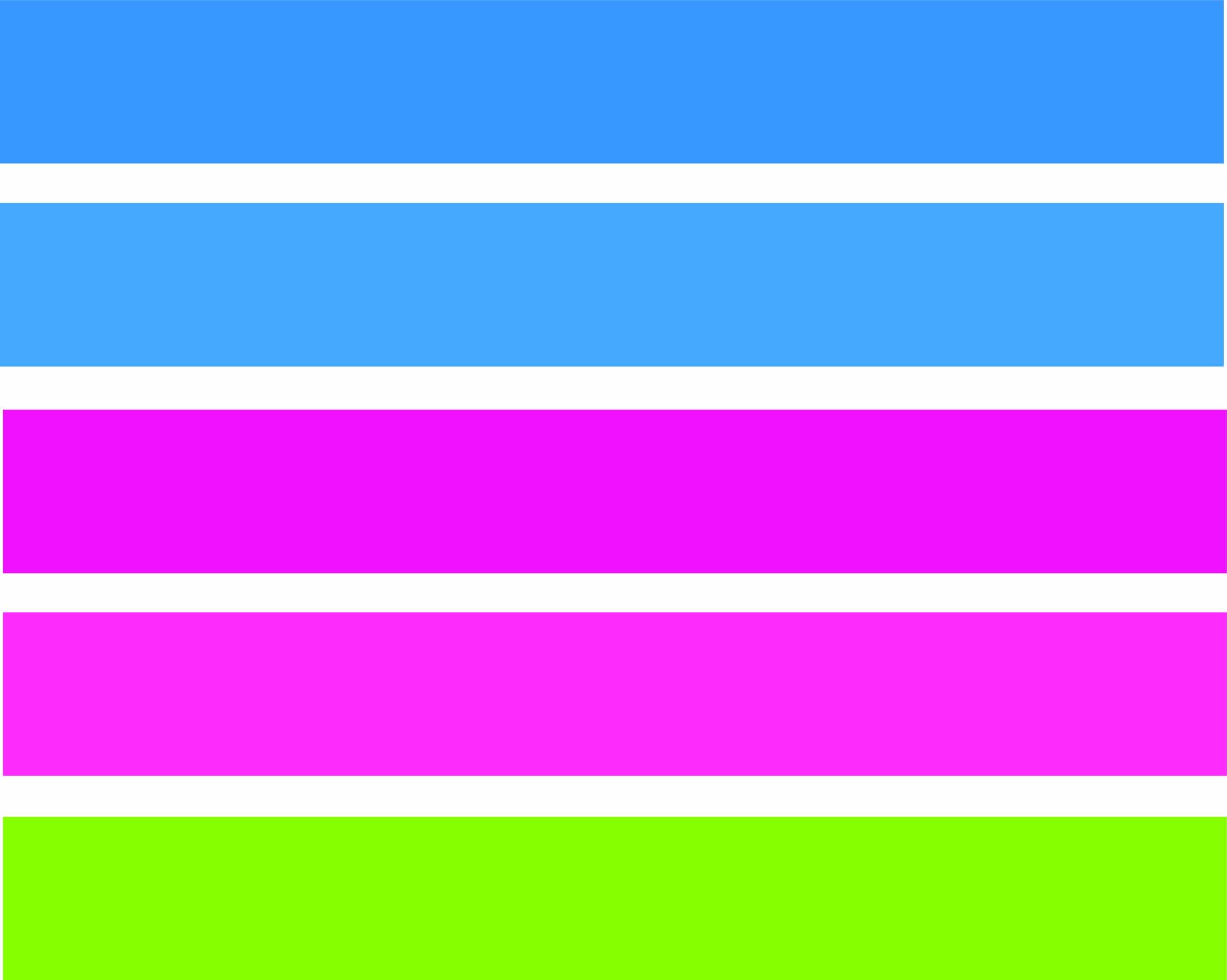
Apart from these monochrome ranges, we leave you below, some more examples of color ranges composed of both blue and other colors. Many of them achieve a very striking contrast that brings freshness and power to the design.
yellow and blue color
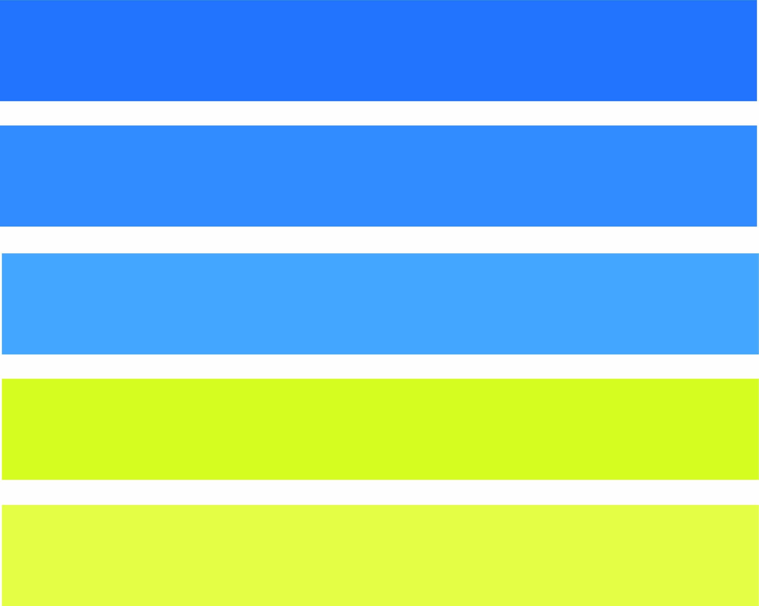
orange and blue color
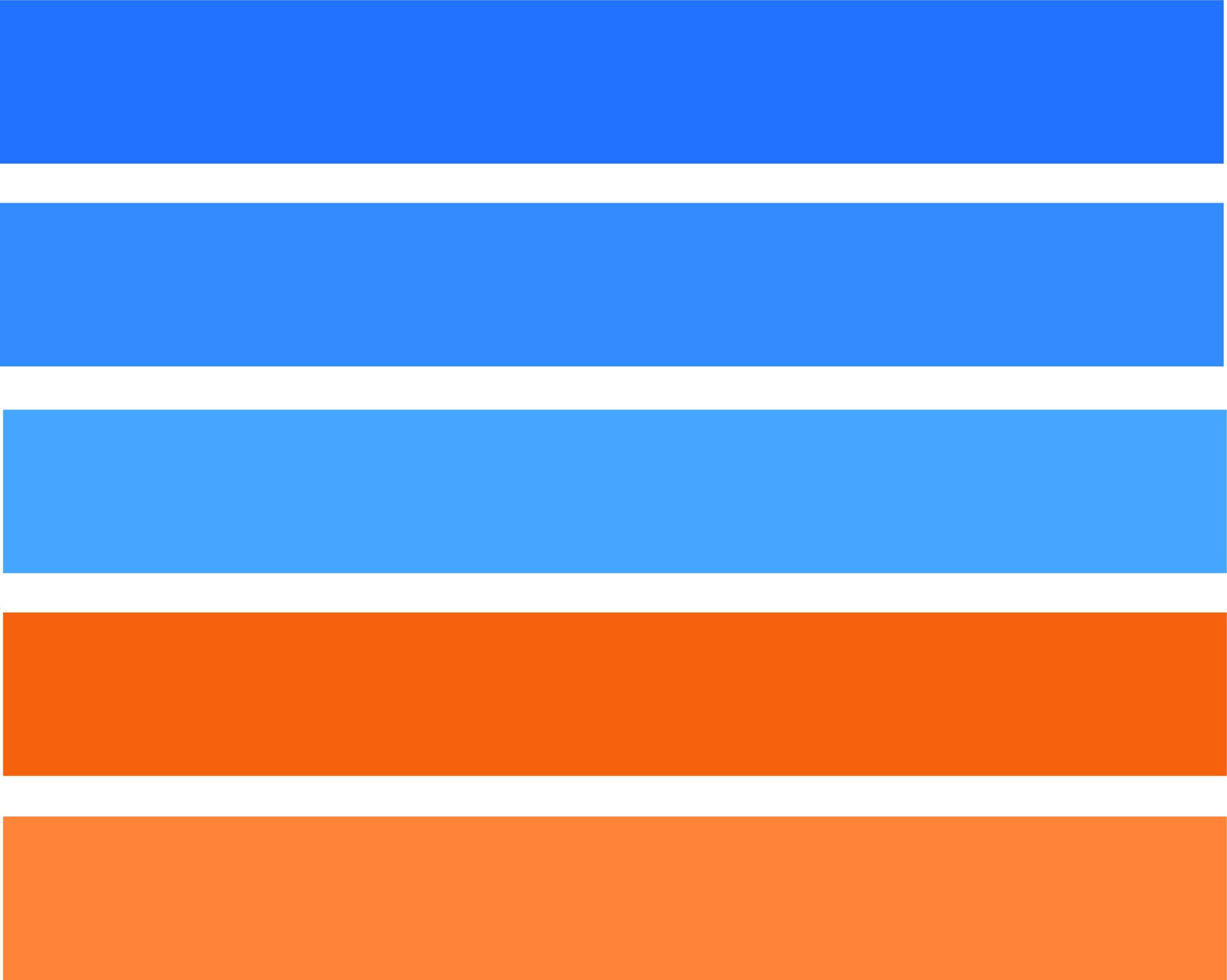
magenta and blue color
green and blue color
color triad
Design projects with shades of blue
In this last section, we have made a compilation of some of the most outstanding design projects in which blue color ranges are used. As you can see, we bring you as many projects with a monochromatic use of blue, as others in which more colors are played.
Asis Design Studio – Planet Runner
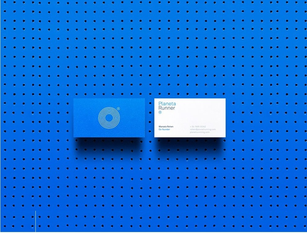
https://www.experimenta.es/
Studio Eduardo Aires – Identity for the city of Porto
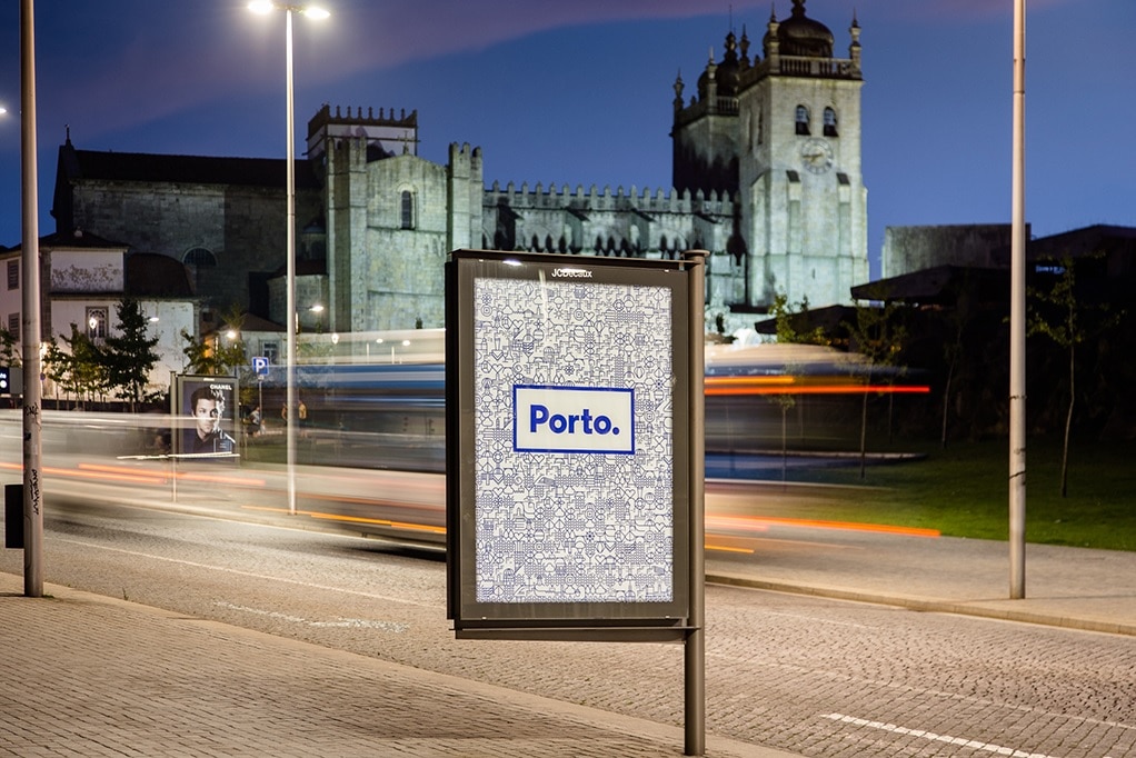
https://eduardoaires.com/studio/
Design agency Toormix – Identity Modacc
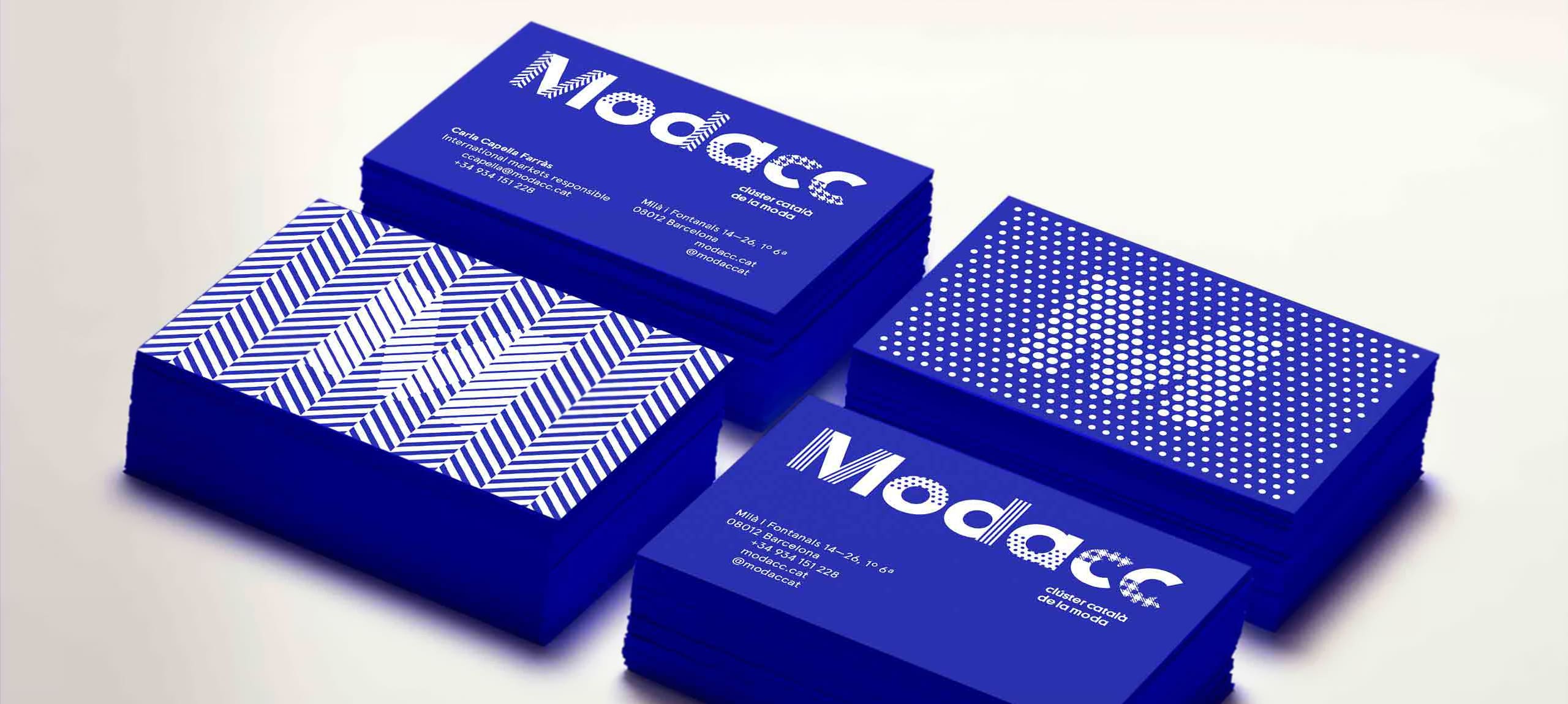
https://toormix.com/
In conclusion, as can be seen both in these designs and in others, the use of the color blue can give us very good results. The most important thing to remember is that you not only have to know the needs of the brands, but also what, as we said at the beginning, what each of the colors transmits.
We encourage you to experiment not only with the examples of color palettes that we have left you, but also to create your own until you achieve the desired goal. Also, remember to use colors that work with the brand you are working with, who that brand is with, what it seeks to convey, as well as its personality and philosophy.