
Source: YouTube
Car logos are characterized by their strength and sportiness. More and more car brands are committed to a safe, identifiable and unique design.
A logo, capable of differentiating itself from the rest with just one icon or symbol that fully represents some of the values that the company or brand offers its customers.
For this reason, we have come to talk to you about a brand in the automotive sector that is leading success and luxury wherever it goes, we talk about BMW and how a simple circular logo has managed to captivate the attention of an entire public and of many years of history and evolution.
BMW: what it is and characteristics
Source: Mr Creative
BMW, in your terminology, are the acronyms of a series of German words that mean Bayerische Motoren Werke AG. And it is neither more nor less than one of the most important and outstanding German car brands in the market.
It is not a simple brand, since BMW is listed as one of the most prestigious brands in the car market. So much so, that the vast majority of its vehicles are sporty and high-end.
This famous brand, started as headquarters in the city of Munich (Germany), and currently, it already has some more offices spread all over the world. So much so, that we can currently say that it is a brand that competes with other brands in the same sector and level, in this case, Audi or Mercedes-Benz.
Features
- We can add that BMW is not only patented as an automobile brand, but also participates as a main sponsor in many other sports. In this way, we can see how it is one of the brands that projects a serious and sporty character, compared to a series of sports that denote the same meaning.
- BMW already has the sale of electric cars. It is one of the brands that have also joined a radical environmental change in recent years, so it appears that we are also talking about a brand that is committed to sustainability and to offering a series of guidelines and improvements for our environment.
- As it is a high-end car brand, we can say that the prices or value of its vehicles include quite high values, since we are dealing with professional vehicles, and a high degree of engineering that goes beyond the automobile.
Evolution of the BMW logo
Fuente: YouTube
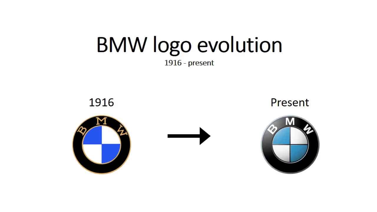
1913 – 1916
Source: ozAudi
The first BMW logo was made up of a kind of circular shape or medallion that received the name of Rapp Motorenwerke. Inside, there was a kind of black horse located in his profile, and that simulated the famous horse taken from a chessboard.
The medallion was quite thick and extensive, where the naming of the brand remained and where other elements were also shown, such as different white stripes and some stars.
1916 – 1933
Source: motorworld
The second logo already began to have the form that we know today. The same thick black circular frame was shown with a fine gold line that gave the brand design a lot of exclusivity.
The letters of the acronyms were already presented in a significant way on the brand, and they were designed with a sans serif typeface, which gave it a lot of personality.
The inner circle maintained the same graphic and chromatic line that we know today.
1963 – 1997
In 1963, the brand design was giving each time a much more innovative appearance. So much so, that the typography became sans serif, with a much clearer and more concise appearance than what was intended to communicate.
Therefore, it should be noted that it was possible to apply a much more balanced and modern aspect of the logo, typical of a logo of the time.
1970 – 1989
In 1970, BMW decided to design a kind of shiny badge, with the aim of reinforcing the brand and its design, in addition to the values that the company itself acquired as a whole. So much so that the mark was placed on a much larger circle, where they housed shades that managed to contrast very well with the corporate colors of the brand.
1997 – 2020
It may be the design that has been most projected in our minds to date. This design maintains all the innovative aspect of the BMW logo.
A logo where own shadows and highlights have already been applied a breakthrough in technology. It is certainly the most recent logo, but not the current one.
2020 - Present

Source: Economic Monitor
In 2020, BMW decides to incorporate a much more minimalist and current redesign. It redraws the logo in 3D, an aspect that gives it a rather futuristic design.
thick outlines, become finer contours, and they evade all exaggerated and ornate typography, to make way for a serious but demure typography.