
Surely on many occasions, you have spent hours searching among the thousands of fonts that exist, to find the one that best fit or the one that can work best for your project. And when you already have it, you apply it and it is not as you had imagined. This has happened to many of us. This is because the fonts we have selected do not express what you want to convey with your work.
The fonts, like the colors, also have a different personality and styles. Depending on which one is chosen, one message or another can be transmitted. Therefore, in this post We are going to talk to you about bold fonts, where you can use them and we will give you some typographic combinations that never fail.
What is the purpose of a bold font?

Fonts can also transmit sensations to us, therefore, it is essential knowing how to choose the most appropriate typography style to meet our needs in the works. Therefore, the first thing we should differentiate is what we want to convey, that is, seriousness, closeness, modernity, etc.
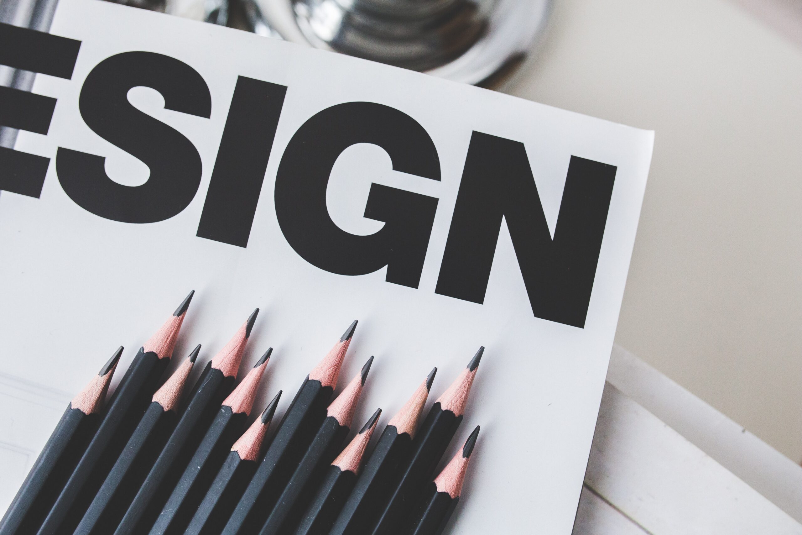
One of the trends in graphic design, is the use of bold fonts or also known as bold. This variant, within the characters, is the thickest and roundest, which is called regular.
In bold fonts, we find that their horizontal axis is thicker than the vertical axis which remains almost with the same. The strokes of the letters expand to the width, not the height.
As you may have seen on occasion, when downloading a font, not all of them have this weight variant, not all of them have bold. This variant, if you will find it, in fonts that are specific for reading texts with medium density or headlines, although on many occasions these rules are broken.
The term bold comes from the Anglo-Saxon world, but we already know that we really like a term in English, but it is the black of all life.
The success of bold typography
Thanks to the growth of lettering, it has led to the typography has become an indispensable element and this at its best. It does not mean that if you do not control the lettering technique you are not within this world, we also have a gap even if we work with pre-designed letters.
Another trend that has revolutionized the use of typography is the inclination towards more minimalist designs, since the fonts become the center of the compositions and of all eyes.
The bold type, the bigger they say the better, to draw the attention of the public. The typography, is the main element of logo designs, posters, web pages, brochures, etc.. any support. These are the well-known, typographic designs, designs where the font has all the prominence of the composition.
Bold typography, large or reduced size
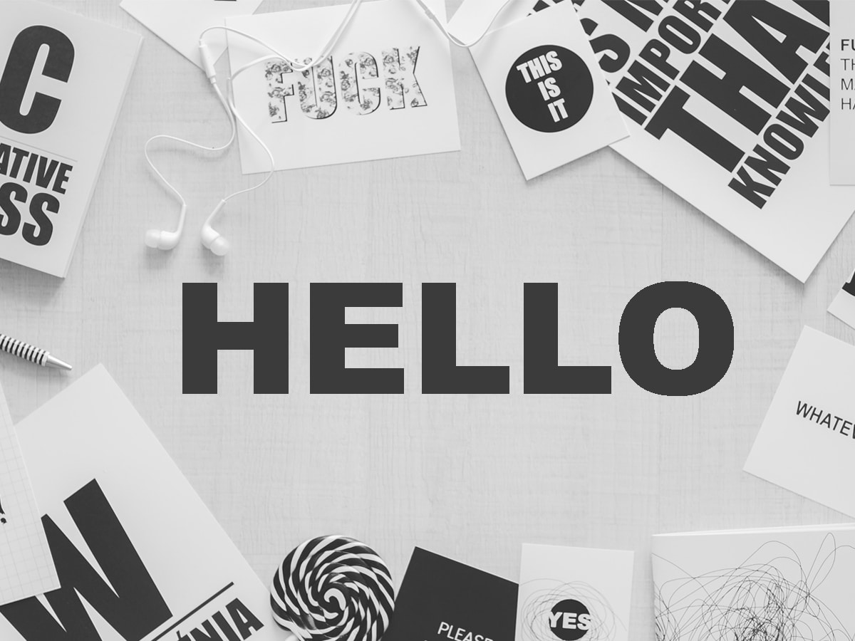
One of the trends that have been on the rise, is the use of typography in very large sizes, in order to give personality to the texts of the compositions and taking the prominence away from the surrounding elements. This leads to typography becoming the center of attention for the public.
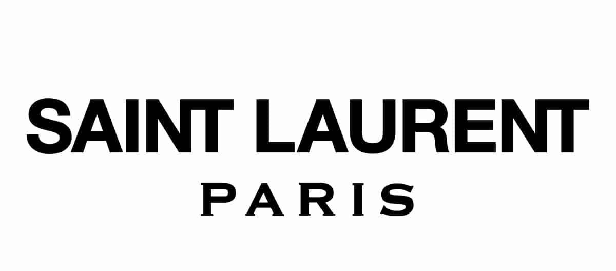
Not only can we see this technique in posters, brochures or flyers, it is also used in the creation of logos. Many brands want their message to be shouted from the rooftops, that your logo is not just one more for the public, that it stands out above all the competitors around you.
The use of bold typography, we can see it in countless supports used, as we have seen in posters, in logos, but also in web pages or even in promotional or event brochures.
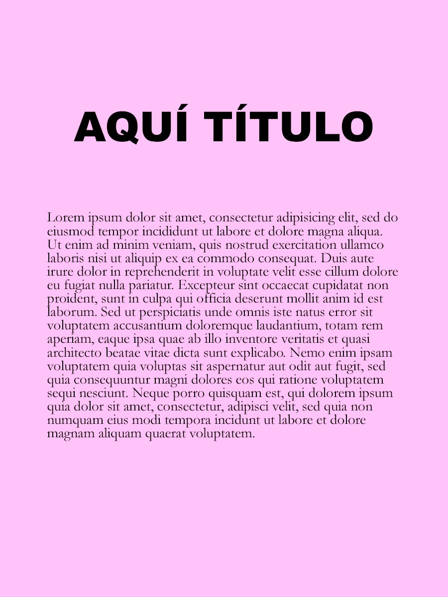
In web page design, the use of text is informative, which makes it a fundamental aspect of design. When making a web page, it must be clear that the The text must be brief and direct, in addition to being legible when reading.
Some designers, both graphic and web, associate legibility of texts with bold typography and in large sizes, everything above 20 points. With this, nothing will be left without being seen or read.
Typographic combinations you should know
If you are already one step closer to joining this trend of bold typography, but you are not very clear about the typographic choice, do not worry, we are going to give you some typography combinations to succeed in your designs, and you will no longer have an excuse not to turn to the dark side.
It is impossible to talk about graphic design without talking about typographic combinations. And it is that, typography has the power to elevate a design or sink it completely. As we know that it is not easy to find, on many occasions, winning combinations of fonts, we bring you a few to give you a hand, it is your own decision where to use the bold font.
Helvetica Neue and Garamond
We started with a great classic, but that is one of the font combinations that work best, you will always hit the nail on the head. It is not very original, but on many occasions you have to play it safe. In this case we suggest using Helvetica Neue for the titles and Garamond for the text block.
Trade Gothic and Sabon
One of the fonts that is a safe bet is Trade Gothic and if you make a combination with a serif typeface like Sabon, perfect combination. In this case we suggest you do the opposite of the previous section. Typography with serifs, Sabon, for the title, and sans-serif for the following text.
Courier and Montserrat
As we have discussed in another of our posts, there are many lovers of typewriter typography, and it is a total trend. This typography style, combined with the Montserrat, guaranteed success.
Baskerville and Akzidenz Grotesk

Winning combination, whichever way you look. Serif typeface like Baskerville, along with sans-serif typeface like Akzidenz Grotesk, perfect contrast. A combination that you can use as you see fit, in our case we would use serif for the titles, and sans-serif for the text.
We will have stopped one hundred percent combinations, thousands of combinations with fonts in their bold version, to break with what is established and give a new look to the designs.
From here we invite you to immerse yourself in this dark world, and start creating works that scream from the rooftops with the use of bold fonts.