
Bootstrap is a CSS framework that has become very popular throughout the network. Their styles responsive are seen on social networks Tuenti y Twitter. The use of this saves us a lot of time when developing a web application since it saves us all the work and effort involved in creating a clean page style suitable for all devices. Consulting the styles used in this framework, we will realize that they are familiar to us, since today many websites have implemented it.
The structure
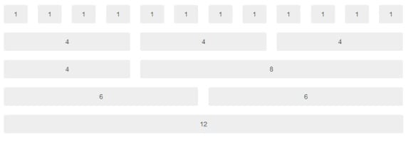
Bootstrap Fluid Structure
For our website to be accessible from mobiles and tablets we will have to use the fluid structure that Bootstrap offers us. The use of this structure is very simple, everything is based on elements chip that will help us layout our web design. Later, when we access this design from a smartphone o tablets, this will automatically adapt to that device, considerably improving the quality of navigation. We will use the chip with classes in logical divisions within the fluid structure, i.e .:
<div class="row-fluid">
   <div class="span2">Contenido</div>
</div>
Where the number 2 represents the size of the span. Each row contains enough space for 12 spans of size 1, or 2 of size 6, this can be distributed as you like. Once the space of a row is exceeded, it will go down to the next automatically, allowing us to use a chip size 12 to create a line break. If we wanted to skip some chip when creating one, that is, start from 4 chip, and apply a size of 3, we would use this code:
<div class="span2 offset4">Contenido</div>
This allows the division to jump four spans before displaying the content. We can use this at our free will, skipping what we want with our code.
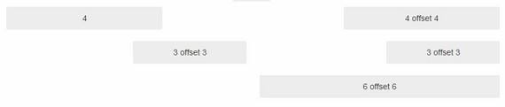
Skipping spans with the offset class
Different design for each device

CSS classes to differentiate each device
To apply a different design for each type of device, we will tell each logical division for which device it is oriented, using the following classes:
In this way, we can show a totally different design for each device with the same URL.
Buttons

List of buttons offered by Bootstrap
Bootstrap offers us a clean repertoire of colored buttons, its use is very simple:
<a class="btn btn-success" href="URL">
   Nombre del Botón
</a>
Where btn btn-success refers to the color of the button, to change it, we will only have to replace it with the classes shown in the previous image.
Installing Bootstrap
For the installation of this CSS framework, we will download the zip from the link that I will leave at the end of the post, and we will write the following code in the head of our HTML file.
<meta name="viewport" content="width=device-width, initial-scale=1.0" />
<link href="./css/bootstrap.css" rel="stylesheet" type="text/css" />
<link href="./css/bootstrap-responsive.css" rel="stylesheet" type="text/css" />
<script type="text/javascript" src="./js/bootstrap.js"></script>
<script type="text/javascript" src="./js/bootstrap.min.js"></script>
Once we have made sure that the CSS and JS files are in the same folder as our HTML file, we can start designing our responsive website.
More information - Form Validation
Download - Bootstrap: CSS Framework
Do not have more tutorials on this framework ???