
There is no doubt that a good presence for a company, brand or product is very important. If not, let them tell the many brand image examples that stand out for being successful. Not only do you manage to capture the attention of whoever sees it, but it also allows it to be remembered and identified. Therefore, when you create a brand, you know that you have to put a lot of effort into finding that image that characterizes you and that really captivates.
But it is not easy. And we have thought of bringing you a compilation of brand image examples so that you can inspire and see those aspects that are usually successful. In fact, the vast majority of these examples will sound familiar to you. Are we going to give you ideas?
foursquare
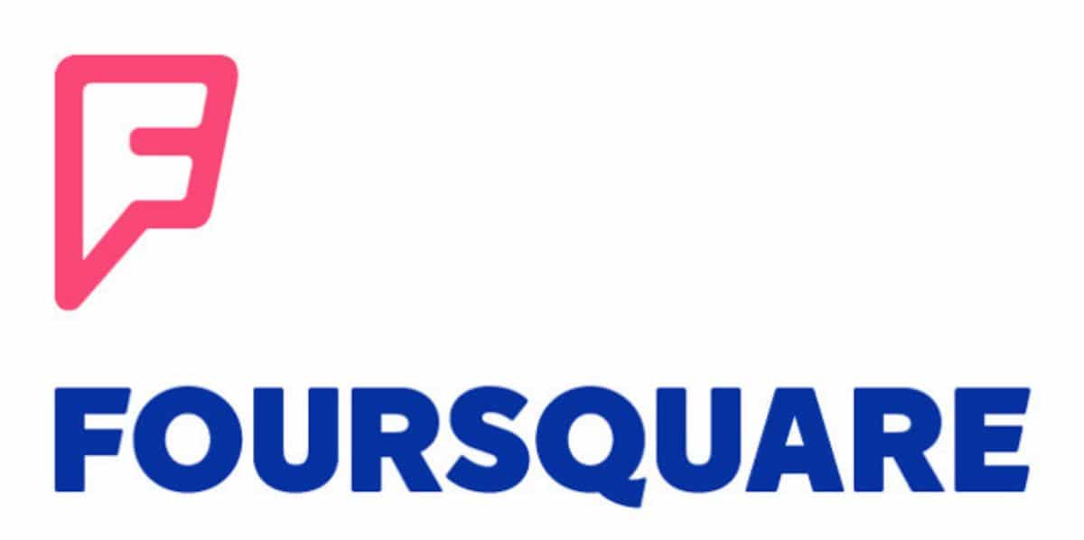
This brand is well known, especially by users looking for a site based on where they are. It is a very useful application and web for businesses and stores since they allow them to enter their data so that they can be listed.
But what interests us the most is the brand image, which, as you can see, is very simple. So much that it is simply the letter "F" that you use as the application icon. However, it has an unusual shape, but if you look a little more, you will see that it is not only an F, but it can also be a "pin" on the map, or the emblem of a superhero. Or what many users say, which looks like a speech bubble.
For this reason he has captivated so many.
Apple Lossless Audio CODEC (ALAC),
When Apple was looking for a brand image, it would most likely want there to be a connection with consumers. In fact, his idea was to make those who wear his product think that "our products make you special." And this still endures.
Therefore, the image of the bitten apple was all it took to create it. In addition, this has been able to vary to monochrome, metallic, colors of inspiration and are creative and original, etc.
Ikea
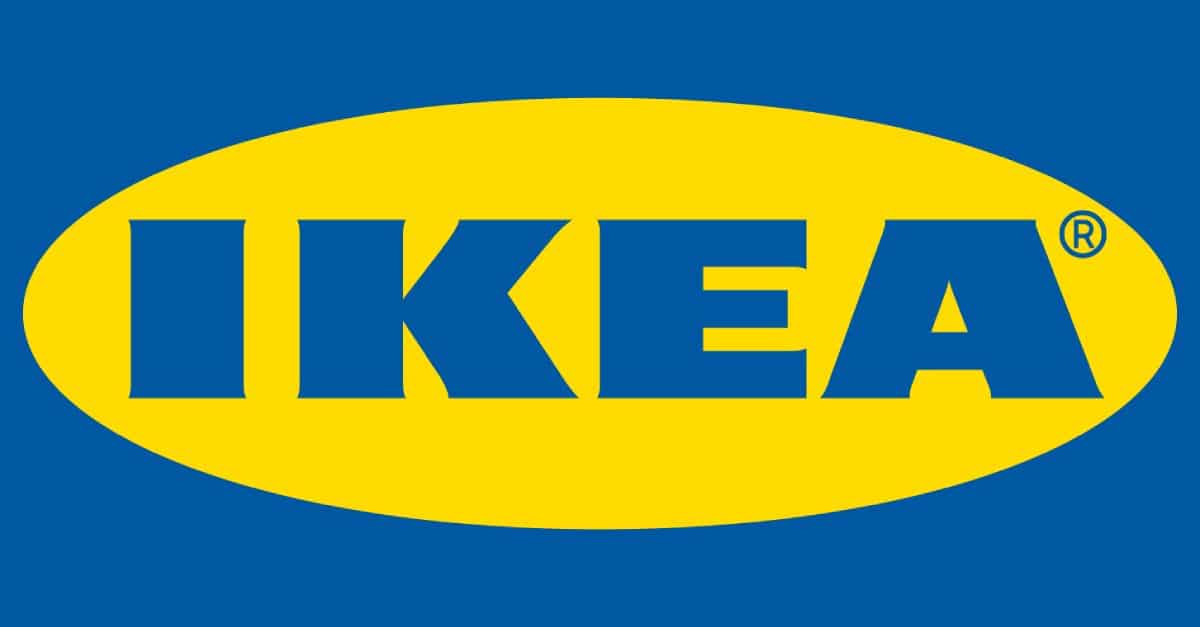
Without a doubt, this company had to be one of the examples of brand image. It is a image that sought to combine colors. And, if you look at it, it has a background in blue, another in yellow (an oval) and finally the letters also in blue. A mixture that has been quite successful and that everyone identifies with the furniture store.
Of course, the success came not only because of that brand image, but also because of the advertising it created, and the products it sells.
Nintendo
Does the image of Nintendo come to you now? It's about a rectangle in which they placed the brand name. No more. If you are a fan you will know that the name is due to three kanjis, "nin", "ten", "do" that mean "Heaven blesses hard work".
And in this case, the brand image wanted to show everything through typography, very simple but at the same time easy to identify from others.
Mercadona

Not only Mercadona, but also its two private brands, Hacendado and Deliplus. When you pick up a Mercadona product, you can easily identify if they are white label or not simply by looking at the label. So what they just play with the typography.
As for the corporate image, it is known anywhere in Spain. Its logo is easy to identify and does not lead to misunderstandings.
Disney
Another of the brands that use just the words to create an effective brand identity. In fact, if you see that typeface in other words, the first thing that comes to mind is Disney, so they did it pretty well.
In addition, it has an even greater achievement, and that is that in 100 years it has continued with the same brand image without hardly having to change it.
Mailchimp
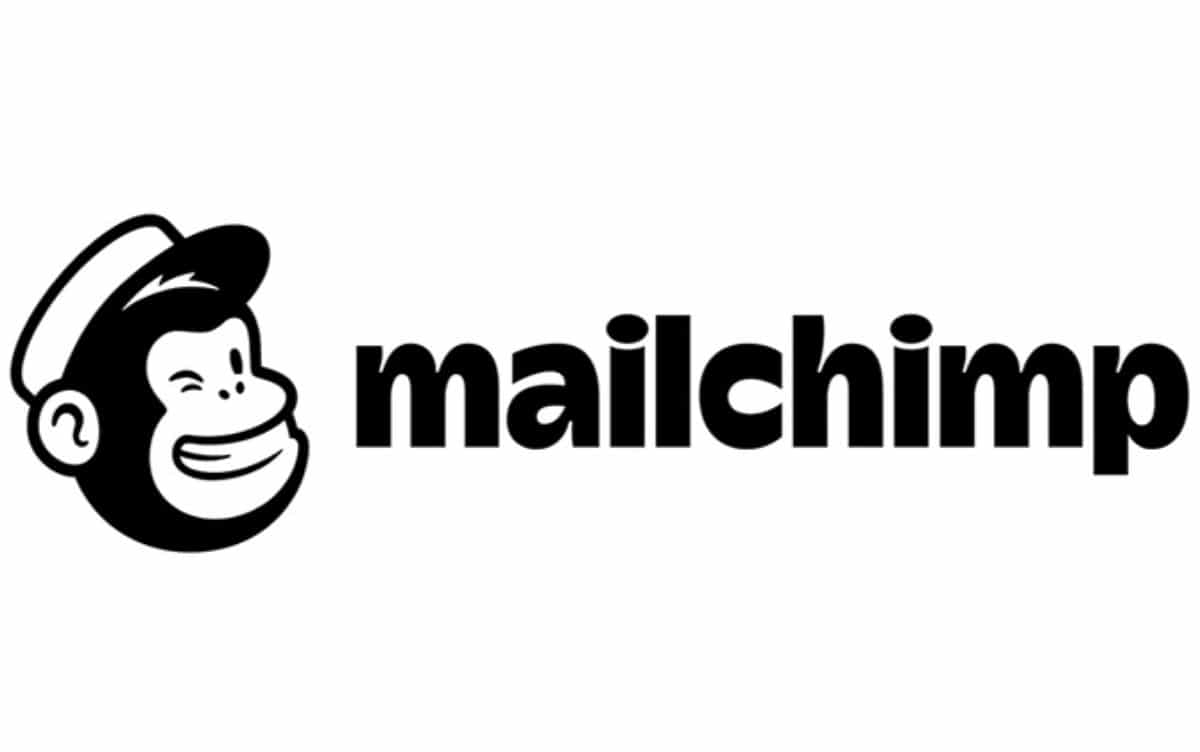
If you are an entrepreneur and you have an online store, or you have a website with subscribers to whom you send emails from time to time, surely you use Mailchimp as an email marketing tool. It is one of the most used.
Well, the corporate image of this company is that of a little monkey with a hat (as if it were a mechanic) and the name of the brand, Mailchimp. Cash.
Right now the logo has undergone a small change since, although before it was the image of the monkey in light blue and the word as if it were written by hand, now it is with a yellow background and, in contrast, the silhouette of the monkey and the word in bold, focused on the technological and geometric.
MUDEC
Can you imagine a brand image that will change every two by three? It would be all chaos. Except in the case of MUDEC.
We are referring to Milan Museum of Cultures which, since it opened, has become one of the most important.
Among the examples of brand image, this is perhaps the most dynamic that we can show you and it is never the same. We explain ourselves. The main image is a capital M with "little arms" on either side. But then it changes. In other words, it has a fixed element, which is that "M", but the finish changes from time to time.
What did they want to achieve with it? Well, that the corporate image was "alive", that people identified it with the Museum (by the M) but at the same time they were curious about the new design, which almost always goes to any of the collections or exhibitions that are found. inside.
Nike
Of Nike we must comment that it was not a company that got it right first. And is that the first logo and brand image was not the most successful (the logo was an overlapping BRS). However, since 1971 the image has continued with the same logo that has evolved.
Before, they needed to identify that arch with the word Nike but, since 1995, the word Nike has disappeared from their brand image because it was no longer necessary to identify it. Everyone knows that a bow in that certain shape indicates the Nike brand.
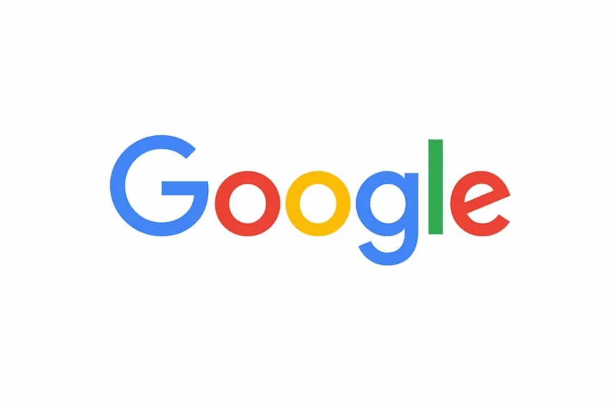
Another example of brand image is Google. Over the years it has maintained that colorful in his letters, and he has taken advantage of. It is true that at the beginning it was a bit sinful, because you didn't see a very "worked" logo. But the truth is that with the evolutions that it has undergone, it has ended up being a world reference in cases of success with brand identity.
Now, any product that comes out is known to be theirs because of the color red, yellow, green and blue.
There are many more examples of brand image that you should consider, but it would be endless. Can you think of a more important one?