
The brand manual is located in the creation of the corporate identity, the set of characteristics, values and beliefs that surround a product, company or service. It helps us to differentiate ourselves from the competition, to create a firm skeleton of our identity, to be unique and to stand out in a positive way. It is the discipline that arises from research, the planning of a strategy and the design of the elements.
When creating a brand or logo we must take into account all aspects, that is, all its applications so that everything has coherence between them. To achieve this it is essential that as a company you create a brand manual, a document that specifies all those details that must be taken into account when using the graphic concepts. In short, explain how the brand should be used.
What content do we find in a brand manual?
The sections of a brand manual may vary depending on the type of company or service to which we are dedicated. We must bear in mind that each company has different needs and therefore, the applications can cover different media or supports.
The logotype
To begin with, the most prominent element that gives us more personality is the logo. We must mark the respect area, we refer to the spaces between the elements, defines the minimum space allowed around the logo. No other elements should be applied within this zone. This guarantees correct application and legibility of our brand.
In this section we can specify other applications such as the combination of the different variants of our logo, the minimum size of reproduction in different formats, the different versions of the logo, among others.
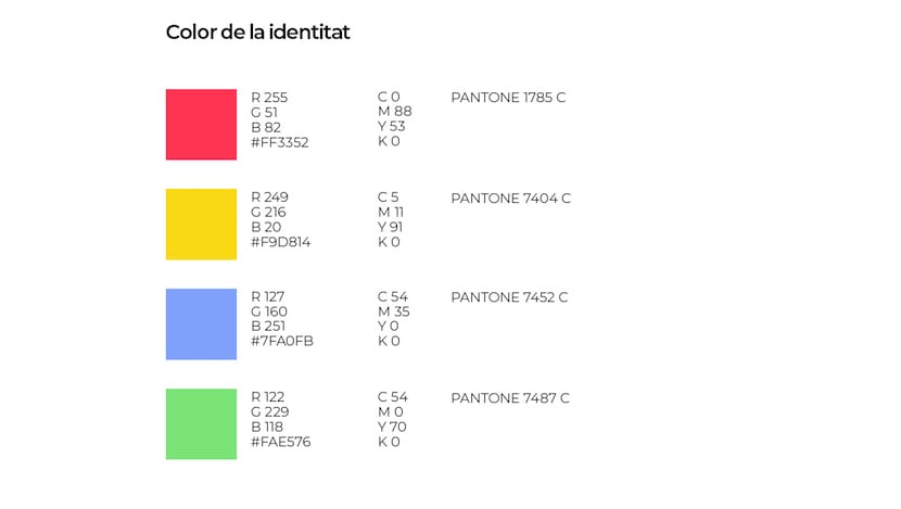
Colors
Define the main colors that will represent our brand is essential to create an identity in the mind of the user. The color palette can be applied in different ways depending on the support in which we want to apply it, we must define it in the manual clearly. To ensure that the colors will always be the same we must indicate the color with the walls CMYK, RGB and web.
On the other hand, we must do the same with secondary colours and outstanding. For example, we can define that the gray color will be used for reading base texts, to divide columns into tables.
To ensure that both the printed and digital media use the same color, a table can be created indicating the CMYK (printed) and RGB (digital) values as a summary.
Color typology
To understand in a technical way the different color typologies, we will divide them into four typologies:
First of all we find the PantoneSurely you have heard of them since they are the most used colors. It's about a color catalog. By choosing a specific pantone, you make sure that when you take a project to print, the screen color is the same as on paper.
Second, we talk about CMYKThese initials correspond to the colors that printers use to get the rest of the colors. This combination is made up of cyan (blue), magenta, yellow and black. The acronyms correspond to the words in English. The colors in CMYK are not exactly the same, as it will depend on the calibration of each printer.
We continue with the display colors, LLAMADA RGB, formed by the combination of red, green and blue. We will use it for all those digital supports.
In conclusion, HTML It is a code consisting of six figures and letters that are used to determine the colors in web design.
Typography
One mistake that we must avoid is not marking a font according to our brand. It is important to always use the same font family to comunicate. In addition, we must take into account the different weights, that is, if we will use bold (bold), regular or light (fine).
Each typeface gives us different characteristics, if we want to convey modernity, innovation we will opt for a sans serif (without serif), we can use google fonts to inspire us in the choice.
Do not forget to specify font sizes and line spacing according to the format. We can create tables with the necessary information for each format. In addition, we must take into account what color our texts will appear. One idea is to divide the texts according to their importance:
- Titles.
- Subtitle.
- Texts.
- Texts referring to graphics or captions.
Base grid
The base grids are a help to position elements in an orderly manner, that is, positioning each element in a coherent way in space. It also allows us flexibility in the distribution of compositions. The goal is to give a uniform appearance.
The base grid is based on the spacing of the body text line, marking the distance between the texts. The base grid must be modified depending on the formats to which we want to apply, it will not be the same in a large format such as an A2 than in an A4.
Images
We must mark the visual values of the brand to ensure consistency in the images. We can define the characteristics that we want to represent, for example, we can define that we want to represent situations of everyday life, realistic and authentic. Using middle-class people, families, smiling, nice-looking people.
Found two parameters to define:
- Visual language is what defines the content of the images
- The style of the image defines the formal criteria that the image must meet. In this section we include light, color or perspective.
To be even more meticulous, the possibility of making a list with the photographic style is considered, indicating the tone, the color palette, the use of the backgrounds. Attaching sample images is a good resource to avoid doubts.
Pictograms
Pictograms are symbols or image icons that represent information in a simple and graphic way. They should be as clear as possible and not depend on language. Choosing to have a catalog of pictograms is useful to always have them at hand, in addition to ensuring that we maintain a graphic line.
Supports and applications
Standardizing the different supports that are used most often within the daily activity of the company will reinforce our brand identity. We leave you with some examples to consider:
- A4 letter paper
- Business card
- About American
- Folder
- Accreditation
- Stock Exchange
- Receipts
- Flyer / Poster
- roll up
- PPT (Presentations)
- Banner
In short, the type of company defines the needs of the brand manual. As we expand, we will surely need to expand the graphical parameters and therefore, the manual will have to go renewingat least annually.