
Source: The net net
There are many companies and restaurant chains that opt for a change in their image. Many times, this change is made in different time lines, as much as necessary, so that it denotes a most innovative and current aspect, typical of the time in which we find ourselves.
For this reason, the most famous restaurant chain in history, Burger King, also chose to change its image at the end of 2021, with the aim of continuing to transmit an image and values of the brand, to its customers and as high value it has in the brand market.
In this post, We will talk about this new logo that has revolutionized the internet so much in recent years. We will also talk about its characteristics and about the values that the company represents.
Burger King: what is it
Source: Pinterest
Burger King is an American fast food restaurant chain. It is considered one of the most important chains in the entire sector, contributing to a high number of triggering annual sales. Currently, the restaurant chain has reached up to 100 countries, and has reached a number of 15.000 sales worldwide.
It is a company that was founded in the state of Florida, when two American relatives decided to start a business where they cooked hamburgers. Later what appeared to be a small town local, was filled with tourists and customers from all the surrounding states, and that's how the restaurant grew little by littleuntil it became what it is today.
The naming of the company also went through many changes, as it grew, the company took up different names that cataloged it according to its position in the market and its value, until it was renamed Burger King.
Features
Fuente: YouTube
- Currently, Burger King is not only dedicated to the manufacture of hamburgers, but also has ice cream and accessories on its menus.
- Burger King has generated so many sales that one of its main motives is to eat food at an affordable price. Although it is true, it competes with McDonald's, another of the most important restaurant chains. From what is expected of its price, it is lower than Burger King, but currently the difference is barely small, so we can find very similar prices. What changes the most is the quality of its products, with Burger King winning in this situation.
The new Burger King logo: features
Source: 1000 marks
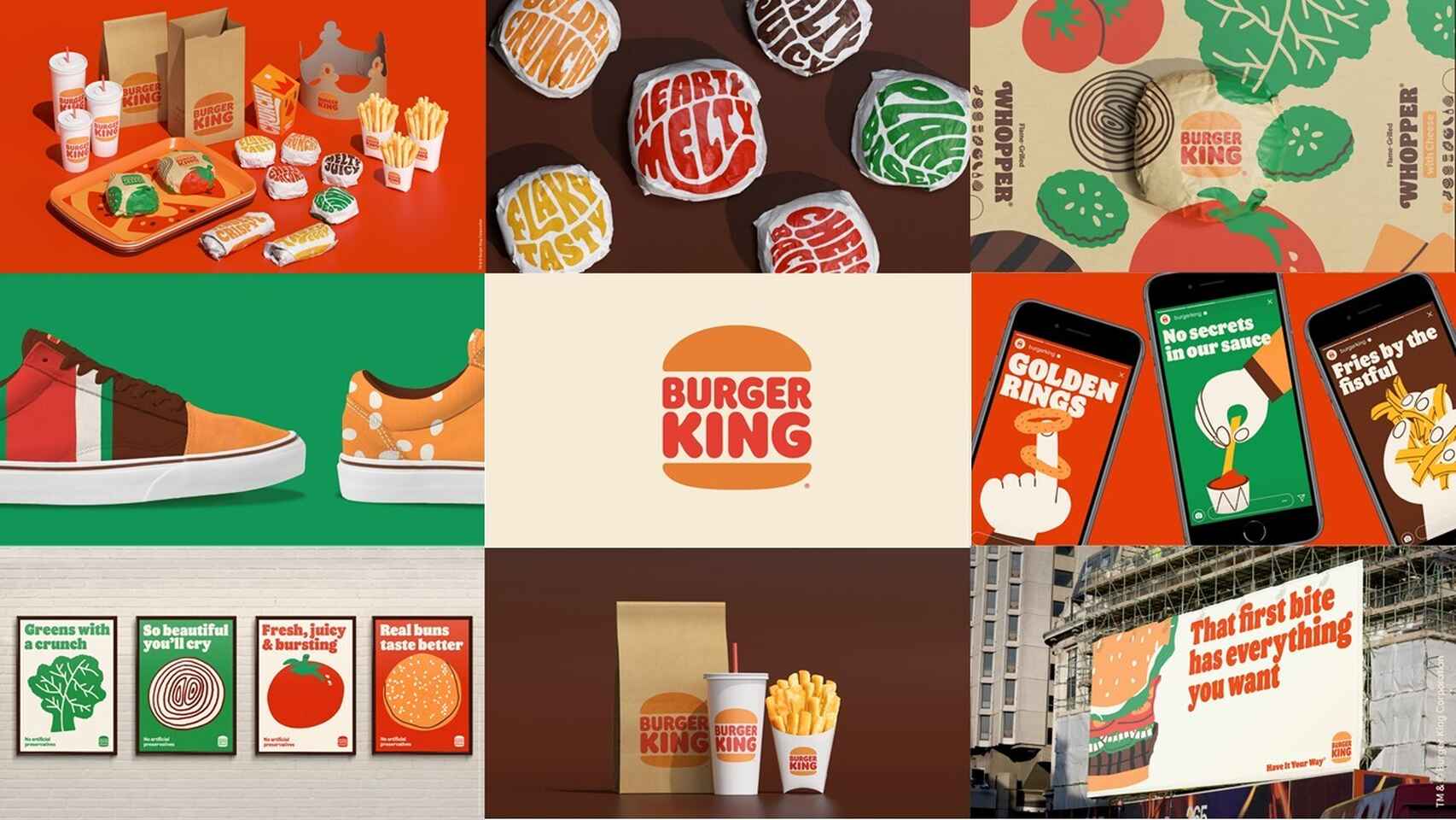
The new Burger King logo was designed on January 8, 2021, it was released on each and every one of its digital platforms, in this way, it managed to achieve a great impact among its public and customers. The new design is mainly characterized by being somewhat more visual than the previous ones.. In this way, this logo represents the values of the brand in its entirety, leaving aside the aesthetics that we were accustomed and accustomed to seeing on the logo.
Not only has it managed to attract thanks to the change in its image, but the designers dared to use more intense and striking colors, in this way, they managed to make the logo focus solely on your own image, and that the client followed with his eyes each of the connotative and denotative features of the brand's design.
The main objective of the renewal of the logo was nothing more than the intention to modernize and give a change to the image of the company, and to its values as a brand, for this reason, they managed to create a design capable of focusing all their attention on the , without a doubt.
Features
Source: Seville Newspaper
The logo focuses on its most innovative and modern image, thus ignoring the famous 1999 logo, with which Burger King embarked on the adventure, and once again managed to capture the public's attention. This time, andhe designer has opted for a much more minimalist design, thus omitting all the details that are not important for the company's image, and giving prominence to a round typeface that shows some of the connotations and values, especially of the product that represents the brand, the hamburgers.
As for the colors, it stands out that they have managed to capture attention with bright and striking tones, this is the case of orange or red and brown, inspired by the moment in which the hamburger touches the grill and magic is created. Some colors that undoubtedly move away from the red and blue tones that the previous logo shared, giving prominence to the only two that have played the most during the course of its image as a brand. Without a doubt, a success in the color palette they have created.