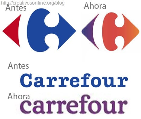
A while ago I was watching TV and in one of the endless series of ads, I saw an ad that caught my attention, not because of its content, but because of the cultural, that had occurred in his logo.
The ad itself was from Carrofour supermarkets, I have come to the computer and I have started looking for information on the subject, but I have not found anything, so I went to its Official Site and there I have only found the change made in a thumbnail of their catalogs and in the aforementioned pdf catalog that I have opened to get to make the image above comparing both logos and fonts.
At the moment the change is not made on the web and can only be seen on television commercials.
These changes consist in a rounding of shapes in the logo of which we already speak here of its hidden message and also in its typography which looks somewhat taller and more rounded now and they use the lowercase "c" instead of the uppercase like before. The most striking change is that of color, since they have gone from red and blue to purple and orange, a combination that is in trend this year.
Now I need to visit a Carrefour center to see the change in their posters, in their lights and in the labels of their products.
I like change, do you?
ero not only the change of colors ... but its location! take a good look ... now they are inverted !!!
I don't particularly like it at all ...
the previous one was better this other one looks weird and ugly.
Oooooh, Carrefour, now instead of Carrefour I will call you Carrefour planet for meaning
expensive! Loguito, be in Fast download for expensive. And without ay challenges I can't download even though it has changed! I can't stay like this
Very good article! Really, I've been reading your weblog and I think you share good quality content. I'm surprised you don't have any more comments, good job.