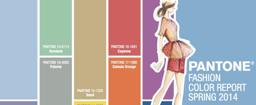
As you may know, the Pantone company is the world authority on colorimetry and periodically (generally after the summer) makes public the list of colors that will set the trend during the coming seasons. Around 1963 he created a unique coding in communication and color identification and since then it has become a reference of great interest for all kinds of designers.
Achieving harmony in our palette and integrating our designs in the chromatic avant-garde can be of great help to capture the attention of our public. The choice of colors and the most amusing equation can contribute a lot to our composition. Do you know the combinations that will be successful this spring?
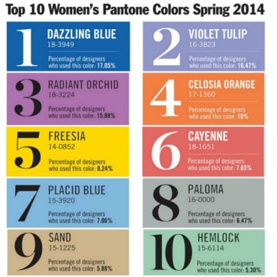
Many of the most relevant designers in the world of fashion, interior design or the graphic field have generated the following pantone color classification for the Spring 2014 season:
- Dazzling Blue: It is framed within the intense tones and makes it a quite viable option when combining it with Placid Blue. It has received an absolute majority, becoming the most successful color among designers with 17.05%.
- Purple Tulip: It is the most romantic option of the season, it evokes rebirth, the celebration of times gone by. Highly recommended to work on the vintage and retro concept.
- Radiant Orchid: Symbol of power, health, wealth and extravagance. The color purple has always been closely linked to the idea of mysticism, fantasy, as it is a color that is rarely present in nature. It is a very cheerful color and considered by many designers the star color of this season.
- Lattice Orange: It is a color that fits very well with young people and may be the most appropriate to communicate with them. It is a stimulating, healthy, energetic color. It has a high visibility so it is one of the ideal colors to attract the attention of our consumers or to highlight certain spaces on our websites or images.
- Freesia: Strong yellow has always been a symbol of light, intelligence, absolute and overflowing reason. Stimulates intellectual and physical activity. It brings a lot of light to our compositions so it is highly recommended.
- Cayenne: Pinkish hues have always been attributed to feminine energy, feminine power. In this case it is a variant that borders on red, so it is still powerful. According to forecasts, it will be very present in the cosmetic and textile world.
- Placid Blue: It is the polar opposite of Dazzling Blue and therefore they are a good combination. They are a fresh and youthful proposal perfect for the warmer seasons, or to work on the design of tourist advertising campaigns.
- Pigeon: It brings poise, seriousness. It is one of the most sophisticated proposals of this palette and due to its great density it can be presented alone.
- sand: According to Pantone, a perfect shade to evoke Caribbean paradises. The beach, the soft sand, the nature. This option is compatible with any alternative present in the classification.
- hemlock: Ideal to be combined with the Sand color if what we want is to leave a taste of nature.
