
Graphic Design as a discipline has materialized over time as a professional activity that has a wide range of knowledge and terms that refer to the concepts that order its world. If we delve into terminology we cannot ignore that one of the most used words in the graphic world by the ordinary citizen is the logo. But, To what extent do we speak in a correct and concise effective way when we use this term?
Dear graphic designer, that a person who is not within our professional framework makes terminological errors can happen. But you as a professional must speak properly and knowingly. Here I remind you of the basic classification that exists in this regard and that will be very useful to recall perhaps dormant concepts.
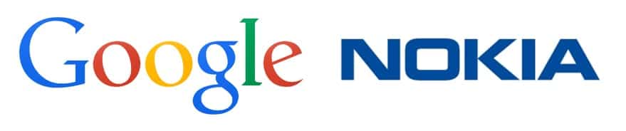
Logo
Etymologically it is made up of the union of two lexical roots. On the one hand Logos which can be translated as word and on the other hand typos that refers to a sign or writing in the form of an imprint. Knowing this we can easily deduce the implications of the concept. A logo will then be that construction that is composed solely of a grouping of letters or types forming words.
Imagotype
The linguistic components that sustain our word refer to a representation of the brand that relies on both iconic and verbal components. Etymologically it is composed of two semantic pieces. On the one hand Imago that refers to the image, a visual representation following a pattern of resemblance to a specific thing, we are talking here about the iconic element. On the other hand, the second component (type) comes from typos that is neither more nor less than a type or letter. The sign, the writing, the written word.
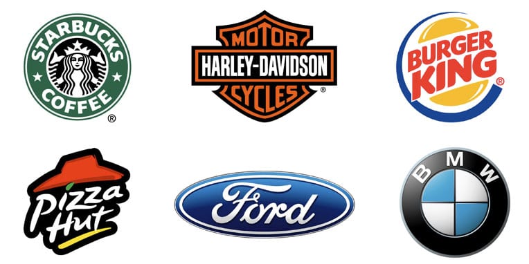
Therefore, this modality is characterized by being a construction composed of a textual element accompanied by a symbolic image. It is important to bear in mind that in order for us to strictly consider a visual brand construction as an imagotype, both elements will appear separately. This means that the structure will be made up of two independent units that make up one unit. On the one hand the image or the symbol and on the other hand the textual component, which is usually located in the lower area under the image although it does not have to be that way.
isologist
On the other hand, under the Isologo concept we find a variation of the Imagotype mode, only in this case with a small peculiarity. We only have to go back to the etymological analysis to guess what it is. Iso is a root of Greek origin that refers to the concept of equality and balance. Let us remember that an Imagotype in the strict sense is the composition of a brand by a textual and a visual element, but always appearing spatially separated. In this case, in order for us to speak properly about an Isologo, the opposite must be true. Both components must form a unit, that is, they will not be spatially separated and both image and text will be part of the same mass.
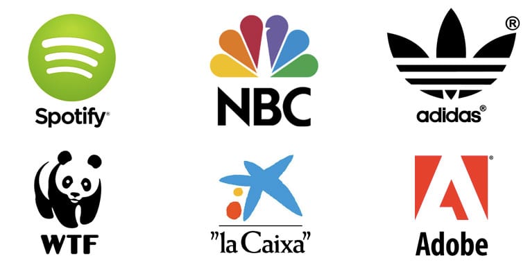
Isotype
Based on the above, we will know that an Isotype is a construction based on types and that it refers to the same brand (or the same logo) although it does not express it in its entirety. We can differentiate six types of isotypes:
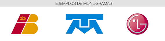
- Monogram: In this modality we speak of a construction formed from the union and interlacing of several initials creating unity. Already in ancient times this technique was used and now it is still done to shoe cattle and mark the identity of the owner.
- Anagram: It uses letters or syllables of the name of the entity represented in ligotyped form, generally it uses contractions to avoid confusion. Above all, they tend to be very useful for brands that have very long names and seek to provide an impact on the customer in a more agile and efficient way.
- Initials: It comes from Latin and means abbreviation. We could say that it goes a step beyond the anagram and that it is sustained in a process of more violent contraction where there is no phonetic articulation and therefore it has to be read letter by letter. The initials of the brand are usually used in a fully legible way to facilitate their reading and assimilation.

- Initial: It comes from the Latin initiates so it refers to the origin or beginning of our construction. It refers to the first letter of the word that makes up the business identity and is used as a synthesis resource.

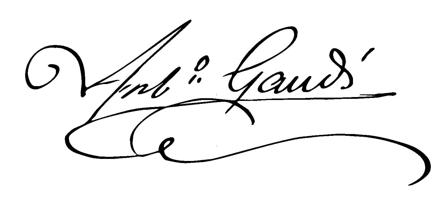
- Company: It is practically not used in graphic design to define the formal element of a business brand. The characterizing element of this modality is its ability to provide the construction with authenticity. Its handwritten character (Script) leads us to a more intimate encounter with the stamp in question and for this reason it is usually relegated to personal brands.
- Pictogram: It comes from Latin and refers to painting and on the other hand gramma, from Greek. They are constructions that synthesize a concept that works as a brand image. They can be designed in a totally figurative way, that is, schematically representing something real or directly abstract that refer to more diluted values or sensations.

Excellent!
At last!!! someone who says it clearly, that I'm tired of hearing that everything is called a logo.
Good contribution.
I really liked everything I read. I was able to clear the mixed ideas in my mind and even work out what I can come up with. Successes with your work. See you later.
The WTF logo you have is wrong, that's not it. The original says WWF. Regards!
The anagram is not what it says, anagram is a literary device that consists of rearranging the letters of a word to form a different one, with another meaning. It was generally used to play words, or generate pseudonyms, such as Tom Marvolo Riddle and I am Lord Voldemort.
Excellent article, very clear. I will quote you in the material of my courses. Thank you.