
Source: SIC News
Graphic design is also linked to the party industry, in fact, a large part of these industries have great recognition thanks to the image they project. This is where the designer or designer comes into play, who performs the task of creating a brand that expresses to its public how it is going to be directed.
In this post we have not only come to show you some of the best clubs in the world. But rather, We are going to show you some of the best logos that have been created in recent years in some of these clubs and especially how they have influenced the industry.
We start with the long list
The best club logos
Hi Ibiza

Source: Hi Ibiza
Hi Ibiza is one of the best nightclubs in the whole world. It is located in Ibiza (Spain). Let's say it's one of those types of clubs that gather thousands and thousands of people during the summer, and that it has great celebrities from the world of electronic music, such as David Guetta. It is located in the same space as the mythical Space Ibiza that we know. It has a capacity of 5000 people, a detail that makes it a great stage to enjoy the best music.
As for its image, a logo stands out that is represented by both initials of the club's name. Besides, It has a certain avant-garde air and at the same time hides a certain historical air. It combines very well with another sans serif sans serif typeface, which gives rise to the name of the city in which it is located. Without a doubt, an image that denotes interest and that is different from the rest of the clubs that we can also find in Ibiza.
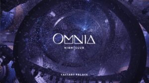
Omnia
Source: Discount Promo
Omnia is a chain of nightclubs that is located in three different cities and places, including San Diego, Los Cabos, Bali and the most impressive of all clubs, the one in las vegas. It is part of the long list of the best clubs in the world, and it is not surprising, since it has great DJ's such as Martin Garrix or Steve Aoki. It also has surprising elements and a design that leaves you speechless.
As for its image, we can highlight that it is a logo that brings together all the luxurious and important features that we have highlighted. The logo is represented by a very creative and unique typography, whose shapes are joined together to create the name of the company. Regarding the character denoted by typography and design, we can highlight that, it is a serious and demure typography, quite formal, an aspect that combines very well with the aesthetics of the image and that does not go unnoticed.
Undoubtedly, a brilliant and very successful logo with the context of their image and the environment they have designed.
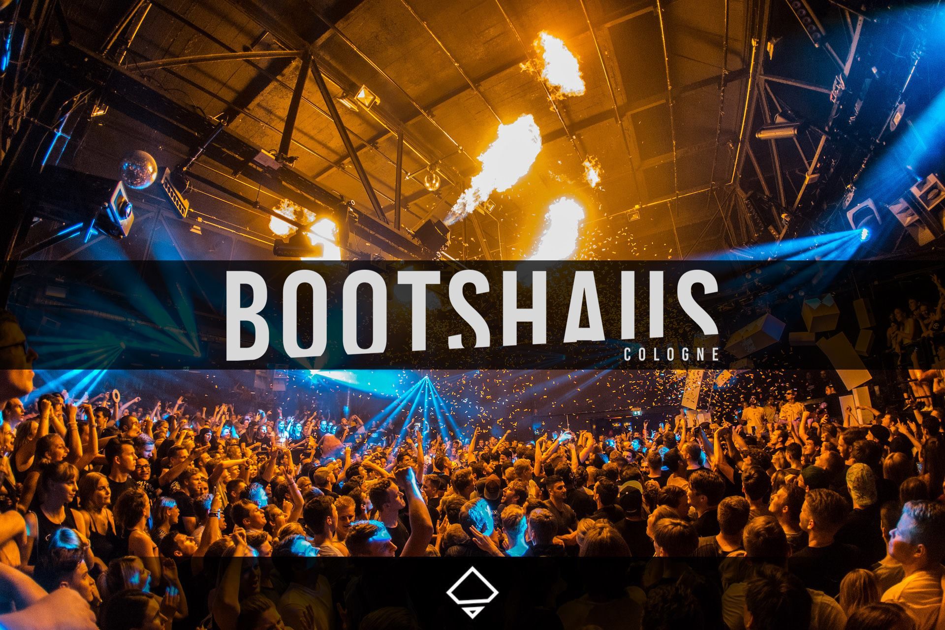
boathouse
Source: Wololo Sound
Bootshaus is listed as one of the best nightclubs in Europe and the world. It is located in the city of Cologne (Germany). It is a nightclub designed and set in the Bass music genre. It is characterized by being a nightclub that shares large spaces inside and outside as it has a huge terrace and several more rooms to share space.
It also has different genres of music as is the case of Techno and house. In addition, great artists have attended, such as Armin Van Buuren, a detail that positions it among the best nightclubs.
If we look at your image, we can tell that your logo projects a rather striking typography, sans serif and with a thickness that stands out from the rest. In addition, it also shares an element that is part of the brand, it has a quite striking geometric shape, it is a kind of square that shares space with other elements as is the case of several lines that break with the initial figure, giving rise to a secondary figure that takes center stage. Without a doubt, a logo that expresses the aesthetics and pure atmosphere of electronic music.
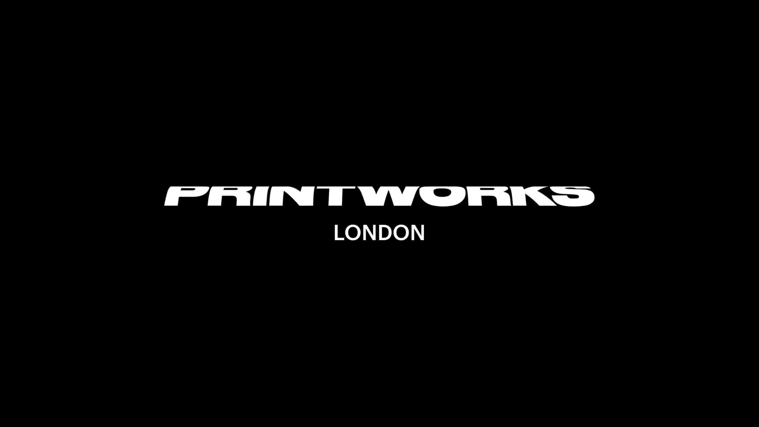
printworks
Source: Behance
If the previous proposals had seemed crazy to you, this one will seem from another planet. Printworks is a nightclub that is located in London. It is a place to dream as it is characterized by its three-dimensional space and by containing a kind of corridor that seems to have no end. It has a capacity of 5000 people and stands out for containing genres such as techno and electronic music. The most surprising thing about the room is that before being a nightclub, it was a factory destined to make newspapers for the city.
The logo shares the same aesthetic that we could see in its environment. It has a typography that has a certain futuristic effect, since it is completely in relief and creates a very interesting wave effect. It also has a kind of symbol made up of several lines that narrow each other, forming a kind of plane, which in this case could decipher the shape of the disco structure. A very interesting aspect since the thickness of the lines and the composition make it a great symbol of the party world, without a doubt.
Green valley
Green Valley is considered the best club in the world. It is located in the county of Camboriú (Brazil). It has a maximum capacity of 12.000 people, a detail that at first glance seems surprising, since it could be equivalent to the entire population of a small town.
It has an infrastructure that is characterized by being outdoors, it is not covered, but it is a place conditioned by the outside environment. It shares great genres but above all Brazilian music stands out, where great artists have also performed.
As for its logo, it stands out for containing a very representative element in the logo, in this case a green butterfly. The color that is repeated the most and that is part of the corporate color, it is definitely green. The typeface it contains is quite modern and up-to-date, since it is a rather geometric sans serif typeface due to its shapes, which thus offers a friendly character to the image. A logo that denotes happiness, energy, good feelings and the desire to dance and feel the music, in one of the most musically influential countries in the world. A logo designed to live an entire carnival.
epic club

Source: TripAdvisor
Epic Club is an amazing nightclub, located in the city of Prague, capital of the Czech Republic. Without a doubt, it is a stage full of magic and lots of lighting in its environment. A place designed for those who love electronic music, intense light, fast and reinforced rhythms of good sensations and energy. What characterizes this club is that it is overloaded with large screens where the element that is most accentuated are three-dimensional cubes located in each of the pillars. A club full of very important artists such as Oliver Heldens.
As for its logo, it is characterized by being a fairly simple and minimalist brand. It is designed in the shape of a cube, since as we have mentioned, the cube is one of the elements that is repeated the most in the design of your environment. The typography is simple and readable, it is sans serif and due to its strokes and shapes, it denotes to be a quite current typography, that plays very well with the aesthetics and the message that they want to communicate to their public. The colors they use are quite warm, although it is true that they also reinforce it with a mixture of cold tones, which contrast very well.
bassiani
bassiani is a nightclub located in the city of Tbilisi (Georgia). One detail to note about its location is that it is located under the Dinamo Arena, the stadium of the Georgia national team. It has a total capacity of 1.2oo people, a fairly complete capacity for a space that is empty and at first glance, desolate.
It is a fairly large room covered in concrete, it is a room set for electronic music and a good space to share great moments in an industry that never ceases to amaze.
As for your logo stands out for containing two colors that characterize it a lot, white and black. The typography is quite geometric and is set in a design that fits perfectly with what can be seen in the club. Also a rather figurative element stands out, as is the case of the face of a gladiator, an element that offers the strength and character necessary for Bassiani to be cataloged as one of the best nightclubs in the world.
Conclusion
The logos of some clubs are mainly characterized by the use of fonts and elements that, as we have seen, are quite figurative and subjective.
We hope that these designs have caught your attention and have served as great inspiration.