When it comes time to choose a range of colors for our projects, things get a bit complicated. It is not about choosing the colors that we like the most, or the ones that we see as the most beautiful..
La range of colors with which we are going to work, it has to be adequate and reflect who we are as a brand or who is that brand with which we work. For this reason, in this publication, we are going to talk about color ranges, their different uses and combinations.
Color goes beyond an optical phenomenon, with colors feelings and emotions can be created in the public that observes them. Choosing a good color palette can make both the user who observes it and the brand that is represented have a connection.
Should we give importance to the range of colors?
One of the most common mistakes when designers face a job is the wrong choice of colors. And not because they don't know how to choose colors, but because too many are used, that is, different colors and not one version of oneself.
Answering the question in this section, it is a yes. As designers, We must be very careful with the choice of colors for our designs.

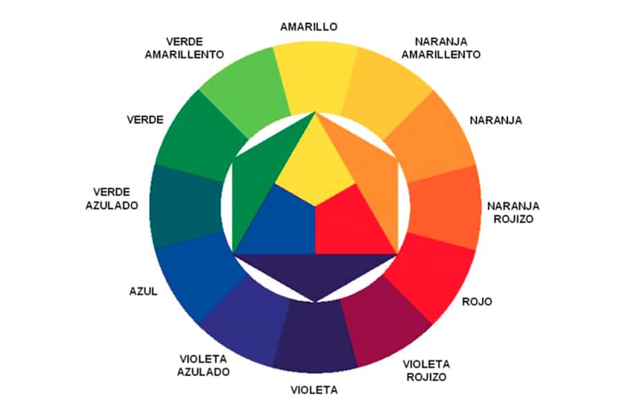
In these images that you see below, in the first of them you can see how the colors are built. From its central part, the primary colors start, the following way, they correspond to the secondary colors. And finally, the outer circle, the tertiary colors.

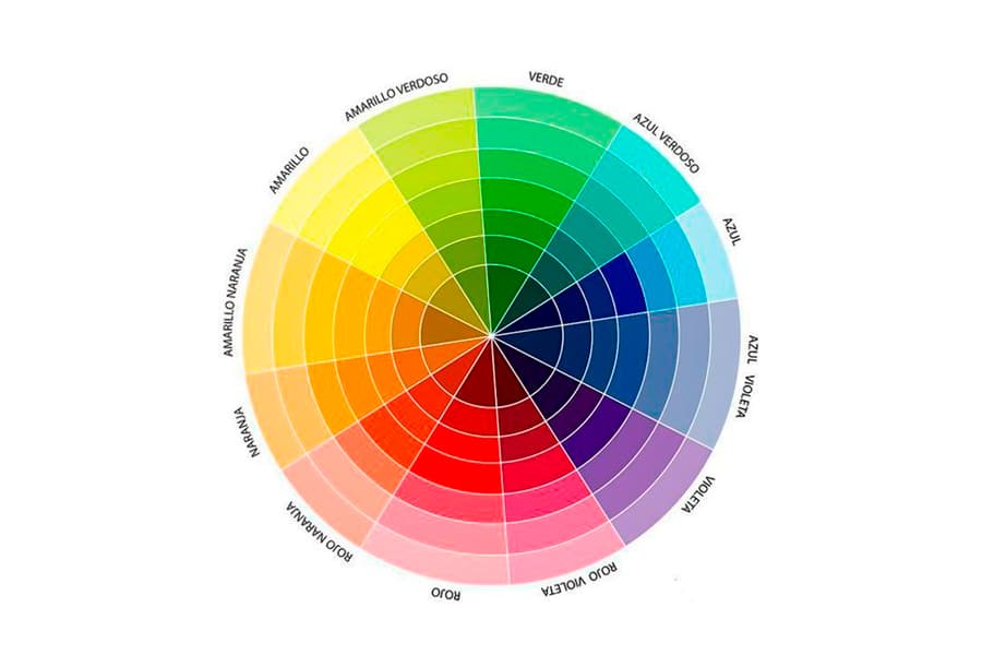
If you look at the other image, It is a circumference that designers keep in mind since it is the one they use to select colors and make palettes.. In this image, the colors that are together are adjacent colors, the ones that are opposite are complementary.
Thanks to color psychology, we know how different colors are perceived by viewers, as well as how they can influence their behavior. But as we have already said on occasion, we must always take into account the context in which said color is presented.
Graphic designers are the ones who, when faced with a corporate identity design, or any type of design, have to analyze and study the different ranges and tones for each of them. It is one of the most important steps before defining any design element.
Combine the selected shades in a range of colors

To know how the tones that have been chosen combine in a range of colors, we must bear in mind the second image that we have seen before, where the colors that were further apart from each other, the complementary ones, will give us a greater contrast among them.
This contrast, what makes it possible for us, is that the design we are making draws more attention to the public and also attracts glances.

On the other hand, the colors closest to each other, the ones we know as adjacent, will give us a better harmony, but without as much contrast as in the previous case.
Therefore, when making the choice of colors, it is very important to take into account both aspects, and seek a balance between them.
One piece of advice we give you is that analyze which are the main and secondary colors that best fit you and from there add a neutral support color. With this neutral tone you will achieve that balance that we were talking about before.
Sometimes this neutral color is replaced by a darker one. The choice of a dark tone is intended to highlight important elements of the design.
When you have an approximate idea of the range of colors with which you are going to work on your project, you only need to define the exact colors. In the next section, we leave you different examples of color ranges so you can get inspired.
Example color ranges
Ideally, you would have a defined corporate color and use it as a starting point.
Monochromatic color schemes
This type of ranges have been created from choosing a color and selecting different shades of that same color.

As you can see in this example, our main color is a purple #BFA0CC. This color, as we have mentioned before, would be our starting point. On both sides of the color we have chosen, there are other types of lilac with a more white or black tone.
All the Monochromatic ranges are always a success since the colors, being related, create a harmony between them. Yes, it is true that this type of color range, depending on what we use it for, can be a bit simple, since we do not have color contrast.
Contrasting color schemes
To make this type of ranges, we must select on the color wheel, colors that are adjacent.

We will get, as in the previous case, harmony between the different colors but with more contrast. Our base color would be terracotta, and its neighbors would go towards more earthy tones or more pink with purple air.
Color ranges with complementary shades
Using this type of ranges, you will achieve that in your projects this combination provides much more contrast than the previous one.

In this case, we have chosen a light blue as the main color, therefore our complementary color is the one on the opposite side, in this case reddish tones.
In the central part we can see our main color and next to it, on the right side, its complementary color. The other two colors are variants of the same. The contrast between the blue and the reddish tone is much more powerful than in the case of the adjacent color range.
Examples of color ranges
At this point, we leave you a selection of different ranges of colors, to serve as inspiration for your projects and with which to draw the attention of your audience.
nude color range

spring color range

Ranges of colors beach, summer

autumn color range

winter color range

burgundy color range

Forest Color Palette

The most important thing, when creating or using a range of colors, is select colors that give us the possibility of creating a design with harmony, in addition to, of course, being eye-catching and giving importance to the content.
Once you know the meaning of each of the colors, all that remains is to make an objective choice of colors and from that point, create a range of colors that faithfully represents who we are and what we want.