
Year after year we have analyzed the evolution of color and we have remained quite expectant before Pantone's predictions, but How important are these trends and how do they affect not only our profession but our society?
All of us who work in the world of images know first-hand that color is a highly conditioning factor in human behavior and perceptions, but to what extent?
What are color trends and who is in charge of defining them?
Professionals in the fields of color research, the color market, advertising and marketing, as well as those involved in graphic design, fashion, interior decoration and industrial design, make selections and reach a consensus about what colors will be successful and fashionable in the following years. This color prediction is translated into "color trends." Along with current economic and cultural indications of commercial markets, product negotiation, median income, and social hierarchy, decisions about color trends are also based on psychological introspection about color use. Color choices are vitally important to all retail sales, products, and services. In every industrialized nation, color is big business.
Choosing colors that cause changes in consumer markets is a highly specialized field. The Association for International Color Instructions, is one of those in charge of setting color trends that will have an effect on a large number of industries. The IACD conducts international conferences and workshops to ensure accuracy in tracking predictable color trends. The IACD's marketing arm, the Color Marketing Group, anticipates a three-year lead, giving plenty of time to implement the design and manufacture of key industry products in new and final colors. A second organization, the American Color Association, specializes in color predictions for the fashion, interior design, and environmental industries. A panel of eight to twelve color specialists meets annually to determine the current impact of current trends. Color trends are closely tied to the economy and as a result, marketing and advertising strategies are affected every time a new color or color combinations emerge on the world market. The color trend becomes part of the media vocabulary, transmitting a message of color to the world through television and printers.
When consumers are comfortable with color in everyday life, analysts seek new and more exciting color combinations to stimulate their emotions and elicit needs. This is often interpreted as "something new" or "stylish." A color scheme compatible with one industry may not be pleasant or viable in another. To compensate for this and preserve the accuracy of the choice, color analysts will make parallel or specific recommendations for fashion, industry, or indoor use.
The importance of color forecasts and trends
Color change affects thousands of industries, and it also affects artists, craftsmen, manufacturers, suppliers, vendors, and support services, from drawing tables and computers to the home or workplace. A new color or color scheme breathes new life into an old product. It also brings to life many collateral industries responsible for introducing the latest craze in fashion. The world economy depends on the viability of the product as well as its comparability, if the product has a good sale, it is certain that the color forecast, and therefore the color trends, played a great role in it and may have defined the color trends for the decade.
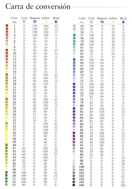
Chromatic conversion chart
The color conversion chart is a key tool for working with color. As there are different color models, we need to know make conversions to work with the greatest accuracy and precision. Conversion is necessary when the color models do not match (for example, when CMYK color is displayed on an RGB monitor or when a document containing images in an RGB color space is sent to a printer).
Although we will see this better in future articles for now, I leave you an example:
Color trends before ... and now
In general, pastel shades of green, blue and orange, prominent for decades in most interior products, have recently given way to bright colors and warm, subtle hues. Light and medium tints have been replaced by shades of vivid reds and yellows, and the jewel-like hues of sapphire and amethyst. These shades are seen very frequently in products intended for the wealthy sectors, such as party clothes and expensive fabrics for the home. They carry an aura of wealth and cultural distinction. Gone are the sophisticated dark grays of the recent past. They have been replaced by burnished metals of gold and copper, combined with rich reddish hues of burgundy, terra cotta and rust. The prominent colors today and for years to come are not muted pastels, but the vibrant hues of magenta, turquoise, and gold. They are used in some manufactured products, indoors, and in fashion. It's accurate to say that fully saturated reds, greens, and blues, and dark, warm, lustrous hues like burgundy, hunter green, and navy, will be strong choices for the foreseeable future.
- The Red It lends excitement to wardrobes, accessories and luxury items, and is a favorite with both men and women.
- The vibrant greens Deep shades will be used as important color accents in fashion, private interiors, and business venues.
- The dark blues and the warm terracotta will be seen in restaurants and public places. Accented by a contrasting bright white, or creamy yellowish orange, these colors create a feeling of warm elegance and enhance interior space.