
All of us who know a little about design know that there are many ways to combine different types of letters, but in order to do this we have to know what are the roles that the different types of typography and you have to detail the qualities they have.
There is a universal norm that tells us that we should not use more than three types of letters within a design, a logo uses one or two types so no more than three should be used in the design. When we want a header to stand out we have to use a different font to make it stand out, although it can also be done with bold or adding another color, but it should be mentioned that not many fonts are used.
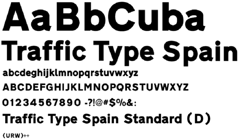
Learn to combine fonts

Choose a font it is usually a difficult job, This is usually because brands have to choose a fixed font type that they are going to use for all the work done, this can be a problem because in some cases the font does not match the size of the design, so it is important to find one that is standard and can be used in many ways.
For choose the first font It is important to find a safe tool that can help us in this work. These tools should not be selected by theory, should be chosen according to your personality, each character has a different personality, so you have to choose two of different characteristics so that when used together they can look good.
You also have to keep in mind that the font has to work correctly With the first one you want to use, the idea is to find one that is related to the first type of letter. Many characters are made with serif but they can also be made without it and the value of combining sources that are different and complement each other is that the form is usually the same but the contrast is minimal, but it may be what is necessary to be able to see the extra http.
If you opted for the one source body readable, you can choose a screen font that is the opposite, also if you choose a geometric style for the body you have to think of a more humanistic style and if it is a warm style you have to contrast it with a much more powerful style.
The simplest way to perform a contrast It is knowing which is the first characteristic that stands out in the main font, and then looking for another that has the main characteristic of the first as its characteristic. This is an option that allows us make many varied creations with a touch of personality and make it look good.
Choose the font type correctly
Choose the ideal typeface It is very important because this is what will allow us to attract our public, not only in the case of graphic designers this is important but also in the case of people who have web pages, they are the first to know that if a font is not eye-catching And the correct one, people will leave your pages because it is not comfortable for them to see and it is difficult for them to read.
Also in the case of graphic designers The logo creation part is important because if one typeface does not contrast with the other, it will not be easy to read what it says so people will not take the time to make an effort to read and the logo would not make sense of this form.
As we can see, it is important to take time to choose the best font that we want to use and also that we must add a touch of personality to make it more striking. These are things that come with practice, so this article could be very helpful for people who are starting or for those who have doubts about how they have to choose their sources.