
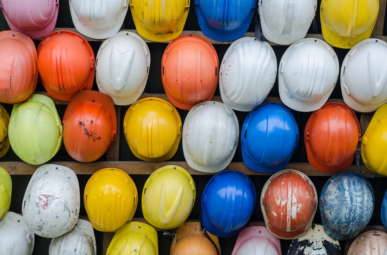
El logo design is an indispensable part of any business and brand today. This includes the construction companies that we are going to talk about in this publication. For these types of companies, it is also important to have a logo that suits their service.
The construction company logos need to be attractive and meaningful. Future clients of these construction companies should know information about the company just by looking at their logo. With the help of this visual element, it is very common for many companies to be remembered, not only for the use of a unique emblem, but also for their brand name.
Basic aspects to create a construction company logo
When we are put in front of a project in which we have to design the corporate identity of a construction company, there are several aspects that we have to keep in mind.
They make use of designs based on structures, buildings, construction tools, etc. With these elements, they guide customers to understand the main activity of the company. But on many occasions, this idea is discarded and truly unique logos are created.
In many construction company logos, one or two colors are used. With them, what is sought is to create an attractive identity, but at the same time discreet.
Another main aspect is what we want our future clients to see in us, that advantages we offer, what values we represent. These advantages can be represented by the colors we use in our logo.
An important point is that when choosing a typeface, it has to be legible and simple. No script or decorated fonts, since when it comes to reproducing it in small sizes it won't work.
The fonts that we usually see in construction company logos are mostly sans-serif fonts with high legibility. In some other cases, a serif typeface has been used, but with very subtle serifs.
Construction logo examples
When we have clarified and studied these points, it is time to start drawing. In this section, we are going to show you a series of examples of construction company logos to serve as inspiration.
Pacha Industrial Consortium
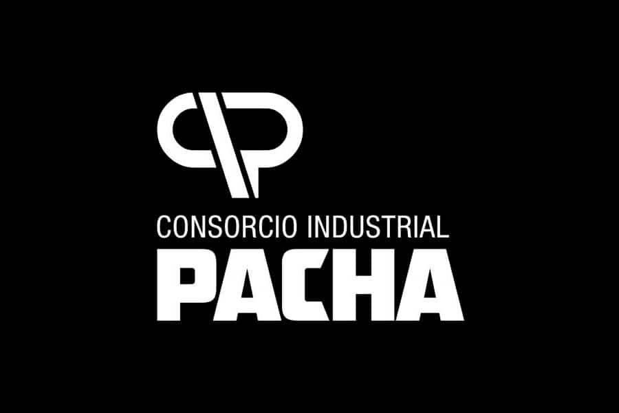
This logo includes construction services, such as electrical, mechanical, civil works, rental of machinery, equipment to generate energy, among others.
In this case, it has isotype that through an abstract design represents the initials CIP. The colors they have used are two variants of gray and red that provide dynamism, modernity, energy and formality.
Construction company Rivera Feijoo
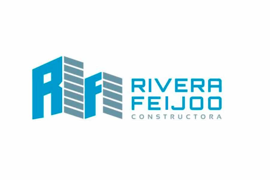
It is a innovative and competitive company in the field of construction. In continuous evolution of its services, to be able to offer its clients the best quality and price in their projects.
El design of its identity revolves around three aspects, integrity, innovation and efficiency. The isotype of the brand is built from the initials RF, Rivera Feijoo. They have played with the letters, in order to create a building with which they want to transmit said integrity. The logo is made up of the name of the company and a descriptive element of its work environment.
ASSEPH construction company
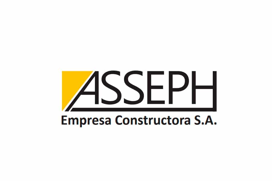
For the design of logo of this construction company, the Segoe UI typography was used. With the use of this geometric typeface, we want to refer to the perseverance of the company.
As for the choice of colors, it is done use of yellow as an element to attract attention and black to give pregnancy.
Condor Construction SA
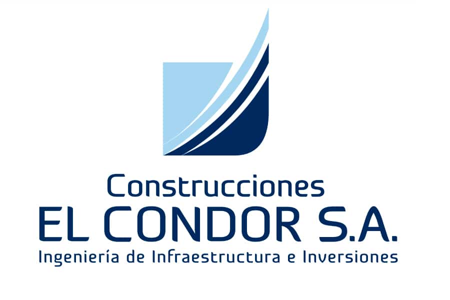
In this case, the Construcciones Cóndor SA logo It is divided into three parts, one of them is the name, another the symbol and finally the activity carried out by the company.
El logo symbol refers to a wing, the wing of the condor. With a vertical design, they want to represent the progress and projection of their company. As for the typography, one of its own has been created solely for the brand. The color palette is made up of complementary colors to facilitate company communication.
M&M consultants and builders
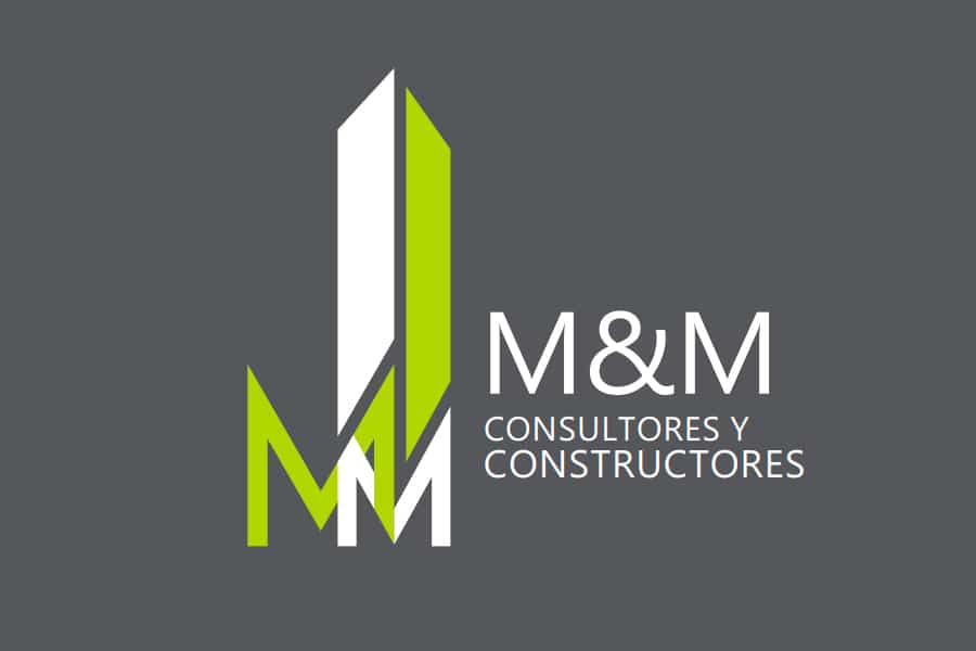
The values under which this company works are responsibility, honesty, persevering work, loyalty and good service.
In this case, the The brand's isotype is constructed by joining the two letters M of its name. With this union, it seeks to symbolize cohesion and solidity. On the other hand, the logo is made up of the name of the company and is accompanied by an explanatory text of its activity.
La font used in this example is Champagne & Limousines, a clear, modern and legible font. The corporate colors that have been used are green and gray, with which contrast is created.
Select homes. Real estate and construction
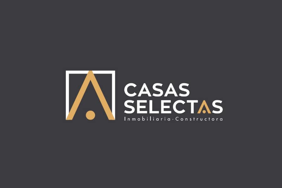
Giving a twist to the conventional designs of this sector, Casas Selectas, carries out a modern and attractive design, with which it stands out above the rest in this sector.
The typography used for this design has been Zona Pro. With this choice, a uniform and modern style to the logo. In addition to being a typeface built in a square box, it is closely related to the design of the brand image.
The imagotype is built by means of a frame with three sides, and inside it the character A is included. With this, we want to allude to a house. This company, seeks to convey elegance and quality, this is done by using a rich black color and a gold color.
Other examples of construction company logos
Then we leave you other examples of logo designs of different styles to the previous ones so that you have other types of references regarding the design of construction company logos.
CLD Construction

Logo with image of a house
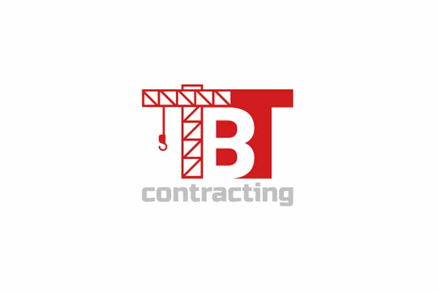
Logo built based on the image of a crane
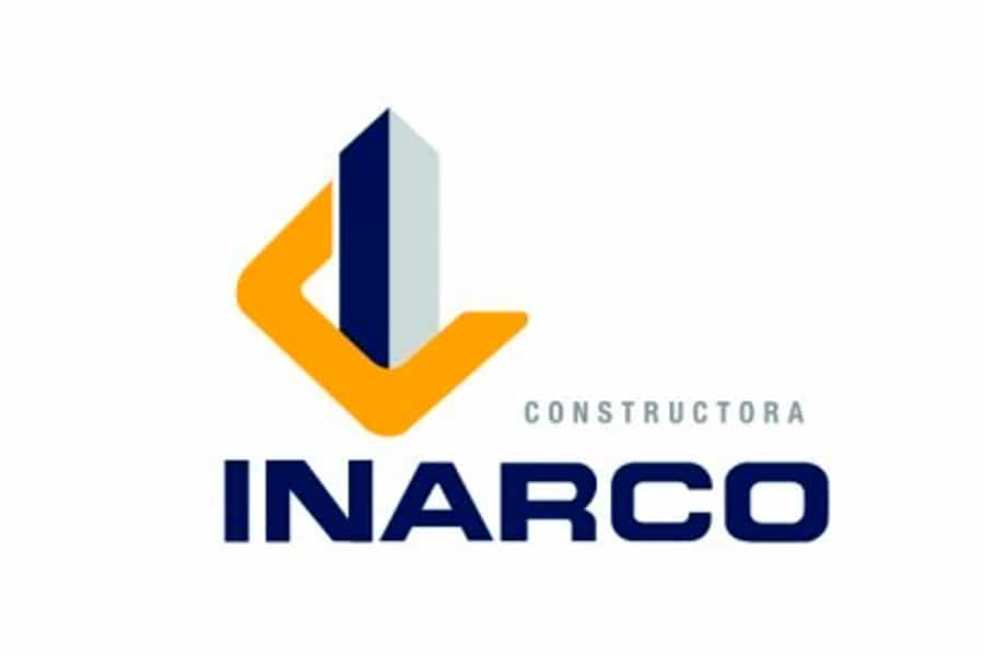
INARCO Construction
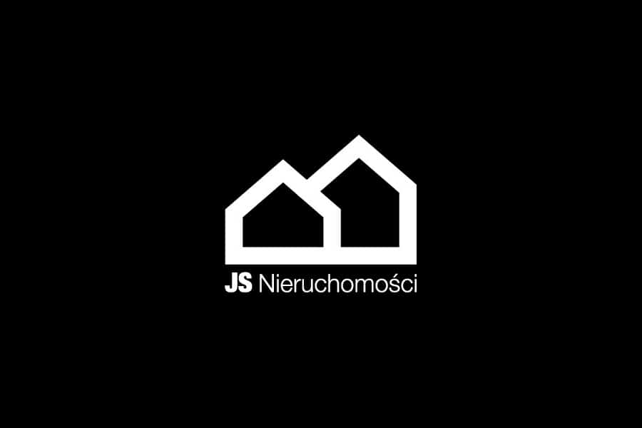
JS Nieruchomosci
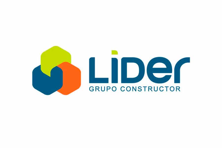
LEADER Construction Group
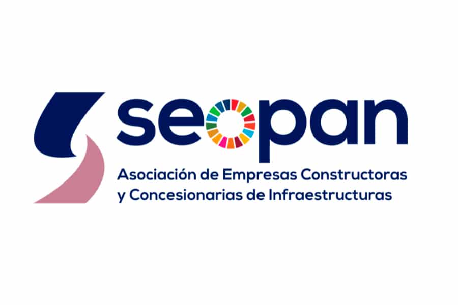
SEOPAN
La visual identity of a brand projects an image both internally and externally, who is as a company. The style of the logo, its way of communicating, its coherence, define its personality and corporate identity. The latter helps a company within such a wide world of brands to differentiate itself from the rest.