To settle our series of tips for the development of a corporate identity manual, it is necessary to make an incision on an essential section: The application of all our work to a physical support, which in some way implies the test of cotton and a more graphic and precise orientation on how the identity of our stamp should be reflected in the different supports.
This section must be developed with the same rigor as the rest of the sections and subsections that make up our document. Contrary to what it may seem to you, it is tremendously illustrative and useful for your clients. Many of them will need to look at it when translating all your work into the final destination, so it is imperative that we offer our design inserts in a detailed and instructive way.
Although it is true that compared to the rest of the sections this can be more fluid and simple, it is also true that on many occasions it is not known to get all the performance that it can. When we are developing first jobs and projects of this type, we can easily make some mistakes. So Here are some tips that can enlighten you a bit and turn your work into an optimal result:
- The first piece of advice I could give you is that do not overdo it with the applications that you propose in your manual. In short, what it is about is to limit and serve a range of truly practicable possibilities. Knowing the objectives and the potential audience of the client will be essential. Depending on the sector you occupy, you will be more predisposed to using specific media and these will be the ones our client needs. It will not be a good manual that is not focused on the company in question and that is not related to the real practices that this company develops on a daily basis.
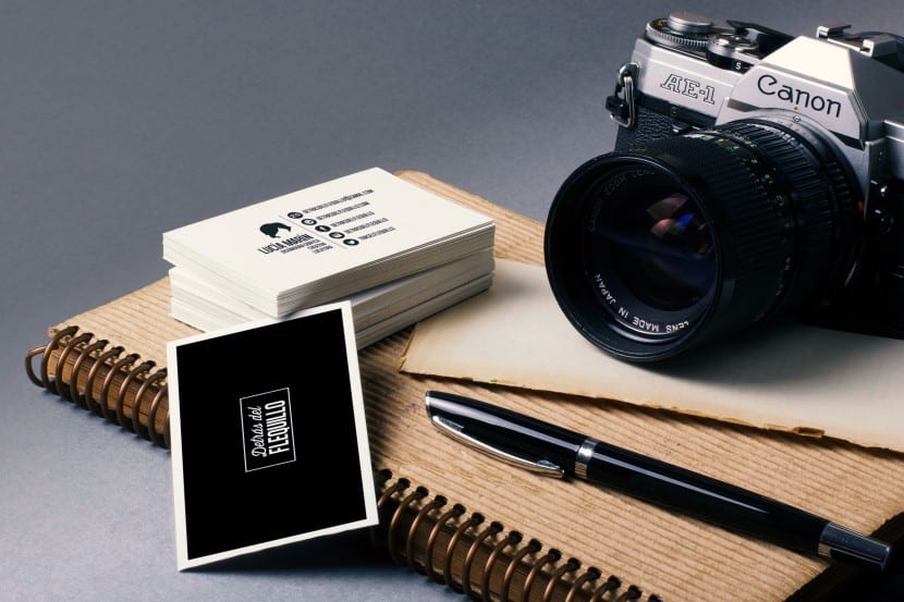
- Mock-ups or illustrations? I personally opt for the first option, basically because it is more realistic for me and this ultimately translates into guarantees. Guarantees and precision are elements highly valued by the customer. I would recommend that you use Mock-Ups of various kinds. From electronic devices (if we are talking about the translation in digital support) to analog media (such as stationery or merchandising). The goal will always be to preserve a greater variety of nuances and details.
- Try to focus on its most functional nature. Our client is looking for a document that is really useful to the company in question and can solve certain doubts at some point. We must always look for (or create) really legible illustrations and photographs that provide us with precision. Let's not look for mockups based solely on their appeal. What it is about is to reinforce that technical, visual, orientation and instructor character. If we also manage to do this using good means and good aesthetics, the better, but try to find the balance between aesthetics and functionality.
- Proportionality and technical data should never be lacking. Please note that we are presenting prototypes of the final products. Except on rare occasions, we will not be offering a full-scale illustration. That is why it is vitally important that we specify the scale of our prototypes and provide all the appropriate indications as well as the possible variations that may occur in the event that the model of our support changes. Sometimes in the same support the way of integrating our designs may vary because the model changes. Imagine that we embody the identity in the uniform of the workers. The arrangement of the elements will probably change if we are talking about a short-sleeved shirt with buttons or one without buttons. If we talk about a jacket or pants. The support is a textile support in any case but depending on the seasons of the year or any other type of external circumstance, these may vary.
- Make your content easily searchable and use sub-sections: I generally divide this section into five sub-sections: Stationery (which includes business cards, catalogs, envelopes ...), electronic supports (computers, smartphones, tablets ...), logistics supports (all types of vehicles), textile supports ( work uniform) and Merchandising (Mugs, calendars, posters, caps ...).
Finally and on a more general level, I recommend that Look for visual identity manuals and models in this regard on the web. There are some very good ones that can inspire and guide you to be able to develop your first manuals. I usually dedicate myself with a lot of implication because I know that it is one of those complements or extra points that a client values. Professionalism, rigor and dedication in what we do as designers is what ends up making the difference, so you have to perfect every last detail. These tips are based on my own experience Although if you have any experience or want to share any other advice, do not hesitate to leave us a comment We don't eat anyone!