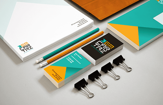
Once we have dealt with the index and the instructions, it will be necessary for us to tackle a section that will delve into the brand (its implications, construction and application rules). It is highly recommended that we add a small introduction to give the user of our document a background.
The strategy established at the corporate level requires compliance with certain parameters and rules that are essential, inviolable and irreplaceable. The differentiation of our brand It is of vital importance and building a clear and concrete figure of our seal is our main objective, so our reader should always make sure that they take the measures outlined in our document.
In our manual the appropriate annotations must be found to be able to apply the brand and represent our company on all media where possible. In addition, it should be clarified that changes may arise in the future and the corporate image may evolve, so if the reader misses any indication or specification, he should not hesitate to contact us or, failing that, the department responsible for corporate image. of the company. Of course, those responsible for the department or corporate image area should have access to it whenever they need it and of course on a return basis. Our client (the business owner) must have full knowledge and control of the possession of the corporate identity manual.
In this first part I will show you four essential categories that must be within our section dedicated to the brand. It has taken up more space than I planned, so in the next article we will settle this chapter.
- Context and data of certain relevance for the team that configures the company: What company are we talking about? What is the origin of the business on which we are building new concepts? At this point you can include a little historical note about the formation of the company, the identity of the founders or even the long-term goals. It is about developing a small context that places the reader. It is very interesting, especially if it is large companies that have a large personal team and there is no direct communication with the founders.
- Values and philosophy that drive the business: Behind every design there is a foundation, a base that supports its architecture. This base is translated into essential and primary values such as innovation, communication or engagement. List the values that fuel the business (and its image) and try to explain why these values are the ones to be taken as a reference. This will serve to specify and put a face in some way to our concept. To the energy that all our construction gives off.
- Meaning and symbols. What is hidden behind your proposal? This point is very interesting and vital for you as a designer. Here we have the opportunity to demonstrate to our client that each element has been studied in a precise and conscientious way. We are going to develop a storyline that justifies each of the elements that make up our design. What meaning does our composition have? How are we going to use these kinds of connotations to dupe and persuade future customers of the business? What is our communication strategy and how have we deployed it on our role? It tries to methodically and deeply analyze each of the components: Color (locates the color palette and provides the information and significance that these shades will give to the set), fonts (the semantic and symbolic implications vary wildly depending on the type of font that let's use), Proportions (these will determine the focus of attention)… The point is that you explain where the design comes from, why the logo is precisely like that and not otherwise. What moved you to build such a visual discourse.
- Elements that support the construction: After our little graphological analysis and the most conceptual and symbolic substance it is time to move to the next level: In technical analysis. Locating, identifying and presenting our work items will be essential. Below I list the three most basic, but of course you can add more if necessary:
- Primary corporate typography: We are talking about the typography present in the logo. This is going to be the most characteristic and defining of the business identity. We must name the specific name of the font used and its family. In case we have made modifications to any character that integrates our typography manually, we must specify it and show the construction and edition in graphics that illustrate the operation.
- Secondary corporate typography: Especially when we talk about logos that present an informal typography or with an excessively artistic form, it will be necessary for us to establish which secondary fonts should be used for more serious documents. This point is more important than is believed and both primary and secondary fonts must be in communion to guarantee visual harmony in all options.
- Corporate colors: It is recommended that we use a catalog of spot colors to create our color palette (for example, Pantone). The primary function of the manual is to indicate precisely how the image should be applied and this includes the color treatment that should be given. It is essential that we offer a graphic sample of each of the corporate colors together with its code. We will also have to offer an alternative and make a conversion of each one of them to the RGB color modes (for electronic supports) and CMYK (for printed supports), also attaching coding in these modalities.