The logo is one of the most representative visual elements of a brand, it is capable of transmitting to the public what its essence is and it is a very powerful symbol. In this tutorial I will show you the basic tools that Illustrator offers for logo design and I will teach you how to get the most out of them. If you want to know how to create a logo with Adobe Illustrator, you can't miss this post!
Logo, isotype or imagotype
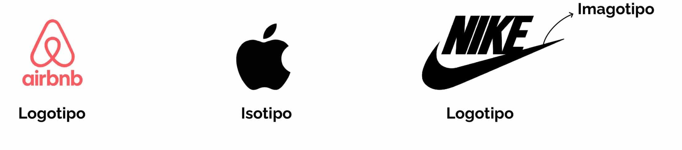
Normally, we use the word logo to refer to the symbol that represents a brand. However, this term is not entirely well used. Before we start designing, let's clear this up.
- El logo is the symbol that represents the brand and is made up of images and text (or typography).
- When the symbol is only composed of an image, no text, it is more correct to use the term isotype.
- There are brands that sometimes use the different parts of their logo independently. For example, Nike is often represented solely by the swoosh. When the logo image is associated with the brand without the need to be accompanied by the typography, we can refer to it as imagotype.
Create new document in Illustrator and observe the model
Let's create a new document. We will give the work table a A4 size, thus we will not lack space to work. I have changed the color mode to RGB.
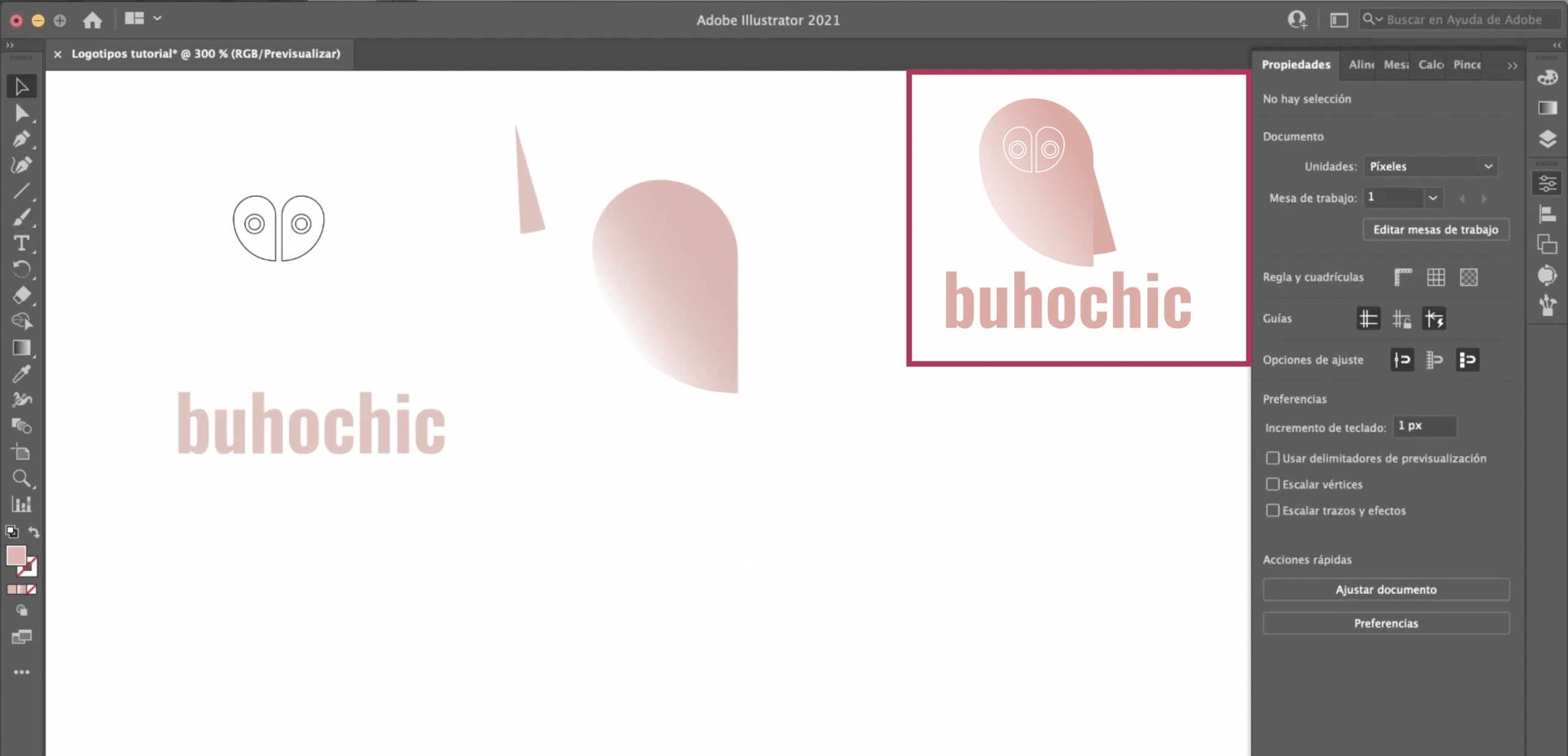
We will start with a simple logo that I have previously designed. Looking at this model, we will see step by step how I have created it and with what tools. Theirs is that you get an idea of how you can get the most out of what Illustrator offers. By breaking down the logo, we see that It is made up of a set of combined shapes and a text.
Create all the necessary shapes in Adobe Illustrator
The body of the owl
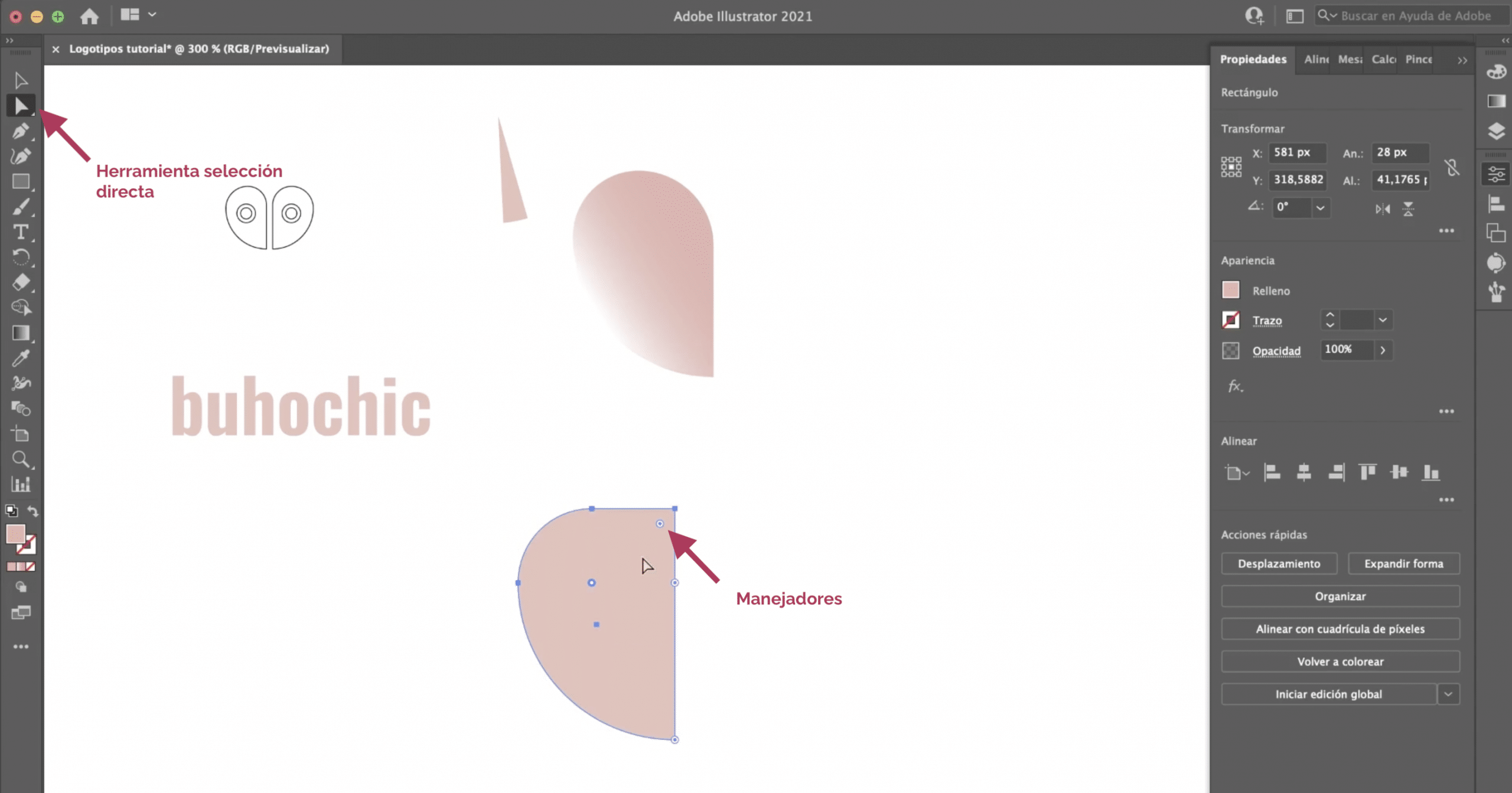
Let's focus on the shapes first. In the toolbar, you will find the shapes tool. By clicking on it, it gives us the option to create rectangles, ellipses, stars, polygons or line segments. In this case, we need create a rectangle. Select the tool and dragging the mouse create a rectangle that is roughly the dimensions you see in the image above.
How can we get from this rectangle to the shape that makes up the owl's body? We need to warp it, and for that we have the direct selection tool on the toolbar. When you select it, you will see that at the corners of the rectangle a kind of handlers (the circles). If you pull directly on any of them you will see that the corners turn round. To warp a single corner, just click once and then pull. You will see that that corner moves and the rest remains as it was.
We will start at the lower left corner, we will take the handle to the limit. We will continue to the upper left and finally we will round the upper right. This way you will get the desired shape.
The eye of the owl
Wide to look closely at the model. The eyes are made up of the same shape as the body and for two circles, one inside another. We will create a smaller rectangle and we will warp itIt's like we did in the previous step. Now, we will create the circles. Select the ellipse tool. To create a perfect circle we have to press the key shift while dragging, if not it could be deformed and be more an ellipse than a circle.
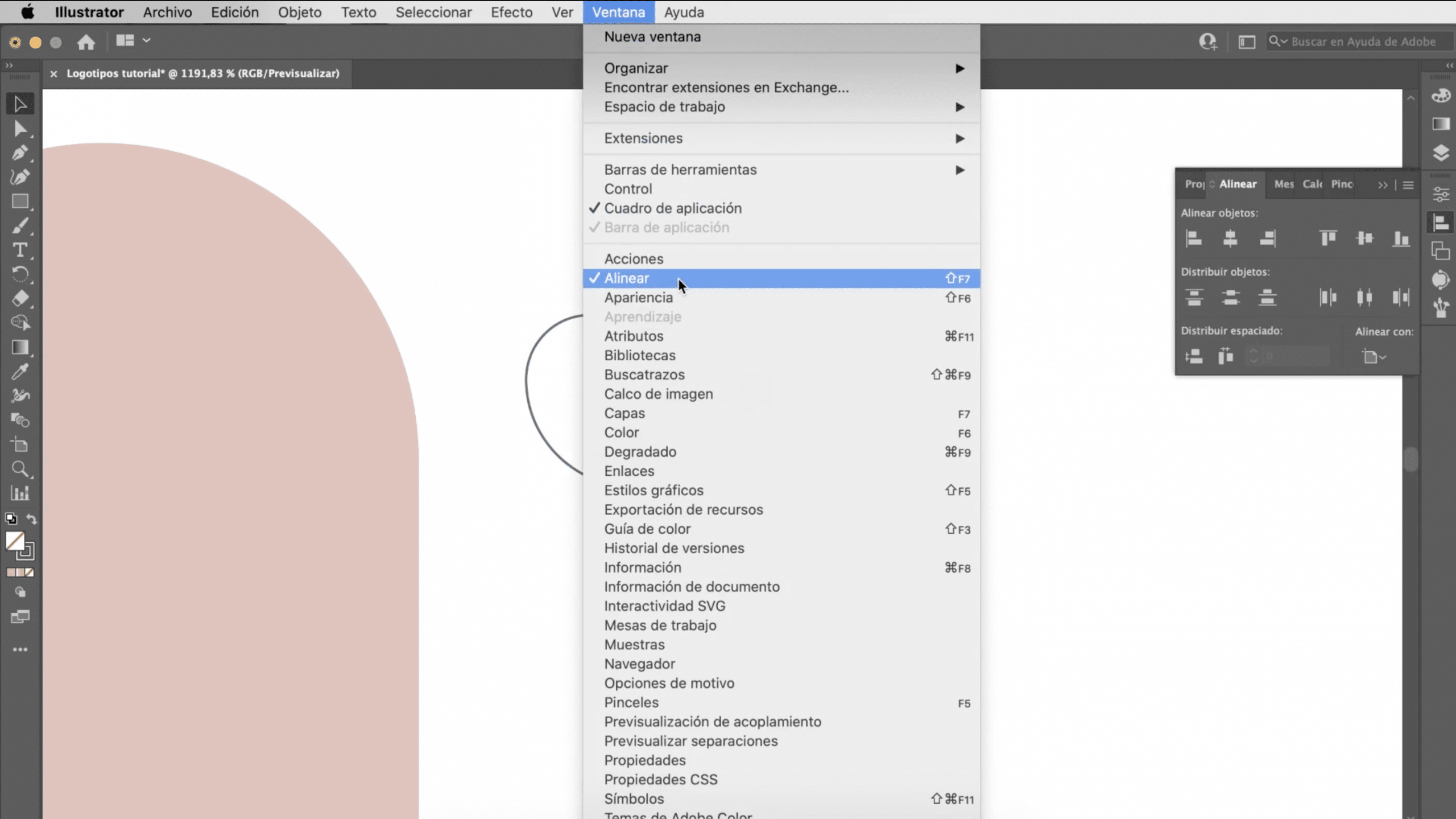
Once we have all the elements of the eye, it is time to assemble it. For any design task you do in Illustrator the align tool is basic. You may not have it visible, you can always access it in window>to line up. It will automatically help you align different elements. You can reference the artboard, the selection, or a key object. To align you just have to select several objects and echoose an alignment option. If you want to choose a reference object, make the selection and click on the object you want to transform into a key object without pressing any key. We will center the pupil inside the outer part of the eye.
Duplicate and flip to create the other eye
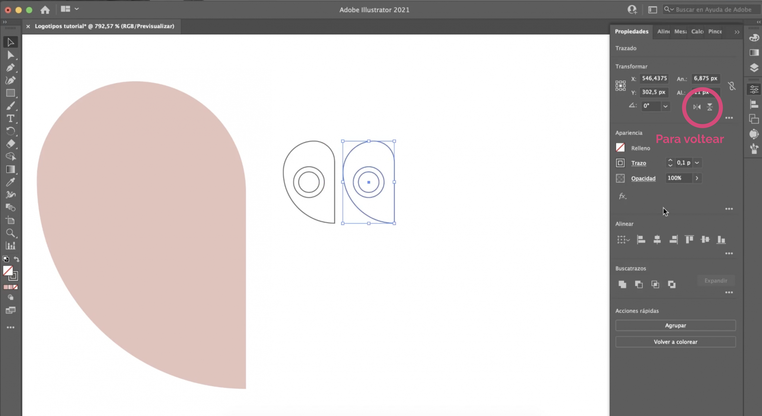
If you notice, the other eye is exactly the same but in the opposite position. In order not to have to repeat the whole process, what we will do is duplicar the already created. You can do it with command + c (copy) and then command + v (paste) or you can choose to press the option key and drag. To invert it, click on it, and in the properties panel, in the "transform" section, in the symbols indicated in the image above, you can flip the shape, in this case we need it to be horizontal.
Create the wing with the pathfinder or pen tool
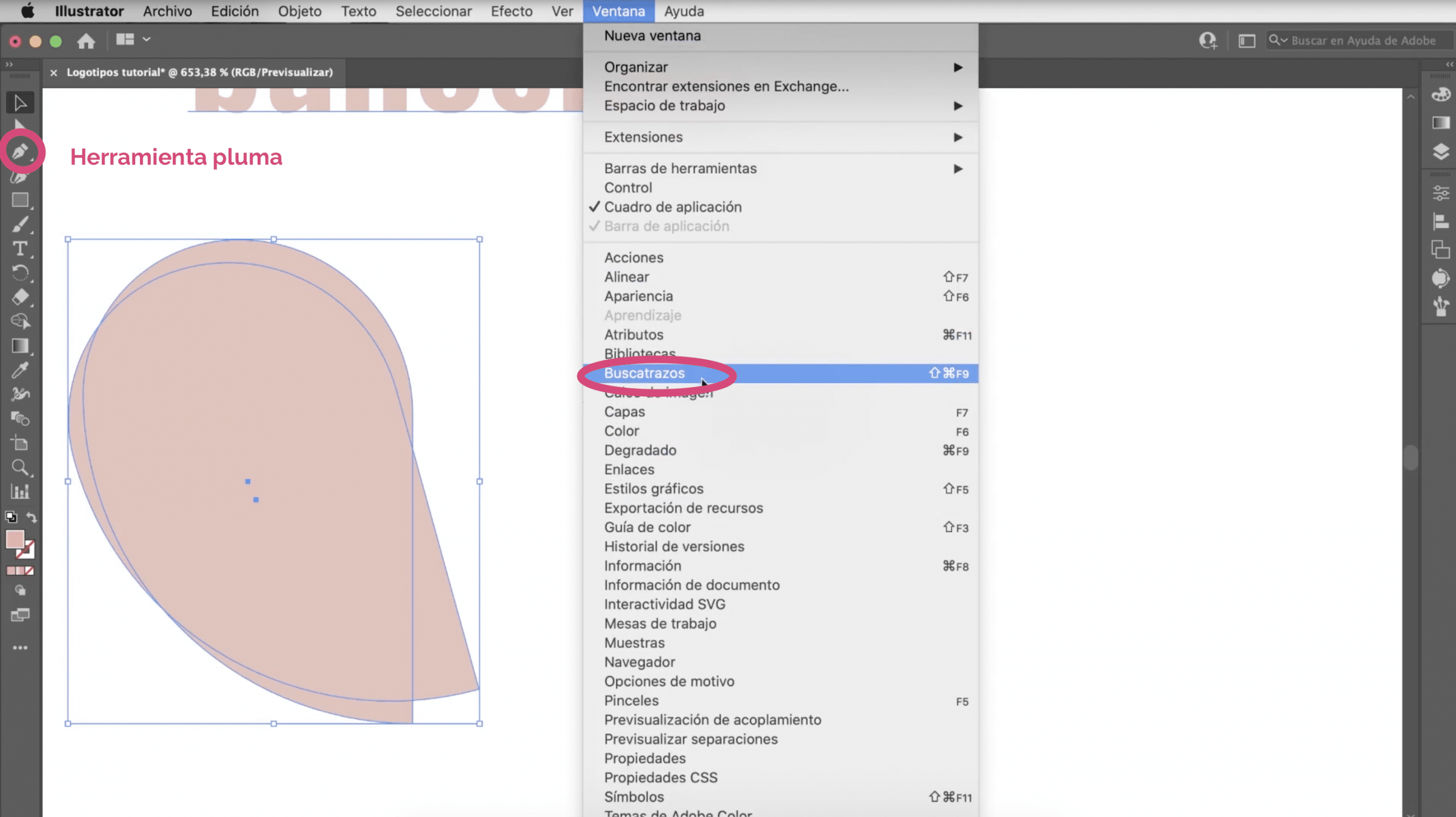
Let's go back to the big shape, you will see that it has a kind of wing. It is actually the same shape we use for the body, placed behind and turned. I will take this opportunity to explain two super useful tools for creating logos: the pen tool and the pathfinder.
La pen tool You have it in the toolbar and it can be used to create the wing. Using it is very simple. Simply click to create vertices and lines will automatically be drawn to join them.
Another way to build the wing is by using the pathfinder. If you do not have it visible, you will find it in the window tab> pathfinder. With this tool you can combine or subtract parts. In this case we have to select the option: less front. Duplicate the shape of the body, place it behind forming the wing and duplicate again, press less in front and erase the excess. We would already have our wing. Once all the shapes are created, you can assemble the logo.
Color and gradient for your logo in Illustrator
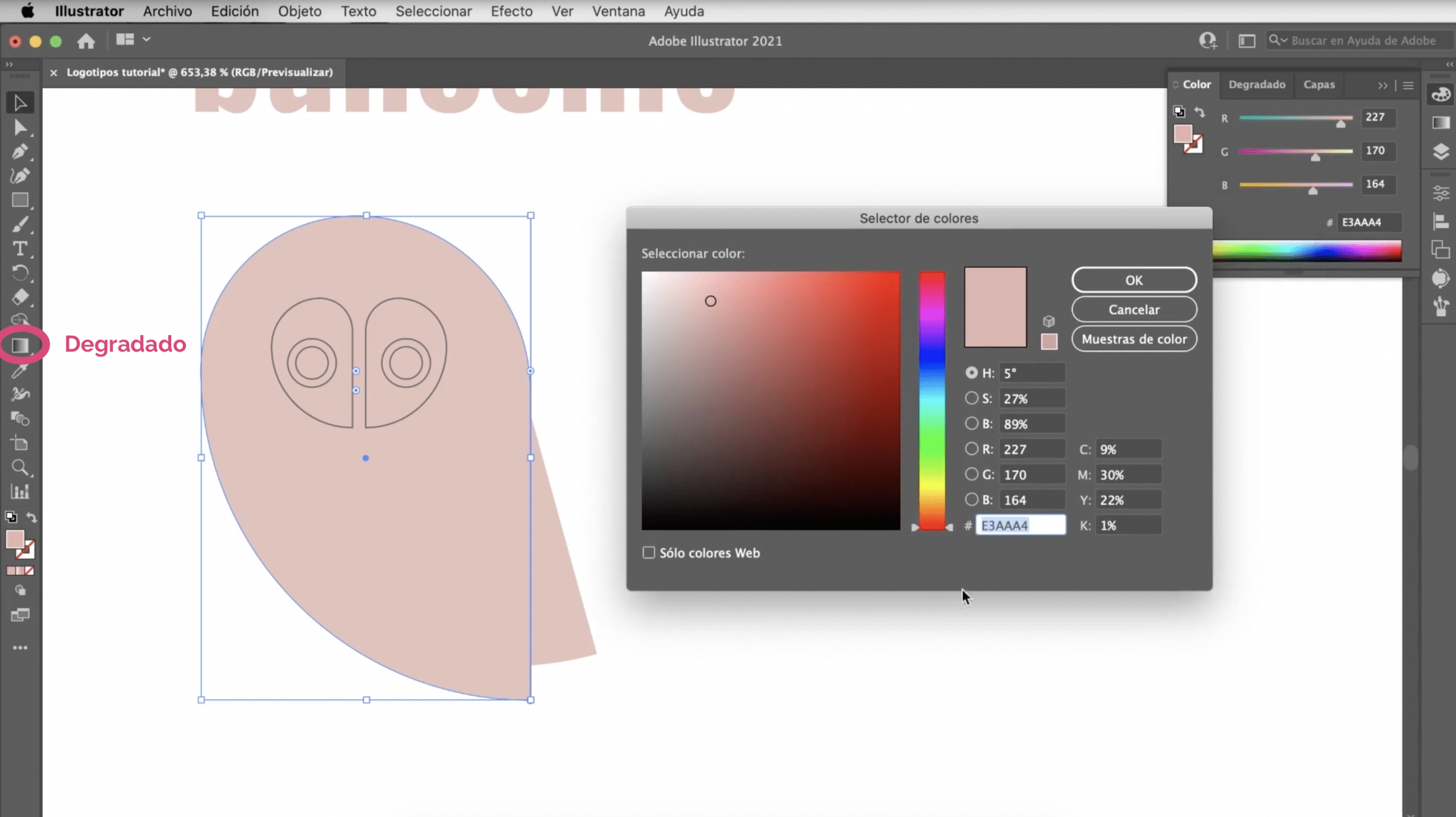
So far we have not touched on the issue of color. It is important that when you design your logo you pay attention to the color, choose tones that harmonize and represent the spirit of the brand. I have chosen a pink, I will leave the color code above in case it works for you. The eyes are not filled, they are a white line with a thickness of 0,25.
The pink part of the body is not a flat color, it has a degraded. There are conflicting opinions on logos with or without gradient. Before using them it was a risk because the gradient could be lost when uploading it to the web. However, this is a problem overcome. Many brands use gradients in their logos, brands as recognizable as Instagram. I personally like them because, if they are used well, they add volume to the logo.
To apply gradients, we have to select the gradient tool and double click on the object. We can shortcut by pressing the G on the keyboard and double clicking. In the properties panel, in gradient, you can choose the type of gradient and display a menu to modify it in the three points. In this case we have chosen a gradient that goes from black to white and we have changed the black to pink and the white we are going to replace with a very very light pink, almost white. By moving the bar that appears in the shape and the points, you can modify the position and structure of the gradient.
Typography in the logo
The text does not have any complications, it is written with the Oswlad Medium font, which you can download for free at Google Fonts. We have given it a size of 17 points and we have chosen the same pink tone. This is how it would look!
How to customize fonts in Adobe Illustrator

Let's talk more about typography! Fonts can be converted to strokes, break, deform and we can play with them. I am quite reluctant to do it, but hey, to create logos is a good resource and you should know it. Let's see an example:
Let's choose the File Black font, and I'm going to write this name. As it is right now, there is little we can do with it. We have to transform the typography into a stroke. For that, we select it with the selection tool, and go to the text tab> create outlines. Before doing this, make sure the text is well written, because you will no longer be able to edit it!
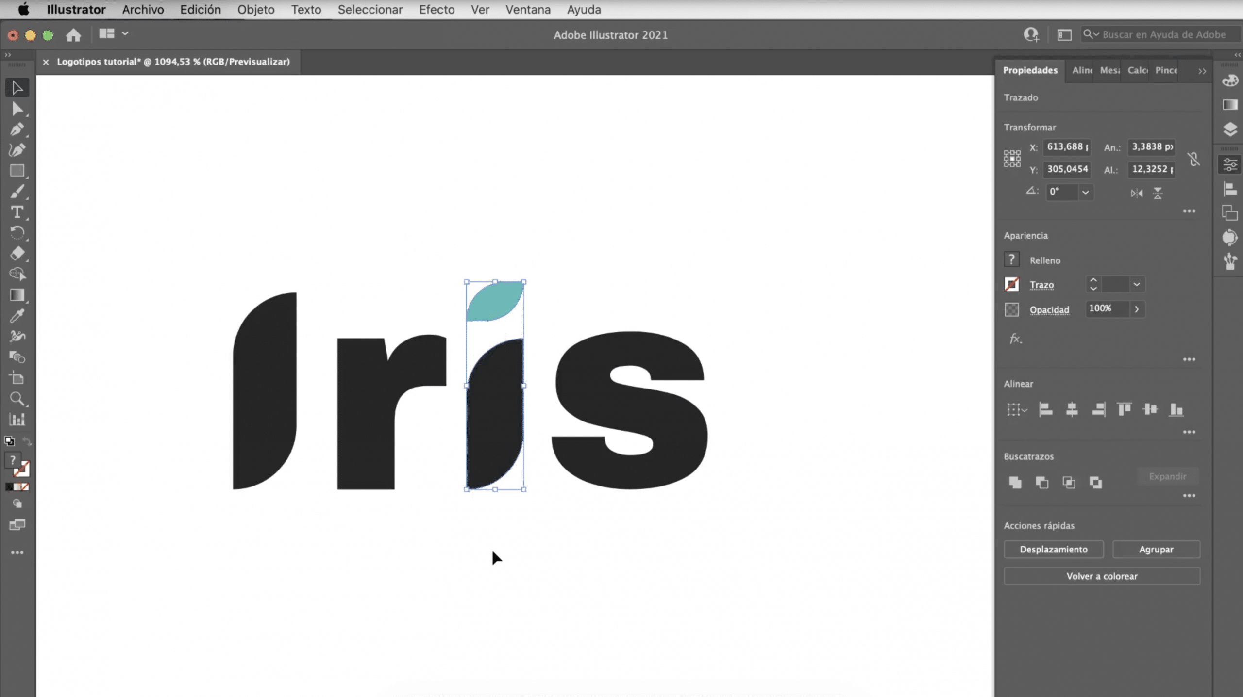
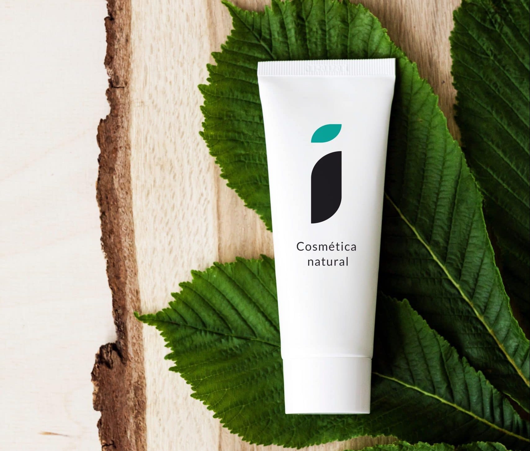
By creating the outlines, you can treat your text like any other Illustrator stroke. As we have done with the shapes, with the direct selection tool we are going to curve the ends of the i's and we will transform the point of the second “i” into a kind of leaf, to which I am going to give this turquoise tone. The interesting thing is that the whole word could be used as a logo or the “i” as an independent image type.
Test your logos with mockups in Photoshop
A good idea to see if your logo works is to create mockups with Photoshop. It is the best way to quickly see how it would look in reality and how it could be implemented. What do you think?