Today we have different windows, supports or ways through which to reflect or integrate the corporate image of a company. For this reason, we must evaluate what destination our creations will have and under what circumstances they should be represented within the company. As we have seen in our series of articles to develop a corporate identity manual in a precise and formal way, it is always necessary that we create a strategy to represent the image of a business. In the case of the monochrome version, we must point out that it is designed to offer an alternative when we find multicolored backgrounds, with gradients or even transparent such as glasses or crystals. The objective is clear: We need to develop alternative versions to ensure the effectiveness of our proposal.
In a previous article we were reviewing some tips to develop monochrome versions of logos and although we have seen several cases, it is true that we left some in the pipeline. Today we are going to close our list of tips and review some examples that illustrate very well the techniques and strategies developed.
- If you want to take a look at the first part of this list of tips, you can access the article by clicking this link.
- If you are interested in the subject of corporate identity manuals, I recommend that you take a look at this series in which we break down each of the elements that it must contain and the more or less defined structure that must be followed.
What about logos that feature blurred areas?
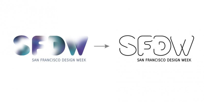
Along with gradients and texturing, the diffusion effect can become quite a challenge to make a monochrome version. Depending on the importance of the blur effect and the structure of the logo will be resolved in one way or another. Below we can see how in the following examples these brands have solved the challenge using a very similar technique using a semitone screen.
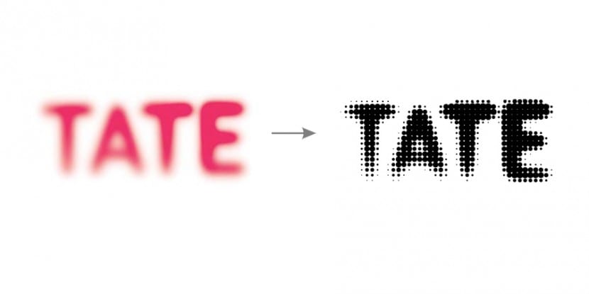
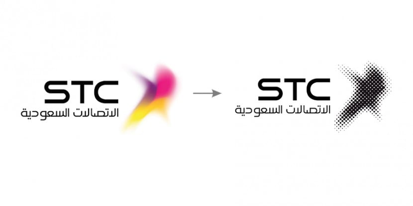
As I was saying, it all depends on the type of design that we are retouching, sometimes to be more faithful to the original, it is necessary that we resort to alternative techniques. In this case, the dashed line is used to adapt to a monochrome version.
Logos with images or hyper-realistic aesthetics
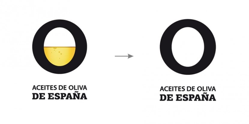
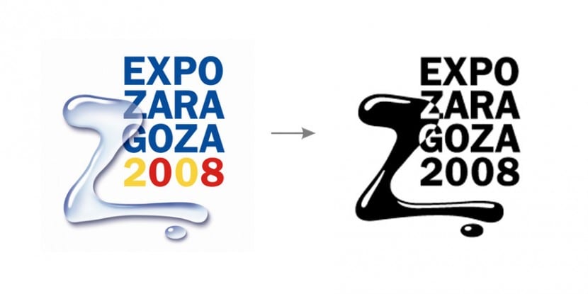
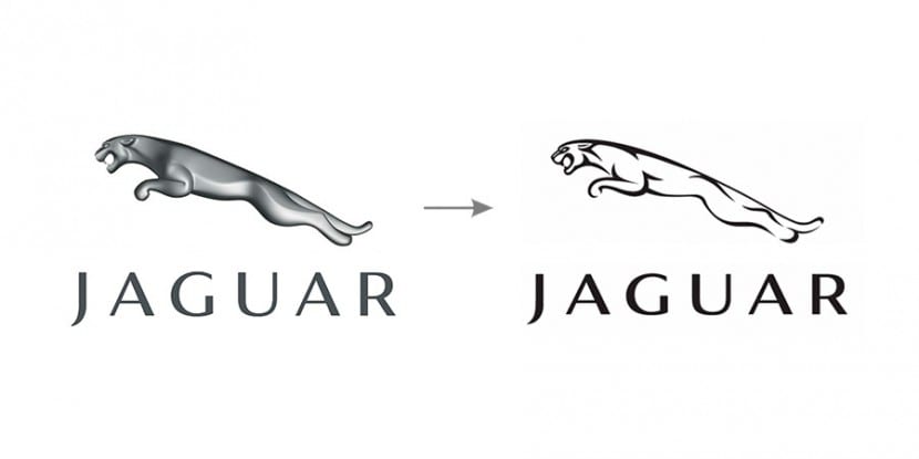
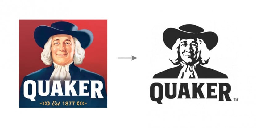
There are other occasions when we are faced with hyper-realistic designs or that even contain photographic elements, in this case we enter into an important dilemma since we can put the essence of the original concept at risk. On many occasions, it is decided to completely eliminate the photographic component and keep the typographic but as we said it depends on the proportion that each of these areas occupies. What is clear is that we must do something and of course since this type of designs contain features that by definition cannot be contained in a composition developed with a single ink such as volumes, shadows, textures, gradients, fades and any kind of light effect. We therefore have two alternatives:
- Remove the photo component: This option is recommended for all those designs in which the choice of it does not alter the essence of the concept and even so we continue to easily identify the logo even in a monochrome version and regardless of said component.
- Develop a flat version of the photo component: For all those cases in which the removal of the realistic component leaves the final version empty of content or directly provides us with a totally different result from the original concept and complicates its easy identification to the public.
You can see below several examples, as always, an image is better than a thousand words:
How to treat and represent textures of the logo?
What if I am not satisfied with a rendering free of all texturing and want to keep the texture in my flat design? Below we see some cases where a representation has been created in a single ink and logically regardless of the chromatic nuances, although in the latter case the two colors that are presented in the original version are flat. There will be designs that are more or less appreciative but remember that the version will only be used on very specific occasions, so it will only be enough for it to be easily recognizable and related to the original brand. Of course, within our possibilities we must try to provide the best finish.
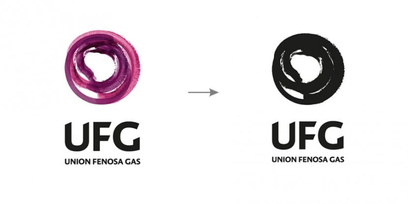

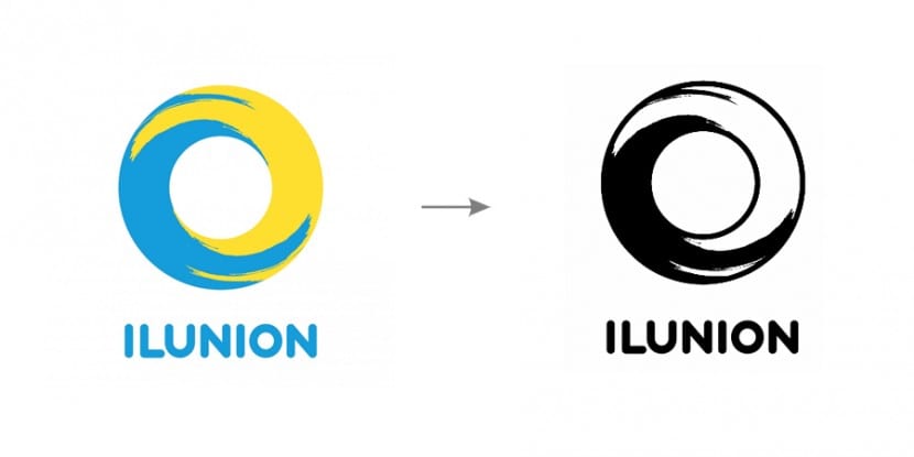
Multiple monochrome versions
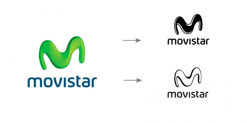
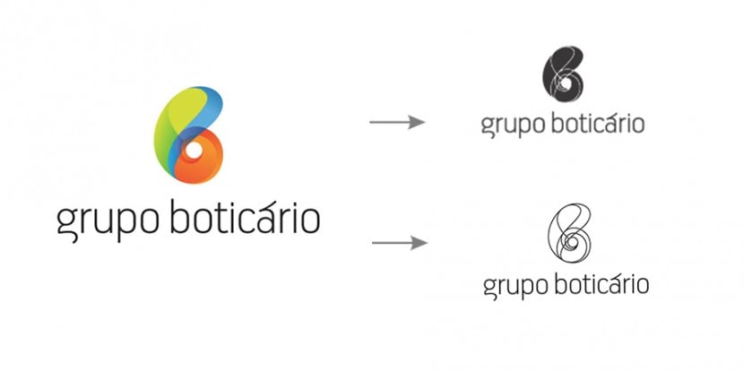
On many occasions, designers develop several alternative monochrome versions to ensure perfect integration into any medium. Today there are various platforms and media on which our logos can be inserted. Many brands tend to develop two versions, one of them being more solid and the other somewhat more contoured. Let's imagine that we need to sew our monochromatic version to a textile garment, in this case we will need a more solid version, however a more detailed version may be more suitable for supports such as glass or decorative objects.

Source: brandemia
Great this article… thank you !.
Hello Fran. I would appreciate it if you could put the source of the original article, which is ours. Thanks a lot
Hi Modesto, thanks for the note, I forgot! All the best :)