
We continue with another publication of those web design with a good list of CSS menus with responsive design. A series of CSS menus dedicated exclusively to that format that does not usually exceed 768 inches and that allows us to have our website ready for visitors to enter from their smartphone.
The truth is that each of the 9 CSS menus with mobile design that you will find below they are of great elegance and they are equipped with a series of animations and a design of high quality and detail. Do not miss either this series of circular menus with that unique shape to display the different sections of our website.
Simple mobile menu
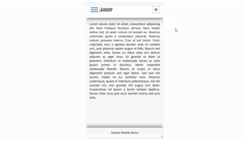
A simple menu for mobile of recent creation and that takes us directly to the current standard of web design for mobile devices. A full responsive menu that uses Bootstrap 3.x, FontAwesome, CSS flexbox and CSS BEM Syntax. A simple menu very well designed and based on its simplicity to be admired.
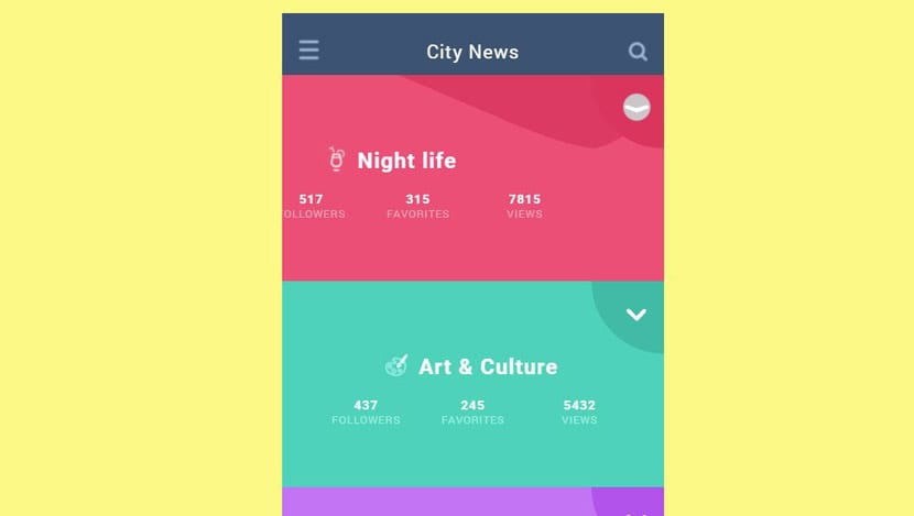
Magical mobile mega menu
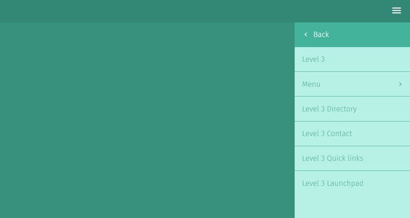
Mega menus allow us to add columns, widgets and all that series of elements necessary to direct traffic to our site Web. This responsive side menu for a smartphone is very simple and you will find all the sections the only space that it uses statically.
app navigation
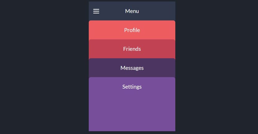
We are facing a responsive menu that is more of a concept. If you are looking for something different from current standard In mobile menus, this menu can be quite appropriate. From the hamburger icon you can extend the series of tabs with which you can access all the pages of the website.
Mobile navigation animation
This responsive menu differs from the rest by one more than nice transition animation since we press the hamburger menu with diagonal design. It also costs an animation in the hover selector to give it more dynamism. Use for GSAP TweenMax and TimelineMax animations.
SVG UI navigation concept
SVG and CSS3 animations for a really original menu that takes you to a very creative transition and that stands out from the rest of the responsive menus on this list. Also notable for its great color and for the great effect that it can give to your web space when viewed from a mobile device such as a tablet.
Details info and navigation

Very similar to the previous one in the design and use of colors, at least in the initial composition, but this time it differs by a responsive circular menu which is located on the side of the screen. The animations are very smooth and it is another responsive menu with a great touch to make our website stand out from a mobile or tablet.
Mobile Gooey navigation
This is a «Gooey» effect very well applied to a mobile-style menu that relies on CSS and jQuery transitions for animations. It's about a series of buttons that open when you click on the hamburger icon that we have right in the center of the lower part of the screen. Another one of those gimmicky responsive menus that is still very current.
Frosty Nav «Toggle» effect
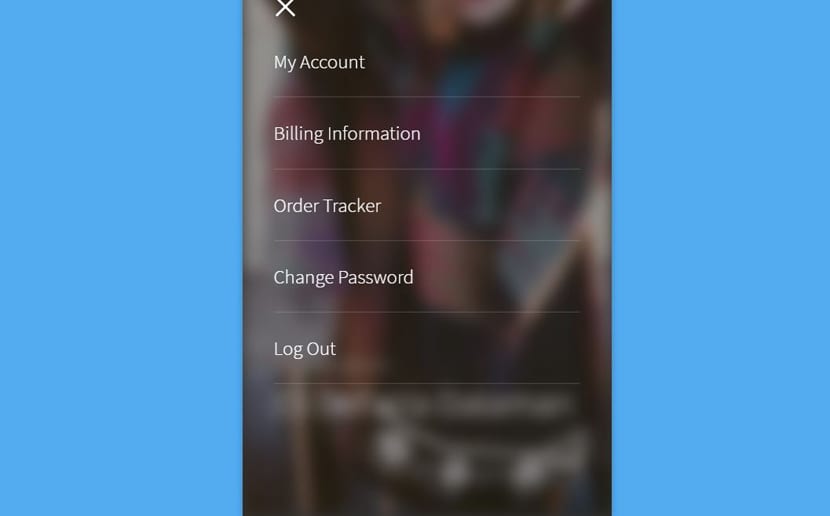
This responsive menu tries to apply a smooth animation just when we press the button hamburger. The effect it does is blur so that the background of the screen is blurred and we can better distinguish each of the sections through which visitors to our website will pass. We have some simple animations for each of the categories without much fanfare, but with great effect.
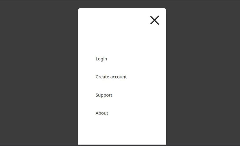
Mobile Menu
We finished this series of mobile responsive menus with one of great quality. Without first forgetting that you can go through another series of menus to distinguish your website, just these in full screen.
Mobile Menu is one that is characterized by the jQuery effect and that it is programmed in both HTML and CSS. Quite simple in its composition, but it is surely capable of giving that premium touch to our website.