
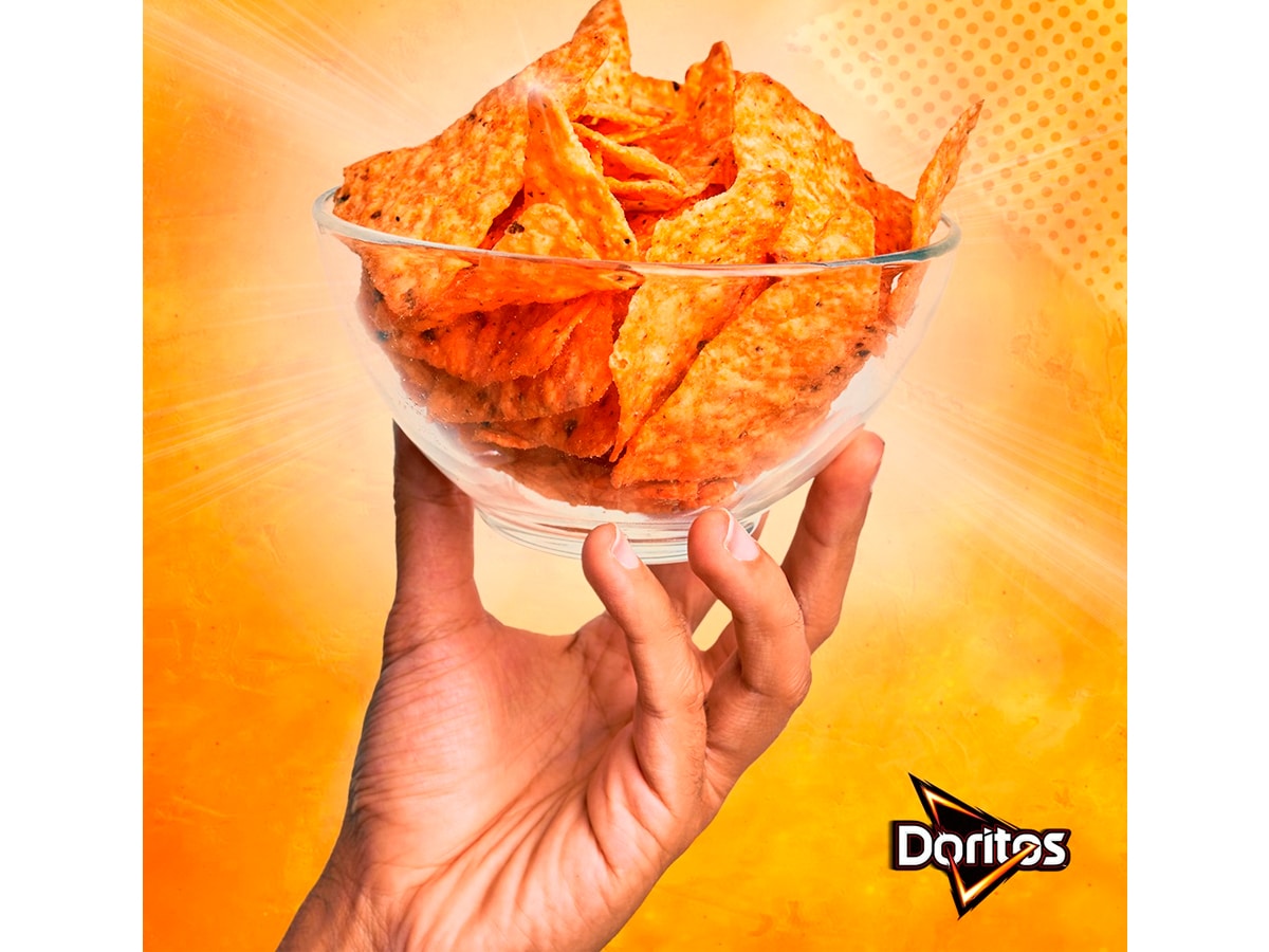
We hope that you are also one of ours and feel an unconditional love towards Doritos. Sure, you've opened a bag while watching TV, playing video games, as an appetizer for a party, etc. Any occasion is good to enjoy these snacks.
Tortilla chips have evolved over time, and the same path has followed its brand image. We are going to talk about this in this publication, about the evolution of the Doritos logo and what has led to it.
The snack brand, owned by the Pepsico Food group in Spain, has changed its image several times in order to present a new personality to its consumers. A brand personality that expresses energy, modernity and adventure, with which to approach the younger public.
Doritos, as we all know, are triangle-shaped corn tortilla snacks seasoned with cheese, pepper, and other ingredients. Over the years, the brand has been expanding the market and bringing out new flavors.
History of Doritos
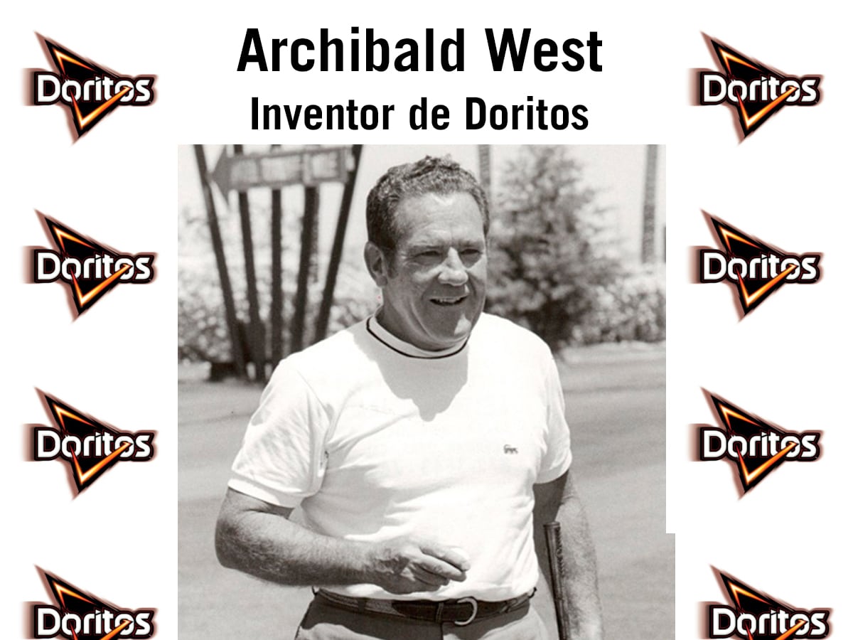
The Doritos, has its origin in the year 1914, in the city of Indianapolis, where its discoverer Arch Clark West lived. When she was young, Arch's father passed away suddenly and her mother was unable to bring them up on her own.
All this situation led to the brothers being taken to the foster home, Indiana Masonic Home, where they spent several years of their lives.
In 1961, he is the vice president of the Frito company, a snacks subsidiary of Pepsico and Frito-Lay. On one of the family trips they used to take, Archibal West noticed that in one of the roadside bars where they made a stop, they served the food accompanied by pieces of corn tortillas.
With this idea in his head, he went to his company and presented it. But due to the financial situation of the company, it could not be carried out.
Some time later, two important companies merged, and in the year 1964, the production of the snacks that Archibal West had proposed began, under the name of Doritos.
The name of Doritos, has a origin related to the production process of the product. Where the corn goes through the browning phase, that is, cooking without being fried, and this word, browning, is the construction of, golden brown.
History of the Doritos logo
The first brand logo appears in 1964, and since then it has been evolving until it manages to visualize the triangular figure of its logo.
La history of this logo there are those who divide it into two phases, the first phase in 1964, in which we find the logo made up of squares and the second phase in 1994, in which the triangle has already begun to be used.
El the brand's first logo, created in 1964, in which a range of 3 colors were used warm, yellow, red and orange. The letters that make up the name of the brand were each placed on a colored rectangle and composed of a typography with serifs and curved lines.

This logo is maintained for about 9 years. and it is in 1973, when the brand presents its first redesign, in which there was a composition of colors different from the previous one.
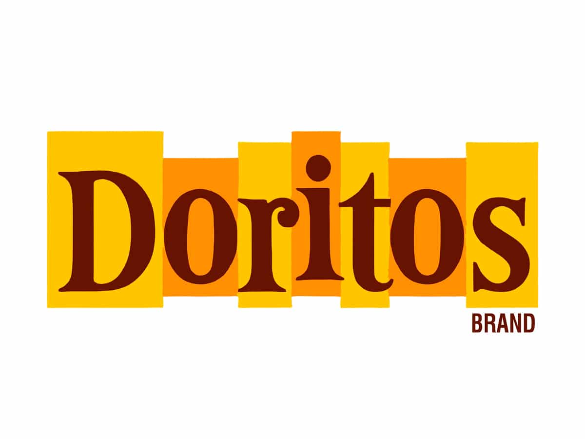
In this case, the colors become much more neutral, such a striking yellow is no longer used. The background was still a set of colored rectangles, which contained a letter of the brand name inside.
In this logo from 1973, you can see how the color chocolate began to be used in the brand name. The typography was aligned, which led to a relative balance, since it continued to maintain a very slight symmetry.
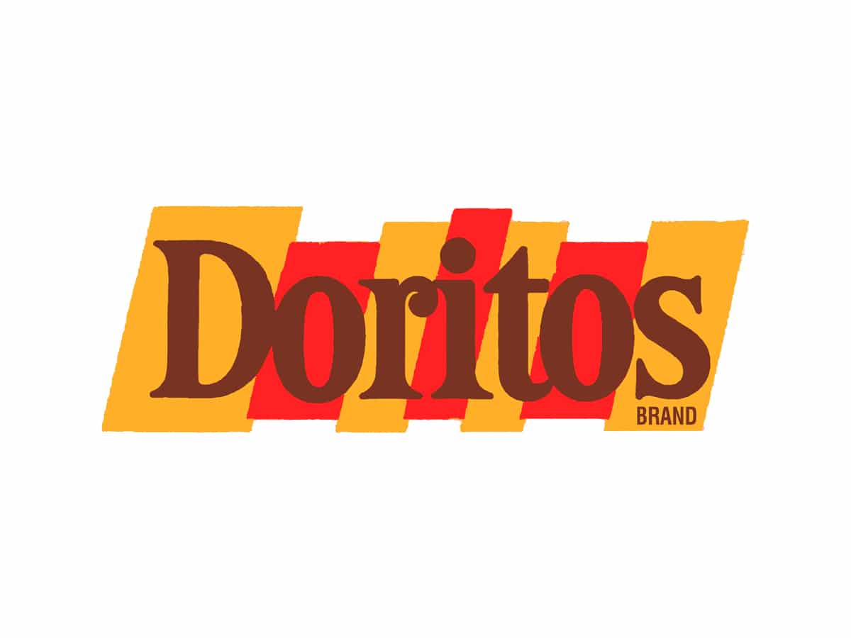
Years later, in 1979, the brand design underwent a change, the rectangles that made up the background were no longer aligned with the letters, but they were inclined. So that the brand name would not be out of place, it was decided to reduce the space between the characters.
Between the years, 1985 and 1994, used for the last time, the logo made up of rectangles in its background. The brand name becomes larger and a black color is used for its letters, in addition to a white outline.
If we look closely, the point of the Latin i, is modified to place a triangle, alluding to the shape of corn tortillas.
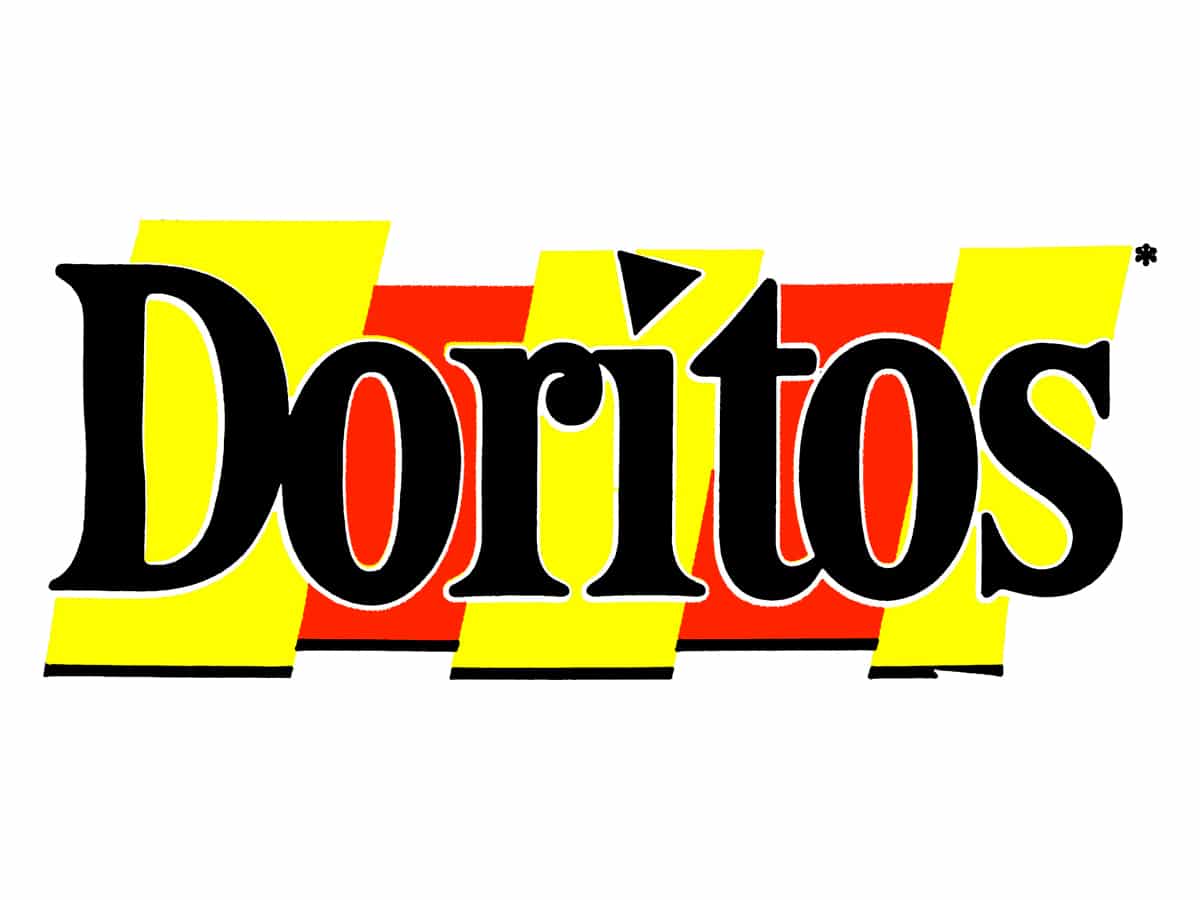
The colors that were used, are again striking tones, playing with bright yellow and an orange red intense. At the same time, it can be seen that the number of rectangles used was reduced to five.
In the middle of 90, the first design of the brand appears with a triangular shape, already characteristic of the brand. In the name, a yellow outline appears, the point of the i is still maintained, in a triangular shape.
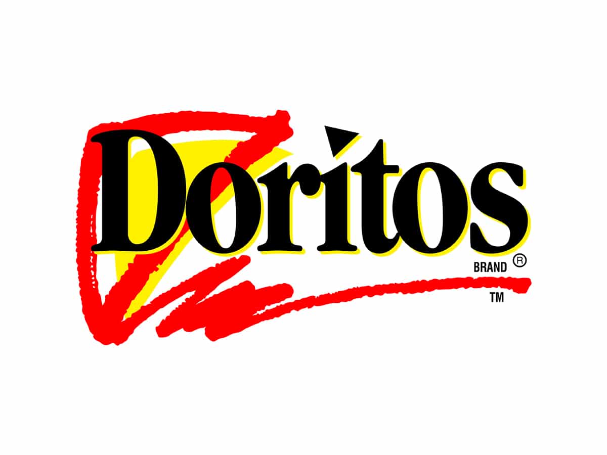
Whole brand name, appears accompanied by a yellow triangular shape, placed at the bottom of the composition, alluding to snacks. On top of said yellow triangle, there is an irregular outline in red, which underlines the name of the brand, emphasizing it.
Over the years, the brand decides to give a new change to its image. The logo is built inside a black rectangle, with uneven edges. The brand name also underwent a color change, going from black to white.
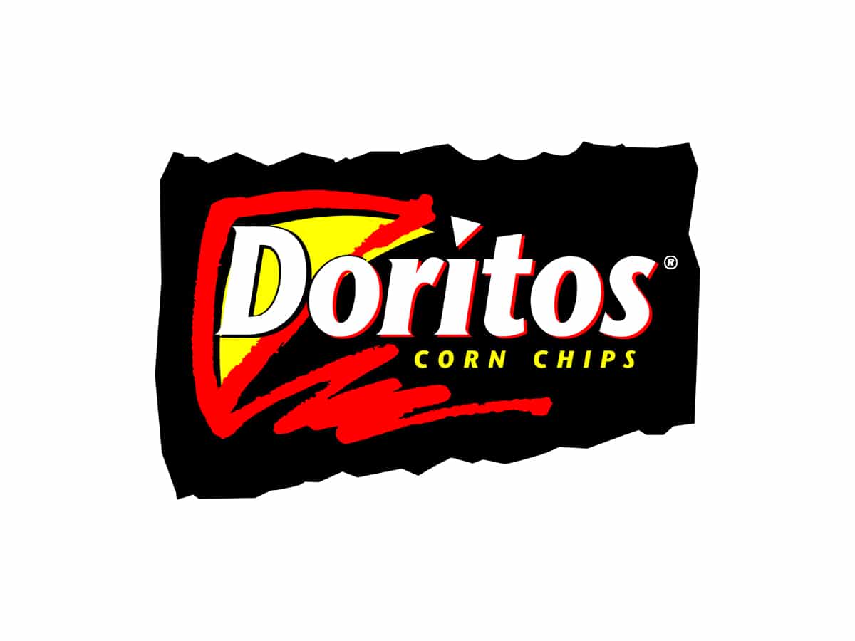
In this layout, a new element is introduced, and it is the phrase, corn chips, which attracts the eyes of the viewers with the use of a vibrant yellow color.
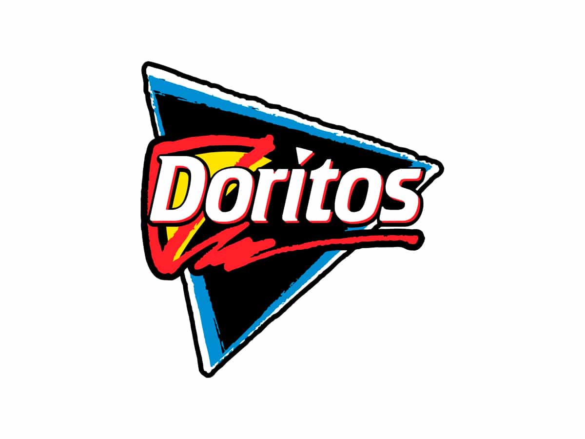
In the years 2000, the rectangular background disappears completely, giving way to a black triangle. This geometric shape is delimited by three triangular stripes of different colors, blue, white and black. Not only were the colors different, but also the thickness of the line, which provided asymmetry to the composition.
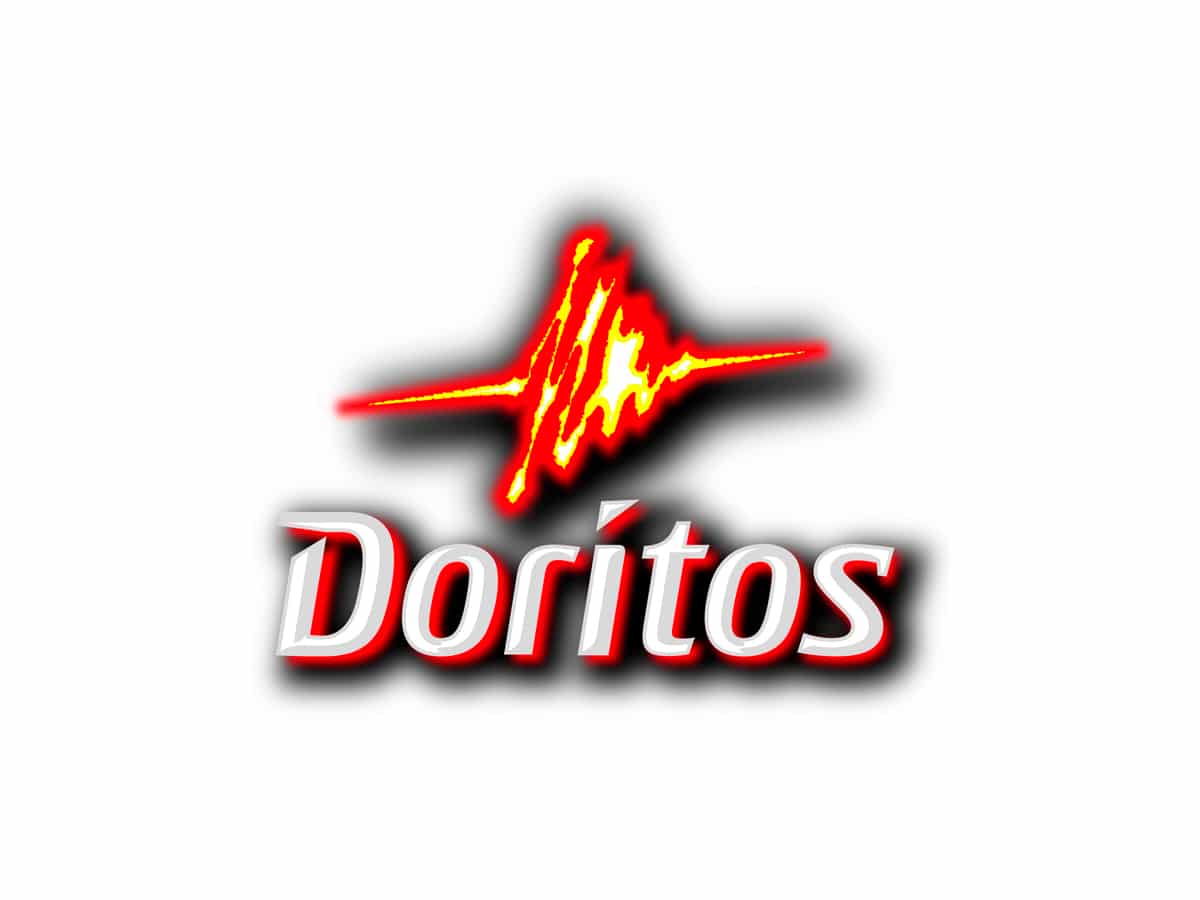
Five years later, in 2005, Doritos makes a radical change to its brand image. This version only appeared on store shelves in the United States. The brand opted for a sans serif typeface and the play of white and gray colors, with red outlines in its characters and a gradient shadow effect in the background.
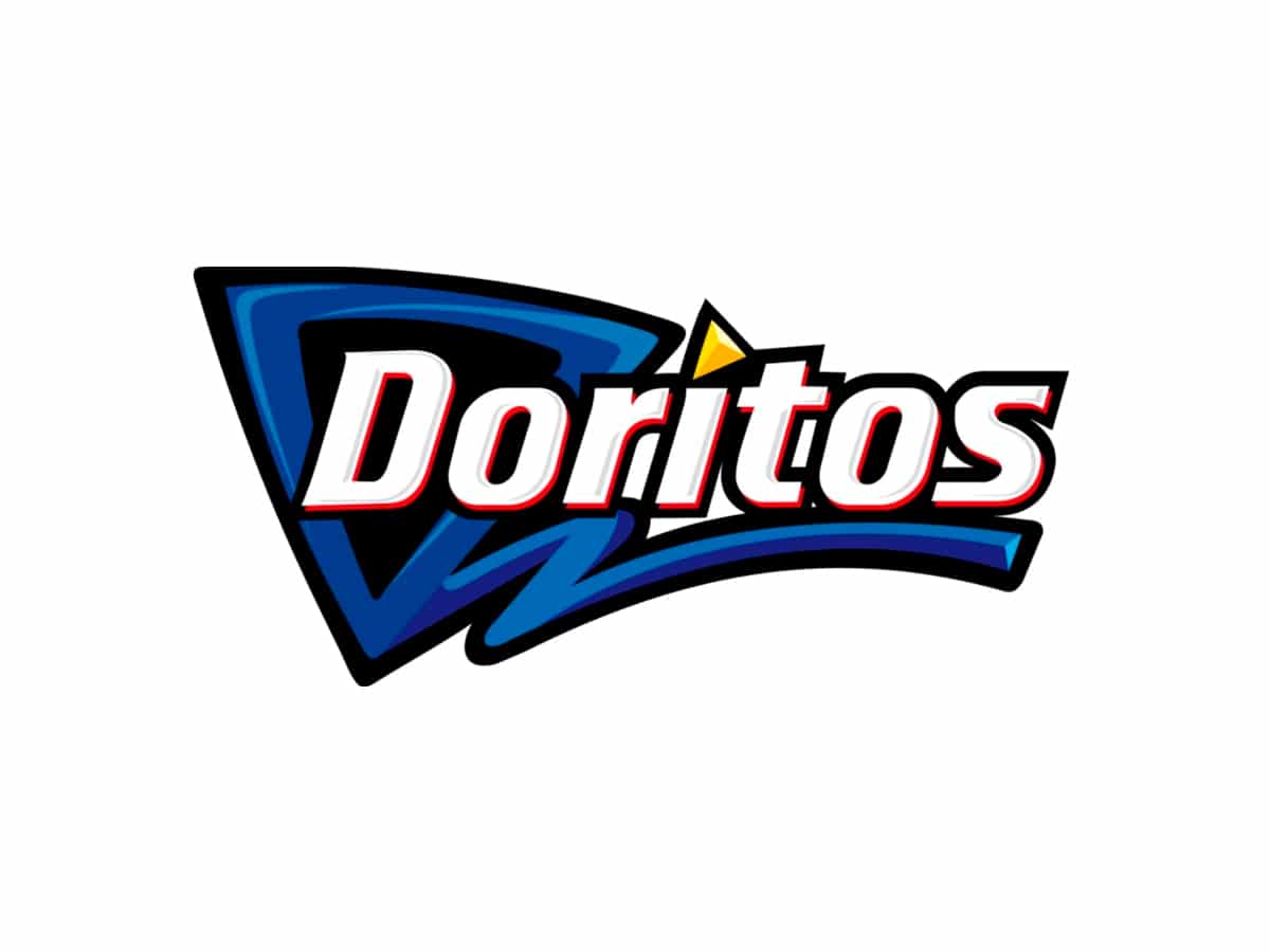
In the year 2007, to the rest of the world, Doritos presented us with a new, much more modern and compact image. The shapes were updated, the triangle became electric blue, the typeface was kept in a sans serif style, and the dot on the i was changed to yellow.
After several phases of changes to the logo, the triangle is here to stay. The design of 2013, from Doritos is the one that continues to this day reproduced on the packaging of its products.
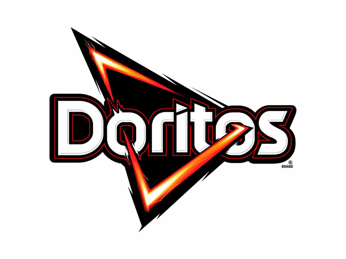
In this new logo, the triangular shape goes through the eyes of the letters o, to give the image more strength. The geometric shape, it is composed of an irregular layout, finished in points and colored in an orange tone with shiny effects.
The name of the brand, continues to maintain a sans serif typeface, with a white cast and XNUMXD effects on its characters, giving it a progressive look.
In the year 2019, the brand was a revolution in the market, when approaching the younger public, the members of generation Z. As we all know, the vast majority of this generation is not very close to brands, which led Doritos to eliminate their image and put in its place an inscription that indicated that the logo was there.
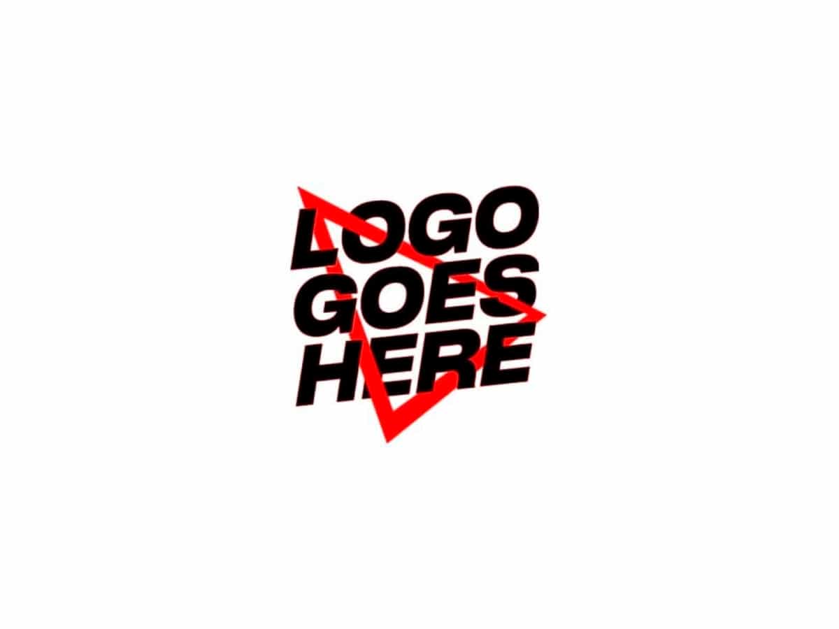
With this campaign, he hoped that his closest public and new generations, recognize your product and brand without the need to see the logo.
Doritos has always known how to adapt to image changes, respecting its brand identity. This becomes clearer when he begins to use the triangle shape in his designs. The colors black, white, red and orange are the hallmark of this brand.