
Source: Wikipedia
When we talk about fonts, we also talk about letters that take us to remote places and times of our history and evolution. There are typefaces carved in stone that, for many years, were the first design mechanism in fonts. Over time, these fonts became what now occupies many spaces around us, Roman typefaces.
But in this post we are not going to talk about this style, but rather we are going to introduce you to another era that had a lot of boom and power. A time full of pharaohs and pyramids where everyone lived together, the Egyptian fonts.
It is for this reason that we are going to explain what they are, what they are used for when we talk about design, and what functions they perform when we interact with them.
what are egyptian fonts
![]()
Egyptian fonts are one of the styles that are part of the different typographic families and styles that exist. They receive the name of Egyptian although they are also known as Meccan fonts. What characterizes this style is that they maintain characteristics similar to Roman fonts, due to the existence of serifs in their shapes. They are often confused with them since they are also found in reading spaces or in magazines such as some headlines, so it is very common to see them in our day to day.
In addition, its striking shape has managed to attract the attention of many brands and companies. For example, there are brands like El País, Sony or Honda. that have joined to include this type of letters in their logos. In short, they are typefaces that maintain that classic and demure style of the Roman family, but at the same time, they are very attractive since their shape has always been maintained as a kind of imprint or stamp of their own.
General characteristics
- Egyptian typefaces are mainly characterized for containing in its forms uniform modulations, that is, at first glance the contrast in its forms cannot be appreciated.
- What it maintains in a similar way to Roman typefaces is that they maintain ornate and very marked serifs in their forms, which means that, as we have indicated previously, maintain that classist and serious style of the time.
- The strokes and their generic appearance is quite uniform, that is to say, there are strokes that vary and do not follow the same pattern, This does not mean that they are not well designed, but rather that in order to maintain the connotations of the era from which it comes, it has been necessary to design its own graphic line that denotes the pure image of the Egyptian era.
- The fact that they contain such marked closings makes it one of the typefaces suitable for use in headlines or large texts where the protagonist is undoubtedly the typeface. It is for this reason that, as we have also indicated previously, it has been used in many logos of some of the most representative brands. In short, it is the ideal typography if you also dedicate yourself to identity design.
Typologies
There are two styles of Egyptian fonts that maintain different characteristics. Each of the styles are functional and we can find them in different applications and uses. That is why, in order for you to better understand what we are talking about, we have summarized its characteristics and, in addition, we are also going to explain what those functions are that they perform in the field of design.
soft link
Egyptian soft-link typefaces are characterized by the fact that they are quite far from the Romanesque trend that we have seen so far and maintain a much more humanistic trend. When we talk about humanism, we mean that his strokes are much better defined and its appearance is much less visually overloaded.
Unlike the normal ones, this style keeps its modulations completely visible, which means that the strokes do not become completely uniform. In addition, they maintain a much less hard connection point, that is, each one of the shots of which the fountain is made, is less forced and goes more unnoticed.
It is undoubtedly one of the styles that has been best used since it shows a slight minority of strength in its forms and in its graphic line. Among his most prominent fonts are: Claredon and Lino Letter.
hard link
Egyptian hard-link typefaces abandon both the Roman classist and the well-defined humanistic style and turn to a much more geometric style. Geometric fonts are usually those that we know as sans-serif. Therefore, as its word indicates, being geometric typefaces, they are quite striking due to the great range of balance they contain.
The modulation of these forms is once again uniform and the finishing touches are once again marked and quite visible. Some of the most outstanding typefaces of this style are: Rockwell and Memphis.
Uses and applications of Egyptian fonts

Source: The voice of Pinto
There are many uses that have been given to this typographic style. But until now, we do not fully know the advantages or benefits of this type of letters. That is why we have made a small list with those benefits that characterize them so much and what different uses we can give these fonts. The list is not very extensive, since they are considered typefaces that were designed primarily to attract the attention of the viewer. But we hope that they serve as a reference and you understand when to use them and when to opt for a different style.
- The first use that is usually given to this type of letters is in continuous texts and bodies that are totally regular. It is what happens when we open a book, these fonts combine well as a possible reading.
- Also if we move away from the small formats and go to the most extensive ones, its use or application is also possible, pSince they are also used for large and medium bodies.
- Another use where Egyptian fonts are often used is in newspaper headlines that summarize all the content and that barely contain words. They are good at attracting attention., so they are usually introduced in slogans or large headlines of interest.
Egyptian typefaces: examples
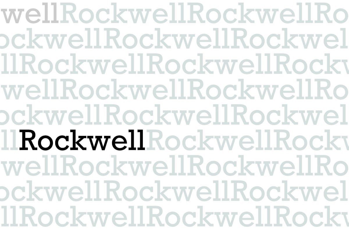
Rockwell
Source: Medium
Rockwell typeface is one of the most prominent Egyptian typefaces. It is considered a Slab Serif typeface and was designed around the year 1934. What characterizes this typeface so much is undoubtedly the stroke of its foot. It is also trendy and comes from a more geometric style.
What also characterizes this typeface is that it has been used in some headlines and movie posters, so its appearance does not go unnoticed and it is very attractive if you want to attract attention.
Claredon
Claredon is also one of the most important and relevant Egyptian typefaces. It was created in England by the designer Robert Besley in 1845. In addition, it is not only among the most important for its physical appearance, but also for being the first Egyptian font to be designed and recorded for the first time.
Also, if you are wondering what use or uses this typeface receives, it is the star typeface of many of the traffic signs in countries like the United States, it has also been used in restaurants and in different shops, so it is even more interesting .
Memphis
Memphis typeface is one of the Egyptian typefaces that was designed and created in 1930 by Dr. Rudolf Wolf. Without a doubt, this typeface was one of the first recoveries of the Egyptian alphabet, which is why it is considered one of the most important and outstanding typefaces.
What characterizes this typeface is its appearance, since it maintains that geometric and popular style. It is also quite a tightrope walker in terms of its visual weight. In the field of design, This typeface has been used both in corporate identities and in packaging designs.
Linen Letter
The Lino Letter typeface was specially designed to be used in print. It maintains very original characteristics such as its high readability range. In 1993, Lynotype launched this typeface and named it Lino Letter.
It is a very useful typeface if you need to apply it to running texts, body texts that are large or medium, which are very attractive for large and clear headlines or subtitles.
Also, being a new style, it is also possible to find it in different variations and thicknesses such as: Black, Bold, Meidum and Roman. In short, it is the perfect typeface for your projects.
Conclusion
Egyptian typefaces have also marked a before and after in the world of graphic design. That is why they have become the star element of many brands that we know.
We hope that you have learned something more about this new typographic style and that the examples that we have suggested have been very useful to you. There are many Egyptian fonts that exist and are available online. Carry out a broader search and let yourself be surprised by what these typefaces are capable of offering to your next projects.