
“Colors” by arjun.nikon is licensed under CC BY-SA 2.0
It is estimated that the human eye can distinguish more than ... 10 million colors! Knowing its characteristics we can have many more ideas for our creations, either in painting, decoration, design and in everything in which colors can be applied.
Color has been studied extensively by philosophers, scientists, psychologists, artists ... throughout history. We can talk about its properties, the chromatic circle, the types of color according to multiple criteria, color scales, its psychological effects ... and a long etcetera.
We are going to develop each of these characteristics below.
The chromatic circle
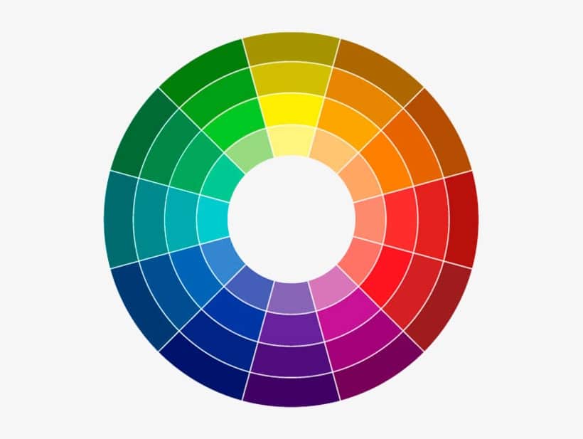
The chromatic circle is the graphic representation of the colors into which the visible light spectrum is broken down. It can represent the primary colors or also the secondary and tertiary colors. In neither does white (the sum of the primary colors) or black (the absence of light) appear.
Colores primarios: cannot be achieved through mixing other colors.
Secondary colours: they are formed by mixing two primary colors.
Tertiary colors: they are formed with the combination of a primary and a secondary color.
There are different color circles depending on whether their primary colors are defined by natural pigments (in the case of paint), a screen (in the case of design or photography) or the inks of a printer.
Color wheel for paint (RYB): uses traditional colors, the primary ones being Red, Yellow and Blue.
Color wheel for design or photography (RGB): uses light colors, they are Red, Green and Blue.
Color wheel for printers (CMYK): uses pigment colors, are Cyan, Magenta and Yellow. In this case, black ink is added to create greater intensity.
The properties of color
Color has three basic properties: hue, saturation, and brightness.
shade: differentiates one color from another, referring to the slight variation in tone that a color makes in the chromatic circle in its immediate area. There are multiple colors depending on their hue. Thus, within the red tone, we can distinguish different reddish shades: scarlet, amaranth, carmine, vermilion, garnet, etc.
Saturation: is the amount of gray that a color has, which determines how intense it is. Thus, the higher the saturation, the more intensity and the less amount of gray in its composition.
Luminosity: It is the amount of light that a color reflects, that is, how light or dark it is. The higher the light, the more light it reflects.
Chromatic scale
When we vary the above properties, we create a chromatic scale. This scale can also be achromatic.
Chromatic: We mix the pure colors with white or black, thus varying the luminosity, saturation and hue.
Achromatic: Grayscale from white to black.
Color harmony and Adobe Color
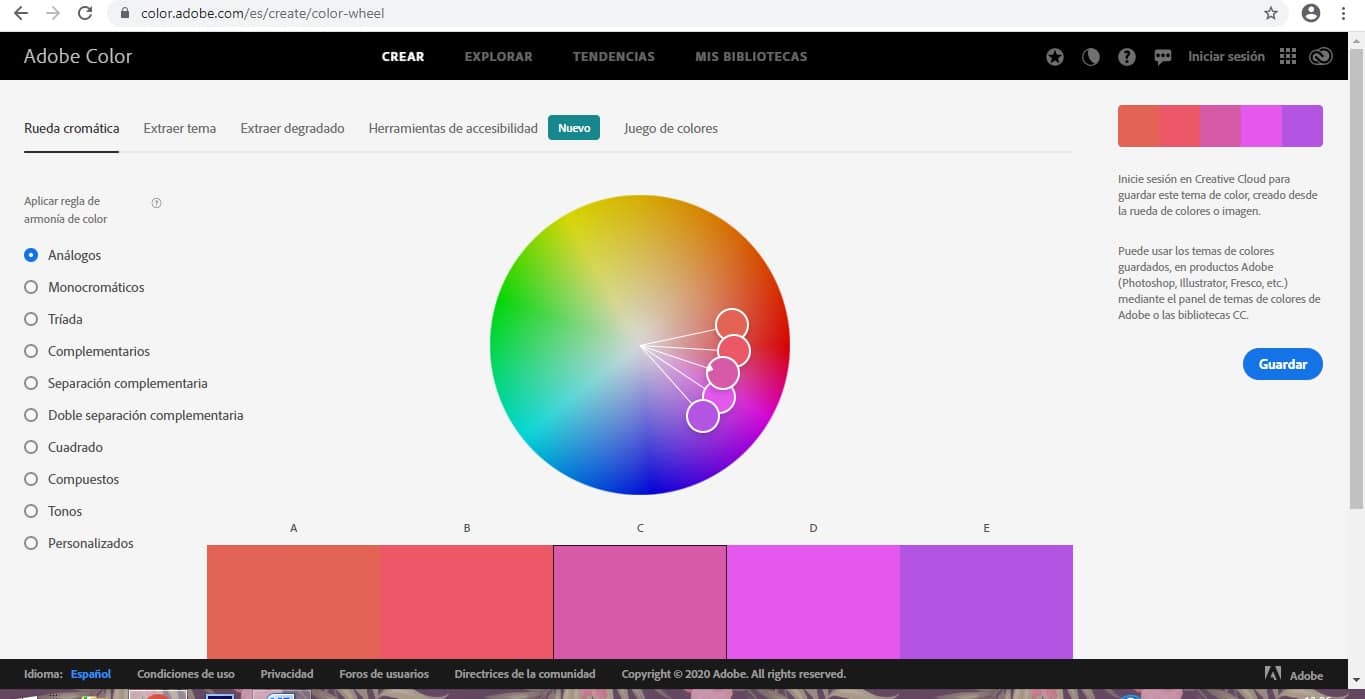
Harmony between colors is created when they have some component in common. We can highlight the Adobe Color program in this regard, as it will allow us to create a great multitude of harmonic color palettes, attending to the different relationships that we are going to see below.
Analogous colors: neighboring colors of the chosen color on a color wheel.
Monochromatic colors: are the shades of a color.
Triad of colors: it would be three equidistant colors on the chromatic circle, which contrast strongly with each other. For example the primary colors.
Complementary colors: they are colors that are located in the opposite way on the chromatic circle.
And a long etcetera.
Effects of color in humans
The psychological effect produced by the use of different colors in humans has also been widely studied. Also influencing the fact that throughout history colors have been associated with various events, transmitting a cultural meaning of them. In western culture:
Blanco: peace, purity. Also coldness, sterility.
Black: mystery, elegance, sophistication. Also death, bad.
RED: passion, sexuality, vitality.
Verde: nature, health, balance.
BLUE: tranquility, commitment.
Pink: youth, tenderness.
What are you waiting for to start creating harmonious color palettes in your works and that generate the effect you want on others?