
The most famous and spectacular automotive event in the world also has a corporate image. This event that is played around the world and has millions of fans has maintained a great trajectory throughout its history. There are many other sports like this, such as Tennis or even MotoGP but the deployment of Formula 1 is unmatched. The F1 logo has been modified a few times, but let's take a look at it.
Surely many of the readers of Creativos Online They are also speed freaks. That is why we have decided to analyze this logo throughout its more than 50 years of history. Although for many it may be little history, we must bear in mind that they are high-speed cars. Of which we have not known for many years, yes, we will not know where the maximum speed is at which it will not be able to surprise the F1.
How was F1 born?
This name does not have much mystery. Whether you write it as F1 or Formula 1, this was born in the year 1959. Since that year, he has been organizing high-speed car events worldwide with teams with increasingly higher budgets. All kinds of car brands have been linked to the sport and more have been added ever since. Iconic brands such as Ferrari or Masseratti that, together with great drivers, have won thousands of awards.
The name of Formula 1 is due to the fact that the way of registering the rules of the competition itself and the championship were strictly formulated. The F1 logo as we know it today has changed over the years. But this time there have been only four times. Of which, two have been more significant changes and the others somewhat more continuous with respect to the previous ones. Although we can say that the first image was not a typical logo, rather a banner.
F1's first corporate image
As we have commented, the first logo did not even have design rules. It was more of a banner that could well serve as a starting point for a Grand Prix. In this first image we can see, on the one hand, the acronym FIA. This acronym belongs to the so-called International Automobile Federation. This federation is a non-profit organization that was born in France and tries to regulate the rules of automobile championships.
This federation not only regulates the cars or the rules for which the responsibility falls on the driver or mechanics. It also governs the laws about the championship itself. Road, environment, road safety... among others. To the left of these initials, we can see what is a logo. This logo belongs to the corporate image of FIA. We can see, somehow, how it is a sphere with all the continents of the planet, although with little legibility. This logo has been modified to a more updated one now.
The rest of the first F1 logo reads "World Championship" and "Formula One". Which comes to refer to the World Championship and Formula 1, which is the name we have been talking about. In this way, a first name is established that would give rise to the following logos. This logo was born in 1985 but it was soon replaced by a brighter image in keeping with the image of a company of this level.
The first F1 logo
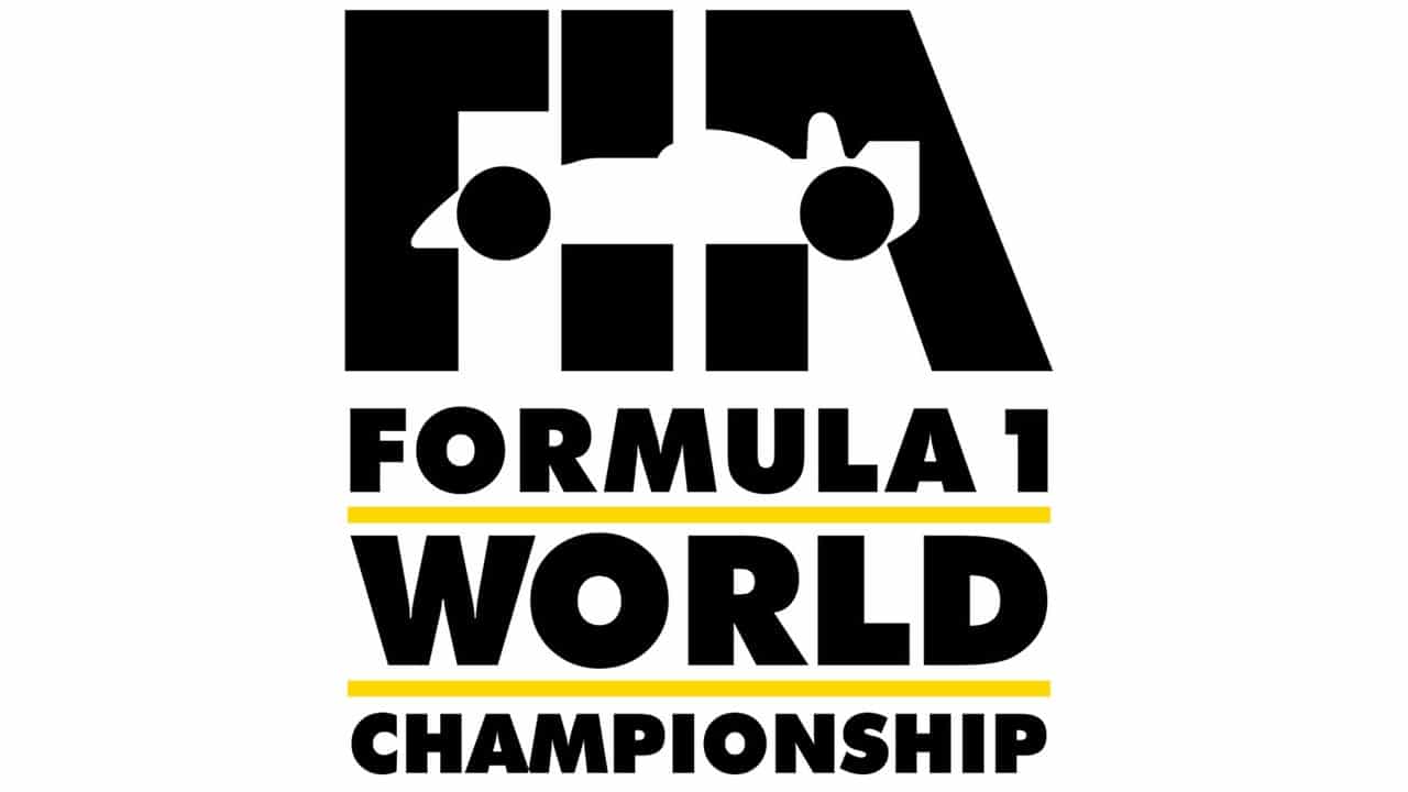
This first logo was more formal and visible. Its lines were clearer and it had better scalability than the previous one. Both the text it has and the placement make it more functional when it comes to reproducing it in different circumstances. This logo, as we can see in the image, consists of four steps. Each of them in a descending size, where the first becomes the protagonist over the rest.
The first thing is the acronym FIA, which continues to gain importance over Formula 1. A claim like this, that it belongs to a great society that makes it credible, but that separates it from a unique brand that vibrates alone. This same logo already has a superimposed image of a Formula 1 car, very similar to the current ones. Where tires play a fundamental role to be part of the word FIA.
Separated by yellow lines that draw attention to a black text, everything else is found. By steps, first Formula 1 and then World and Champions, respectively. Although World has much more presence because having fewer letters and wanting to fit it into the same frame, you must enlarge the letters. This is a defect that gives the format little autonomy and one aspect seems more important than another.
An iconic logo
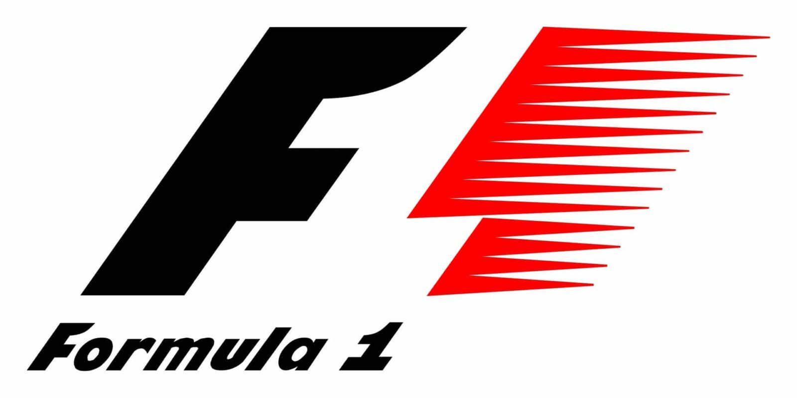
Despite such a sudden change between the first image and the first official logo, where he only spent two years, the next one would not last too long either.. And it is that six years later, In 1993 the most iconic logo of all times in motor sport was born. In fact it is so much so, that it lasts until 2018 where it is modified by the one we currently have. But until then, we can all recognize a logo left for posterity.
This logo already has its own identity. It moves away from the merely corporate and chooses an image with guarantees. Where, in addition to the birth of the concept of "F1", it collects the colors and shapes that evoke an image related to speed sports. Picking up the three most representative colors for such a brand, which are made up of black, white and red. These first two are essential, since much of the brand goes with them.
Since the end of the race flag is made up of these two colors in a checkered format. So it makes sense that F1 has these colors. In addition to placing a letter in italics, which added to a red that loses density, evokes speed in the logo. This red also makes sense when recognized as a color that alludes, according to color psychology, to passion, strength, emotion and passion among others. Something that undoubtedly includes Formula 1.
A brand update

This new logo is redesigned in 2018. Improving criteria in how much the new digital formats to adapt to them. In addition to making a minimalist and modern design, but which at the same time makes it bright and with a look to the future. this logo it has the bright red that it picks up from the flag of the previous logo, but this time it makes it the protagonist. The "F" leans forward and occupies a large part of the logo with a transparent line in the middle resulting in a circuit.
The 1 that also comes out inclined and with no more composition than a vertical line. Making as a whole a dynamic logo with a life of its own, but without losing much of its essence with respect to the previous logo.