
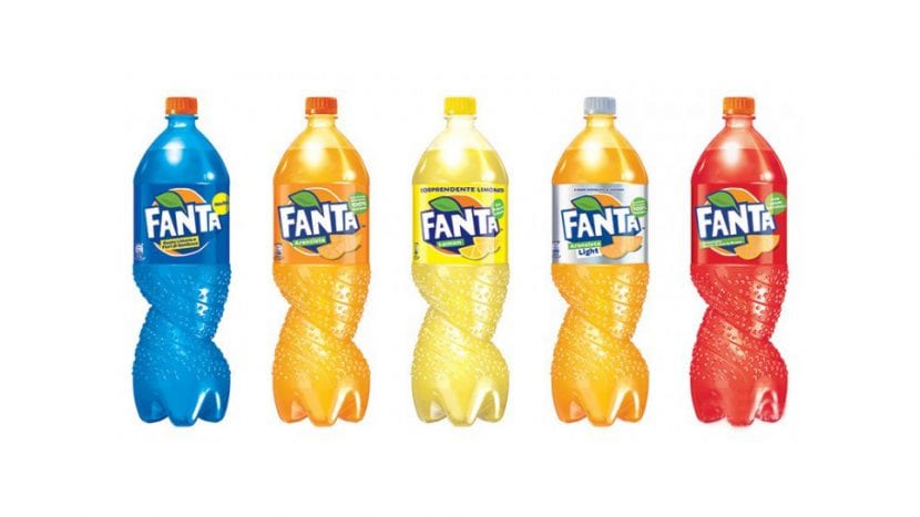
It is one of the most famous products of the Coca-Cola dynasty and has just renewed its image. Fanta has redesigned its logo and adding a much more refreshing aesthetic. Its objective is to connect with its direct audience, young and adolescent above all. At the moment the company has only given the green light to the changes in Italy, Poland, Serbia and Malta. Of course, it is expected that it will be integrated and imposed as the official image of the product.
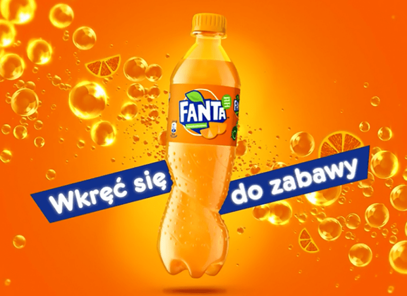
The changes have been implemented both within the logo itself and in the design of the bottle that contains the soft drink. Both in the same strategic harmony, they try to introduce greater dynamism, agility and visual rhythm to the composition. Together with the bubbles that accompany their advertising campaigns, we now find a twisted bottle. Almost severed by its own movement, something that gives us a greater feeling of lightness, flexibility, dynamism. Finally, it reminds us of a healthy, young and energetic body, able to squirm to get in touch with us.
What happened to your logo?
On the other hand, the graphic solution that has been given to its logo stands out for maintaining its palette. The difference is that this time, the main font is not blue on white, but se invest. Now the white color is superimposed on the dark blue color and the latter is confined to the contours of the letters. In addition, the letters that make up the brand name become capital letters almost like a rebellious cry and once again young. The structure of our characters continues to be unstable. We maintain a rhythmic break in the succession of each of the letters. In addition, the segments of an orange are added in the lower area. This is the only orange element that manages to overlap the dark blue that surrounds our typeface.
It seems to us that it has been a very wise choice capable of transmitting a much warmer and more youthful aura to the target audience.
I don't like it reminds me of orange kas
Completely agree with you :)
Total success, and the packaging fulfills the function perfectly.
Thanks to this change, it focuses on the target audience and if it highlights its values.
If competition distances itself even more from this brand and differs from the rest.
It has a certain retro air that I like and it is also more direct. For me, right.
not bad, I think that boxing it out makes it more striking and I like the detail of the smile in the A, now I don't know if it is necessary to complement it with illustrations
yes to the packaging, no to the logo?
The logo fits perfectly into the packaging, it gives it more dynamism than the round font it currently has.
It is a Logo created for the young public and it achieves it.
Although the other one was simpler, I like this one much more. And it seems to me that it draws more attention ...
I like it, it has an old touch but I think those oranges are too much
It's cool to me.
Right, the orange segments give it freshness. I also like the detail of the smile.
I consider the orange slices a mistake, it is supposed to be already an orange. I think it would be better without them and the bottom blue part is "flush" with the name. Colors are more vivid.
It has a cool retro air, the super smile of the last A is much more cool. If the brand removed the orange in the last one, I would not have put it back, and the new packaging is very attractive for the target it is aimed at.
I have plenty of fruit.
I like the new one much more than the old one. It has a retro touch that suits it very well.
Sandra AC what do you think?