Although it is not the only system, Pantone It turns out to be the system with which and at least most people understand each other when determining the color and establishing the appropriate tone they are looking for, mainly within the scope of the graphic artsHowever, it is not only used in that sector.
From the moment the first Pantone letter In 1963, colors do not only have names, but it is also possible to define them through a number and in some cases it can also be done through a denomination, with which the color and hue.
Pantone Chart Color List 2017

If you see one Pantone letter, you can see that each numbering is always followed by 1-2 acronyms, which some designers think are part of the same definition of color, however, what really indicates is nothing more than the surface on which this color is printed, because the material can affect the perception of one dye and another.
Normally, the acronyms that are perceived are the following:
- M when it comes to a matte finish.
- C and CP when it is coated paper.
- EC for coating according to the European standard.
- U and UP when it is textured paper.
- TC and TCX when it is in tissues.
- TPX when it is for paper.
- Q if it is for opaque plastics.
- T if it is for clear plastics.
Since this new century began, Pantone also announces what color the year should be seen And in reality it is an idea that as time goes by, it becomes more solid and in the end you end up observing the color announced by Pantone in any kind of objects, environments, designs, etc.
Who has not heard of Marsala? the earth color that managed to enter the lives of multiple people during 2014, at the time it was announced as the color of the year 2015 and which also was and has been there despite the years.
In September of the previous year the Pantone Color Institute, reported which colors will be a trend during spring 2017.
Combination of relaxation, vitality and open air

From bright / vivid colors to those that convey an earthy effect, the 10 colors that Pantone announced for this spring 2017 turn out to be an evocation of colors found in nature.
The executive director of Pantone Color Institute, I announce that one of the things that have been seen so far this year, undoubtedly consisted of a repeated sense of imagination where color is shown within a totally different context from the traditional one. He also commented that with evocations of the nuances that are found day by day in nature around people, the PANTONE Fashion Color Report Spring 2017, recalls a spectrum not only of feelings but also of emotions.
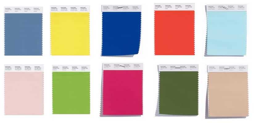
Here we show you which are the 10 colors that Pantone has announced for spring 2017.
Top 10 Pantone Colors for Spring 2017
PANTONE 15-0343 Greenery.
PANTONE 17-4123 Niagara.
PANTONE 17-1462 Flame.
PANTONE 13-0755 Primrose Yellow.
PANTONE 17-2034 Pink Yarrow.
PANTONE 14-1315 Hazelnut.
PANTONE 14-4620 Island Paradise.
PANTONE 13-1404 Pale Dogwood.
PANTONE 19-4045 Lapis Blue.
PANTONE 18-0107 Kale.
In the report that was produced about the previous Pantone colors for this Spring 2017, it is possible to find a very specific description of each of the colors that were selected by Pantone, along with the suggestions on possible combinationsYou can also download the entire palette in a .ase file so that you can work with it when applying these colors.
And for you, what is the Pantone range color that have marked you or have helped you when creating a project or work?